MEDIA
EVALUATION
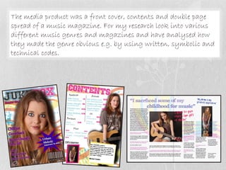
The media product was a front cover, contents and double page
spread of a music magazine. For my research look into various
different music genres and magazines and have analysed how
they made the genre obvious e.g. by using written, symbolic and
technical codes.
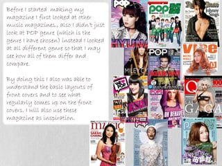
Before I started making my
magazine I first looked at other
music magazines., also I didn’t just
look at POP genre (which is the
genre I have chosen) instead I looked
at all different genre so that I may
see how all of them differ and
compare.

By doing this I also was able to
understand the basic layouts of
front covers and to see what
regularly comes up on the front
covers. I will also use these
magazine as inspiration.
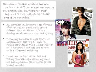
The main areas that stood out and were
clear in all the different magazines were the
title and images., also there were other
things created specifically to cater to the
genre of the magazine.

•   An example of this is that the types of images
    I found on Rolling Stones would be very
    different to ones used in Music in both
    clothing, models, make up, pose’s and lighting

•   The writing and colour schemes between the
    magazines were also very different. For
    example the written in Music is more formal to
    suit a more mature audience, were as POP’s
    writing is informal and chatty.

•   To conclude I decided that like POP and
    Rolling Stones the informal writing would
    best suit my audience father then the formal
    writing in Music.
Front Cover
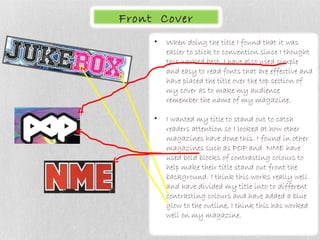
     •   When doing the title I found that it was
         easier to stick to convention since I thought
         this worked best. I have also used simple
         and easy to read fonts that are effective and
         have placed the title over the top section of
         my cover as to make my audience
         remember the name of my magazine.

     •   I wanted my title to stand out to catch
         readers attention so I looked at how other
         magazines have done this. I found in other
         magazines such as POP and NME have
         used bold blocks of contrasting colours to
         help make their title stand out front the
         background. I think this works really well
         and have divided my title into to different
         contrasting colours and have added a blue
         glow to the outline, I think this has worked
         well on my magazine.
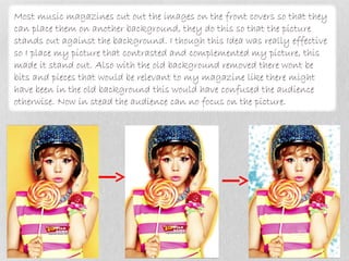
Most music magazines cut out the images on the front covers so that they
can place them on another background, they do this so that the picture
stands out against the background. I though this Idea was really effective
so I place my picture that contrasted and complemented my picture, this
made it stand out. Also with the old background removed there wont be
bits and pieces that would be relevant to my magazine like there might
have been in the old background this would have confused the audience
otherwise. Now in stead the audience can no focus on the picture.
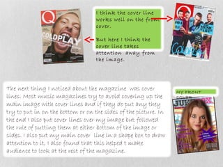
I think the cover line
                                   works well on the front
                                   cover.

                                   But here I think the
                                   cover line takes
                                   attention away from
                                   the image.


The next thing I noticed about the magazine was cover            MY FRONT
lines. Most music magazines try to avoid covering up the         COVER
main image with cover lines and if they do put any they
try to put in on the bottom or on the sides of the picture. In
the end I also put cover lines over my image but followed
the rule of putting them at either bottom of the image or
sides. I also put my main cover line in a shape box to draw
attention to it, I also found that this helped t make
audience to look at the rest of the magazine.
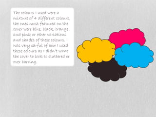
The colours I used were a
mixture of 4 different colours,
the ones most featured on the
cover were blue, black, orange
and pink or other variations
and shades of these colours. I
was very carful of how I used
these colours as I didn’t want
the cover to look to cluttered or
over barring.
Contents


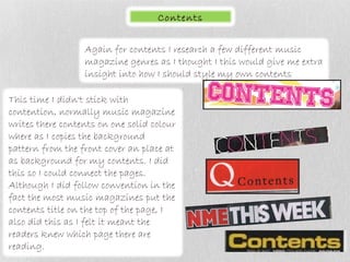
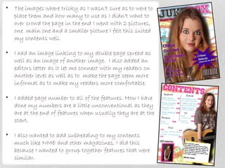
                  Again for contents I research a few different music
                  magazine genres as I thought I this would give me extra
                  insight into how I should style my own contents

This time I didn't stick with
contention, normally music magazine
writes there contents on one solid colour
where as I copies the background
pattern from the front cover an place at
as background for my contents. I did
this so I could connect the pages.
Although I did follow convention in the
fact the most music magazines put the
contents title on the top of the page, I
also did this as I felt it meant the
readers knew which page there are
reading.
•   The images where tricky as I wasn’t sure as to were to
    place them and how many to use as I didn’t want to
    over crowd the page in the end I went with 2 pictures,
    one main one and a smaller picture I felt this suited
    my contents well.

•   I had an image linking to my double page spread as
    well as an image of another image. I also added an
    editors letter as it let me connect with my readers on
    another level as well as to make the page seem more
    informal as to make my readers more comfortable.

•   I added page number to all of the features. How I have
    done my numbers are a little unconventional as they
    are at the end of features when usually they are at the
    start.

•   I also wanted to add subheading to my contents
    much like NME and other magazines, I did this
    because I wanted to group together features that were
    similar.
Double Page Spread

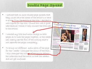
•   I noticed that on most double page spreads that
    they usual have the name of the artist/s or have
    a quotes from the article as the title. I decided to
    use a quote for the title I found this was a good
    idea because I think it help connect the title well
    to the article.

•   I wanted my title and main image on both
    pages as to link the pages together, so the reader
    can clearly see the flow of the writing and to
    not separate the pages completely.

•   To bring out different main parts of the page
    for the I reader I changed the colour of the font.,
    I also changed the colours of the person doing
    the interview and the artist so that the readers
    did not get confused.
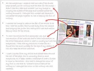
•   All the magazines I research had one side of the double
    page spread just for writing and the other for the image. I
    didn’t like this idea and instead I put my image in
    roughly the middle of the page and instead placed the
    writing around it. I thought this worked well because it
    connected the pages together as well a helping the flow of
    writing.

•   I wanted the image to capture the feel of the article, to do
    this I had the models face turned away from the camera
    and playing the guitar this had quite a sad and mellow
    feeling which fit the article.

•   To start the article the first paragraph was and
    introduction of the interview and a little information on
    the artist themselves which is what is usually put into the
    magazines. I then did my article as a interview as I
    found this the most suitable for the age of my readers it
    will also keep the article informal.

•   I used 2 quotes from my article and placed them around
    the rest of the page, this is normally done in most
    magazines as it keeps readers interested of what's further
    to come in the article. I also had to change the colour of
    my font in one area as I placed a picture behind the
    writing so I changed the colour so the writing was still
    readable.
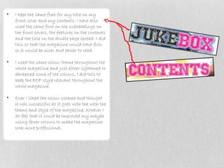
•   I kept the same font for my title on my
    front cover and my contents. I have also
    used the same font on the subheadings on
    the front covers, the features on the contents
    and the title on the double page spread. I did
    this so that the magazine would have flow
    so it would be nicer and easier to read.

•   I used the same colour theme throughout the
    whole magazine and just either lightened or
    darkened some of the colours, I did this to
    keep the POP style relevant throughout the
    whole magazine.

•   Over I liked the colour scheme and thought
    it was successful as it goes with the with the
    theme and style of the magazine, however I
    do feel that it could be improved my maybe
    using fewer colours to make the magazine
    look more professional.

Media evaluation q1

  • 1.
  • 2.
    The media productwas a front cover, contents and double page spread of a music magazine. For my research look into various different music genres and magazines and have analysed how they made the genre obvious e.g. by using written, symbolic and technical codes.
  • 3.
    Before I startedmaking my magazine I first looked at other music magazines., also I didn’t just look at POP genre (which is the genre I have chosen) instead I looked at all different genre so that I may see how all of them differ and compare. By doing this I also was able to understand the basic layouts of front covers and to see what regularly comes up on the front covers. I will also use these magazine as inspiration.
  • 4.
    The main areasthat stood out and were clear in all the different magazines were the title and images., also there were other things created specifically to cater to the genre of the magazine. • An example of this is that the types of images I found on Rolling Stones would be very different to ones used in Music in both clothing, models, make up, pose’s and lighting • The writing and colour schemes between the magazines were also very different. For example the written in Music is more formal to suit a more mature audience, were as POP’s writing is informal and chatty. • To conclude I decided that like POP and Rolling Stones the informal writing would best suit my audience father then the formal writing in Music.
  • 5.
    Front Cover • When doing the title I found that it was easier to stick to convention since I thought this worked best. I have also used simple and easy to read fonts that are effective and have placed the title over the top section of my cover as to make my audience remember the name of my magazine. • I wanted my title to stand out to catch readers attention so I looked at how other magazines have done this. I found in other magazines such as POP and NME have used bold blocks of contrasting colours to help make their title stand out front the background. I think this works really well and have divided my title into to different contrasting colours and have added a blue glow to the outline, I think this has worked well on my magazine.
  • 6.
    Most music magazinescut out the images on the front covers so that they can place them on another background, they do this so that the picture stands out against the background. I though this Idea was really effective so I place my picture that contrasted and complemented my picture, this made it stand out. Also with the old background removed there wont be bits and pieces that would be relevant to my magazine like there might have been in the old background this would have confused the audience otherwise. Now in stead the audience can no focus on the picture.
  • 7.
    I think thecover line works well on the front cover. But here I think the cover line takes attention away from the image. The next thing I noticed about the magazine was cover MY FRONT lines. Most music magazines try to avoid covering up the COVER main image with cover lines and if they do put any they try to put in on the bottom or on the sides of the picture. In the end I also put cover lines over my image but followed the rule of putting them at either bottom of the image or sides. I also put my main cover line in a shape box to draw attention to it, I also found that this helped t make audience to look at the rest of the magazine.
  • 8.
    The colours Iused were a mixture of 4 different colours, the ones most featured on the cover were blue, black, orange and pink or other variations and shades of these colours. I was very carful of how I used these colours as I didn’t want the cover to look to cluttered or over barring.
  • 9.
    Contents Again for contents I research a few different music magazine genres as I thought I this would give me extra insight into how I should style my own contents This time I didn't stick with contention, normally music magazine writes there contents on one solid colour where as I copies the background pattern from the front cover an place at as background for my contents. I did this so I could connect the pages. Although I did follow convention in the fact the most music magazines put the contents title on the top of the page, I also did this as I felt it meant the readers knew which page there are reading.
  • 10.
    The images where tricky as I wasn’t sure as to were to place them and how many to use as I didn’t want to over crowd the page in the end I went with 2 pictures, one main one and a smaller picture I felt this suited my contents well. • I had an image linking to my double page spread as well as an image of another image. I also added an editors letter as it let me connect with my readers on another level as well as to make the page seem more informal as to make my readers more comfortable. • I added page number to all of the features. How I have done my numbers are a little unconventional as they are at the end of features when usually they are at the start. • I also wanted to add subheading to my contents much like NME and other magazines, I did this because I wanted to group together features that were similar.
  • 11.
    Double Page Spread • I noticed that on most double page spreads that they usual have the name of the artist/s or have a quotes from the article as the title. I decided to use a quote for the title I found this was a good idea because I think it help connect the title well to the article. • I wanted my title and main image on both pages as to link the pages together, so the reader can clearly see the flow of the writing and to not separate the pages completely. • To bring out different main parts of the page for the I reader I changed the colour of the font., I also changed the colours of the person doing the interview and the artist so that the readers did not get confused.
  • 12.
    All the magazines I research had one side of the double page spread just for writing and the other for the image. I didn’t like this idea and instead I put my image in roughly the middle of the page and instead placed the writing around it. I thought this worked well because it connected the pages together as well a helping the flow of writing. • I wanted the image to capture the feel of the article, to do this I had the models face turned away from the camera and playing the guitar this had quite a sad and mellow feeling which fit the article. • To start the article the first paragraph was and introduction of the interview and a little information on the artist themselves which is what is usually put into the magazines. I then did my article as a interview as I found this the most suitable for the age of my readers it will also keep the article informal. • I used 2 quotes from my article and placed them around the rest of the page, this is normally done in most magazines as it keeps readers interested of what's further to come in the article. I also had to change the colour of my font in one area as I placed a picture behind the writing so I changed the colour so the writing was still readable.
  • 13.
    I kept the same font for my title on my front cover and my contents. I have also used the same font on the subheadings on the front covers, the features on the contents and the title on the double page spread. I did this so that the magazine would have flow so it would be nicer and easier to read. • I used the same colour theme throughout the whole magazine and just either lightened or darkened some of the colours, I did this to keep the POP style relevant throughout the whole magazine. • Over I liked the colour scheme and thought it was successful as it goes with the with the theme and style of the magazine, however I do feel that it could be improved my maybe using fewer colours to make the magazine look more professional.