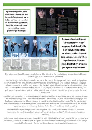
This document summarizes the key design elements and conventions used in the student's media magazine project. The summary discusses:
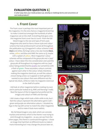
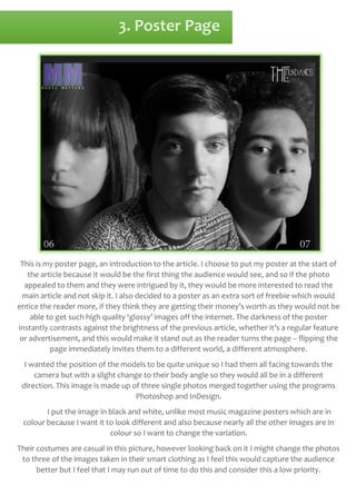
1) The use of a grayscale color scheme with purple as the accent color to make the magazine stand out on shelves. Inspiration was drawn from existing magazines like Q and NME.
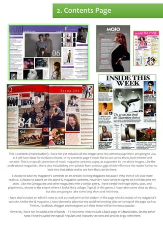
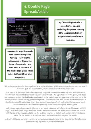
2) Layouts that mimic existing magazine conventions like placing the logo in the top left corner, using varied image sizes on the contents page, and centering larger images on double page spreads.
3) The theme of mystery and darkness carried throughout the magazine through image tones and backgrounds to match the alternative music genre.
4) Continued experimentation with improvements like removing a photo glow and considering alternate