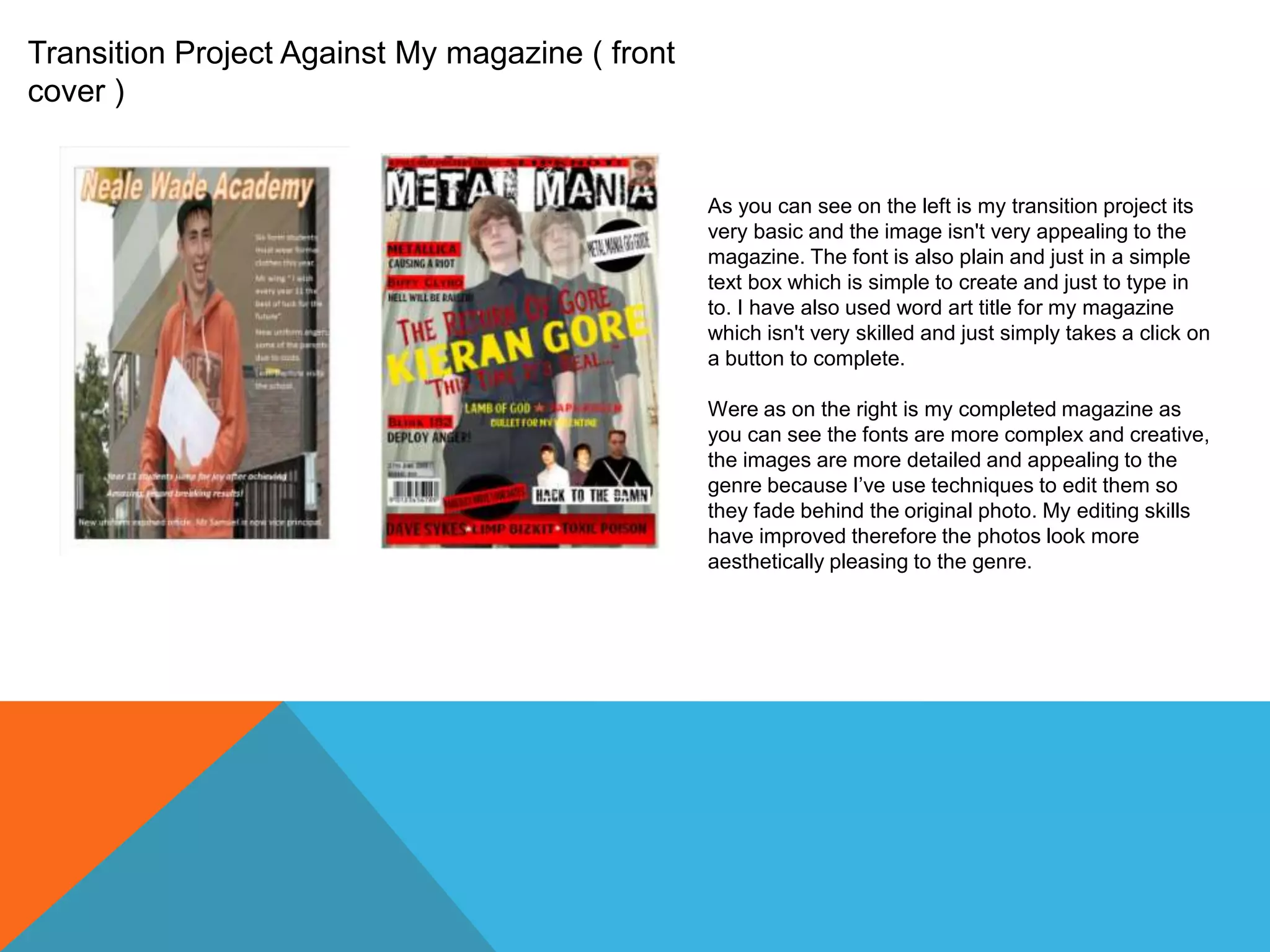
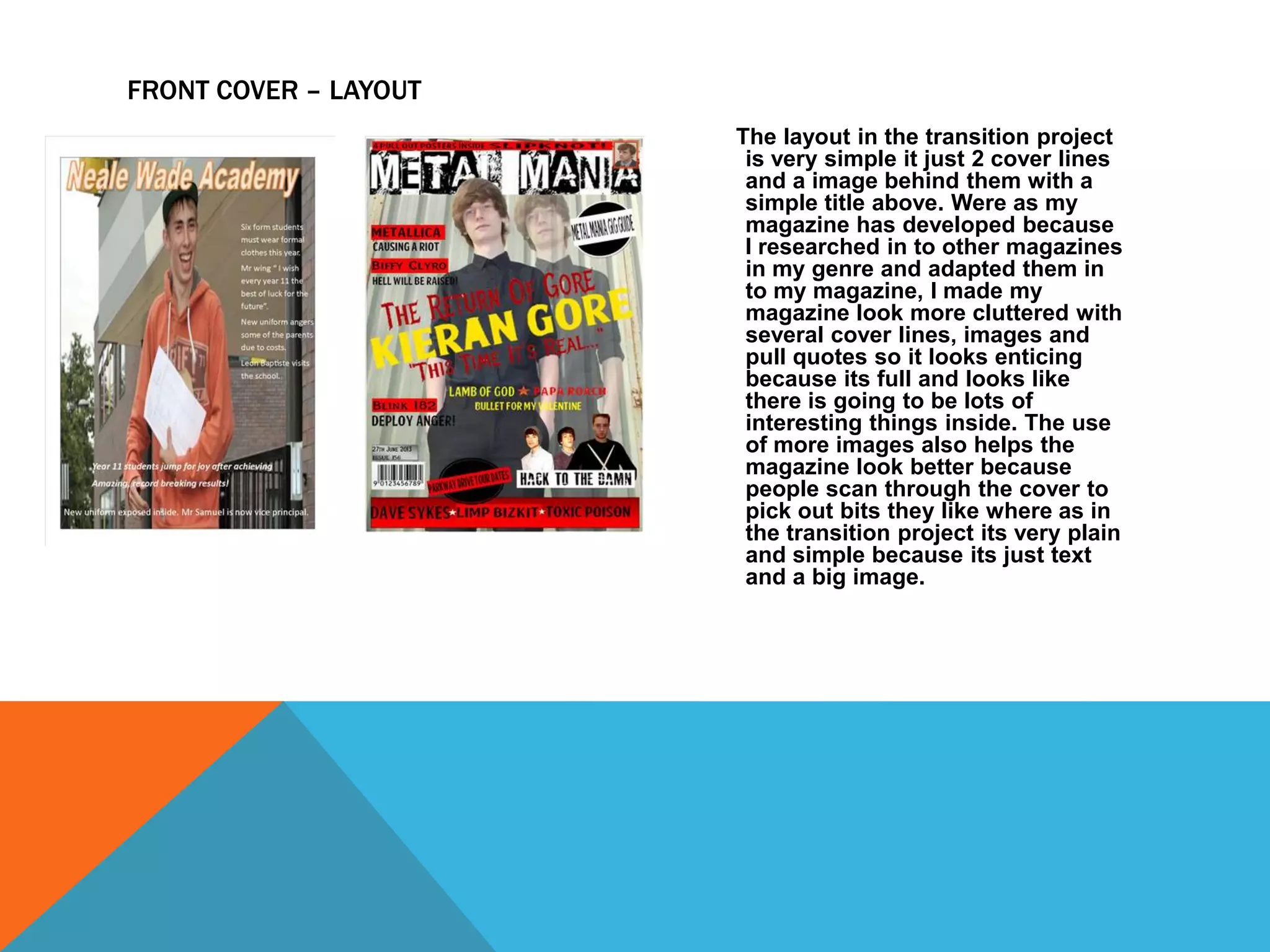
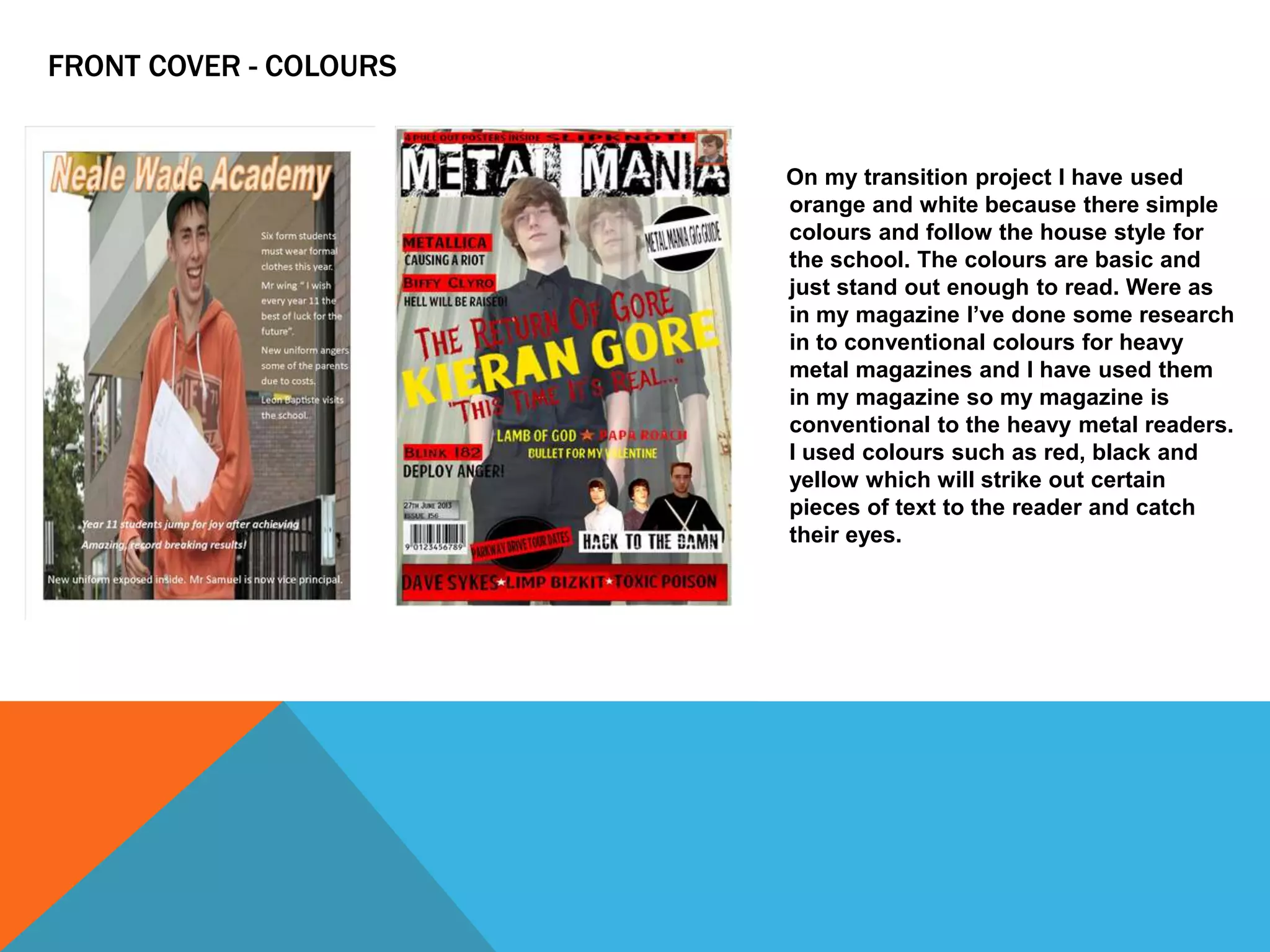
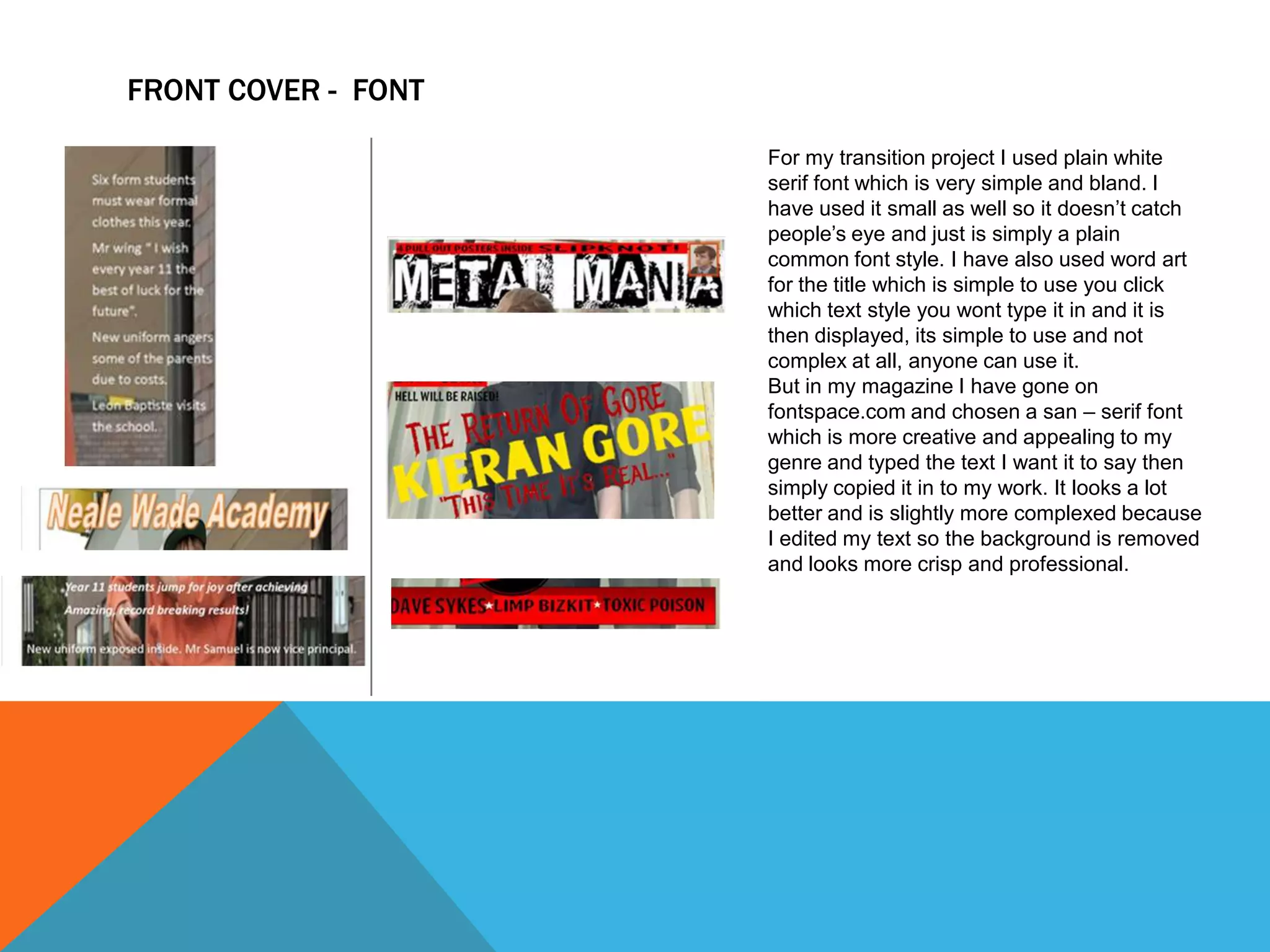
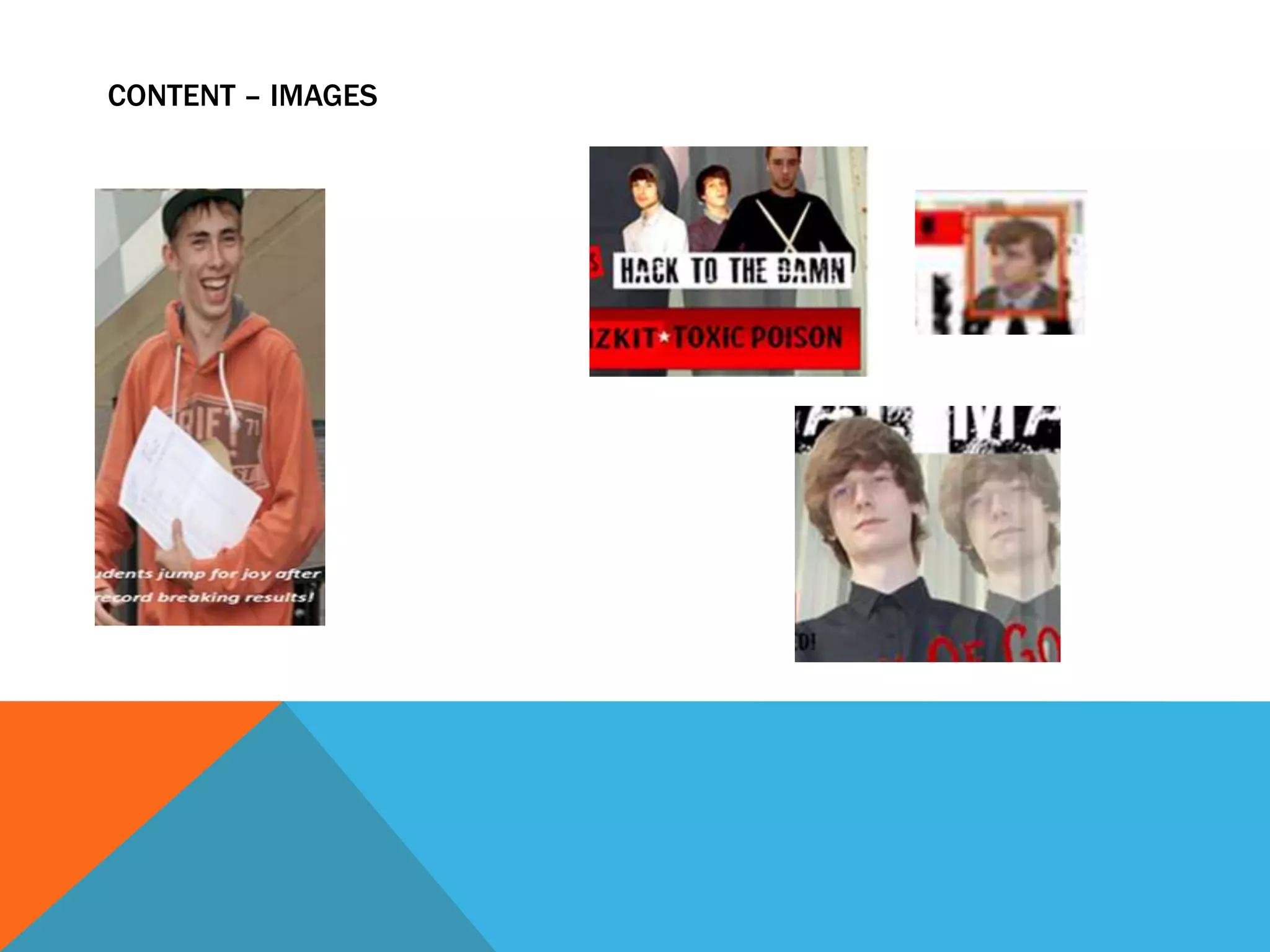
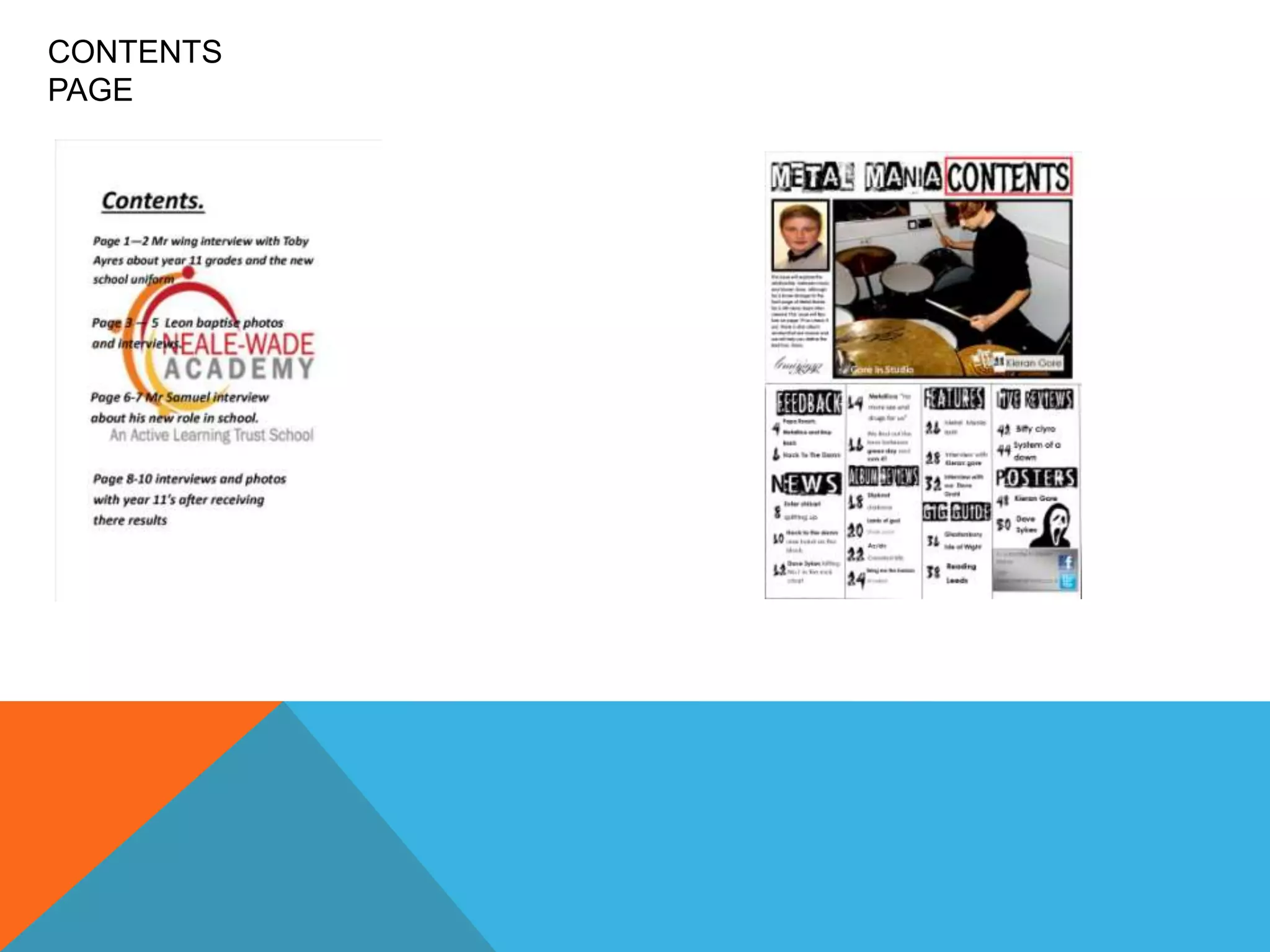
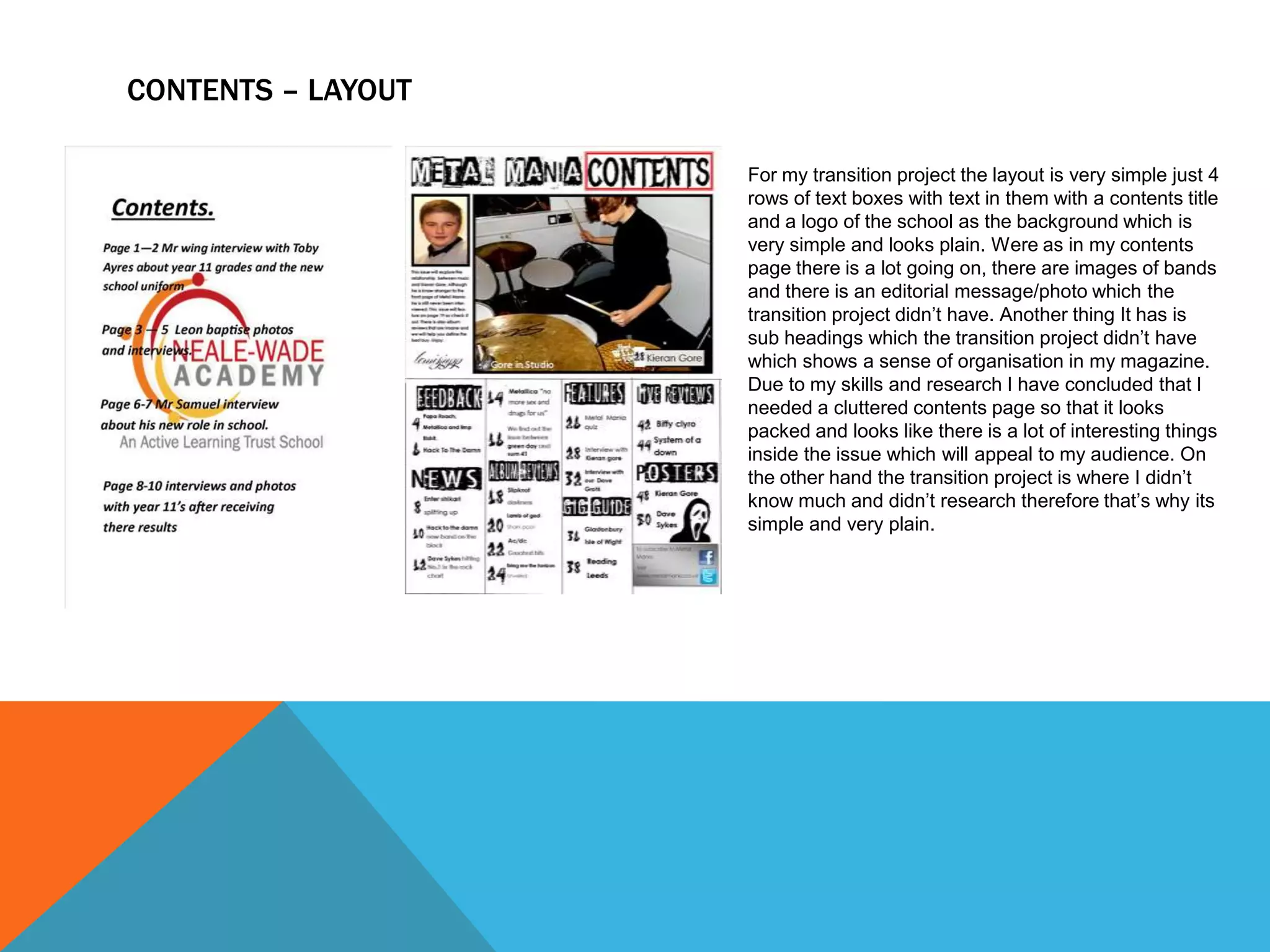
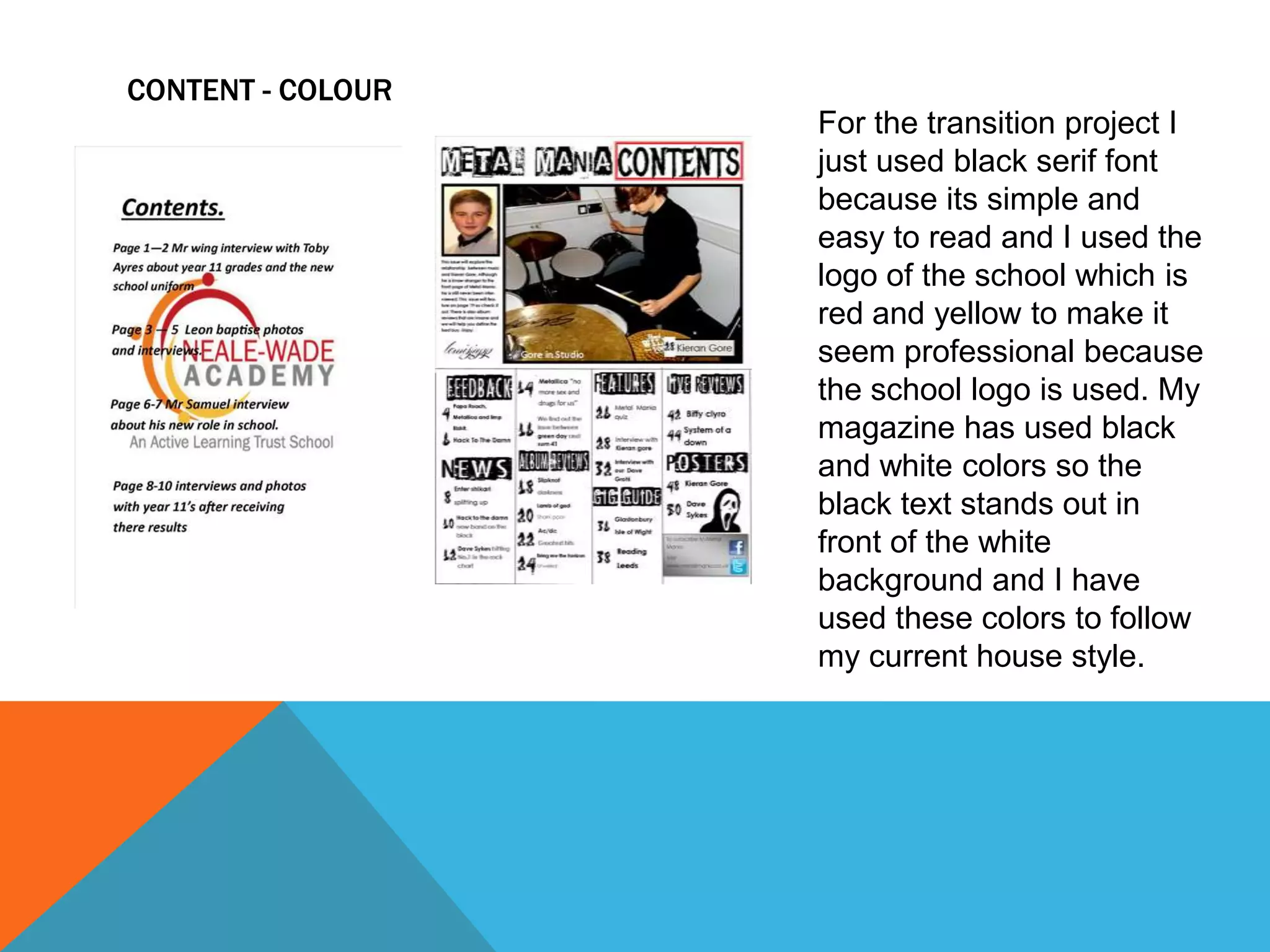
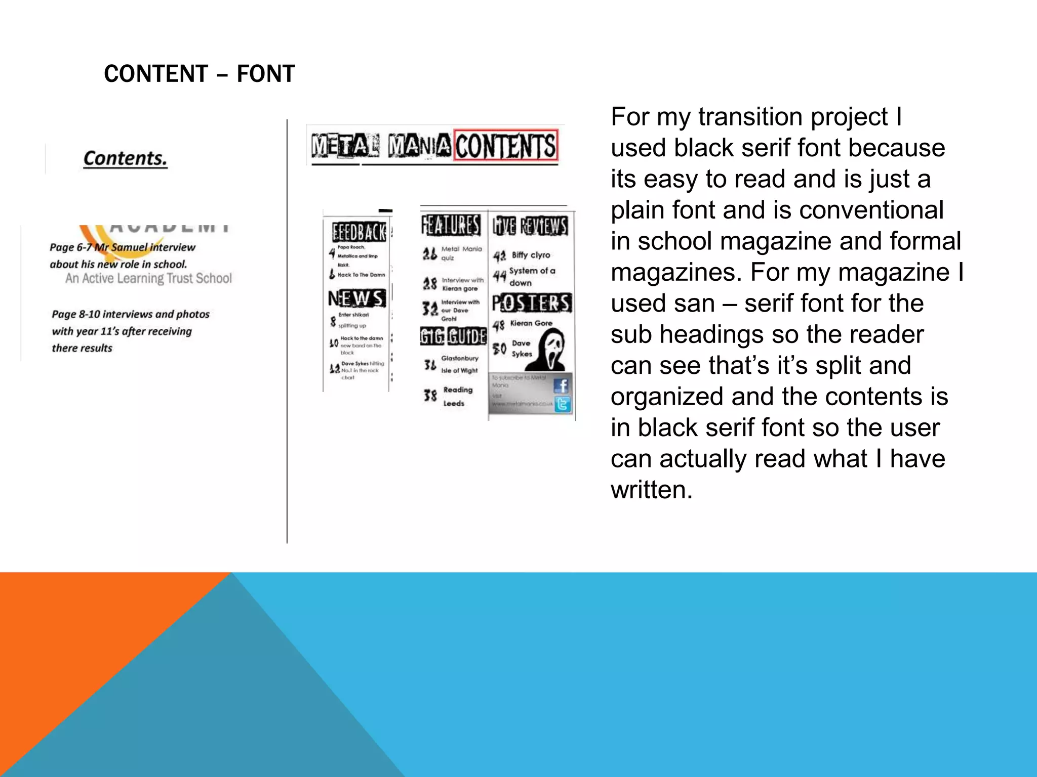
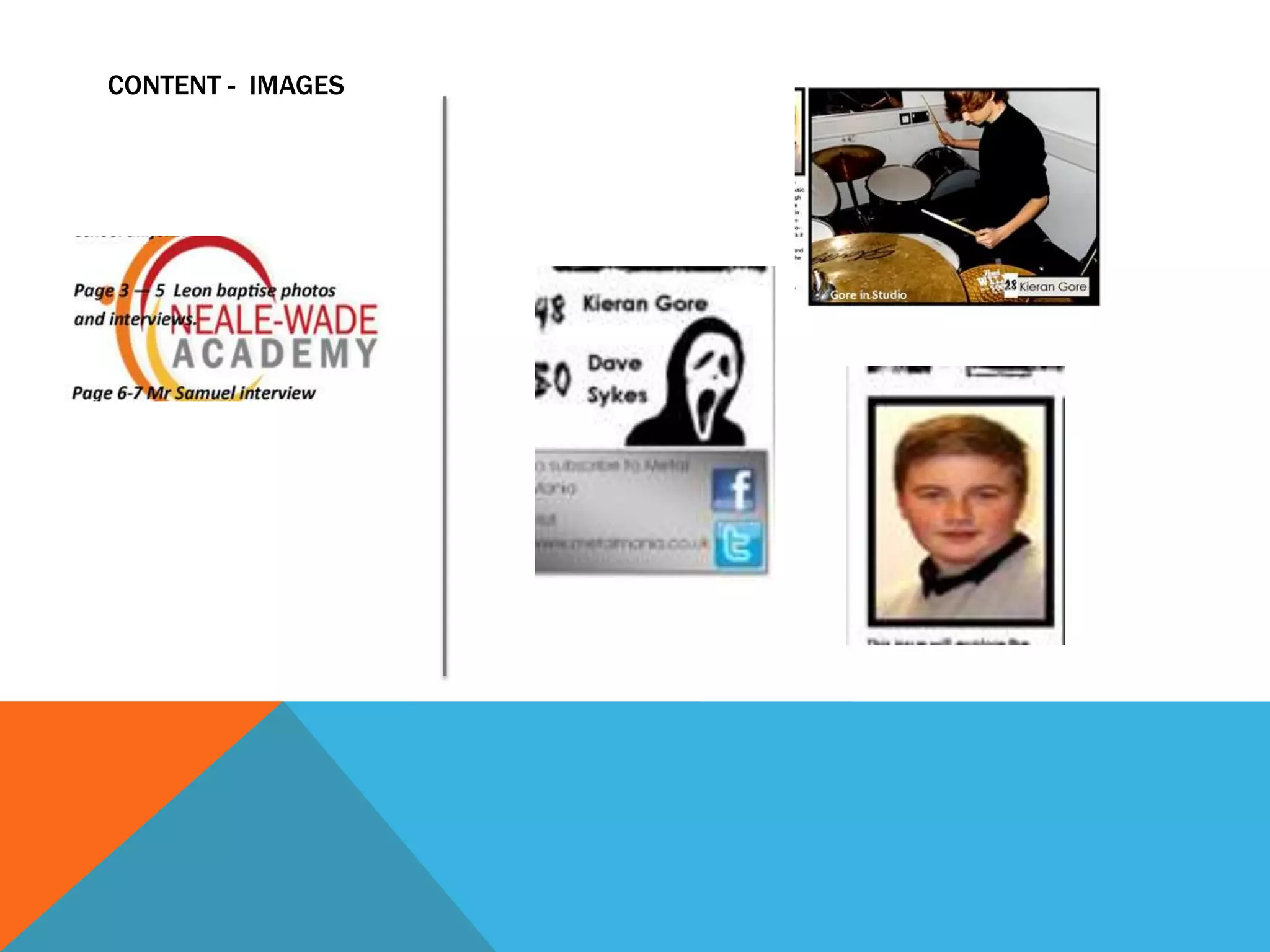
Transition Project Against My magazine ( front
cover )

As you can see on the left is my transition project its
very basic and the image isn't very appealing to the
magazine. The font is also plain and just in a simple
text box which is simple to create and just to type in
to. I have also used word art title for my magazine
which isn't very skilled and just simply takes a click on
a button to complete.
Were as on the right is my completed magazine as
you can see the fonts are more complex and creative,
the images are more detailed and appealing to the
genre because I’ve use techniques to edit them so
they fade behind the original photo. My editing skills
have improved therefore the photos look more
aesthetically pleasing to the genre.
FRONT COVER – LAYOUT
The layout in the transition project
is very simple it just 2 cover lines
and a image behind them with a
simple title above. Were as my
magazine has developed because
I researched in to other magazines
in my genre and adapted them in
to my magazine, I made my
magazine look more cluttered with
several cover lines, images and
pull quotes so it looks enticing
because its full and looks like
there is going to be lots of
interesting things inside. The use
of more images also helps the
magazine look better because
people scan through the cover to
pick out bits they like where as in
the transition project its very plain
and simple because its just text
and a big image.
FRONT COVER - COLOURS

On my transition project I have used
orange and white because there simple
colours and follow the house style for
the school. The colours are basic and
just stand out enough to read. Were as
in my magazine I’ve done some research
in to conventional colours for heavy
metal magazines and I have used them
in my magazine so my magazine is
conventional to the heavy metal readers.
I used colours such as red, black and
yellow which will strike out certain
pieces of text to the reader and catch
their eyes.
FRONT COVER - FONT
For my transition project I used plain white
serif font which is very simple and bland. I
have used it small as well so it doesn’t catch
people’s eye and just is simply a plain
common font style. I have also used word art
for the title which is simple to use you click
which text style you wont type it in and it is
then displayed, its simple to use and not
complex at all, anyone can use it.
But in my magazine I have gone on
fontspace.com and chosen a san – serif font
which is more creative and appealing to my
genre and typed the text I want it to say then
simply copied it in to my work. It looks a lot
better and is slightly more complexed because
I edited my text so the background is removed
and looks more crisp and professional.
CONTENT – IMAGES
FRONT COVER – MODE OF ADDRESS
The transition project mode of address is happy because there's a seeming
of success because the year 11s have achieved good results in their
gcse’s which is a good thing and the main picture on the front shows
the happiness because it’s a boy smiling after his success so the
general mode of the address is happiness and success.
My magazine’s general mode of address is aggressive and rebellious
because I have used images that portray that they are aggressive due to
their expressions on their faces and the use of san – serif fonts make
the font styles look aggressive and creative which helps me create an
aggressive mode of address.
CONTENTS
PAGE
CONTENTS – LAYOUT
For my transition project the layout is very simple just 4
rows of text boxes with text in them with a contents title
and a logo of the school as the background which is
very simple and looks plain. Were as in my contents
page there is a lot going on, there are images of bands
and there is an editorial message/photo which the
transition project didn’t have. Another thing It has is
sub headings which the transition project didn’t have
which shows a sense of organisation in my magazine.
Due to my skills and research I have concluded that I
needed a cluttered contents page so that it looks
packed and looks like there is a lot of interesting things
inside the issue which will appeal to my audience. On
the other hand the transition project is where I didn’t
know much and didn’t research therefore that’s why its
simple and very plain.
CONTENT - COLOUR
For the transition project I
just used black serif font
because its simple and
easy to read and I used the
logo of the school which is
red and yellow to make it
seem professional because
the school logo is used. My
magazine has used black
and white colors so the
black text stands out in
front of the white
background and I have
used these colors to follow
my current house style.
CONTENT – FONT
For my transition project I
used black serif font because
its easy to read and is just a
plain font and is conventional
in school magazine and formal
magazines. For my magazine I
used san – serif font for the
sub headings so the reader
can see that’s it’s split and
organized and the contents is
in black serif font so the user
can actually read what I have
written.
CONTENT - IMAGES

Comparison between my transition project and my real

  • 2.
    Transition Project AgainstMy magazine ( front cover ) As you can see on the left is my transition project its very basic and the image isn't very appealing to the magazine. The font is also plain and just in a simple text box which is simple to create and just to type in to. I have also used word art title for my magazine which isn't very skilled and just simply takes a click on a button to complete. Were as on the right is my completed magazine as you can see the fonts are more complex and creative, the images are more detailed and appealing to the genre because I’ve use techniques to edit them so they fade behind the original photo. My editing skills have improved therefore the photos look more aesthetically pleasing to the genre.
  • 3.
    FRONT COVER –LAYOUT The layout in the transition project is very simple it just 2 cover lines and a image behind them with a simple title above. Were as my magazine has developed because I researched in to other magazines in my genre and adapted them in to my magazine, I made my magazine look more cluttered with several cover lines, images and pull quotes so it looks enticing because its full and looks like there is going to be lots of interesting things inside. The use of more images also helps the magazine look better because people scan through the cover to pick out bits they like where as in the transition project its very plain and simple because its just text and a big image.
  • 4.
    FRONT COVER -COLOURS On my transition project I have used orange and white because there simple colours and follow the house style for the school. The colours are basic and just stand out enough to read. Were as in my magazine I’ve done some research in to conventional colours for heavy metal magazines and I have used them in my magazine so my magazine is conventional to the heavy metal readers. I used colours such as red, black and yellow which will strike out certain pieces of text to the reader and catch their eyes.
  • 5.
    FRONT COVER -FONT For my transition project I used plain white serif font which is very simple and bland. I have used it small as well so it doesn’t catch people’s eye and just is simply a plain common font style. I have also used word art for the title which is simple to use you click which text style you wont type it in and it is then displayed, its simple to use and not complex at all, anyone can use it. But in my magazine I have gone on fontspace.com and chosen a san – serif font which is more creative and appealing to my genre and typed the text I want it to say then simply copied it in to my work. It looks a lot better and is slightly more complexed because I edited my text so the background is removed and looks more crisp and professional.
  • 6.
  • 7.
    FRONT COVER –MODE OF ADDRESS The transition project mode of address is happy because there's a seeming of success because the year 11s have achieved good results in their gcse’s which is a good thing and the main picture on the front shows the happiness because it’s a boy smiling after his success so the general mode of the address is happiness and success. My magazine’s general mode of address is aggressive and rebellious because I have used images that portray that they are aggressive due to their expressions on their faces and the use of san – serif fonts make the font styles look aggressive and creative which helps me create an aggressive mode of address.
  • 8.
  • 9.
    CONTENTS – LAYOUT Formy transition project the layout is very simple just 4 rows of text boxes with text in them with a contents title and a logo of the school as the background which is very simple and looks plain. Were as in my contents page there is a lot going on, there are images of bands and there is an editorial message/photo which the transition project didn’t have. Another thing It has is sub headings which the transition project didn’t have which shows a sense of organisation in my magazine. Due to my skills and research I have concluded that I needed a cluttered contents page so that it looks packed and looks like there is a lot of interesting things inside the issue which will appeal to my audience. On the other hand the transition project is where I didn’t know much and didn’t research therefore that’s why its simple and very plain.
  • 10.
    CONTENT - COLOUR Forthe transition project I just used black serif font because its simple and easy to read and I used the logo of the school which is red and yellow to make it seem professional because the school logo is used. My magazine has used black and white colors so the black text stands out in front of the white background and I have used these colors to follow my current house style.
  • 11.
    CONTENT – FONT Formy transition project I used black serif font because its easy to read and is just a plain font and is conventional in school magazine and formal magazines. For my magazine I used san – serif font for the sub headings so the reader can see that’s it’s split and organized and the contents is in black serif font so the user can actually read what I have written.
  • 12.