
More Related Content
What's hot
What's hot (20)
Similar to Stages of development double page
Similar to Stages of development double page (20)
Stages of development double page
- 1. Stages of development- do
- 2. I wrote my interview out in a word document before I placed it in in design. I did this so that I could easily check for any spelling mistakes, I made sure that my questions and answers for the singers interview sound professional and like they are from a real magazine.
- 3. I then moved my text from the word document into in design, I altered the font size and style until it fit the page nicely and I felt happy with the presentation. I made a small quotation in the article which I though was a main section and made it bigger and bolder with large speech marks around it. The text at the top is some simple facts and background information on her and then the questions and answers follow after a small introduction to make the text flow.
- 4. Next I used the rectangle tool to put a very long but thin rectangle across the top of the page and then used an italic font to write the artists name so that it stands out from all the other text. I have kept all the text on the page black so that it looks simple and doesn’t clash with any of the other colours throughout the magazine.
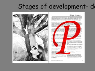
- 5. I then inserted a text box just for the letter ‘P’ I wrote it in a capital letter and in a massive font size and placed the letter image to ‘the back of text’ so that it sits behind the current text that is on the page already.
- 6. I edited my image which originally looked like the image on the right by using photo shop, I changed the colour of the image to black and white, I darkened the contrast and increased the brightness.
- 7. I then placed the image from photo shop into in design and cropped the image size.