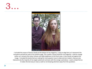
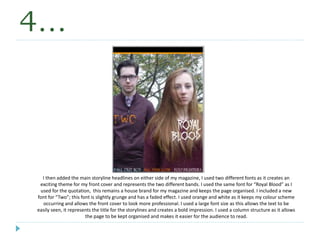
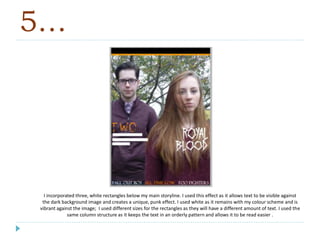
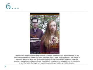
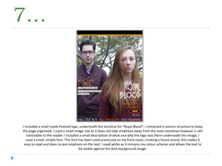
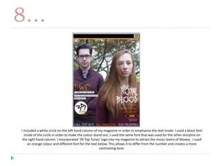
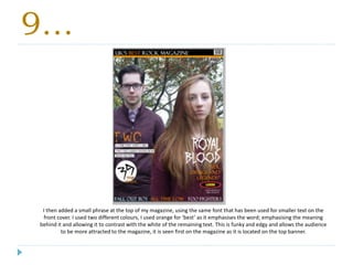
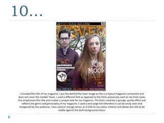
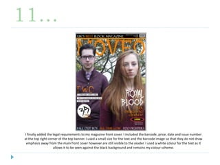
1. The document describes the process of designing a magazine front cover for a rock music magazine. Large images and bold fonts were used to attract audiences. Orange and black were used as main colors to represent happiness and power.
2. Famous modern rock bands' names were included at the bottom in an edgy orange font. Headline stories were placed on either side in different fonts to represent different bands and create excitement.
3. Additional details like logos and top song lists were added in a column structure to keep the design organized while maintaining the punk aesthetic. The front cover was designed to attract music fans through its bold visuals and color scheme.
These are my final decisions on the fonts I will use for my music magazine and the colour scheme I will use. There are also my final photos I will use in my magazine.
These are my final flat plans for my POP music magazine. This powerpoint includes my flat plans for the cover page, chart page, contents page, and both pages of the double page spread.
Instructions for Submissions thorugh G- Classroom.pptxJheel Barad
This presentation provides a briefing on how to upload submissions and documents in Google Classroom. It was prepared as part of an orientation for new Sainik School in-service teacher trainees. As a training officer, my goal is to ensure that you are comfortable and proficient with this essential tool for managing assignments and fostering student engagement.
Model Attribute Check Company Auto PropertyCeline George
In Odoo, the multi-company feature allows you to manage multiple companies within a single Odoo database instance. Each company can have its own configurations while still sharing common resources such as products, customers, and suppliers.
The Art Pastor's Guide to Sabbath | Steve ThomasonSteve Thomason
What is the purpose of the Sabbath Law in the Torah. It is interesting to compare how the context of the law shifts from Exodus to Deuteronomy. Who gets to rest, and why?
How to Make a Field invisible in Odoo 17Celine George
It is possible to hide or invisible some fields in odoo. Commonly using “invisible” attribute in the field definition to invisible the fields. This slide will show how to make a field invisible in odoo 17.
2. 1…
Firstly, I added the main and only image for my front cover. I set it to the size I wanted; using a very large
image allows the focus to be on the models and give a representation of what genre my magazine is. I left a
small space above and below the image as I am incorporating colour later on in my production; I used this
image as the female model has a strong focus and bold features. This attracts the audience and appeals to
both male and females (the beauty myth allows females to be attracted to this image).
3. 2…
I then added three, block colour banners to my magazine. I used two, one thick and one thin, at the top of the
image and a thin banner at the bottom of the image. The different thickness’ create a contrast. I used orange for
one banner as this creates a house colour for my magazine and adds a ‘pop’ of colour; this has connotations of
happiness and fierceness. I also used black, this colour has connotations of power and rock and creates a colour
scheme for my magazine. I used banners as they create a unique look.
4. 3…
I included the names of famous bands at the bottom of my magazine, I used an edgy font as it represents the
rock genre and will be used in my contents page. This creates a house brand for my magazine. I used an orange
colour as it remains the colour scheme and adds brightness to the front cover, it also stands out against the
image. I included the bands that are making the most popular music to date and are modern, they are also
listened to by the majority of my target audienceIt contrasts with the orange used above. I used a simple font as
it makes the text easy to read, as well as not drawing attention away from the quotation.
5. 4…
I then added the main storyline headlines on either side of my magazine, I used two different fonts as it creates an
exciting theme for my front cover and represents the two different bands. I used the same font for “Royal Blood” as I
used for the quotation, this remains a house brand for my magazine and keeps the page organised. I included a new
font for “Two”; this font is slightly grunge and has a faded effect. I used orange and white as it keeps my colour scheme
occurring and allows the front cover to look more professional. I used a large font size as this allows the text to be
easily seen, it represents the title for the storylines and creates a bold impression. I used a column structure as it allows
the page to be kept organised and makes it easier for the audience to read.
6. 5…
I incorporated three, white rectangles below my main storyline. I used this effect as it allows text to be visible against
the dark background image and creates a unique, punk effect. I used white as it remains with my colour scheme and is
vibrant against the image; I used different sizes for the rectangles as they will have a different amount of text. I used the
same column structure as it keeps the text in an orderly pattern and allows it to be read easier .
7. 6…
I then included the text for both of my storylines, I used the same font as this remains a theme for my
front cover and allows the page to look more organised. I used a black, small font for the “Two” text as it
stands out against the white text background and does not take the emphasis away from the actual
storyline. I used a larger, orange text for the “Royal Blood” storyline as this adds a vibrancy to this column
of text. The text is also bigger as it is another quotation and is a key part to this storyline.
8. 7…
I included a small Leeds Festival logo, underneath the storyline for “Royal Blood”; I remained a column structure to keep
the page organised. I used a small image size as it does not take emphasis away from the main storylines however is still
noticeable to the reader. I included a small description of what and why the logo was there underneath the image; I
used a small, simple font. This font has been used previously on my front cover, creating a house brand, this makes it
easy to read and does no put emphasis on the text. I used white as it remains my colour scheme and allows the text to
be visible against the dark background image.
9. 8…
I included a white circle on the left hand column of my magazine in order to emphasise the text inside. I used a black font
inside of the circle in order to make the colour stand out; I used the same font that was used for the other storyline on
the right hand column. I incorporated ‘39 Top Tunes’ logo into my magazine to attract the music lovers of Moveo, I used
an orange colour and different font for the text below. This allows it to differ from the number and creates a more
contrasting tone.
10. 9…
I then added a small phrase at the top of my magazine, using the same font that has been used for smaller text on the
front cover. I used two different colours, I used orange for ‘best’ as it emphasises the word; emphasising the meaning
behind it and allowing it to contrast with the white of the remaining text. This is funky and edgy and allows the audience
to be more attracted to the magazine, it is seen first on the magazine as it is located on the top banner.
11. 10…
I included the title of my magazine, I put this behind the main image as this is a typical magazine convention and
does not cover the models’ faces. I used a different font as opposed to the fonts previously used on my front cover,
this emphasises the title and creates a unique look for my magazine. The font I used has a grunge, quirky effect and
reflects the genre and personality of my magazine. I used a very large font therefore it can be easily seen and
recognised by the audience, I also used an orange colour as it links to my colour scheme and allows the title to be
visible against the dark background colour.
12. 11…
I finally added the legal requirements to my magazine front cover. I included the barcode, price, date and issue number
at the top right corner of the top banner. I used a small size for the text and the barcode image so that they do not draw
emphasis away from the main front cover however are still visible to the reader. I used a white colour for the text as it
allows it to be seen against the black background and remains my colour scheme.