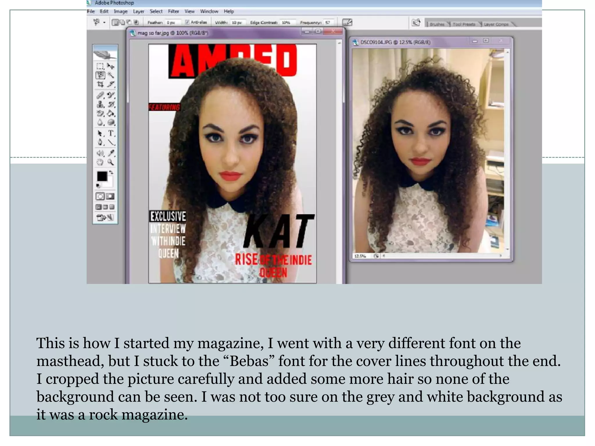
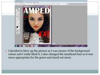
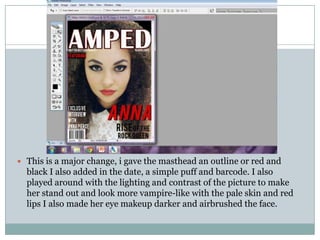
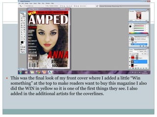
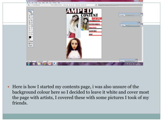
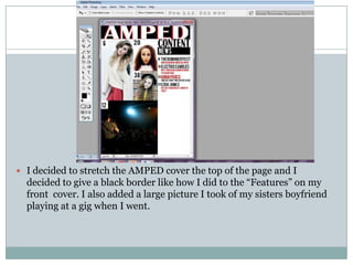
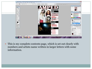
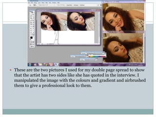
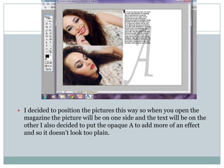
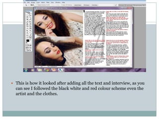
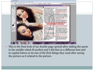
This is how I started my magazine, I went with a very different font on the
masthead, but I stuck to the “Bebas” font for the cover lines throughout the end.
I cropped the picture carefully and added some more hair so none of the
background can be seen. I was not too sure on the grey and white background as
it was a rock magazine.
 I decided to blow up the picture as I was unsure of the background
  colour and I really liked it. I also changed the masthead font as it was
  more appropriate for the genre and stood out more.
 This is a major change, i gave the masthead an outline or red and
  black I also added in the date, a simple puff and barcode. I also
  played around with the lighting and contrast of the picture to make
  her stand out and look more vampire-like with the pale skin and red
  lips I also made her eye makeup darker and airbrushed the face.
 This was the final look of my front cover where I added a little “Win
  something” at the top to make readers want to buy this magazine I also
  did the WIN in yellow so it is one of the first things they see. I also
  added in the additional artists for the coverlines.
 Here is how I started my contents page, i was also unsure of the
  background colour here so I decided to leave it white and cover most
  the page with artists, I covered these with some pictures I took of my
  friends.
 I decided to stretch the AMPED cover the top of the page and I
  decided to give a black border like how I did to the “Features” on my
  front cover. I also added a large picture I took of my sisters boyfriend
  playing at a gig when I went.
 This is my complete contents page, which is set out clearly with
  numbers and artists name written in larger letters with some
  information.
 These are the two pictures I used for my double page spread to show
  that the artist has two sides like she has quoted in the interview. I
  manipulated the image with the colours and gradient and airbrushed
  them to give a professional look to them.
 I decided to position the pictures this way so when you open the
  magazine the picture will be on one side and the text will be on the
  other I also decided to put the opaque A to add more of an effect
  and so it doesn’t look too plain.
 This is how it looked after adding all the text and interview, as you
  can see I followed the black white and red colour scheme even the
  artist and the clothes.
 This is the final look of my double page spread after adding the quote
  in the middle which fit perfect and I did that in a different font and
  in capital letters so its one of the first things they read after seeing
  the picture as it related to the picture.

Music magazine progress

  • 1.
    This is howI started my magazine, I went with a very different font on the masthead, but I stuck to the “Bebas” font for the cover lines throughout the end. I cropped the picture carefully and added some more hair so none of the background can be seen. I was not too sure on the grey and white background as it was a rock magazine.
  • 2.
     I decidedto blow up the picture as I was unsure of the background colour and I really liked it. I also changed the masthead font as it was more appropriate for the genre and stood out more.
  • 3.
     This isa major change, i gave the masthead an outline or red and black I also added in the date, a simple puff and barcode. I also played around with the lighting and contrast of the picture to make her stand out and look more vampire-like with the pale skin and red lips I also made her eye makeup darker and airbrushed the face.
  • 4.
     This wasthe final look of my front cover where I added a little “Win something” at the top to make readers want to buy this magazine I also did the WIN in yellow so it is one of the first things they see. I also added in the additional artists for the coverlines.
  • 5.
     Here ishow I started my contents page, i was also unsure of the background colour here so I decided to leave it white and cover most the page with artists, I covered these with some pictures I took of my friends.
  • 6.
     I decidedto stretch the AMPED cover the top of the page and I decided to give a black border like how I did to the “Features” on my front cover. I also added a large picture I took of my sisters boyfriend playing at a gig when I went.
  • 7.
     This ismy complete contents page, which is set out clearly with numbers and artists name written in larger letters with some information.
  • 8.
     These arethe two pictures I used for my double page spread to show that the artist has two sides like she has quoted in the interview. I manipulated the image with the colours and gradient and airbrushed them to give a professional look to them.
  • 9.
     I decidedto position the pictures this way so when you open the magazine the picture will be on one side and the text will be on the other I also decided to put the opaque A to add more of an effect and so it doesn’t look too plain.
  • 10.
     This ishow it looked after adding all the text and interview, as you can see I followed the black white and red colour scheme even the artist and the clothes.
  • 11.
     This isthe final look of my double page spread after adding the quote in the middle which fit perfect and I did that in a different font and in capital letters so its one of the first things they read after seeing the picture as it related to the picture.