The document discusses the author's learning experience while working on a magazine project, highlighting the technical skills acquired, particularly in Photoshop CS6. It contrasts the preliminary task with the final magazine, emphasizing improvements in image quality, color schemes, and design dynamics that contributed to a more professional appearance. The author notes the importance of effective layering and variation in font and color to create an appealing layout in the finished product.

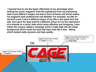


![ceramic-art-and-pottery [Autosaved].pptx](https://cdn.slidesharecdn.com/ss_thumbnails/ceramic-art-and-potteryautosaved-260113113456-35c55ddb-thumbnail.jpg?width=640&height=640&fit=bounds)


