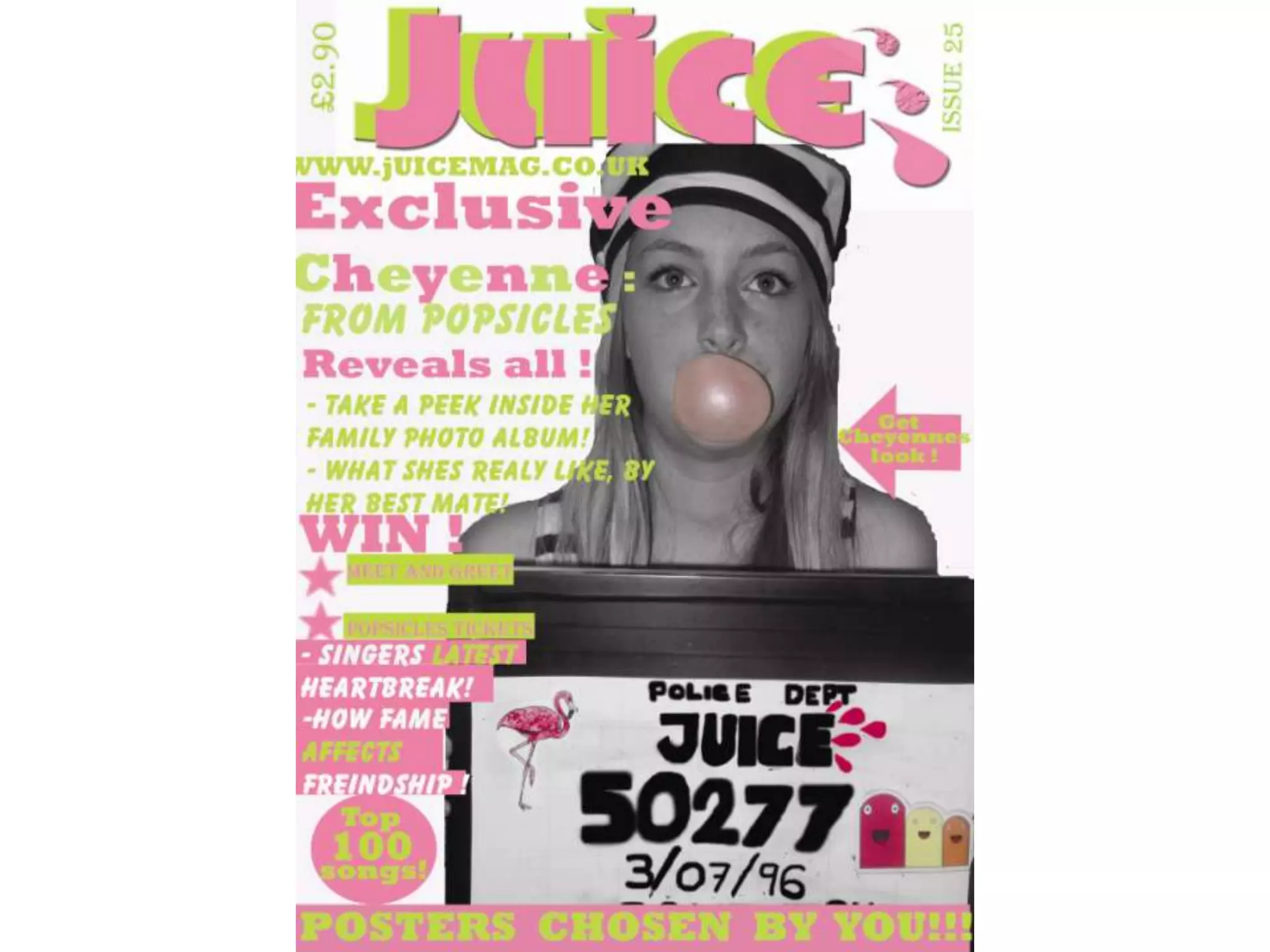
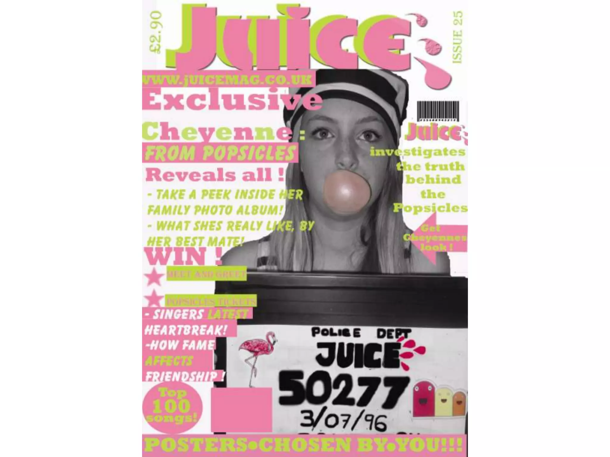
1. The document describes changes made in the second draft of a magazine cover design. The text on the front cover was changed to be bolder and boxes were added around certain elements to make them stand out more. An arrow was also added.
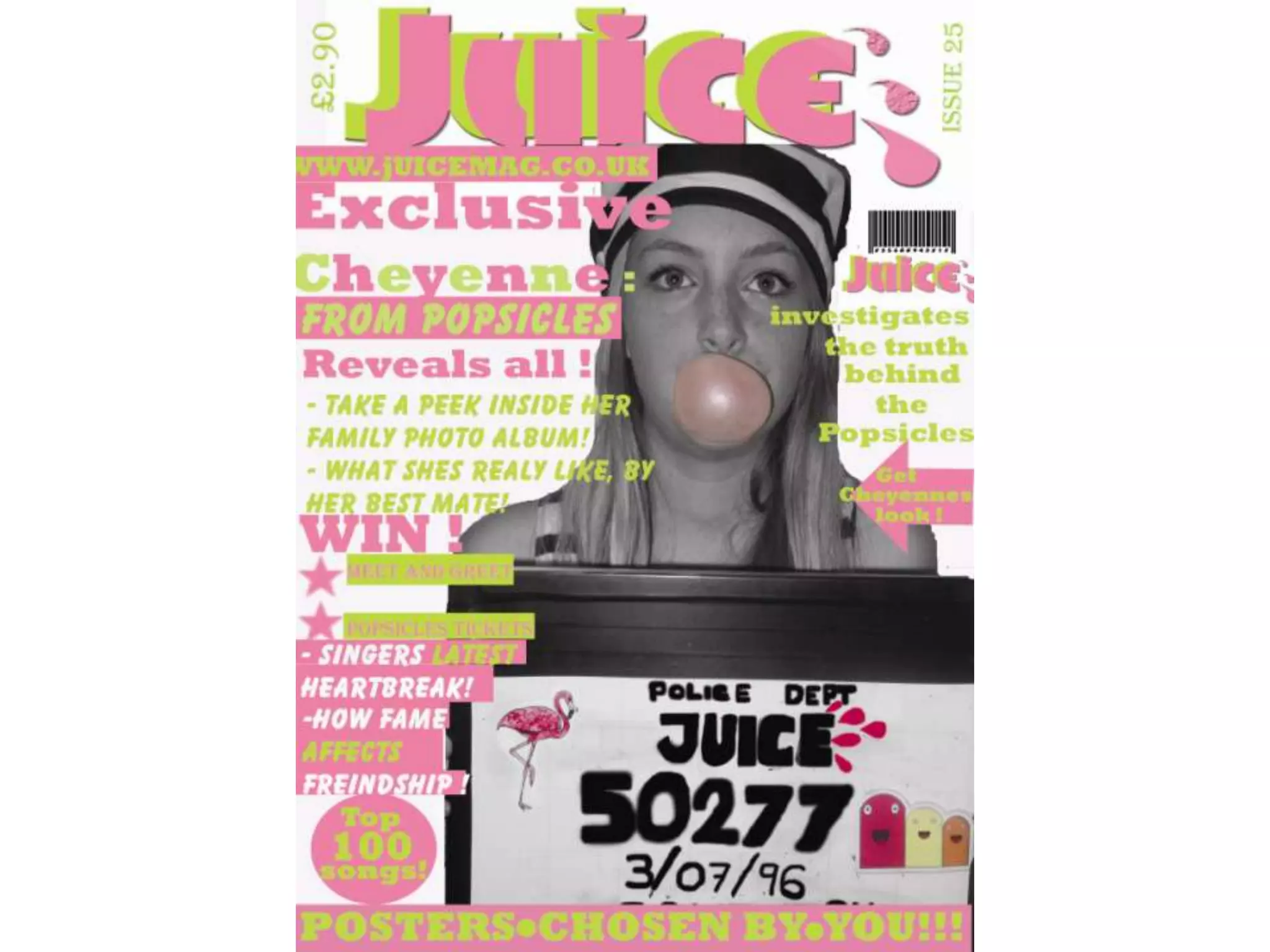
2. In the second step, the author added the magazine's logo and the words "investigates the truth behind the popsicles" to the left side to fill the blank space. A barcode was also added to make it look more professional.
3. In the third step, a small pink rectangle was added to feature an article title. The draft is nearly finished but still needs more work.