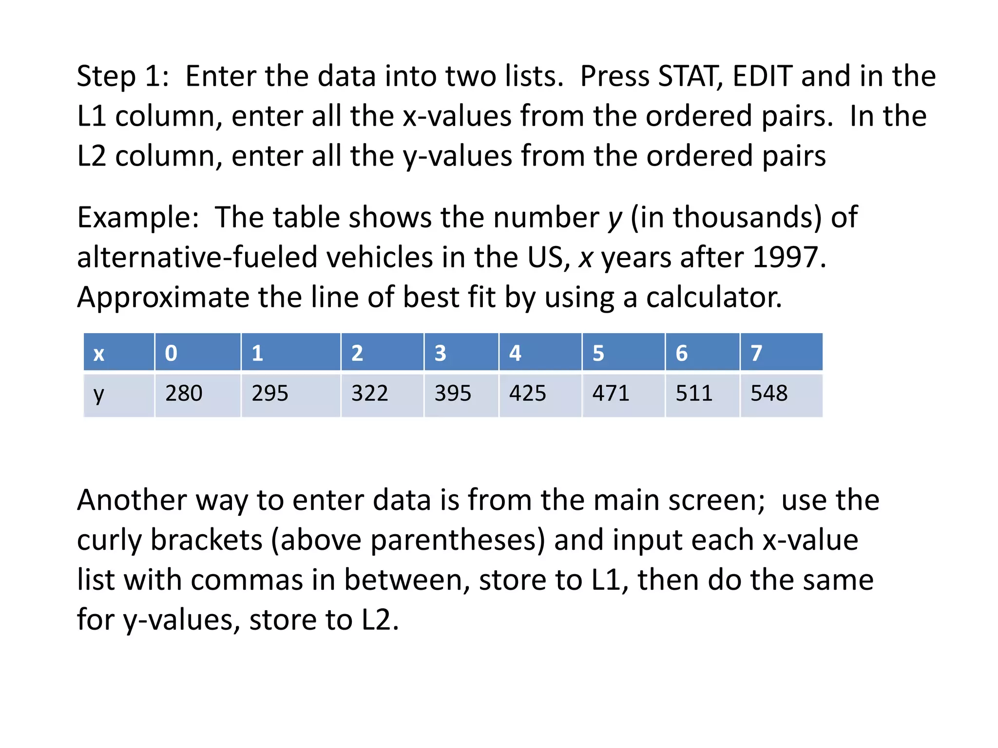
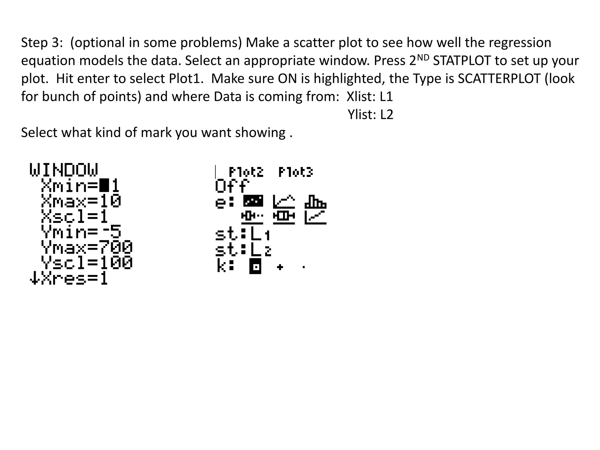
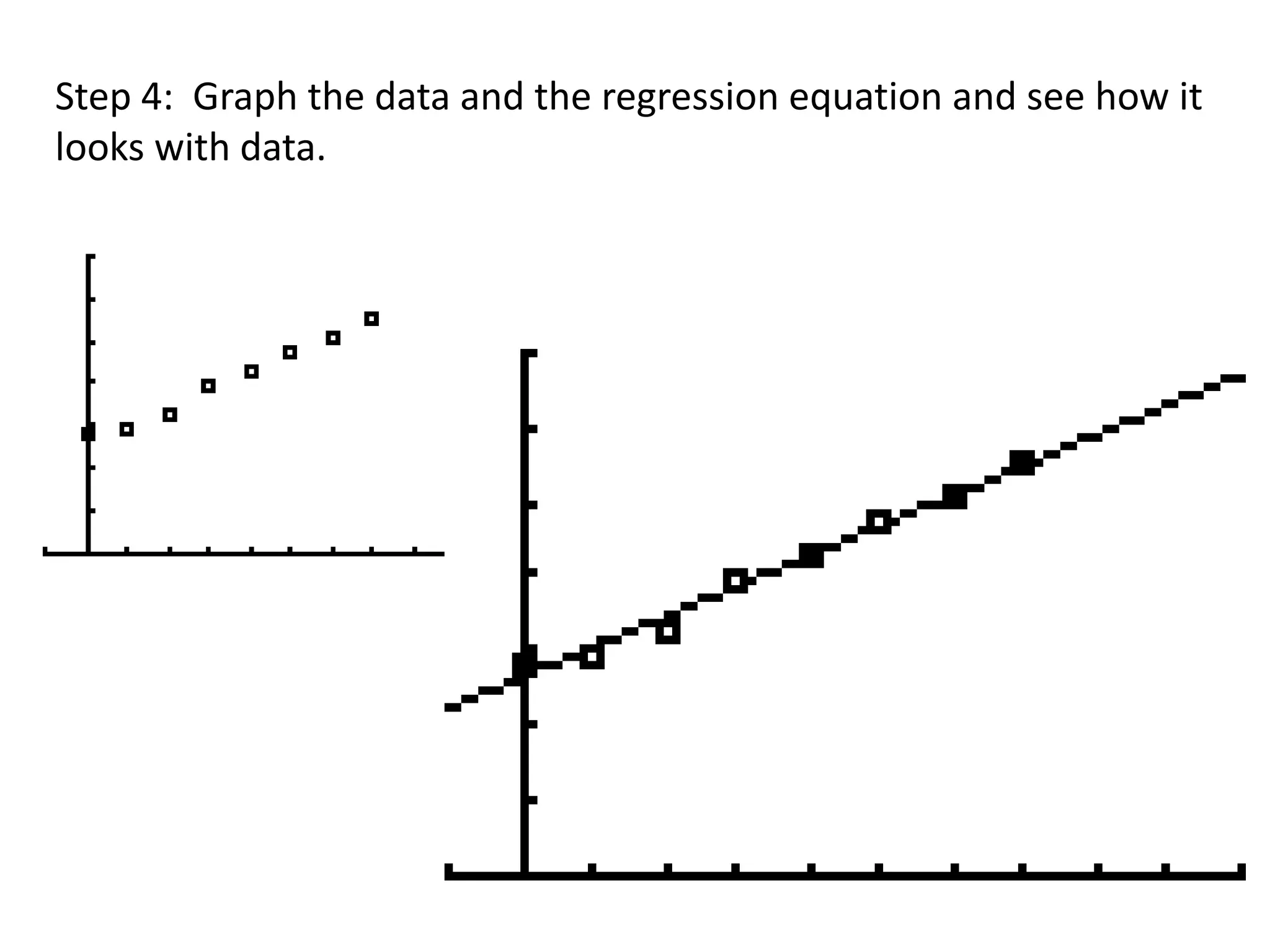
This document provides instructions for using a graphing calculator to perform linear regression on a dataset and find the line of best fit. It describes entering paired x and y data values into separate lists, using the LinReg(ax+b) function to determine the regression equation, optionally creating a scatter plot of the original data and regression line, and using the line equation to forecast values. As an example, it analyzes a dataset of alternative-fueled vehicles in the US from 1997 to predict the number in 2014.
How to combine interpolation and regression graphs in RDougLoqa
This is a general tutorial that shows you how to take Census data, aggregate columns/rows and use interpolation lines and regression curves in your graphs. You can graph individual rows/columns or aggregate rows/columns. There is an example of graphs created here: https://www.linkedin.com/pulse/comparison-annual-income-going-back-from-2017-doug-loqa-doug-loqa/
MAT 240 Random Sampling in Excel Tutorial This tutorial wiAbramMartino96
MAT 240 Random Sampling in Excel Tutorial
This tutorial will guide you though the steps necessary to collect a random sample of a data set to put on
a new sheet.
1. Open your data set in Excel. Be sure the Analysis toolpak is enabled. Steps for how to do this are
available on the Microsoft support site.
2. To find a random sample, you first need to insert the =rand() function an empty column next to
your data. In the example being shown, it is column G. To do this, select the target cell and type
in =rand() then press enter.
3. Double click the Fill handle (little square icon) at the bottom right side of the highlighted cell to
copy the formula through to the bottom of the data set. This will copy this formula to each row
of data.
4. Sort your new column to rearrange the data into a random order. To do this, select the data
within your column, then click the Sort & Filter button from the Home ribbon and choose Sort
https://support.microsoft.com/en-us/office/load-the-analysis-toolpak-in-excel-6a63e598-cd6d-42e3-9317-6b40ba1a66b4
Smallest to Largest.
5. A dialog box will open asking if you what you want to do. Select to Expand the selection and
click Sort.
6. Capture your sample size by selecting the amount of rows you are sampling. A sample of 50
would mean you should select the first 50 rows of data.
a. By selecting only the first cell of data in the first column and dragging down, Excel will
count the number of rows for you.
b. Once you have the correct number of rows, then drag to the right to highlight all the
data in the appropriate number of rows.
7. Cut and paste this selected data set onto a new sheet and you will have your random sample
separated from the main data set.
8. In the Descriptive statistics window, select input range field, then select all your numerical data
9. Then check the Summary Statistics box and click ok
10. You now should see a new sheet with just your descriptive statistics listed in a chart. Change the
titles of the columns to their respective names from your data: median listing price, median dollars
per square foot, median square feet. And remove any extraneous information that is not needed for
this project.
MAT 240 Random Sampling in Excel Tutorial
MAT 240 Scatterplots in Excel Tutorial
This tutorial will guide you though the steps necessary to create scatterplots using your data. It will also
walk you through inserting a linear trend line and inserting the regression equation and the R-squared
value on the chart.
1. Open your data set in Excel.
2. Select all the data for the two variables you are targeting. (example: median listing price & Median
square feet)
a. Tip: holding down the CTRL button while selecting your data will allow you to select two
columns of data that are not next to each other
3. On the Insert tab select Recommended Charts button
4. This will bring up the insert chart dialog box prompting you to ...
In this tutorial, we discuss how to do a regression analysis in Excel. I will teach you how to activate the regression analysis feature, what are the functions and methods we can use to do a regression analysis in Excel and most importantly, how to interpret the regression analysis results. Source: https://tinytutes.com/tutorials/regression-analysis-in-excel/
MAT 240 Random Sampling in Excel Tutorial This tutorial wiAbramMartino96
MAT 240 Random Sampling in Excel Tutorial
This tutorial will guide you though the steps necessary to collect a random sample of a data set to put on
a new sheet.
1. Open your data set in Excel. Be sure the Analysis toolpak is enabled. Steps for how to do this are
available on the Microsoft support site.
2. To find a random sample, you first need to insert the =rand() function an empty column next to
your data. In the example being shown, it is column G. To do this, select the target cell and type
in =rand() then press enter.
3. Double click the Fill handle (little square icon) at the bottom right side of the highlighted cell to
copy the formula through to the bottom of the data set. This will copy this formula to each row
of data.
4. Sort your new column to rearrange the data into a random order. To do this, select the data
within your column, then click the Sort & Filter button from the Home ribbon and choose Sort
https://support.microsoft.com/en-us/office/load-the-analysis-toolpak-in-excel-6a63e598-cd6d-42e3-9317-6b40ba1a66b4
Smallest to Largest.
5. A dialog box will open asking if you what you want to do. Select to Expand the selection and
click Sort.
6. Capture your sample size by selecting the amount of rows you are sampling. A sample of 50
would mean you should select the first 50 rows of data.
a. By selecting only the first cell of data in the first column and dragging down, Excel will
count the number of rows for you.
b. Once you have the correct number of rows, then drag to the right to highlight all the
data in the appropriate number of rows.
7. Cut and paste this selected data set onto a new sheet and you will have your random sample
separated from the main data set.
8. In the Descriptive statistics window, select input range field, then select all your numerical data
9. Then check the Summary Statistics box and click ok
10. You now should see a new sheet with just your descriptive statistics listed in a chart. Change the
titles of the columns to their respective names from your data: median listing price, median dollars
per square foot, median square feet. And remove any extraneous information that is not needed for
this project.
MAT 240 Random Sampling in Excel Tutorial
MAT 240 Scatterplots in Excel Tutorial
This tutorial will guide you though the steps necessary to create scatterplots using your data. It will also
walk you through inserting a linear trend line and inserting the regression equation and the R-squared
value on the chart.
1. Open your data set in Excel.
2. Select all the data for the two variables you are targeting. (example: median listing price & Median
square feet)
a. Tip: holding down the CTRL button while selecting your data will allow you to select two
columns of data that are not next to each other
3. On the Insert tab select Recommended Charts button
4. This will bring up the insert chart dialog box prompting you to ...
In this tutorial, we discuss how to do a regression analysis in Excel. I will teach you how to activate the regression analysis feature, what are the functions and methods we can use to do a regression analysis in Excel and most importantly, how to interpret the regression analysis results. Source: https://tinytutes.com/tutorials/regression-analysis-in-excel/
Instructions(1) Work through the pages below.(2) Use the us_demog.docxdirkrplav
Instructions:(1) Work through the pages below.(2) Use the us_demographics.jmp data table to: (a) select a continuous variable and generate a histogram
(b) select two continuous variables and determine the correlation coefficient(c) generate box plots using College Degrees as the Y, Response variable and Region as the X, Factor variable(3) Copy and paste the results for 2 (a, b, & c) in a Word document.
Histograms, Descriptive Statistics, and Stem and Leaf
Use to display and describe the distribution of continuous (numeric) variables. Histograms and stem and leaf plots allow you to quickly assess the shape, centering and spread of a distribution. For categorical (nominal or ordinal) variables, see the page on Bar Charts and Frequency Distributions.
Histograms and Descriptive Statistics
1. Open the JMP® data table us_demographics.jmp, select Analyze > Distribution.
2. Click on one of the continuous variables from Select Columns, and click Y, Columns (continuous variables have blue triangles).
3. Click OK to generate a histogram, outlier box plot and descriptive statistics.
· The percentiles, including quartiles and the median, are listed under Quantiles.
· The sample mean, standard deviation and other statistics are listed under Summary Statistics.
Example: Car Physical Data.jmp (Help > Sample Data)
Tips:
· To change the display from vertical to horizontal (as shown), click on the top red triangle and select Stack.
· To change the graphical display for a variable, or to select additional options, click on the red triangle for that variable.
· To display different summary statistics, use the red triangle next to Summary Statistics.
· To change all future output to horizontal, go to Preferences > Platforms > Distribution, click Stack and
Horizontal, then click OK.
Stem and Leaf Plot
To generate a stem and leaf plot, click on the red triangle for the variable and select Stem and Leaf.
Tips:
· A key to interpret the values is at the bottom of the plot. The top value in this example is 4300, the bottom value is 1700 (values have been rounded to the nearest 100).
· Click on values in the stem and leaf plot to select observations in both the histogram and the data table. Or, select bars in the histogram to select values in the stem and leaf plot and data table.
jmp.com/learn rev 07/2012
Use to display the distribution of continuous variables. They are also useful for comparing distributions.
Box Plots – One Variable
1. From the open JMP® data table, select Analyze > Distribution.
2. Click on another continuous variable from Select Columns, and Click Y, Columns (continuous variables have blue triangles).
3. Click OK. An outlier box plot is displayed by default next to the histogram (or above if horizontal layout). To display a quantile box plot, select the option from the red triangle for the variable.
jmp.com/learn rev 07/2012
Box Plots
The lines on the Quantile Box Plot correspond to the quantiles in the distribut.
Week 2 Project - STAT 3001Student Name Type your name here.docxcockekeshia
Week 2 Project - STAT 3001
Student Name: <Type your name here>
Date: <Enter the date on which you began working on this assignment.>
Instructions: To complete this project, you will need the following materials:
· STATDISK User Manual (found in the classroom in DocSharing)
· Access to the Internet to download the STATDISK program.
This assignment is worth a total of 60 points.
Part I. Histograms and Frequency Tables
Instructions
Answers
1. Open the file Diamonds using menu option Datasets and then Elementary Stats, 9th Edition. This file contains some information about diamonds. What are the names of the variables in this file?
2. Create a histogram for the depth of the diamonds using the Auto-fit option. Paste the chart here. Once your histogram displays, click Turn on Labels to get the height of the bars.
3. Using the information in the above histogram, complete this table. Be sure to include frequency, relative frequency, and cumulative frequency.
Depth
Frequency
Relative Frequency
Cumulative Frequency
57-58.9
59-60.9
61-62.9
63-64.9
a. Using the frequency table above, how many of the diamonds have a depth of 60.9 or less? How do you know?
b. Using the frequency table above, how many of the diamonds have a depth between 59 and 62.9? Show your work.
c. What percent of the diamonds have a depth of 61 or more?
Part II. Comparing Datasets
Instructions
Answers
1. Create a boxplot that compares the color and clarity of the diamonds. Paste it here.
2. Describe the similarities and differences in the data sets. Please be specific to the graph created.
Part III. Finding Descriptive Numbers
Instructions
Answers
3. Open the file named Stowaway (using Datasets and then Elementary Stats, 9th Edition). This gives information on the number of stowaways going west vs east.List all the variables in the dataset.
4. Find the Mean, median, and midrange for the Data in Column 1.
5. Find the Range, variance, and standard deviation for the first column.
6. List any values for the first column that you think may be outliers. Why do you think that?
[Hint: You may want to sort the data and look at the smallest and largest values.]
7. Find the Mean, median, and midrange for the data in Column 2.
8. Find the Range, variance, and standard deviation for the data in Column 2.
9. List any values for the second column that you think may be outliers. Why do you think that?
10. Find the five-number summary for the stowaways data in Columns 1 and 2. You will need to label each of the columns with an appropriate measure in the top row for clarity.
11. Compare number of stowaways going west and east using a boxplot of Columns 1 and 2. Paste your boxplot here
12. Create a histogram for the
Column 1 data and paste it here.
13. Create a histogram for the
Column 2 data and paste it here.
Part IV. Interpreting Statistical Information
The Stowaway data contains two columns, both of which are mea.
SQL, or Structured Query Language, is a powerful and versatile programming language used for managing and manipulating relational databases. With its intuitive syntax and wide-ranging capabilities, SQL has become a cornerstone of modern data management systems, enabling users to interact with databases efficiently and effectively.
One of the primary functions of SQL is to retrieve data from databases using queries. These queries allow users to specify the data they want to retrieve, filter it based on certain criteria, and perform various operations on it. SQL queries typically consist of several components, including:
1. **SELECT statement**: The SELECT statement is used to specify the columns of data that should be retrieved from the database. It allows users to choose which fields they want to include in the query's results.
2. **FROM clause**: The FROM clause specifies the table or tables from which the data should be retrieved. It identifies the source of the data for the query.
3. **WHERE clause**: The WHERE clause is used to filter the data based on specific conditions. It allows users to narrow down the results of their query by specifying criteria that must be met by the data.
4. **JOIN clause**: The JOIN clause is used to combine data from multiple tables in a database. It allows users to create relationships between tables based on common fields and retrieve data that spans multiple tables.
5. **GROUP BY clause**: The GROUP BY clause is used to group the results of a query based on one or more columns. It allows users to aggregate data and perform calculations on groups of records rather than individual records.
6. **HAVING clause**: The HAVING clause is used in conjunction with the GROUP BY clause to filter groups of data based on specific conditions. It allows users to apply conditions to groups of records after they have been grouped by the GROUP BY clause.
7. **ORDER BY clause**: The ORDER BY clause is used to sort the results of a query based on one or more columns. It allows users to specify the order in which the data should be displayed.
SQL also provides a wide range of functions and operators for performing calculations, manipulating strings and dates, and performing various other tasks. These functions and operators enhance the flexibility and power of SQL queries, enabling users to perform complex operations on their data with ease.
In addition to querying data, SQL is also used for managing database structures, creating and modifying tables, defining relationships between tables, and enforcing constraints to maintain data integrity. SQL's data definition language (DDL) allows users to create, alter, and drop database objects such as tables, indexes, and views, while its data manipulation language (DML) allows users to insert, update, delete, and retrieve data from tables.
Overall, SQL is a fundamental tool for working with relational databases, providing users with the ability to retrieve, manipulate, and manage
ENGR 102B Microsoft Excel Proficiency LevelsPlease have your in.docxYASHU40
ENGR 102B: Microsoft Excel Proficiency Levels
Please have your instructor or TA initial each level as you complete it. If you need additional help, ask the TAs or use the help guide within Excel.
Once you master Excel Levels I through IV, you can note Excel as a skill on your resume!
Please see D2L Content for this week for your Excel Homework assignment (individual), which is due via D2L Dropbox by the due date specified in the D2L News for your section.
If you use a Mac, please be sure to submit your homework in a format that the grader and instructor can open on a PC.
Level I: Basic Functions Initials _______
1. Calculating an Average: Calculate the arithmetic average of the 5 values listed below. Enter the values in cells A2 through A6. Place a descriptive label in cell A1.
3.6, 3.8, 3.5, 3.7, 3.6
First, calculate the average the long way, by summing the values and dividing by 5:
You will enter the following formula into a blank cell to accomplish this:
=(A2+A3+A4+A5+A6)/5
Second, calculate the average using Excel’s AVERAGE( ) function by entering the following formula in a cell:
=AVERAGE(cellrange)
Replace the “cellrange” with the actual addresses in your spreadsheet of the range of cells holding the five values (i.e., for this problem, the cell range is A2:A6).
2. Determining Velocities (in kph): Some friends at the University of Calgary are coming south for spring break. Help them avoid a speeding ticket by completing a velocity conversion worksheet that calculates the conversion from mph to kph in increments of 10 from 10 to 100. A conversion factor you will need is 0.62 miles/km; you will need this factor to convert from miles/hour to km/hour. Place the conversion factor in its own cell and then reference it in your conversion calculations using absolute cell referencing (e.g., $C$2). Refer to the CBT video on Absolute and Relative Cell Referencing from the “Preparation for the Excel Workshop” assignment if you don’t remember how to do this.
Level II: Advanced Functions Initials _______
1. Projectile Motion I: (See following page for Fig. 1 Excel chart) A projectile is launched at the angle 35o from the horizontal with a velocity equal to 30 m/s. Neglecting air resistance and assuming a horizontal surface, determine how far away from the launch site the projectile will land.
To answer this problem, you will need:
1. Excel’s trigonometry functions to handle the 35o angle, and
2. Equations relating distance to velocity and acceleration
When velocity is constant, as in the horizontal motion of our particle (since we’re neglecting air resistance), the distance traveled is simply the initial horizontal velocity times the time of flight:
(Equation 1)
What keeps the projectile from flying forever is gravity. Since the gravitational acceleration is constant, the vertical distance traveled becomes
(Equation 2)
Because the projectile ends up back on the ground, the final value of y is zero (a hor ...
DBM380 v14Create a DatabaseDBM380 v14Page 2 of 2Create a D.docxedwardmarivel
DBM/380 v14
Create a Database
DBM/380 v14
Page 2 of 2Create a Database
The following assignment is based on the business scenario for which you created both an entity-relationship diagram and a normalized database design in Week 2.
For this assignment, you will create multiple related tables that match your normalized database design. In other words, you will implement a physical design (an actual, usable database) based on a logical design.
Refer to the linked W3Schools.com articles “SQL CREATE TABLE Statement,” “SQL PRIMARY KEY Constraint,” “SQL FOREIGN KEY Constraint,” and “SQL INSERT INTO Statement” for help in completing this assignment.
Note: In the industry, even the most carefully thought out database designs can contain mistakes. Feel free to correct in your tables any mistakes you notice in your normalized database design. Also, note that in Microsoft® Access®, you follow the steps below to launch the SQL editor:
Figure 1. To create a SQL query in Microsoft® Access®, begin by clicking the CREATE tab.
To Complete This Assignment:
1. Use the CREATE TABLE statement to create each table in your design. Note that a table in a RDMS corresponds to an entity in an entity-relationship diagram. Recommended tables for this assignment are CUSTOMER, ORDER, ORDER_DETAIL, PRODUCT, EMPLOYEE, and STORE.
2. As part of each CREATE TABLE statement, define all of the columns, or fields, that you want each particular table to contain. Give them short, meaningful names and include constraints; that is, describe what type of data each column (field) is allowed to hold and any other constraints, such as size, range, or uniqueness.
3. Note that any field you marked as a unique identifier in your normalized database design is a key field. Key fields must be described as both UNIQUE and NOT NULL, which means a value must exist for each record and that value must be unique across all records.
4. After you have created all six tables, including relationships between the tables as appropriate (matching the primary key in one table to a foreign key in another table), use the INSERT INTO statement to insert 10 records into each of your tables. You will need to make up the data you insert into your tables. For example, to insert one record into the CUSTOMER table, you will need to invent a customer number, a customer name, and so on—one value for each of the fields you defined for the CUSTOMER table—to insert into the table.
5. To ensure that your INSERT INTO statements succeeded in populating your tables, use the SELECT statement described in Ch. 7, “Introduction to Structured Query Language,” in Database Systems: Design, Implementation, and Management.to retrieve the records you inserted. For example, to see all 10 records you inserted into the CUSTOMER table, you might apply the following SQL statement: SELECT * FROM CUSTOMER;
After you have created all six tables and populated ten records in each table, submit to the Assignment Files tab the database containin.
Labs/Lab5/Lab5_Excel_SH.htmlLab 5: SpreadsheetsLearning Outcomes and IntroductionTask 1: Powers of 2, Powers of 10 Task 2: Importing and Sorting DataTask 3: Graphing DataTask 4: FunctionsSubmission
Learning Outcomes and Introduction
During this process, you will be able to: Demonstrate your ability to layout and format a spreadsheetDemonstrate the use of relative vs. absolute references in spreadsheetsDemonstrate the use of functions in ExcelDemonstrate the use of IF and VLOOKUP in Excel
Task 1:Powers of 2, Powers of 10 (20 marks)Instructions
There is a reasonably close relationship between the powers of two and the powers of ten: 210 is a little more than 103, that is, 1024 is close to 1000. Similarly, 220 is more than 106
and the ratio is 1.049. The approximation is pretty good for a long distance though eventually it breaks down. Your task is to make a spreadsheet that shows
how good the approximation is and find the place where the ratio first becomes greater than 2.
Start your spreadsheet program (such as Excel)
Enter Data:
Put the numbers 0, 1, 2, ...,40 into column A.Put into column B a formula that will compute 2 raised to the power 10 times the value in column A. Put into column C a formula that will compute 10 raised to the power 3 times the value in column A.Put into column D a formula that will compute the ratio of B over C, that is, the ratio of how good or bad the
approximation is.Set the cell format for column D to display exactly two digits after the decimal point.
Prepare a Chart:
Select the correct range to create a chart that shows the ratio changing for the 40 rows.Use the chart wizard ("Insert>Chart>Column" or this icon ) to create a graph that shows the ratio.Move the chart so that is beside your data as shown in the picture below.
Add an appropriate chart title and remove the " legend"
Save Worksheet:
In this lab, you will be using a new sheet for each part, each with its own name. For task1, double-click on the tab that
says Sheet1
Type the name Power2 in its place.Save the spreadsheet in a file called lab5_Firstname_Lastname under the folder COMP152\Lab5
Side Note: the spreadsheet application you are using will add the correct filename extension)
Do this with as little typing and as much use of Excel's extension feature as possible; you can probably do it by typing no more
than two or three rows and then extending them. Your table should look like this when done, except that it will have more rows, more data in the graph,
and a highlighted row towards the end:
Note: In the example below, numbers are displayed as "floating point". You do not have to
format that way, most of us prefer more common looking number formats (comma style?).
No matter what format and number of decimal places you choose to display - the spreadsheet
software is actually using floating point in the background to ensure maximum accur ...
PAGE 1Using Microsoft Excel 2010 for Selected Tasks(Thr.docxalfred4lewis58146
PAGE
1
Using Microsoft Excel 2010 for Selected Tasks
(Throughout this document, a set of data refers to observations of just one variable.)
(1) To portray as a bar chart a given frequency, relative frequency, or percentage distribution of a set of qualitative data, one may:
With the categories in one column and the counts or proportions or percentages in another:
1. Select (by clicking-and-dragging) the counts or proportions or percentages.
2. Choose (from upper menu) Insert, then Column (for vertical bars) or Bar (for horizontal bars), then the first pictured sub-type.
3. Right-click on a blank spot in the chart area, choose Select Data…, choose (right of center) Edit, enter the location of the categories, click OK, and click OK.
4. Choose (from upper menu) Layout, then Axis Titles to enter appropriate labels for the horizontal and vertical axes, then Chart Title to enter an appropriate title.
5. If you wish the counts or proportions or percentages to be shown on the bars: Choose (from menu) Data Labels, then your preferred position.
(2)To portray as a pie chart a given frequency, relative frequency, or percentage distribution, one may:
With the categories or numeric classes in one column and the counts or proportions or percentages in another:
1. Select (by clicking-and-dragging) the counts or proportions or percentages.
2. Choose (from upper menu) Insert, then Pie, then the first pictured sub-type.
3. Right-click on a blank spot in the chart area, choose Select Data…, choose (right of center) Edit, enter the location of the categories or numeric classes, click OK, and click OK.
4. (a) Choose (from upper menu) Layout, then Data Labels, then More Data Label Options (which will by default cause each “Value”--i.e, each count or proportion or percentage selected in step 1.--to appear on or near a pie slice); (b) if you wish each category or numeric class to appear on or near a pie slice, select Category name, then your preferred position; (c) click on Close; and (d) if the legend box is now superfluous, delete it.
5. Choose (from menu) Chart Title to enter an appropriate title.
(3) Counting the number of cells (within some range of cells) satisfying a particular condition:
Examples:
· To count how many of the cells A1 through A100 contain the word Agree, one may enter in some blank cell =COUNTIF(A1:A100, “Agree”) Note: In lieu of typing in “Agree”, one may click on a cell containing the word Agree.
· To count how many of the cells A1 through A100 contain the number 89, one may enter in some blank cell =COUNTIF(A1:A100, 89) Note: In lieu of typing in 89, one may click on a cell containing the number 89.
· To count how many of the cells A1 through A100 contain a number in the interval 10 to under 20, enter in some blank cell =COUNTIF(A1:A100,”<20”)-COUNTIF(A1:A100,”<10”)
· Note: Each relative address A1:A100 above may be replaced by the absolute address $A$1:$A$100. In lieu of typing in the absolute address $A$1:$A$100, .
The Art Pastor's Guide to Sabbath | Steve ThomasonSteve Thomason
What is the purpose of the Sabbath Law in the Torah. It is interesting to compare how the context of the law shifts from Exodus to Deuteronomy. Who gets to rest, and why?
2024.06.01 Introducing a competency framework for languag learning materials ...Sandy Millin
http://sandymillin.wordpress.com/iateflwebinar2024
Published classroom materials form the basis of syllabuses, drive teacher professional development, and have a potentially huge influence on learners, teachers and education systems. All teachers also create their own materials, whether a few sentences on a blackboard, a highly-structured fully-realised online course, or anything in between. Despite this, the knowledge and skills needed to create effective language learning materials are rarely part of teacher training, and are mostly learnt by trial and error.
Knowledge and skills frameworks, generally called competency frameworks, for ELT teachers, trainers and managers have existed for a few years now. However, until I created one for my MA dissertation, there wasn’t one drawing together what we need to know and do to be able to effectively produce language learning materials.
This webinar will introduce you to my framework, highlighting the key competencies I identified from my research. It will also show how anybody involved in language teaching (any language, not just English!), teacher training, managing schools or developing language learning materials can benefit from using the framework.
Welcome to TechSoup New Member Orientation and Q&A (May 2024).pdfTechSoup
In this webinar you will learn how your organization can access TechSoup's wide variety of product discount and donation programs. From hardware to software, we'll give you a tour of the tools available to help your nonprofit with productivity, collaboration, financial management, donor tracking, security, and more.
The Indian economy is classified into different sectors to simplify the analysis and understanding of economic activities. For Class 10, it's essential to grasp the sectors of the Indian economy, understand their characteristics, and recognize their importance. This guide will provide detailed notes on the Sectors of the Indian Economy Class 10, using specific long-tail keywords to enhance comprehension.
For more information, visit-www.vavaclasses.com
This is a presentation by Dada Robert in a Your Skill Boost masterclass organised by the Excellence Foundation for South Sudan (EFSS) on Saturday, the 25th and Sunday, the 26th of May 2024.
He discussed the concept of quality improvement, emphasizing its applicability to various aspects of life, including personal, project, and program improvements. He defined quality as doing the right thing at the right time in the right way to achieve the best possible results and discussed the concept of the "gap" between what we know and what we do, and how this gap represents the areas we need to improve. He explained the scientific approach to quality improvement, which involves systematic performance analysis, testing and learning, and implementing change ideas. He also highlighted the importance of client focus and a team approach to quality improvement.
How to Make a Field invisible in Odoo 17Celine George
It is possible to hide or invisible some fields in odoo. Commonly using “invisible” attribute in the field definition to invisible the fields. This slide will show how to make a field invisible in odoo 17.
Ethnobotany and Ethnopharmacology:
Ethnobotany in herbal drug evaluation,
Impact of Ethnobotany in traditional medicine,
New development in herbals,
Bio-prospecting tools for drug discovery,
Role of Ethnopharmacology in drug evaluation,
Reverse Pharmacology.
Palestine last event orientationfvgnh .pptxRaedMohamed3
An EFL lesson about the current events in Palestine. It is intended to be for intermediate students who wish to increase their listening skills through a short lesson in power point.
1. 2.6 Lines of Best Fit
Using linear regression features on
graphing calculators.
2. Step 1: Enter the data into two lists. Press STAT, EDIT and in the
L1 column, enter all the x-values from the ordered pairs. In the
L2 column, enter all the y-values from the ordered pairs
Example: The table shows the number y (in thousands) of
alternative-fueled vehicles in the US, x years after 1997.
Approximate the line of best fit by using a calculator.
x 0 1 2 3 4 5 6 7
y 280 295 322 395 425 471 511 548
Another way to enter data is from the main screen; use the
curly brackets (above parentheses) and input each x-value
list with commas in between, store to L1, then do the same
for y-values, store to L2.
3. Step 2: Find an equation of best fitting (linear regression) line.
Press STAT, choose CALC, and then LinReg(ax + b).
Your screen should look like this:
OR If this one, you might need to make
sure it is using L1 and L2 by
inputting after this command
Select Calculate and up will come this screen:
Write down equation. To graph, you
also could have stored this equation in
the previous step.
If your correlation coefficient doesn’t show up, in CATALOG,
select DiagnosticOn.
4. Step 3: (optional in some problems) Make a scatter plot to see how well the regression
equation models the data. Select an appropriate window. Press 2ND STATPLOT to set up your
plot. Hit enter to select Plot1. Make sure ON is highlighted, the Type is SCATTERPLOT (look
for bunch of points) and where Data is coming from: Xlist: L1
Ylist: L2
Select what kind of mark you want showing .
5. Step 4: Graph the data and the regression equation and see how it
looks with data.
6. You can use this Line of BEST FIT to predict values in regions
where you don’t have data. This is called Forecasting , and is
used extensively in business and scientific applications
For example, use the equation in our example to
predict how many alternative-fueled cars there are in
2014.
Solution: Since t = 0 represented 1997, and 2014
represents t = 17, we would take our equation and
input t = 17
You could do this with trace, but might need to change
your window to include x = 17. Make sure you are
paying attention to which graph you are tracing on.
If x = 17, y = 957.6, which is in thousands of cars.