The document provides detailed instructions on how to use Microsoft Excel 2010 for various data visualization and analysis tasks, including creating bar charts, pie charts, histograms, and line graphs from qualitative and quantitative data. It also covers statistical functions for summary measures such as mean, median, and standard deviation, as well as methods for analyzing binomial and normal distributions. Additional instructions include using the descriptive statistics tool and determining covariance or correlation coefficients from data sets.
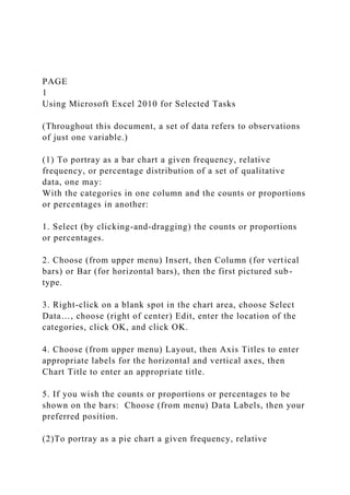
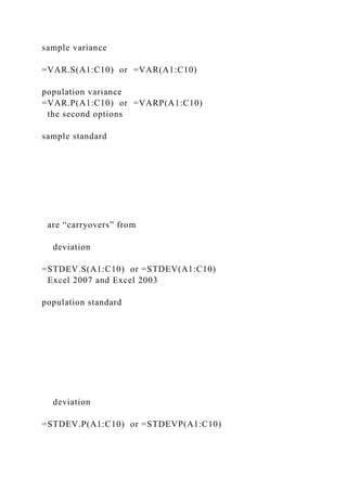
![9. If the numeric classes are intervals of an [a,b) or (a,b] nature
and you want their boundaries (instead of the intervals
themselves) specified along the x-axis: (a) replace (via
“overwriting”) the column of numeric classes (including, if
present, the bogus blank) with—in ascending order—the
boundaries (excluding 0 if the first numeric class has a lower
boundary of 0); (b) right click on one of the boundaries in the
histogram; (c) select the right justify option; and (d) select
Format Axis…, then Alignment, and enter 5⁰ for the Custom
Angle .
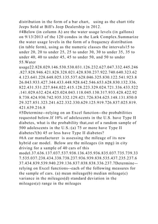
(6) Using Excel statistical functions to obtain individual
summary measures for a set of quantitative data:
Summary measure
What you enter in some blank cell (assuming data resides in
cells A1:C10)
mean
=AVERAGE(A1:C10)
median
=MEDIAN(A1:C10)
mode
=MODE(A1:C10)
range
=MAX(A1:C10)-MIN(A1:C10)](https://image.slidesharecdn.com/page1usingmicrosoftexcel2010forselectedtasksthr-221114040043-f3f54227/85/PAGE-1Using-Microsoft-Excel-2010-for-Selected-Tasks-Thr-docx-5-320.jpg)
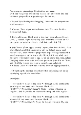
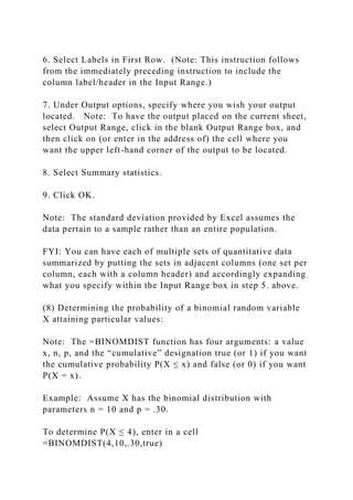
![(7) Using Excel’s Descriptive Statistics tool to obtain a list of
various summary measures for a set of quantitative data:
Note: The Descriptive Statistics tool (and a number of other
tools, several of which are relied upon in ECON 3300) is in the
Excel Add-In called Analysis ToolPak. If working from your
own computer, you will need to have the Analysis ToolPak
Add-In installed on your computer. You have ready access to
the Analysis ToolPak Add-In from any KSU classroom or
labroom computer. (Mac users: My understanding is that
StatPlus:mac, downloadable from
http://www.analystsoft.com/en/products/statplusmacle/,
provides Analysis ToolPak functionality, but the instructions
below are specific to users of Analysis ToolPak.)
With the data in one column, and a descriptive label (e.g.,
Annual Income if the data comprises annual incomes) at the
head of the column:
1. Choose (from upper menu) Data.
2. Choose (from right side of upper menu) Data Analysis…
[Note: If Data Analysis does not appear, you need to activate
the Analysis ToolPak Add-In, which you can accomplish by the
following series of clicks: (a) click on File (in upper menu); (b)
click on Options (on the left); (c) click on Add-Ins (on the left);
(d) click on Go (at the bottom); (e) click inside the empty box
next to Analysis ToolPak; and (f) click OK.]
3. Choose Descriptive Statistics.
4. Click OK.
5. Specify within the Input Range box (via a click-and-drag
operation or direct address entry) the location of your column
label/header and data.](https://image.slidesharecdn.com/page1usingmicrosoftexcel2010forselectedtasksthr-221114040043-f3f54227/85/PAGE-1Using-Microsoft-Excel-2010-for-Selected-Tasks-Thr-docx-7-320.jpg)
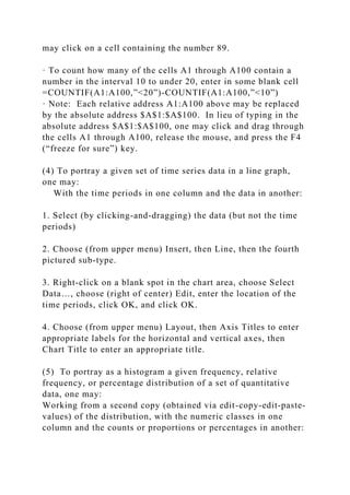
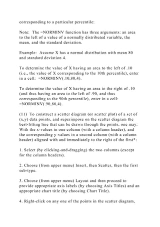
![To determine P(X = 5), enter in a cell
=BINOMDIST(5,10,.30,false)
Other desired probabilities can be obtained by recasting them in
terms of = or ≤ probabilities.
For example, P(X ≥ 7) is the same as P(not (X ≤ 6)) = 1 – P(X≤
6), so can be obtained by entering in a cell =1–
BINOMDIST(6,10,.30,true). For another example, P(X = 3 or
4) can be obtained by entering in a cell
=BINOMDIST(3,10,.30,false) + BINOMDIST(4,10,.30,false).
(9) Determining the probability of a normally distributed
random variable X attaining particular values:
Note: The =NORMDIST function has four arguments: a value
x, the mean, the standard deviation, and the “cumulative”
designation true (or 1) if you want the cumulative probability
P(X ≤ x), and false (or 0) if you want f(x) [which can be used to
graph a normal curve].
Example: Assume X has a normal distribution with mean 100
and standard deviation 10.
To determine P(X < 125) or P(X ( 125), enter in a cell:
=NORMDIST(125,100,10,true)
To determine P(X > 125) or P(X ( 125), enter in a cell: =1 -
NORMDIST(125,100,10,true)
To determine P(125 < X < 130) or P(125 ( X < 130) or P(125 <
X ( 130) or P(125 ( X ( 130), enter in a cell:
=NORMDIST(130,100,10,true) - NORMDIST(125,100,10,true)
(10) Determining the value of a normally distributed variable X
corresponding to a particular area to the left or right, and thus](https://image.slidesharecdn.com/page1usingmicrosoftexcel2010forselectedtasksthr-221114040043-f3f54227/85/PAGE-1Using-Microsoft-Excel-2010-for-Selected-Tasks-Thr-docx-9-320.jpg)


![slide_group-2[1].pptx_updated[1]_updated[1].pptx](https://cdn.slidesharecdn.com/ss_thumbnails/slidegroup-21-240306181115-7f1b3f8f-thumbnail.jpg?width=640&height=640&fit=bounds)


