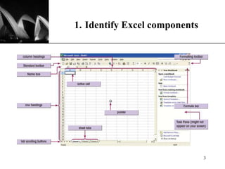
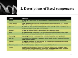
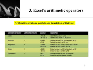
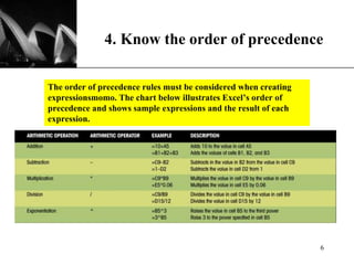
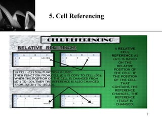
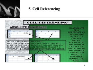
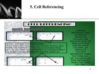
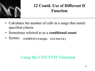
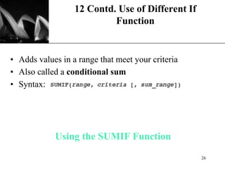
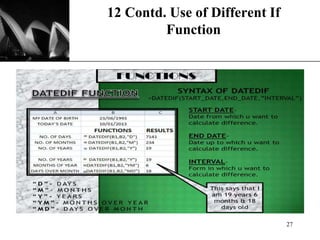
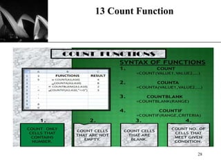
The document provides a comprehensive introduction to Microsoft Excel XP, covering components, arithmetic operators, cell referencing, functions, creating charts, and script automation. It also explains various functions like math and statistical functions, conditional counting, and the intricacies of using the Insert Function dialog box. Additionally, it guides users on how to create and edit scripts for automating tasks in Excel.


![XP
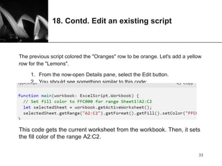
18. Contd. Create a Table
Let's convert this fruit sales data into a table. We'll use our
script for the entire process.
1. Add the following line to the end of the script (before the
closing }):
let table = selectedSheet.addTable("A1:C5", true);
1. That call returns a Table object. Let's use that table to sort the
data. We'll sort the data in ascending order based on the values in
the "Fruit" column. Add the following line after the table
creation:
table.getSort().apply([{ key: 0, ascending: true }]); 35](https://image.slidesharecdn.com/msexcelmodule4-240228074943-814bb0c3/85/MS_Excel_Module4-1-ffor-beginners-yo-pptx-35-320.jpg)
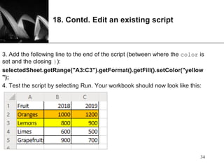
![XP
18. Contd. Create a Table
Your script should look like this:
function main(workbook: ExcelScript.Workbook) {
// Set fill color to FFC000 for range Sheet1!A2:C2
let selectedSheet = workbook.getActiveWorksheet();
selectedSheet.getRange("A2:C2").getFormat().getFill().setColor("FFC000");
selectedSheet.getRange("A3:C3").getFormat().getFill().setColor("yellow");
let table = selectedSheet.addTable("A1:C5", true);
table.getSort().apply([{ key: 0, ascending: true }]);
}
3. Run the script. You should see a table like this:
36](https://image.slidesharecdn.com/msexcelmodule4-240228074943-814bb0c3/85/MS_Excel_Module4-1-ffor-beginners-yo-pptx-36-320.jpg)