SlideShare a Scribd company logo
Graphing interpolation, regression,
and subsets of Census data in R
by Doug Loqa
Pull data into R, group data subsets, and
create a comparison between interpolation
and regression curves.
You may start with the groups on the left, but prefer to
summarize some condensed categories like those on the right.
Measures of income
dispersion 2017 2016
…..
10th percentile limit 14,219 13,901
…..
20th percentile limit 24,638 24,518
…..
40th percentile limit 47,110 46,581
…..
50th (median) 61,372 60,309
…..
60th percentile limit 77,552 76,479
…..
80th percentile limit 126,855 123,621
…..
90th percentile limit 179,077 174,203
…..
95th percentile limit 237,034 230,095
…..
Measures of income
dispersion 2017 2016
…..
50th percentile below 36834.75 36327.25
…..
Upper-Middle 102,204 100,050
…..
Top 10 % 208,056 202,149
…..
Save the file from Census data, and save the tabular
data you want into a .csv. Then import it into R (The
categorical data will read horizontally seen below).
Use the read.csv command and make sure headers are set to true,
and StringsAsFactors are set to false. The StringsAsFactors can cause
information to be “bucketed” and make analysis more difficult.
read.csv(“Your data.csv”, headers = T, StringsAsFactors = F)
Convert the input to
numerical data for R
Combine the gsub and as.numeric() functions
gsub(“,”,””,datarow)
as.numeric(datavector) combine below 
as.numeric(gsub(…..)) Assign this to a variable
Problems: The data will come in as
strings, so you won’t be able to run
any calculations initially. Also, R
doesn’t work with commas when
computing values.
Solutions: Run the formulas to the
left to fix this. The combination of
the two functions create numerical
data vectors R can read.
Create all numeric
vectors needed for
your first category
Run the mean function inside the apply() function with your
saved vectors
apply(rbind(vect1, vect2, vect3),2,mean)
In the second argument here, you can enter a “1” or “2” to
calculate across rows, or down columns respectively. In this
case, since we need to calculate down, a 2 was entered.
Remember this was entered horizontally.
Continue this process until you have all of your categorial rows
of data to analyze.
Problem: You still need to combine
vectors for your aggregated
categorical information.
Solution: The way you can
summarize the vectors of data is by
using the apply() function. You
need to know what direction the
data will be computed in, so pay
attention to the second parameter
here.
Use the plot()function with specified
titles, colors, and the category.
Use, col =“color”, xlab, ylab, main, type =“p”, and you can use
seq(1997,2017,1) for x-values here. You can use your categorical data for your
y-values. The x-values should represent the span of data you are measuring
Use the approxfun()function to graph the
interpolation lines.
Use similar categorical information as used for the plot function, and first try the “linear” option. You can
use “2” as a rule to treat the graph as though it was continuing through the points on the ends. The Category is
your vector with y-values. Note if you have your data in columns, you will use Category[,1] instead. f<-
approxfun(seq(start,end,1),Category[1,],method="linear", rule = 2) Start = 1997
and end = 2017 in this case. You then need to use the curve()function and make sure you specify add =
TRUE. I used purple as the color below.
Use the constant argument of the
approxfun()function to see trends.
Use the same categorical information as done before and now use the “constant” option. You can use “2” as
an option to treat the graph as though it was continuing through the points.
f<-approxfun(seq(start,end,1),Category[1,],method=“constant", rule = 2)
Start and end would again be your beginning and ending years. You then need to use the curve function and
make sure you specify add = TRUE. I used lightgreen as the color below.
Use the interpolation curves to determine
what degree of polynomial to use
Where it is obvious, you will see the “angled” interpolations switch from fitting above the linear to
below the linear, and vice versa. Count how many of those “shifts” there are and that is your degree. So,
counting 5 arrows below means there are 5-1 = 4 shifts. You can guess this requires a 4th degree
polynomial.
Use the lm() curves to set up your
polynomial graphs
• Set up your regression picking the degree you guessed from the previous page:
r<-lm(Category[1,]~poly(seq(start,end,1),4,raw = T))
• Now use the predict function to get a regression function out of this:
rc<-predict(r)
Use the lines() function to graph your
regression curve on top of this.
You use the same sequence using the beginning and ending years, and use the regression curve based
on the predict() function, generated in last step, to graph this.
lines(y~x, col=“color choice”,lwd = 2)
Use the par()function to group your graphs
once you have a number of them complete.
par(mfrow = c(1,2)) will give you 2 graphs side-by-side. Make sure that your
titles are short enough to not collide when graphing.
Add rows of graphs and you’re done!
You can make this process even easier by combining some of these steps into a user-
defined function if you know how to set up your variables. Also consider using the
layout() function instead of par()

More Related Content

What's hot

Data handling -
Data handling  -Data handling  -
Data handling -
Manpreet Singh
 
Learning to use Desmos KS3
Learning to use Desmos KS3Learning to use Desmos KS3
Learning to use Desmos KS3
Colleen Young
 
R nonlinear least square
R   nonlinear least squareR   nonlinear least square
R nonlinear least square
Learnbay Datascience
 
R9
R9R9
1-7 Presenting Data
1-7 Presenting Data1-7 Presenting Data
1-7 Presenting Data
rkelch
 
SCATTER PLOTS
SCATTER PLOTSSCATTER PLOTS
SCATTER PLOTS
karen wagoner
 
Types of graphs
Types of graphsTypes of graphs
Types of graphs
bweldon
 
Using lograrithmic graph paper
Using lograrithmic graph paperUsing lograrithmic graph paper
Using lograrithmic graph paper
martyynyyte
 
Nps speedo meter gauge chart in tabelau
Nps speedo meter   gauge chart in tabelauNps speedo meter   gauge chart in tabelau
Nps speedo meter gauge chart in tabelau
Sivakumar Ramar
 
Scatter plots
Scatter plotsScatter plots
Scatter plots
Ms. Jones
 
Data handling
Data handlingData handling
Data handling
Punita Verma
 
Data handling
Data handlingData handling
Data handling
Advetya Pillai
 
Types of Charts
Types of ChartsTypes of Charts
Types of Charts
Loyd Calangan
 
NCV 4 Mathematical Literacy Hands-On Support Slide Show - Module 2 Part 3
NCV 4 Mathematical Literacy Hands-On Support Slide Show - Module 2 Part 3NCV 4 Mathematical Literacy Hands-On Support Slide Show - Module 2 Part 3
NCV 4 Mathematical Literacy Hands-On Support Slide Show - Module 2 Part 3
Future Managers
 
Graphing
GraphingGraphing
Graphing
NCVPS
 
Different types of charts
Different types of chartsDifferent types of charts
Different types of charts
Zakaria Salim
 
Simple graph types
Simple graph typesSimple graph types
Simple graph types
Mahi Syama
 
Charts And Graphs
Charts And GraphsCharts And Graphs
Charts And Graphs
Himadri Shekhar
 
How to make pie chart and it’s uses
How to make pie chart and it’s usesHow to make pie chart and it’s uses
How to make pie chart and it’s uses
Mohammed Rahat Kaleem
 
Have you ever wonder how Excel sets the upper limit and the lower limit on th...
Have you ever wonder how Excel sets the upper limit and the lower limit on th...Have you ever wonder how Excel sets the upper limit and the lower limit on th...
Have you ever wonder how Excel sets the upper limit and the lower limit on th...
​Jennifer ChiaYu Lin
 

What's hot (20)

Data handling -
Data handling  -Data handling  -
Data handling -
 
Learning to use Desmos KS3
Learning to use Desmos KS3Learning to use Desmos KS3
Learning to use Desmos KS3
 
R nonlinear least square
R   nonlinear least squareR   nonlinear least square
R nonlinear least square
 
R9
R9R9
R9
 
1-7 Presenting Data
1-7 Presenting Data1-7 Presenting Data
1-7 Presenting Data
 
SCATTER PLOTS
SCATTER PLOTSSCATTER PLOTS
SCATTER PLOTS
 
Types of graphs
Types of graphsTypes of graphs
Types of graphs
 
Using lograrithmic graph paper
Using lograrithmic graph paperUsing lograrithmic graph paper
Using lograrithmic graph paper
 
Nps speedo meter gauge chart in tabelau
Nps speedo meter   gauge chart in tabelauNps speedo meter   gauge chart in tabelau
Nps speedo meter gauge chart in tabelau
 
Scatter plots
Scatter plotsScatter plots
Scatter plots
 
Data handling
Data handlingData handling
Data handling
 
Data handling
Data handlingData handling
Data handling
 
Types of Charts
Types of ChartsTypes of Charts
Types of Charts
 
NCV 4 Mathematical Literacy Hands-On Support Slide Show - Module 2 Part 3
NCV 4 Mathematical Literacy Hands-On Support Slide Show - Module 2 Part 3NCV 4 Mathematical Literacy Hands-On Support Slide Show - Module 2 Part 3
NCV 4 Mathematical Literacy Hands-On Support Slide Show - Module 2 Part 3
 
Graphing
GraphingGraphing
Graphing
 
Different types of charts
Different types of chartsDifferent types of charts
Different types of charts
 
Simple graph types
Simple graph typesSimple graph types
Simple graph types
 
Charts And Graphs
Charts And GraphsCharts And Graphs
Charts And Graphs
 
How to make pie chart and it’s uses
How to make pie chart and it’s usesHow to make pie chart and it’s uses
How to make pie chart and it’s uses
 
Have you ever wonder how Excel sets the upper limit and the lower limit on th...
Have you ever wonder how Excel sets the upper limit and the lower limit on th...Have you ever wonder how Excel sets the upper limit and the lower limit on th...
Have you ever wonder how Excel sets the upper limit and the lower limit on th...
 

Similar to How to combine interpolation and regression graphs in R

2.3 Graphs that enlighten and graphs that deceive
2.3 Graphs that enlighten and graphs that deceive2.3 Graphs that enlighten and graphs that deceive
2.3 Graphs that enlighten and graphs that deceive
Long Beach City College
 
working with python
working with pythonworking with python
working with python
bhavesh lande
 
Me 443 4 plotting curves Erdi Karaçal Mechanical Engineer University of Gaz...
Me 443   4 plotting curves Erdi Karaçal Mechanical Engineer University of Gaz...Me 443   4 plotting curves Erdi Karaçal Mechanical Engineer University of Gaz...
Me 443 4 plotting curves Erdi Karaçal Mechanical Engineer University of Gaz...
Erdi Karaçal
 
Excel Slope Instruction
Excel Slope InstructionExcel Slope Instruction
Excel Slope Instruction
totoros_girl
 
Regression analysis in excel
Regression analysis in excelRegression analysis in excel
Regression analysis in excel
Awais Salman
 
MATLAB
MATLABMATLAB
MATLAB
svati sharma
 
CIV1900 Matlab - Plotting & Coursework
CIV1900 Matlab - Plotting & CourseworkCIV1900 Matlab - Plotting & Coursework
CIV1900 Matlab - Plotting & Coursework
TUOS-Sam
 
Environmental Engineering Assignment Help
Environmental Engineering Assignment HelpEnvironmental Engineering Assignment Help
Environmental Engineering Assignment Help
Matlab Assignment Experts
 
Regression analysis in excel
Regression analysis in excelRegression analysis in excel
Regression analysis in excel
Thilina Rathnayaka
 
17545489052556.pdf
17545489052556.pdf17545489052556.pdf
17545489052556.pdf
Ashish Gupta
 
Graphical Representation of Statistical data
Graphical Representation of Statistical dataGraphical Representation of Statistical data
Graphical Representation of Statistical data
MD SAMSER
 
Numerical and statistical methods new
Numerical and statistical methods newNumerical and statistical methods new
Numerical and statistical methods new
Aabha Tiwari
 
Essay On Linear Function
Essay On Linear FunctionEssay On Linear Function
Essay On Linear Function
Angie Lee
 
R for Statistical Computing
R for Statistical ComputingR for Statistical Computing
R for Statistical Computing
Mohammed El Rafie Tarabay
 
2.4 Scatterplots, correlation, and regression
2.4 Scatterplots, correlation, and regression2.4 Scatterplots, correlation, and regression
2.4 Scatterplots, correlation, and regression
Long Beach City College
 
Introduction to r
Introduction to rIntroduction to r
Introduction to r
Golden Julie Jesus
 
Qt graphical representation of data
Qt   graphical representation of dataQt   graphical representation of data
Qt graphical representation of data
Joel Pais
 
Qt graphical representation of data
Qt   graphical representation of dataQt   graphical representation of data
Qt graphical representation of data
Joel Pais
 
ENGR 102B Microsoft Excel Proficiency LevelsPlease have your in.docx
ENGR 102B Microsoft Excel Proficiency LevelsPlease have your in.docxENGR 102B Microsoft Excel Proficiency LevelsPlease have your in.docx
ENGR 102B Microsoft Excel Proficiency LevelsPlease have your in.docx
YASHU40
 
Chapter#8
Chapter#8Chapter#8

Similar to How to combine interpolation and regression graphs in R (20)

2.3 Graphs that enlighten and graphs that deceive
2.3 Graphs that enlighten and graphs that deceive2.3 Graphs that enlighten and graphs that deceive
2.3 Graphs that enlighten and graphs that deceive
 
working with python
working with pythonworking with python
working with python
 
Me 443 4 plotting curves Erdi Karaçal Mechanical Engineer University of Gaz...
Me 443   4 plotting curves Erdi Karaçal Mechanical Engineer University of Gaz...Me 443   4 plotting curves Erdi Karaçal Mechanical Engineer University of Gaz...
Me 443 4 plotting curves Erdi Karaçal Mechanical Engineer University of Gaz...
 
Excel Slope Instruction
Excel Slope InstructionExcel Slope Instruction
Excel Slope Instruction
 
Regression analysis in excel
Regression analysis in excelRegression analysis in excel
Regression analysis in excel
 
MATLAB
MATLABMATLAB
MATLAB
 
CIV1900 Matlab - Plotting & Coursework
CIV1900 Matlab - Plotting & CourseworkCIV1900 Matlab - Plotting & Coursework
CIV1900 Matlab - Plotting & Coursework
 
Environmental Engineering Assignment Help
Environmental Engineering Assignment HelpEnvironmental Engineering Assignment Help
Environmental Engineering Assignment Help
 
Regression analysis in excel
Regression analysis in excelRegression analysis in excel
Regression analysis in excel
 
17545489052556.pdf
17545489052556.pdf17545489052556.pdf
17545489052556.pdf
 
Graphical Representation of Statistical data
Graphical Representation of Statistical dataGraphical Representation of Statistical data
Graphical Representation of Statistical data
 
Numerical and statistical methods new
Numerical and statistical methods newNumerical and statistical methods new
Numerical and statistical methods new
 
Essay On Linear Function
Essay On Linear FunctionEssay On Linear Function
Essay On Linear Function
 
R for Statistical Computing
R for Statistical ComputingR for Statistical Computing
R for Statistical Computing
 
2.4 Scatterplots, correlation, and regression
2.4 Scatterplots, correlation, and regression2.4 Scatterplots, correlation, and regression
2.4 Scatterplots, correlation, and regression
 
Introduction to r
Introduction to rIntroduction to r
Introduction to r
 
Qt graphical representation of data
Qt   graphical representation of dataQt   graphical representation of data
Qt graphical representation of data
 
Qt graphical representation of data
Qt   graphical representation of dataQt   graphical representation of data
Qt graphical representation of data
 
ENGR 102B Microsoft Excel Proficiency LevelsPlease have your in.docx
ENGR 102B Microsoft Excel Proficiency LevelsPlease have your in.docxENGR 102B Microsoft Excel Proficiency LevelsPlease have your in.docx
ENGR 102B Microsoft Excel Proficiency LevelsPlease have your in.docx
 
Chapter#8
Chapter#8Chapter#8
Chapter#8
 

Recently uploaded

Why Choose Odoo 17 Community & How it differs from Odoo 17 Enterprise Edition
Why Choose Odoo 17 Community & How it differs from Odoo 17 Enterprise EditionWhy Choose Odoo 17 Community & How it differs from Odoo 17 Enterprise Edition
Why Choose Odoo 17 Community & How it differs from Odoo 17 Enterprise Edition
Envertis Software Solutions
 
Revolutionizing Visual Effects Mastering AI Face Swaps.pdf
Revolutionizing Visual Effects Mastering AI Face Swaps.pdfRevolutionizing Visual Effects Mastering AI Face Swaps.pdf
Revolutionizing Visual Effects Mastering AI Face Swaps.pdf
Undress Baby
 
OpenMetadata Community Meeting - 5th June 2024
OpenMetadata Community Meeting - 5th June 2024OpenMetadata Community Meeting - 5th June 2024
OpenMetadata Community Meeting - 5th June 2024
OpenMetadata
 
Using Query Store in Azure PostgreSQL to Understand Query Performance
Using Query Store in Azure PostgreSQL to Understand Query PerformanceUsing Query Store in Azure PostgreSQL to Understand Query Performance
Using Query Store in Azure PostgreSQL to Understand Query Performance
Grant Fritchey
 
UI5con 2024 - Keynote: Latest News about UI5 and it’s Ecosystem
UI5con 2024 - Keynote: Latest News about UI5 and it’s EcosystemUI5con 2024 - Keynote: Latest News about UI5 and it’s Ecosystem
UI5con 2024 - Keynote: Latest News about UI5 and it’s Ecosystem
Peter Muessig
 
LORRAINE ANDREI_LEQUIGAN_HOW TO USE ZOOM
LORRAINE ANDREI_LEQUIGAN_HOW TO USE ZOOMLORRAINE ANDREI_LEQUIGAN_HOW TO USE ZOOM
LORRAINE ANDREI_LEQUIGAN_HOW TO USE ZOOM
lorraineandreiamcidl
 
Hand Rolled Applicative User Validation Code Kata
Hand Rolled Applicative User ValidationCode KataHand Rolled Applicative User ValidationCode Kata
Hand Rolled Applicative User Validation Code Kata
Philip Schwarz
 
KuberTENes Birthday Bash Guadalajara - Introducción a Argo CD
KuberTENes Birthday Bash Guadalajara - Introducción a Argo CDKuberTENes Birthday Bash Guadalajara - Introducción a Argo CD
KuberTENes Birthday Bash Guadalajara - Introducción a Argo CD
rodomar2
 
Microservice Teams - How the cloud changes the way we work
Microservice Teams - How the cloud changes the way we workMicroservice Teams - How the cloud changes the way we work
Microservice Teams - How the cloud changes the way we work
Sven Peters
 
How to write a program in any programming language
How to write a program in any programming languageHow to write a program in any programming language
How to write a program in any programming language
Rakesh Kumar R
 
E-commerce Development Services- Hornet Dynamics
E-commerce Development Services- Hornet DynamicsE-commerce Development Services- Hornet Dynamics
E-commerce Development Services- Hornet Dynamics
Hornet Dynamics
 
Introducing Crescat - Event Management Software for Venues, Festivals and Eve...
Introducing Crescat - Event Management Software for Venues, Festivals and Eve...Introducing Crescat - Event Management Software for Venues, Festivals and Eve...
Introducing Crescat - Event Management Software for Venues, Festivals and Eve...
Crescat
 
Oracle Database 19c New Features for DBAs and Developers.pptx
Oracle Database 19c New Features for DBAs and Developers.pptxOracle Database 19c New Features for DBAs and Developers.pptx
Oracle Database 19c New Features for DBAs and Developers.pptx
Remote DBA Services
 
Unveiling the Advantages of Agile Software Development.pdf
Unveiling the Advantages of Agile Software Development.pdfUnveiling the Advantages of Agile Software Development.pdf
Unveiling the Advantages of Agile Software Development.pdf
brainerhub1
 
openEuler Case Study - The Journey to Supply Chain Security
openEuler Case Study - The Journey to Supply Chain SecurityopenEuler Case Study - The Journey to Supply Chain Security
openEuler Case Study - The Journey to Supply Chain Security
Shane Coughlan
 
Oracle 23c New Features For DBAs and Developers.pptx
Oracle 23c New Features For DBAs and Developers.pptxOracle 23c New Features For DBAs and Developers.pptx
Oracle 23c New Features For DBAs and Developers.pptx
Remote DBA Services
 
Artificia Intellicence and XPath Extension Functions
Artificia Intellicence and XPath Extension FunctionsArtificia Intellicence and XPath Extension Functions
Artificia Intellicence and XPath Extension Functions
Octavian Nadolu
 
Neo4j - Product Vision and Knowledge Graphs - GraphSummit Paris
Neo4j - Product Vision and Knowledge Graphs - GraphSummit ParisNeo4j - Product Vision and Knowledge Graphs - GraphSummit Paris
Neo4j - Product Vision and Knowledge Graphs - GraphSummit Paris
Neo4j
 
Using Xen Hypervisor for Functional Safety
Using Xen Hypervisor for Functional SafetyUsing Xen Hypervisor for Functional Safety
Using Xen Hypervisor for Functional Safety
Ayan Halder
 
Need for Speed: Removing speed bumps from your Symfony projects ⚡️
Need for Speed: Removing speed bumps from your Symfony projects ⚡️Need for Speed: Removing speed bumps from your Symfony projects ⚡️
Need for Speed: Removing speed bumps from your Symfony projects ⚡️
Łukasz Chruściel
 

Recently uploaded (20)

Why Choose Odoo 17 Community & How it differs from Odoo 17 Enterprise Edition
Why Choose Odoo 17 Community & How it differs from Odoo 17 Enterprise EditionWhy Choose Odoo 17 Community & How it differs from Odoo 17 Enterprise Edition
Why Choose Odoo 17 Community & How it differs from Odoo 17 Enterprise Edition
 
Revolutionizing Visual Effects Mastering AI Face Swaps.pdf
Revolutionizing Visual Effects Mastering AI Face Swaps.pdfRevolutionizing Visual Effects Mastering AI Face Swaps.pdf
Revolutionizing Visual Effects Mastering AI Face Swaps.pdf
 
OpenMetadata Community Meeting - 5th June 2024
OpenMetadata Community Meeting - 5th June 2024OpenMetadata Community Meeting - 5th June 2024
OpenMetadata Community Meeting - 5th June 2024
 
Using Query Store in Azure PostgreSQL to Understand Query Performance
Using Query Store in Azure PostgreSQL to Understand Query PerformanceUsing Query Store in Azure PostgreSQL to Understand Query Performance
Using Query Store in Azure PostgreSQL to Understand Query Performance
 
UI5con 2024 - Keynote: Latest News about UI5 and it’s Ecosystem
UI5con 2024 - Keynote: Latest News about UI5 and it’s EcosystemUI5con 2024 - Keynote: Latest News about UI5 and it’s Ecosystem
UI5con 2024 - Keynote: Latest News about UI5 and it’s Ecosystem
 
LORRAINE ANDREI_LEQUIGAN_HOW TO USE ZOOM
LORRAINE ANDREI_LEQUIGAN_HOW TO USE ZOOMLORRAINE ANDREI_LEQUIGAN_HOW TO USE ZOOM
LORRAINE ANDREI_LEQUIGAN_HOW TO USE ZOOM
 
Hand Rolled Applicative User Validation Code Kata
Hand Rolled Applicative User ValidationCode KataHand Rolled Applicative User ValidationCode Kata
Hand Rolled Applicative User Validation Code Kata
 
KuberTENes Birthday Bash Guadalajara - Introducción a Argo CD
KuberTENes Birthday Bash Guadalajara - Introducción a Argo CDKuberTENes Birthday Bash Guadalajara - Introducción a Argo CD
KuberTENes Birthday Bash Guadalajara - Introducción a Argo CD
 
Microservice Teams - How the cloud changes the way we work
Microservice Teams - How the cloud changes the way we workMicroservice Teams - How the cloud changes the way we work
Microservice Teams - How the cloud changes the way we work
 
How to write a program in any programming language
How to write a program in any programming languageHow to write a program in any programming language
How to write a program in any programming language
 
E-commerce Development Services- Hornet Dynamics
E-commerce Development Services- Hornet DynamicsE-commerce Development Services- Hornet Dynamics
E-commerce Development Services- Hornet Dynamics
 
Introducing Crescat - Event Management Software for Venues, Festivals and Eve...
Introducing Crescat - Event Management Software for Venues, Festivals and Eve...Introducing Crescat - Event Management Software for Venues, Festivals and Eve...
Introducing Crescat - Event Management Software for Venues, Festivals and Eve...
 
Oracle Database 19c New Features for DBAs and Developers.pptx
Oracle Database 19c New Features for DBAs and Developers.pptxOracle Database 19c New Features for DBAs and Developers.pptx
Oracle Database 19c New Features for DBAs and Developers.pptx
 
Unveiling the Advantages of Agile Software Development.pdf
Unveiling the Advantages of Agile Software Development.pdfUnveiling the Advantages of Agile Software Development.pdf
Unveiling the Advantages of Agile Software Development.pdf
 
openEuler Case Study - The Journey to Supply Chain Security
openEuler Case Study - The Journey to Supply Chain SecurityopenEuler Case Study - The Journey to Supply Chain Security
openEuler Case Study - The Journey to Supply Chain Security
 
Oracle 23c New Features For DBAs and Developers.pptx
Oracle 23c New Features For DBAs and Developers.pptxOracle 23c New Features For DBAs and Developers.pptx
Oracle 23c New Features For DBAs and Developers.pptx
 
Artificia Intellicence and XPath Extension Functions
Artificia Intellicence and XPath Extension FunctionsArtificia Intellicence and XPath Extension Functions
Artificia Intellicence and XPath Extension Functions
 
Neo4j - Product Vision and Knowledge Graphs - GraphSummit Paris
Neo4j - Product Vision and Knowledge Graphs - GraphSummit ParisNeo4j - Product Vision and Knowledge Graphs - GraphSummit Paris
Neo4j - Product Vision and Knowledge Graphs - GraphSummit Paris
 
Using Xen Hypervisor for Functional Safety
Using Xen Hypervisor for Functional SafetyUsing Xen Hypervisor for Functional Safety
Using Xen Hypervisor for Functional Safety
 
Need for Speed: Removing speed bumps from your Symfony projects ⚡️
Need for Speed: Removing speed bumps from your Symfony projects ⚡️Need for Speed: Removing speed bumps from your Symfony projects ⚡️
Need for Speed: Removing speed bumps from your Symfony projects ⚡️
 

How to combine interpolation and regression graphs in R

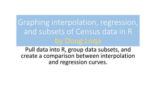
  • 1. Graphing interpolation, regression, and subsets of Census data in R by Doug Loqa Pull data into R, group data subsets, and create a comparison between interpolation and regression curves.
  • 2. You may start with the groups on the left, but prefer to summarize some condensed categories like those on the right. Measures of income dispersion 2017 2016 ….. 10th percentile limit 14,219 13,901 ….. 20th percentile limit 24,638 24,518 ….. 40th percentile limit 47,110 46,581 ….. 50th (median) 61,372 60,309 ….. 60th percentile limit 77,552 76,479 ….. 80th percentile limit 126,855 123,621 ….. 90th percentile limit 179,077 174,203 ….. 95th percentile limit 237,034 230,095 ….. Measures of income dispersion 2017 2016 ….. 50th percentile below 36834.75 36327.25 ….. Upper-Middle 102,204 100,050 ….. Top 10 % 208,056 202,149 …..
  • 3. Save the file from Census data, and save the tabular data you want into a .csv. Then import it into R (The categorical data will read horizontally seen below). Use the read.csv command and make sure headers are set to true, and StringsAsFactors are set to false. The StringsAsFactors can cause information to be “bucketed” and make analysis more difficult. read.csv(“Your data.csv”, headers = T, StringsAsFactors = F)
  • 4. Convert the input to numerical data for R Combine the gsub and as.numeric() functions gsub(“,”,””,datarow) as.numeric(datavector) combine below  as.numeric(gsub(…..)) Assign this to a variable Problems: The data will come in as strings, so you won’t be able to run any calculations initially. Also, R doesn’t work with commas when computing values. Solutions: Run the formulas to the left to fix this. The combination of the two functions create numerical data vectors R can read.
  • 5. Create all numeric vectors needed for your first category Run the mean function inside the apply() function with your saved vectors apply(rbind(vect1, vect2, vect3),2,mean) In the second argument here, you can enter a “1” or “2” to calculate across rows, or down columns respectively. In this case, since we need to calculate down, a 2 was entered. Remember this was entered horizontally. Continue this process until you have all of your categorial rows of data to analyze. Problem: You still need to combine vectors for your aggregated categorical information. Solution: The way you can summarize the vectors of data is by using the apply() function. You need to know what direction the data will be computed in, so pay attention to the second parameter here.
  • 6. Use the plot()function with specified titles, colors, and the category. Use, col =“color”, xlab, ylab, main, type =“p”, and you can use seq(1997,2017,1) for x-values here. You can use your categorical data for your y-values. The x-values should represent the span of data you are measuring
  • 7. Use the approxfun()function to graph the interpolation lines. Use similar categorical information as used for the plot function, and first try the “linear” option. You can use “2” as a rule to treat the graph as though it was continuing through the points on the ends. The Category is your vector with y-values. Note if you have your data in columns, you will use Category[,1] instead. f<- approxfun(seq(start,end,1),Category[1,],method="linear", rule = 2) Start = 1997 and end = 2017 in this case. You then need to use the curve()function and make sure you specify add = TRUE. I used purple as the color below.
  • 8. Use the constant argument of the approxfun()function to see trends. Use the same categorical information as done before and now use the “constant” option. You can use “2” as an option to treat the graph as though it was continuing through the points. f<-approxfun(seq(start,end,1),Category[1,],method=“constant", rule = 2) Start and end would again be your beginning and ending years. You then need to use the curve function and make sure you specify add = TRUE. I used lightgreen as the color below.
  • 9. Use the interpolation curves to determine what degree of polynomial to use Where it is obvious, you will see the “angled” interpolations switch from fitting above the linear to below the linear, and vice versa. Count how many of those “shifts” there are and that is your degree. So, counting 5 arrows below means there are 5-1 = 4 shifts. You can guess this requires a 4th degree polynomial.
  • 10. Use the lm() curves to set up your polynomial graphs • Set up your regression picking the degree you guessed from the previous page: r<-lm(Category[1,]~poly(seq(start,end,1),4,raw = T)) • Now use the predict function to get a regression function out of this: rc<-predict(r)
  • 11. Use the lines() function to graph your regression curve on top of this. You use the same sequence using the beginning and ending years, and use the regression curve based on the predict() function, generated in last step, to graph this. lines(y~x, col=“color choice”,lwd = 2)
  • 12. Use the par()function to group your graphs once you have a number of them complete. par(mfrow = c(1,2)) will give you 2 graphs side-by-side. Make sure that your titles are short enough to not collide when graphing.
  • 13. Add rows of graphs and you’re done! You can make this process even easier by combining some of these steps into a user- defined function if you know how to set up your variables. Also consider using the layout() function instead of par()