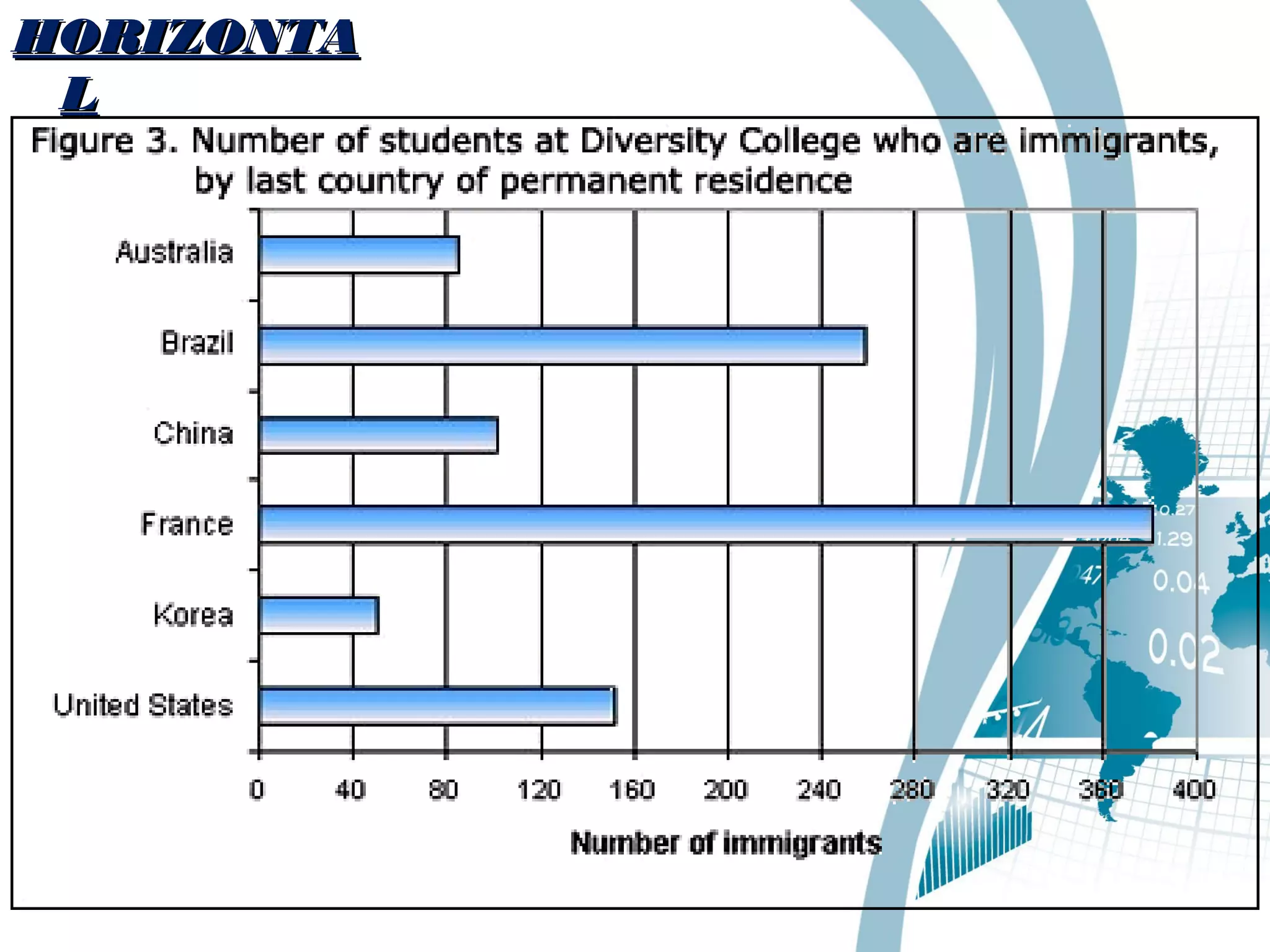
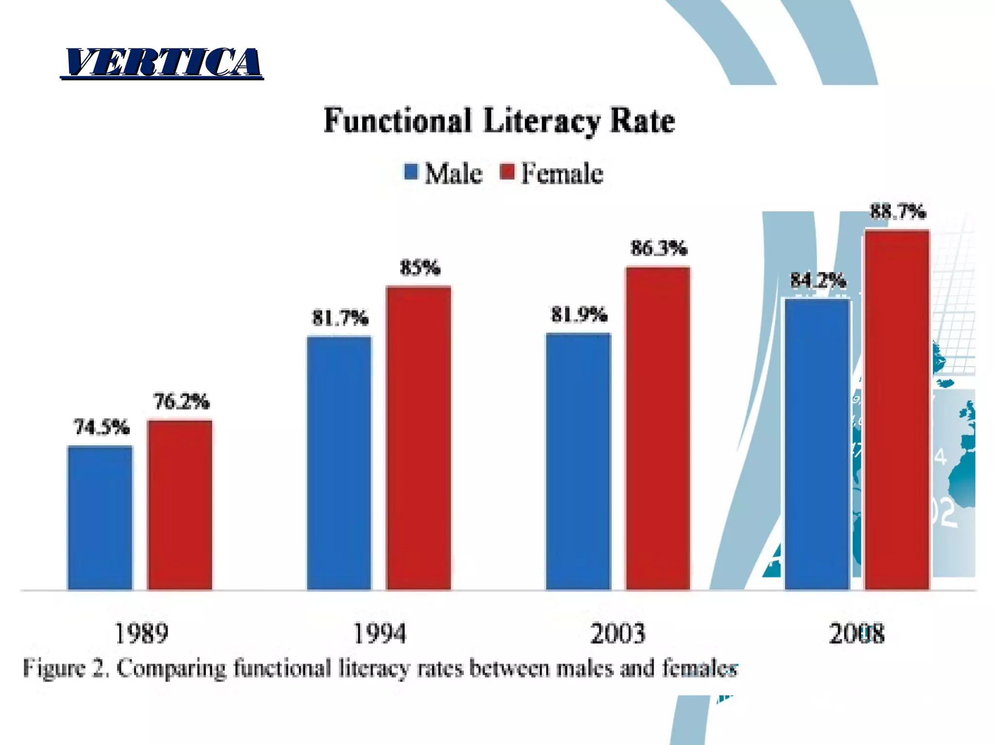
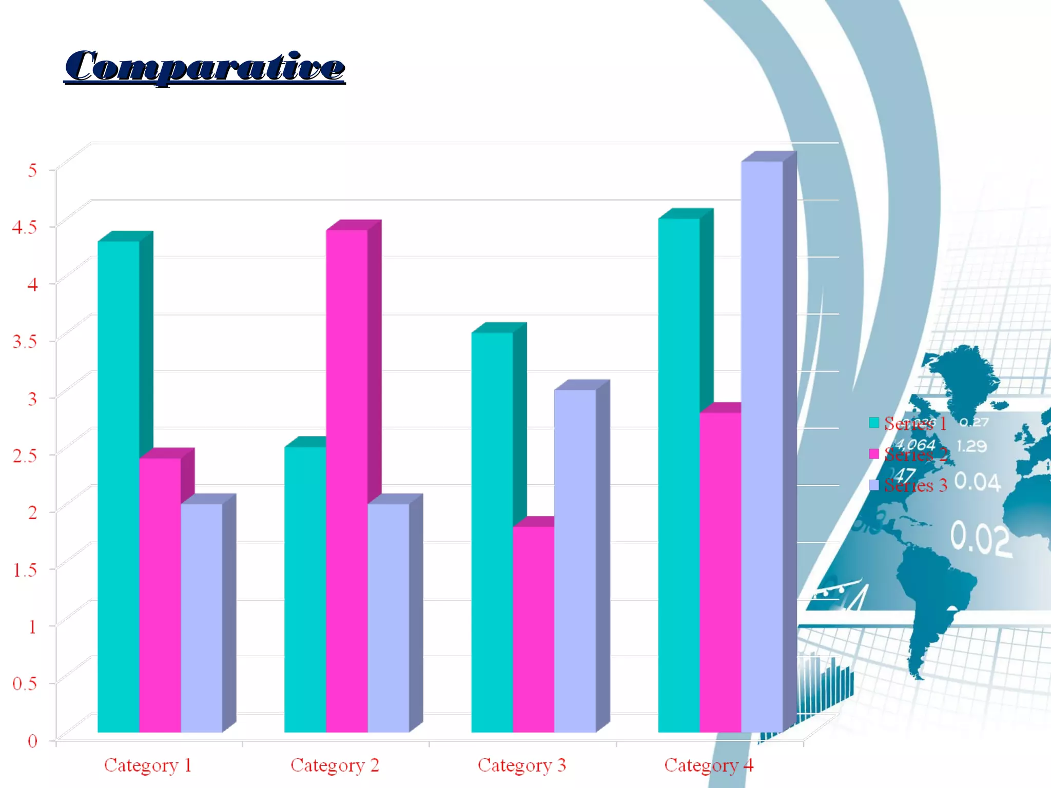
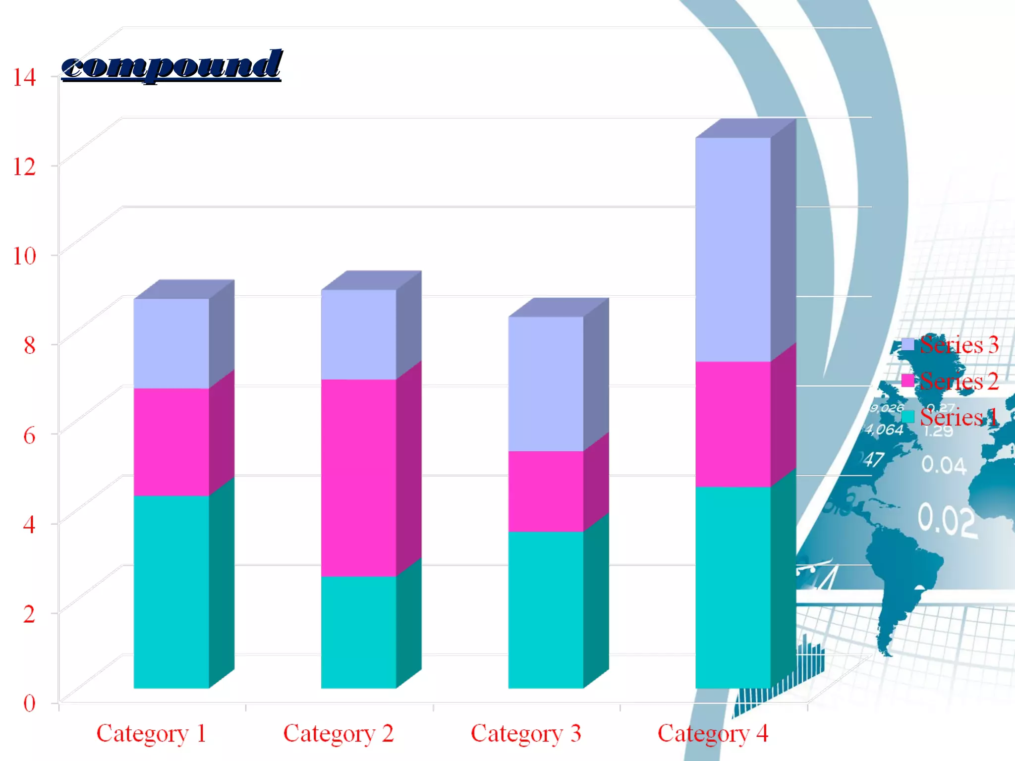
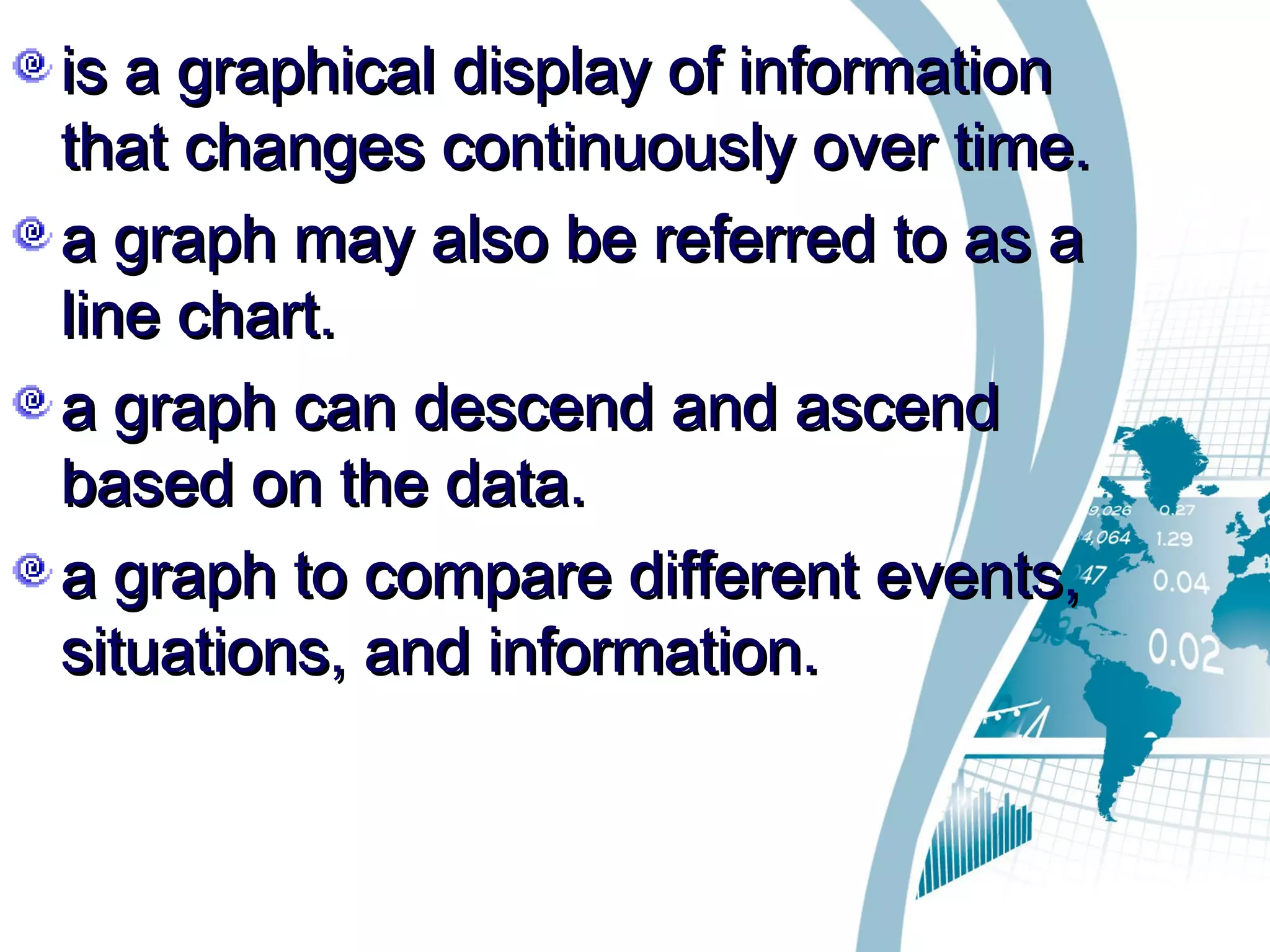
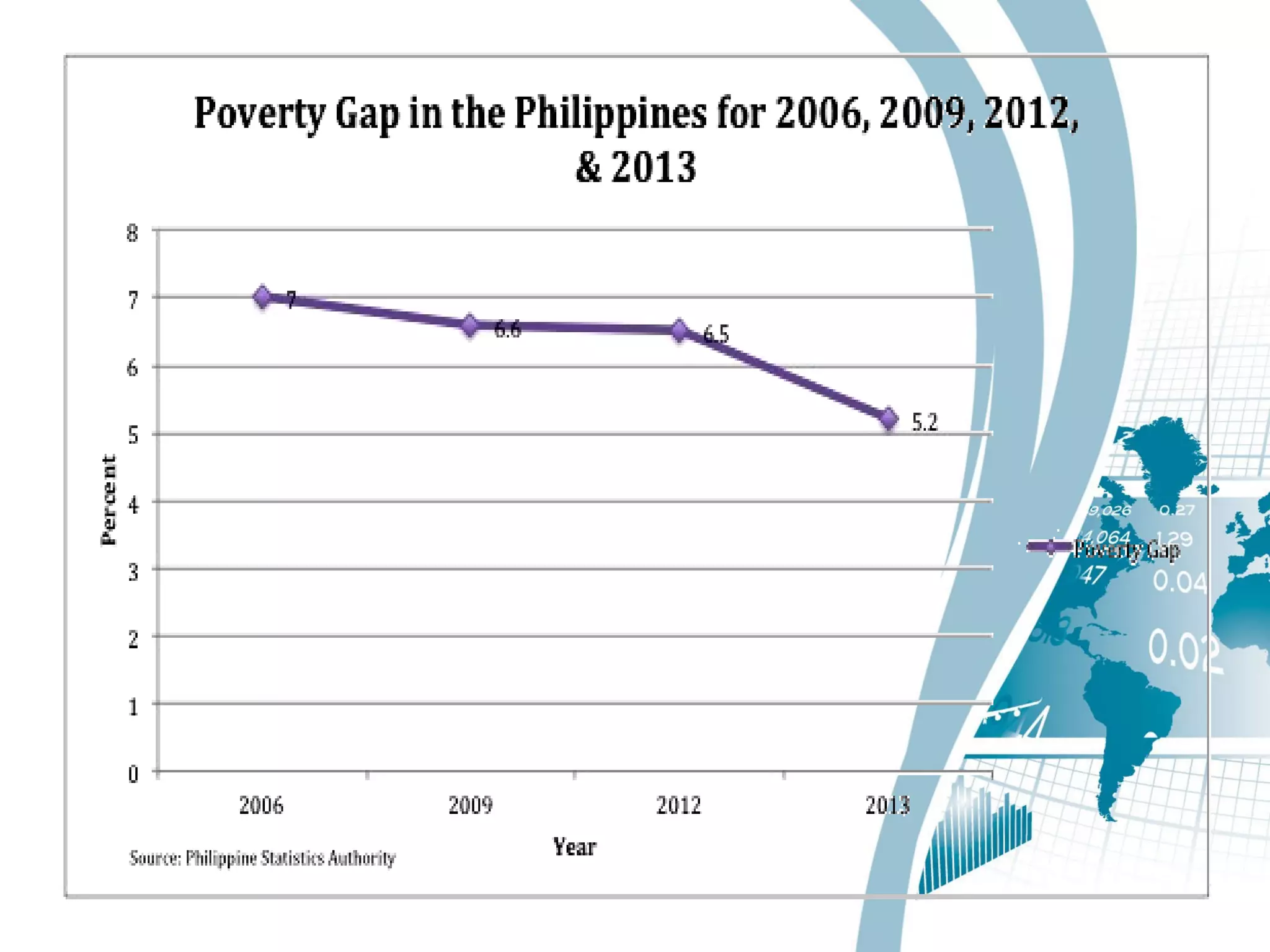
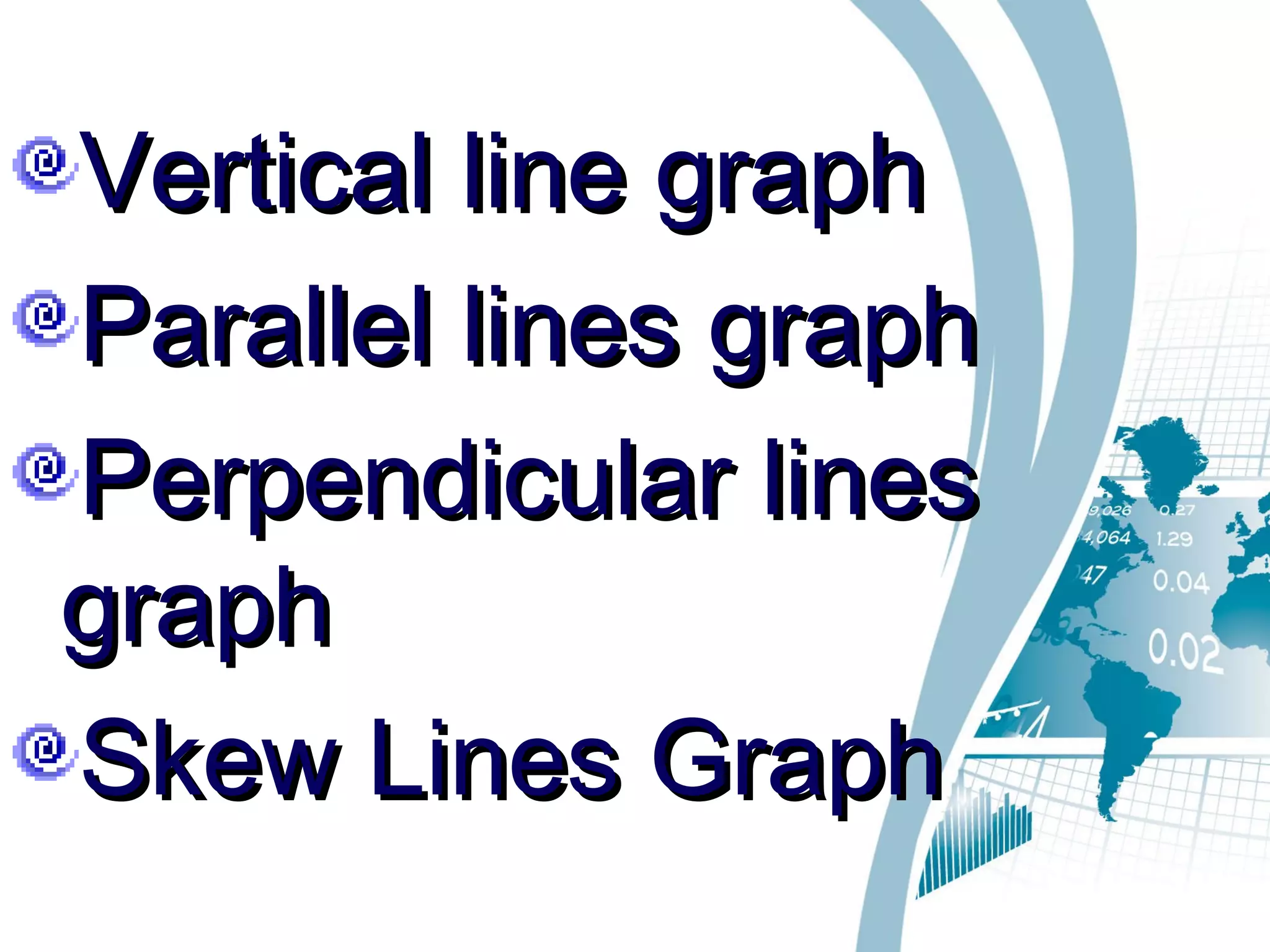
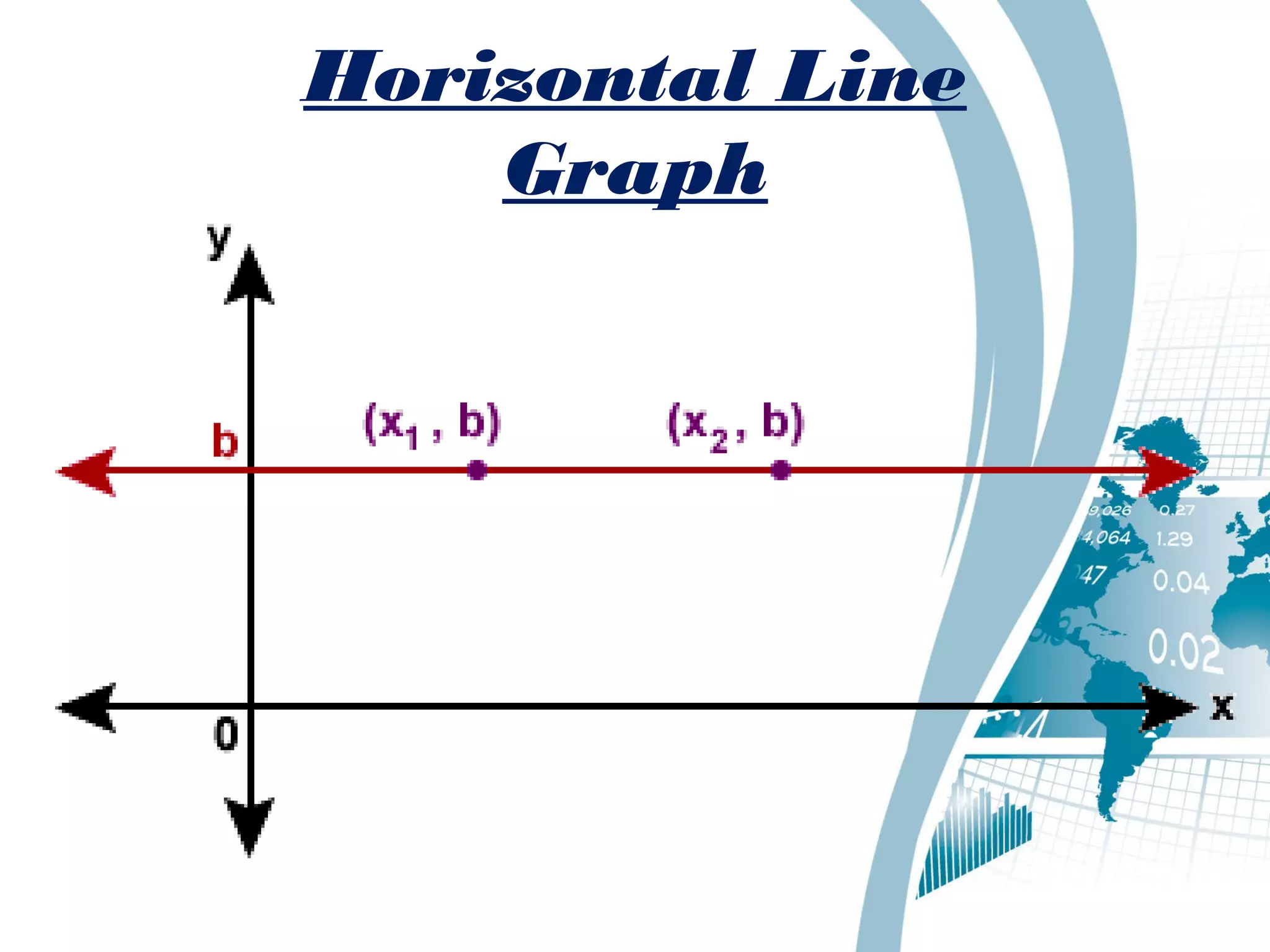
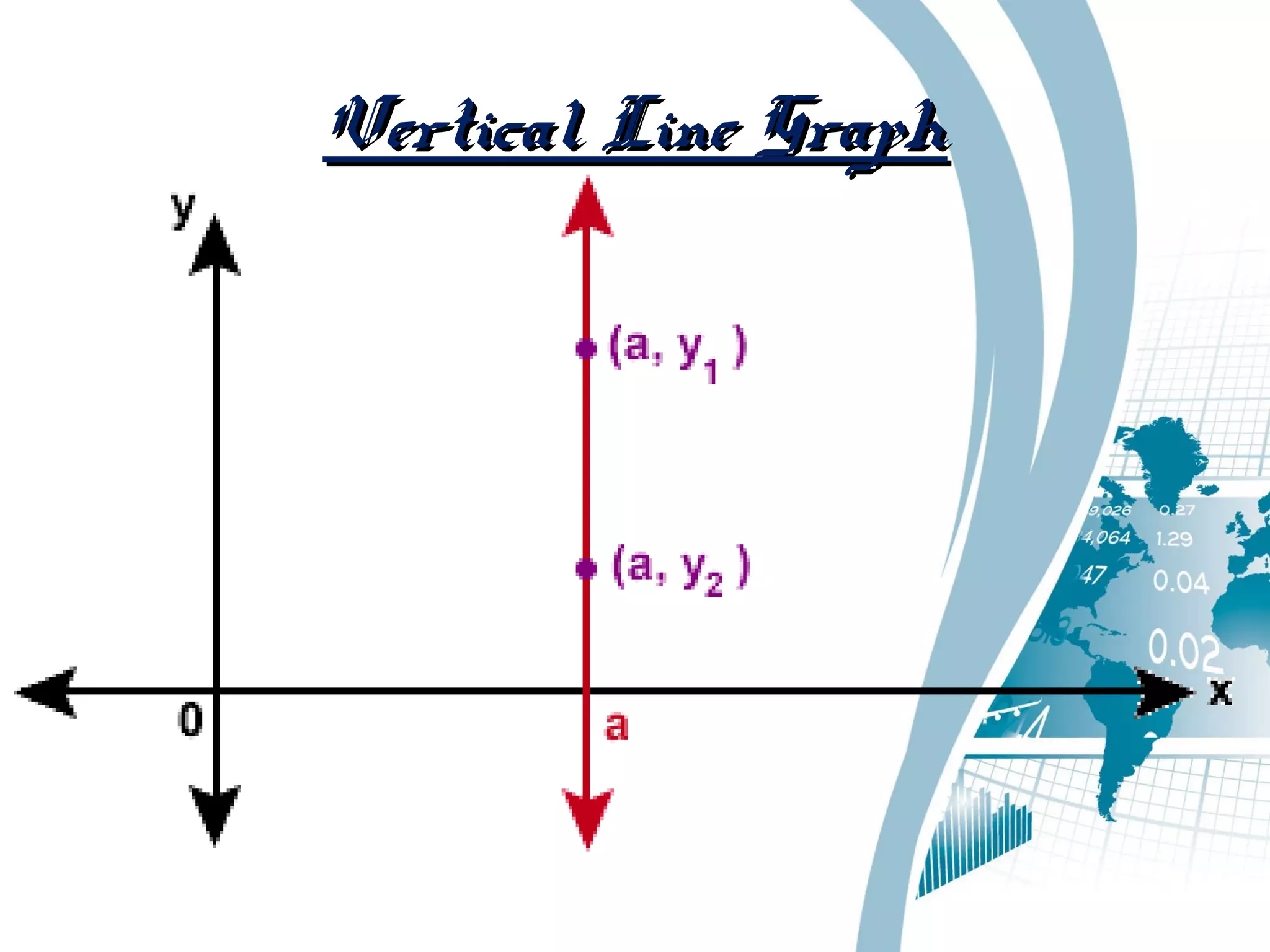
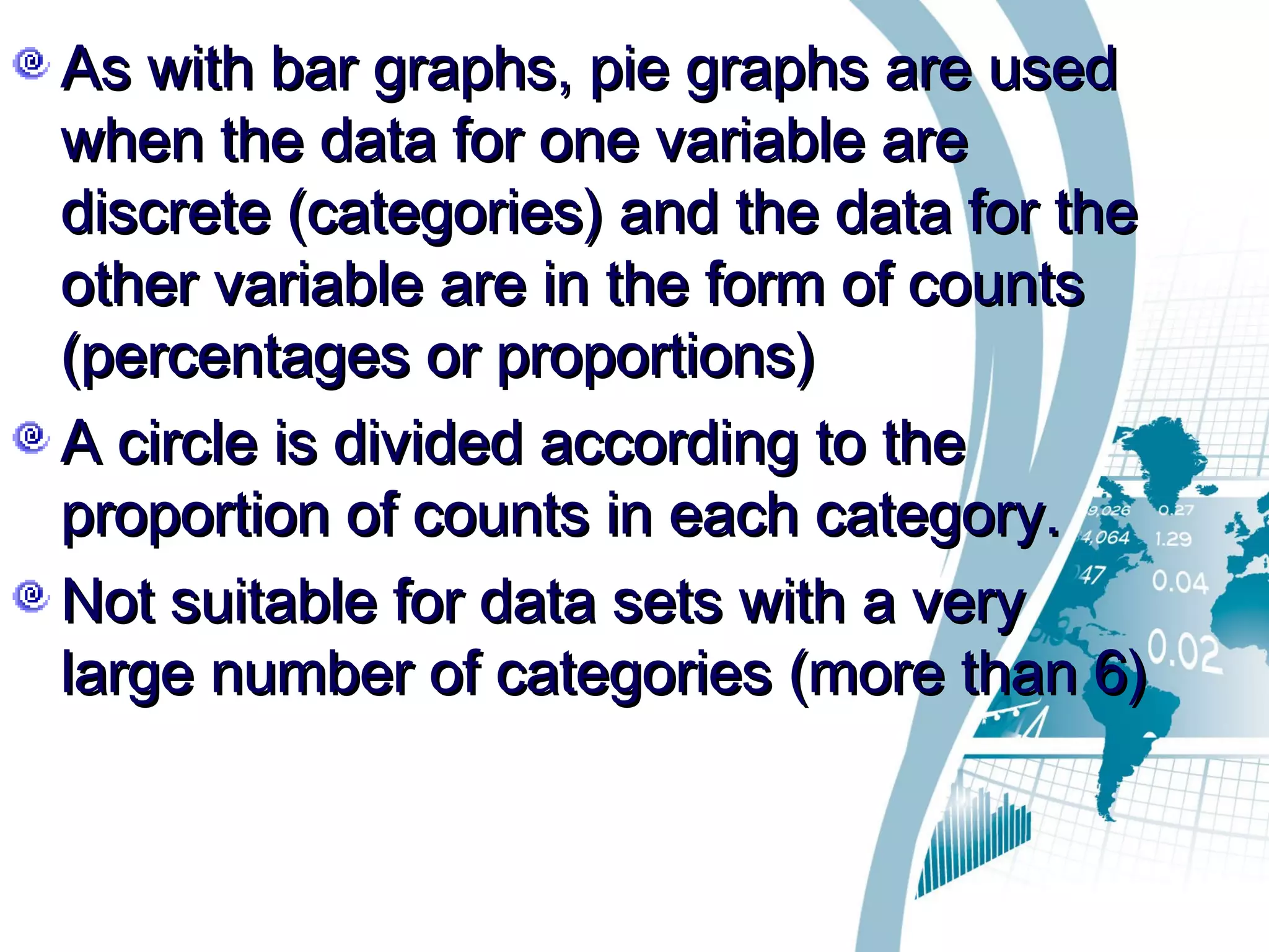
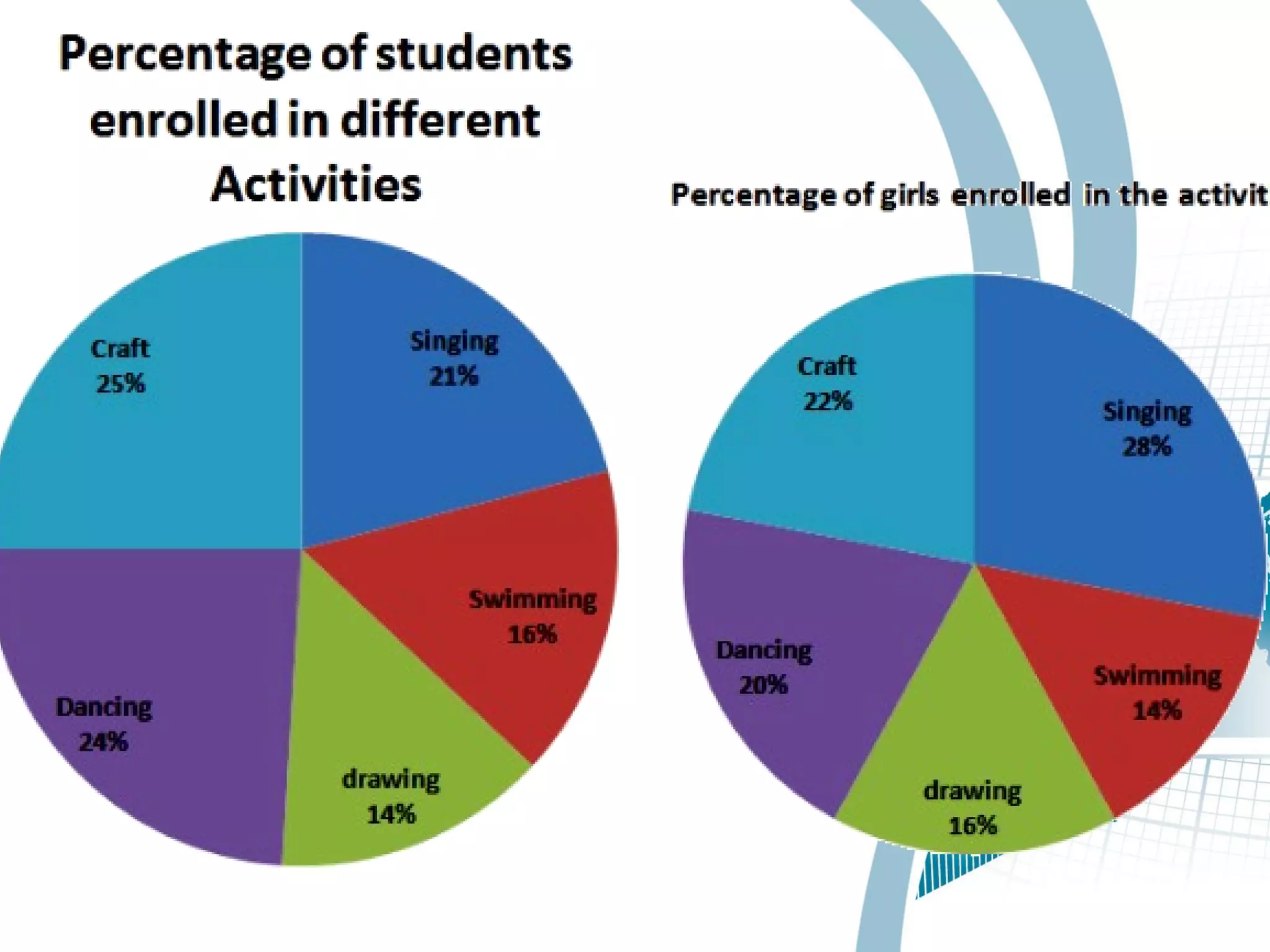
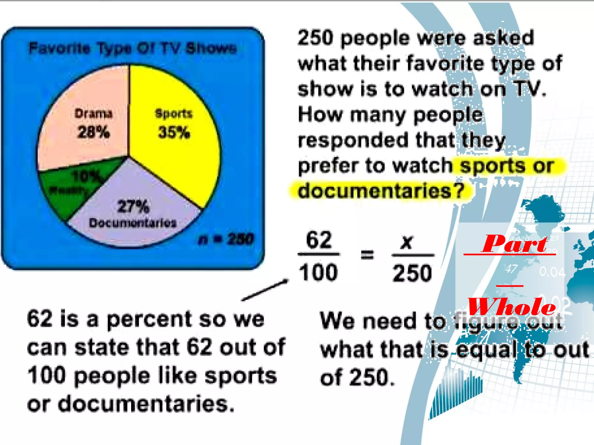
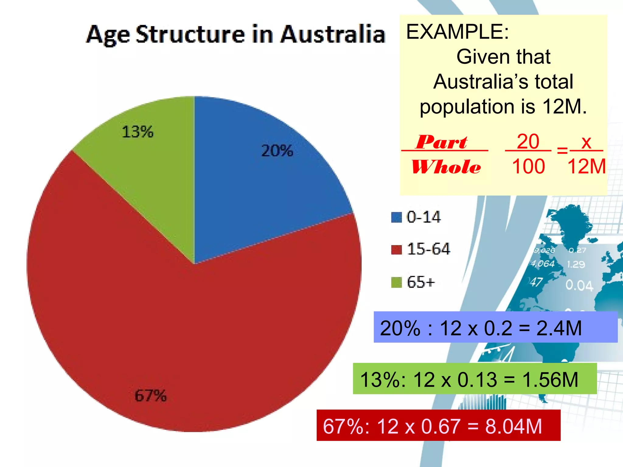
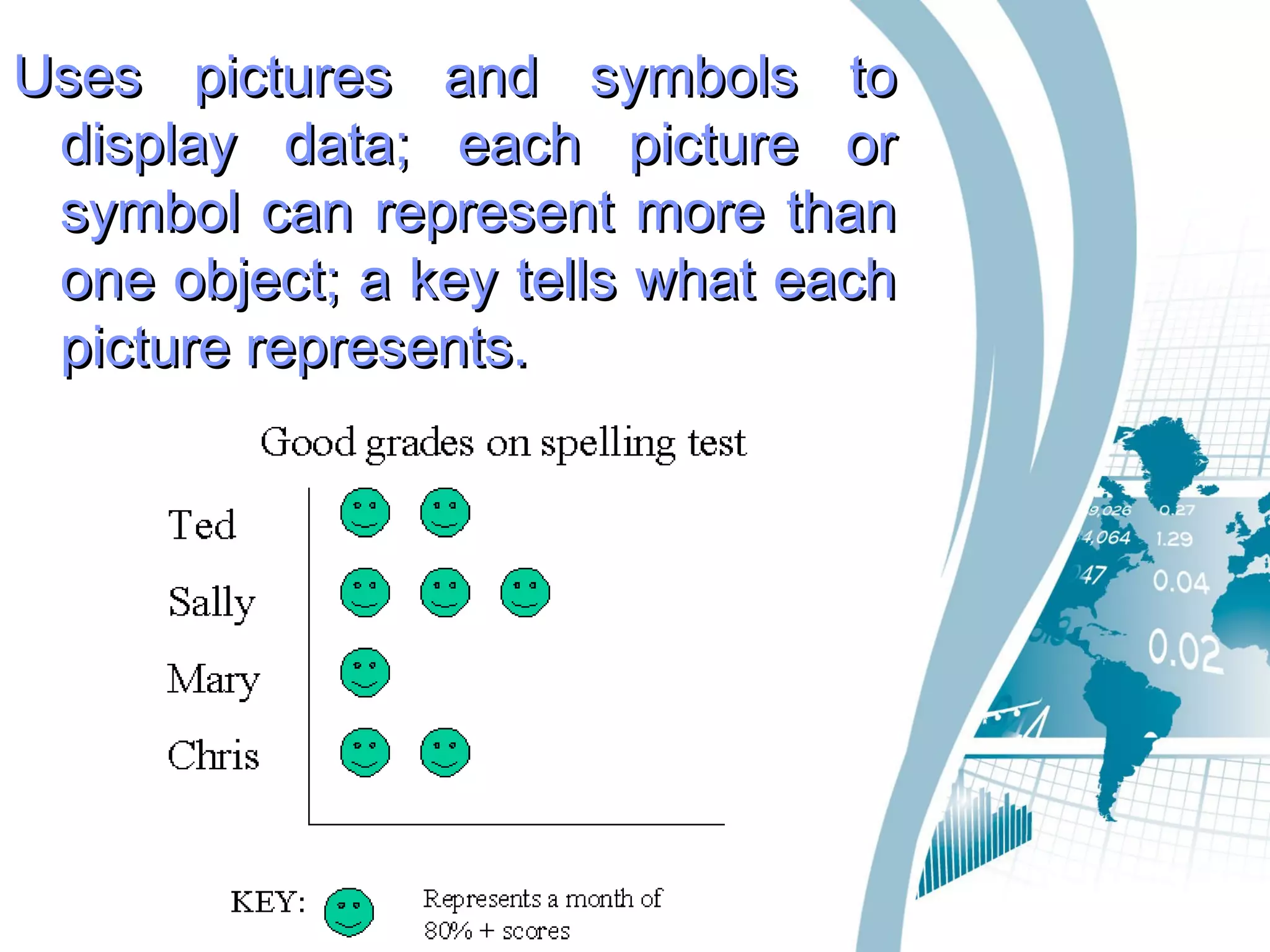
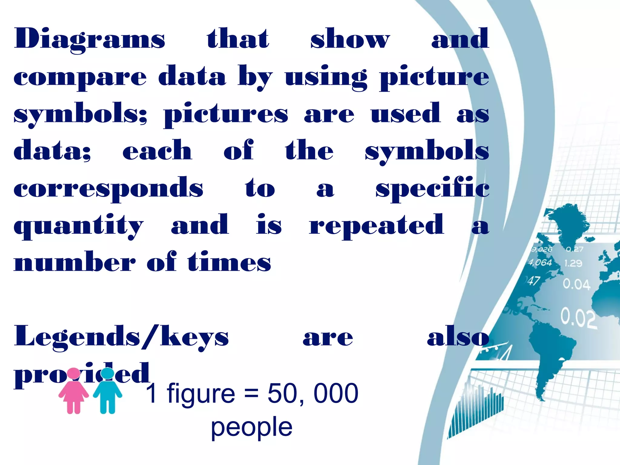
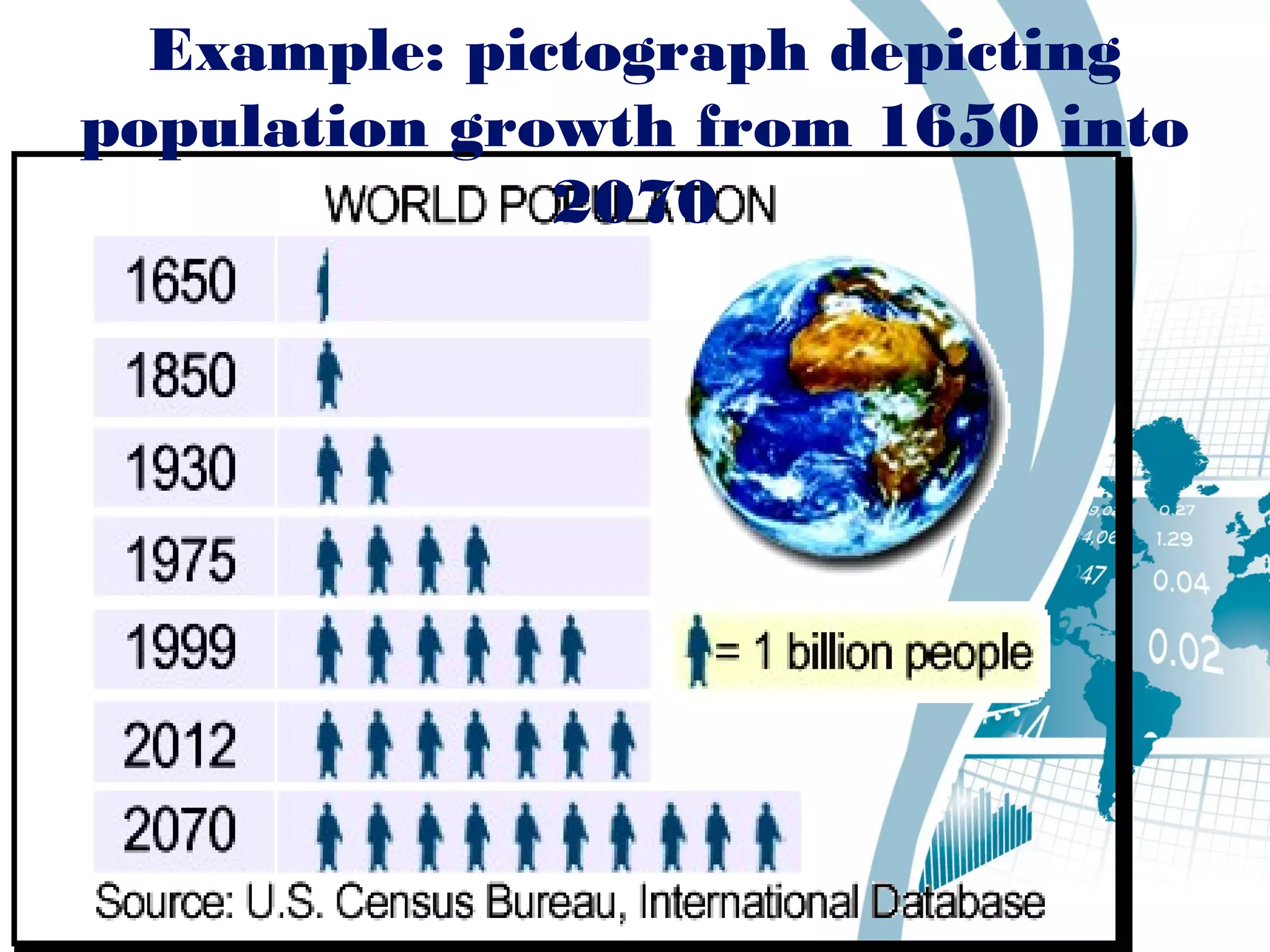
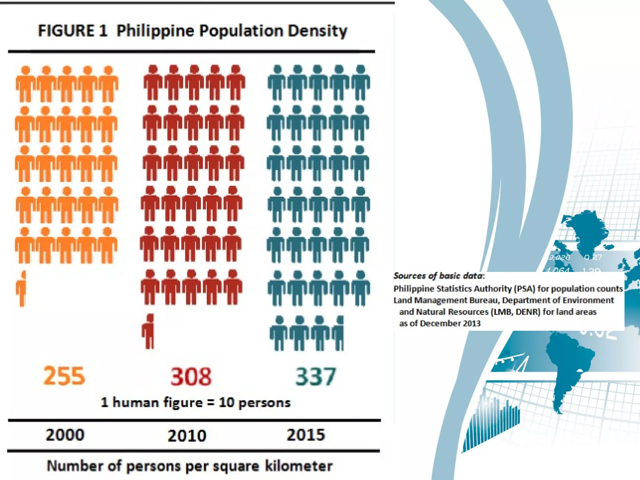
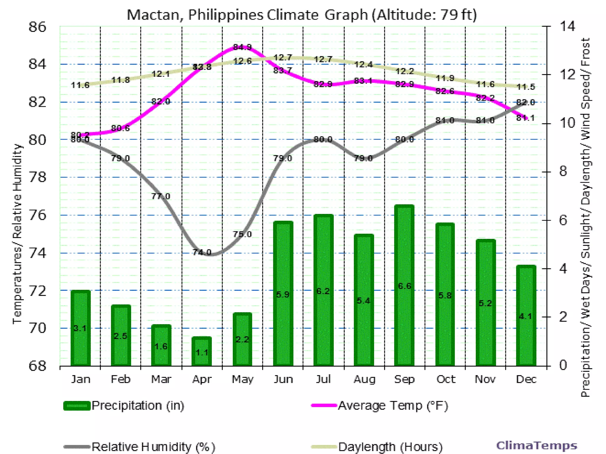
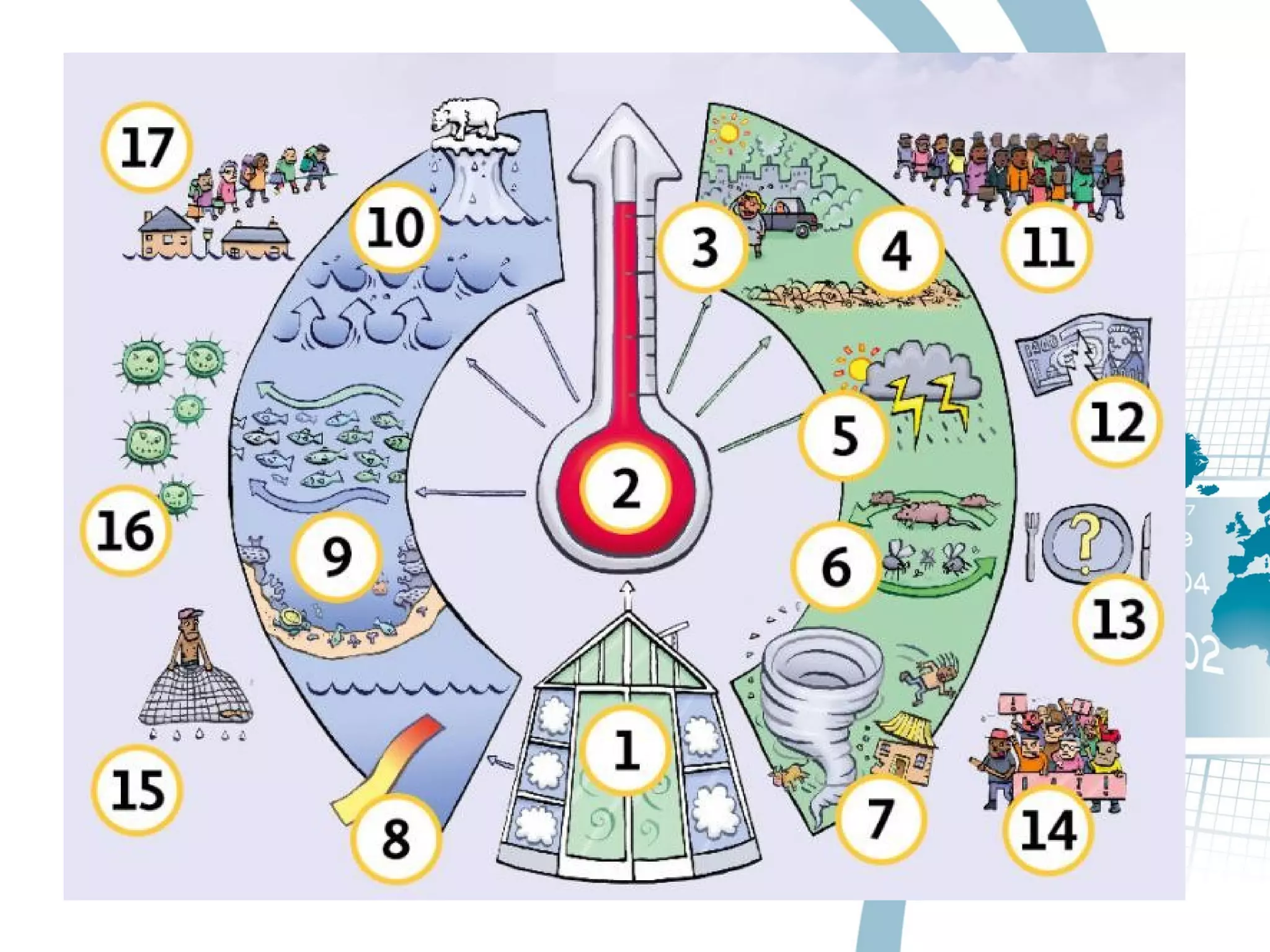
Lesson 3: GraphingLesson 3: Graphing
DIGNOSDIGNOS HerrerHerrerGornezGornez
First stop
Lorie AnnLorie Ann
BAR
GRAP
H
is a chart that uses bars to showis a chart that uses bars to show
comparisons between categoriescomparisons between categories
of data.of data.
the the barsbars can be either horizontal can be either horizontal
or vertical.or vertical.
graphsgraphs with vertical bars are with vertical bars are
sometimes called vertical sometimes called vertical barbar
graphsgraphs..
a a barbar have two axes.have two axes.
TYPES OFTYPES OF
BARBAR
GRAPHGRAPH
HORIZONTAHORIZONTA
LL
VERTICAVERTICA
LL
ComparativeComparative
compoundcompound
LINELINE
GRAPGRAP
HH
is a graphical display of informationis a graphical display of information
that changes continuously over time.that changes continuously over time.
a graph may also be referred to as aa graph may also be referred to as a
line chart.line chart.
a graph can descend and ascenda graph can descend and ascend
based on the data.based on the data.
a graph to compare different events,a graph to compare different events,
situations, and information.situations, and information.
Types ofTypes of
Line GraphLine Graph
Vertical line graphVertical line graph
Parallel lines graphParallel lines graph
Perpendicular linesPerpendicular lines
graphgraph
Skew Lines GraphSkew Lines Graph
Horizontal Line
Graph
Vertical Line GraphVertical Line Graph
Parallel lines graph
Perpendicular lines graph
Skew Lines Graph
Mylene PearlMylene PearlDIGNOSDIGNOS GORNEZGORNEZ HerreraHerrera
Coming next is…
Pie GraphPie Graph
(Circle graph)(Circle graph)
As with bar graphs, pie graphs are usedAs with bar graphs, pie graphs are used
when the data for one variable arewhen the data for one variable are
discrete (categories) and the data for thediscrete (categories) and the data for the
other variable are in the form of countsother variable are in the form of counts
(percentages or proportions)(percentages or proportions)
A circle is divided according to theA circle is divided according to the
proportion of counts in each category.proportion of counts in each category.
Not suitable for data sets with a veryNot suitable for data sets with a very
large number of categories (more than 6)large number of categories (more than 6)
Part
Whole
EXAMPLE:
Given that
Australia’s total
population is 12M.
Part
Whole
20
100
x
12M
=
13%: 12 x 0.13 = 1.56M
20% : 12 x 0.2 = 2.4M
67%: 12 x 0.67 = 8.04M
PictographPictograph
Uses pictures and symbols toUses pictures and symbols to
display data; each picture ordisplay data; each picture or
symbol can represent more thansymbol can represent more than
one object; a key tells what eachone object; a key tells what each
picture represents.picture represents.
Diagrams that show and
compare data by using picture
symbols; pictures are used as
data; each of the symbols
corresponds to a specific
quantity and is repeated a
number of times
Legends/keys are also
provided
1 figure = 50, 000
people
Example: pictograph depicting
population growth from 1650 into
2070
Marry RoseMarry Rose GORNEZGORNEZ HERREHERREDIGNOSDIGNOS
Finally…
ClimographClimograph
AA climographclimograph is ais a
graphical representation ofgraphical representation of
basic climatic parameters,basic climatic parameters,
that is monthly averagethat is monthly average
temperature andtemperature and
precipitation, at a certainprecipitation, at a certain
location. It is used for alocation. It is used for a
quick-view of the climatequick-view of the climate
of a locationof a location
Climate graphsClimate graphs are aare a
combination of a barcombination of a bar
graphgraph and a lineand a line graphgraph..
Temperature is shown on aTemperature is shown on a
lineline graphgraph, with the figures, with the figures
being shown on the rightbeing shown on the right
side of theside of the graphgraph. Rainfall. Rainfall
is shown by a baris shown by a bar graphgraph,,
with the figures beingwith the figures being
shown down the left side ofshown down the left side of
thethe graphgraph..
Climate change brings withClimate change brings with
it an increase init an increase in
malnutrition, mentalmalnutrition, mental
health conditions,health conditions,
infectious disease spreadinfectious disease spread
and even deathand even death
How does ‘climateHow does ‘climate
change’ affect humanchange’ affect human
health?health?
What do you think?What do you think?
Are you ready?Are you ready?

types of graphs (with climograph)

  • 1.
    Lesson 3: GraphingLesson3: Graphing DIGNOSDIGNOS HerrerHerrerGornezGornez First stop Lorie AnnLorie Ann
  • 2.
  • 3.
    is a chart that uses bars toshowis a chart that uses bars to show comparisons between categoriescomparisons between categories of data.of data. the the barsbars can be either horizontal can be either horizontal or vertical.or vertical. graphsgraphs with vertical bars are with vertical bars are sometimes called vertical sometimes called vertical barbar graphsgraphs.. a a barbar have two axes.have two axes.
  • 4.
  • 5.
  • 6.
  • 7.
  • 8.
  • 9.
  • 10.
    is a graphicaldisplay of informationis a graphical display of information that changes continuously over time.that changes continuously over time. a graph may also be referred to as aa graph may also be referred to as a line chart.line chart. a graph can descend and ascenda graph can descend and ascend based on the data.based on the data. a graph to compare different events,a graph to compare different events, situations, and information.situations, and information.
  • 12.
    Types ofTypes of LineGraphLine Graph
  • 13.
    Vertical line graphVerticalline graph Parallel lines graphParallel lines graph Perpendicular linesPerpendicular lines graphgraph Skew Lines GraphSkew Lines Graph
  • 14.
  • 15.
  • 16.
  • 17.
  • 18.
  • 19.
    Mylene PearlMylene PearlDIGNOSDIGNOSGORNEZGORNEZ HerreraHerrera Coming next is…
  • 20.
    Pie GraphPie Graph (Circlegraph)(Circle graph)
  • 21.
    As with bargraphs, pie graphs are usedAs with bar graphs, pie graphs are used when the data for one variable arewhen the data for one variable are discrete (categories) and the data for thediscrete (categories) and the data for the other variable are in the form of countsother variable are in the form of counts (percentages or proportions)(percentages or proportions) A circle is divided according to theA circle is divided according to the proportion of counts in each category.proportion of counts in each category. Not suitable for data sets with a veryNot suitable for data sets with a very large number of categories (more than 6)large number of categories (more than 6)
  • 23.
  • 24.
    EXAMPLE: Given that Australia’s total populationis 12M. Part Whole 20 100 x 12M = 13%: 12 x 0.13 = 1.56M 20% : 12 x 0.2 = 2.4M 67%: 12 x 0.67 = 8.04M
  • 25.
  • 26.
    Uses pictures andsymbols toUses pictures and symbols to display data; each picture ordisplay data; each picture or symbol can represent more thansymbol can represent more than one object; a key tells what eachone object; a key tells what each picture represents.picture represents.
  • 27.
    Diagrams that showand compare data by using picture symbols; pictures are used as data; each of the symbols corresponds to a specific quantity and is repeated a number of times Legends/keys are also provided 1 figure = 50, 000 people
  • 28.
    Example: pictograph depicting populationgrowth from 1650 into 2070
  • 30.
    Marry RoseMarry RoseGORNEZGORNEZ HERREHERREDIGNOSDIGNOS Finally…
  • 31.
  • 33.
    AA climographclimograph isais a graphical representation ofgraphical representation of basic climatic parameters,basic climatic parameters, that is monthly averagethat is monthly average temperature andtemperature and precipitation, at a certainprecipitation, at a certain location. It is used for alocation. It is used for a quick-view of the climatequick-view of the climate of a locationof a location
  • 34.
    Climate graphsClimate graphsare aare a combination of a barcombination of a bar graphgraph and a lineand a line graphgraph.. Temperature is shown on aTemperature is shown on a lineline graphgraph, with the figures, with the figures being shown on the rightbeing shown on the right side of theside of the graphgraph. Rainfall. Rainfall is shown by a baris shown by a bar graphgraph,, with the figures beingwith the figures being shown down the left side ofshown down the left side of thethe graphgraph..
  • 36.
    Climate change bringswithClimate change brings with it an increase init an increase in malnutrition, mentalmalnutrition, mental health conditions,health conditions, infectious disease spreadinfectious disease spread and even deathand even death How does ‘climateHow does ‘climate change’ affect humanchange’ affect human health?health? What do you think?What do you think?
  • 38.