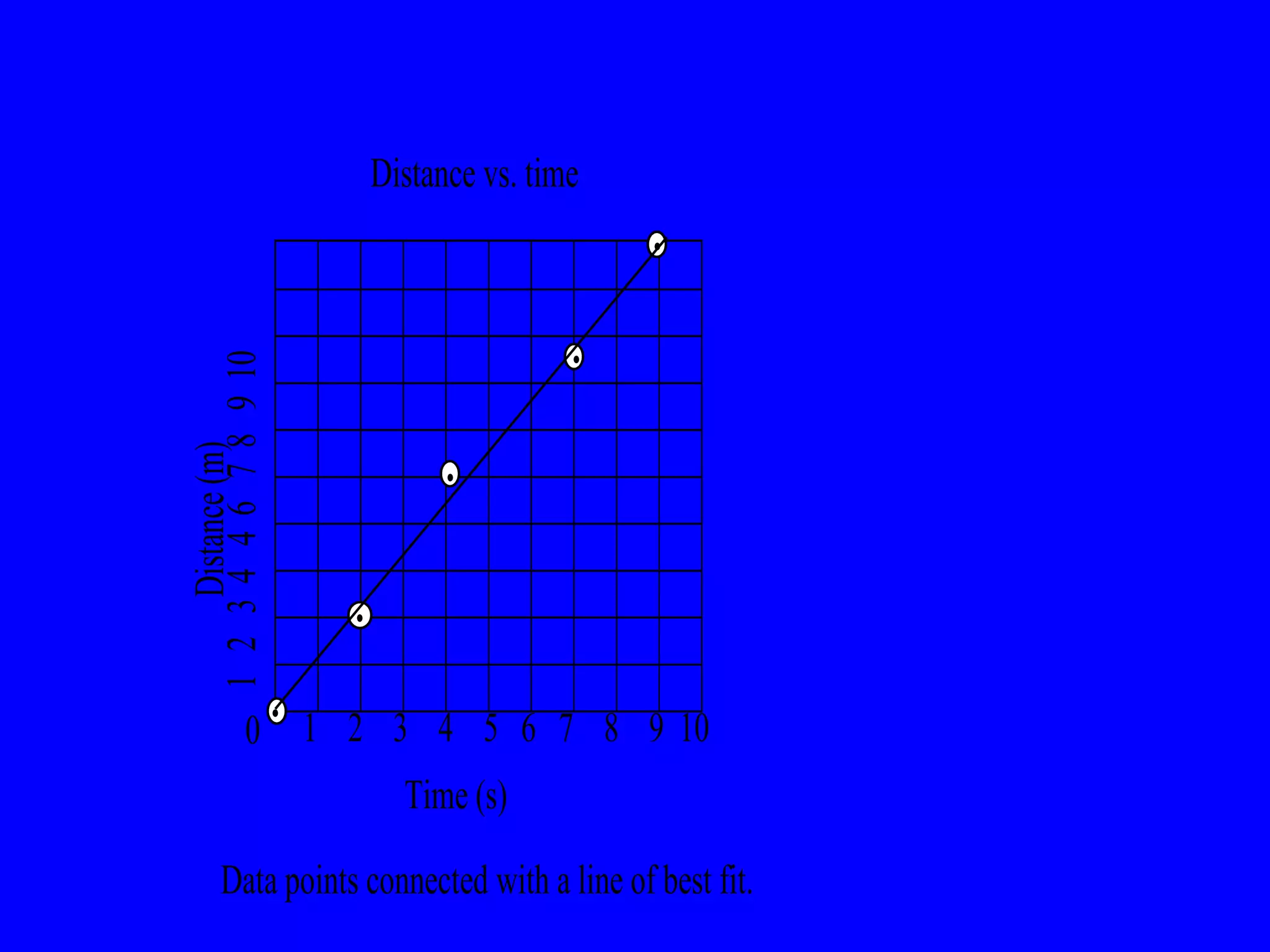
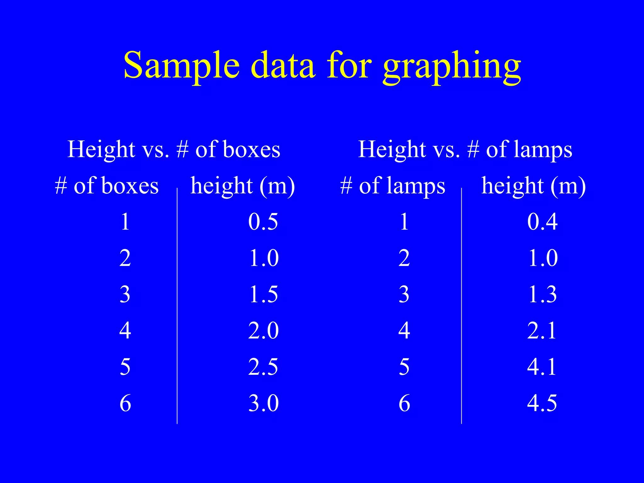
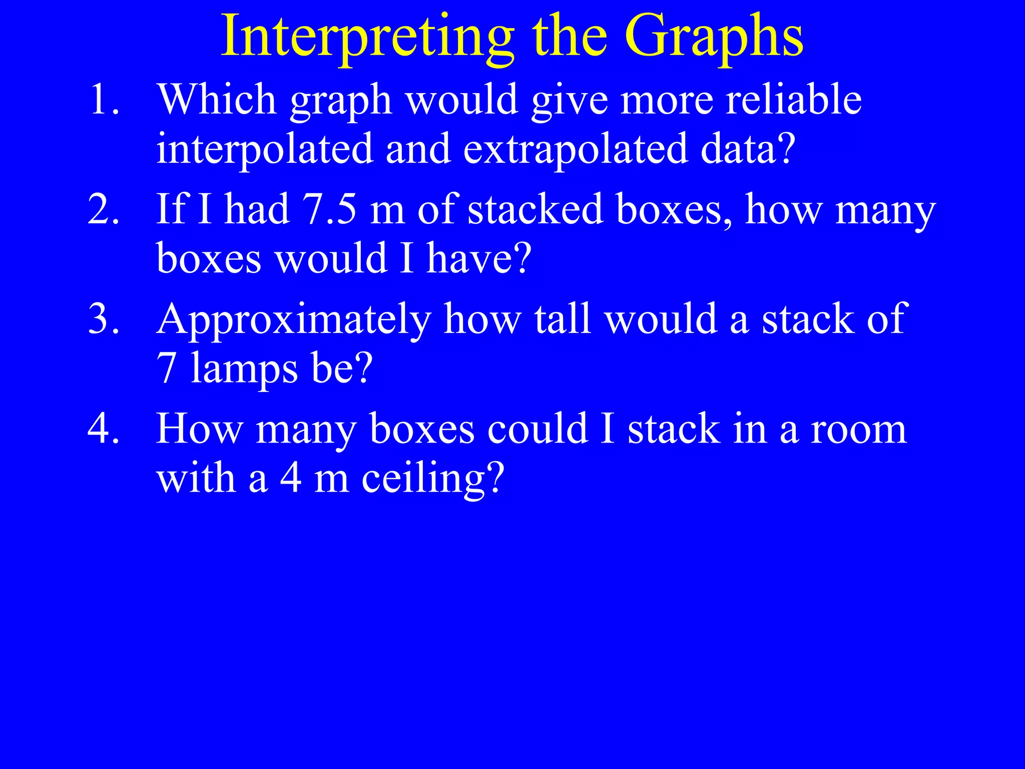
Warm - Up Write the significant figures and convert into scientific notation for each of the following: 54.30 4 sig figs 5.430 x 10 1 0.00230 3 sig figs 2.30 x 10 -3 1000.00 6 sig fig 1.00000 x 10 3
1-7: Presenting Data Organize  and  analyze  data using tables and graphs. Determine  type of graph to use.
Why do we graph data? To show the relationship between the graphed variables. (Without calculations) To gain interpolated and extrapolated data.  “ inter” – in between data points. “ extra” – outside of data points.
Graphing is NOT: Easier – Quitting after data collection is easier than graphing the data! More visual – A data table is also a visual! More organized – A data table is organized, by its very design!
Rules for Graphing Label x and y axes .  Include units. Title your graph.   (y vs. x!) Number axes correctly. Plot data with a fine point Connect data points  - smooth curve or line of best fit.
 
Sample data for graphing Height vs. # of boxes # of boxes  height (m) 1 0.5 2 1.0 3 1.5 4 2.0 5 2.5 6 3.0 Height vs. # of lamps # of lamps   height (m) 1 0.4 2 1.0 3 1.3 4 2.1 5 4.1 6 4.5
Interpreting the Graphs Which graph would give more reliable interpolated and extrapolated data? If I had 7.5 m of stacked boxes, how many boxes would I have? Approximately how tall would a stack of 7 lamps be? How many boxes could I stack in a room with a 4 m ceiling?

1-7 Presenting Data

  • 1.
    Warm - UpWrite the significant figures and convert into scientific notation for each of the following: 54.30 4 sig figs 5.430 x 10 1 0.00230 3 sig figs 2.30 x 10 -3 1000.00 6 sig fig 1.00000 x 10 3
  • 2.
    1-7: Presenting DataOrganize and analyze data using tables and graphs. Determine type of graph to use.
  • 3.
    Why do wegraph data? To show the relationship between the graphed variables. (Without calculations) To gain interpolated and extrapolated data. “ inter” – in between data points. “ extra” – outside of data points.
  • 4.
    Graphing is NOT:Easier – Quitting after data collection is easier than graphing the data! More visual – A data table is also a visual! More organized – A data table is organized, by its very design!
  • 5.
    Rules for GraphingLabel x and y axes . Include units. Title your graph. (y vs. x!) Number axes correctly. Plot data with a fine point Connect data points - smooth curve or line of best fit.
  • 6.
  • 7.
    Sample data forgraphing Height vs. # of boxes # of boxes height (m) 1 0.5 2 1.0 3 1.5 4 2.0 5 2.5 6 3.0 Height vs. # of lamps # of lamps height (m) 1 0.4 2 1.0 3 1.3 4 2.1 5 4.1 6 4.5
  • 8.
    Interpreting the GraphsWhich graph would give more reliable interpolated and extrapolated data? If I had 7.5 m of stacked boxes, how many boxes would I have? Approximately how tall would a stack of 7 lamps be? How many boxes could I stack in a room with a 4 m ceiling?

Editor's Notes

  • #4 Presentation notes