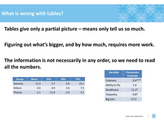
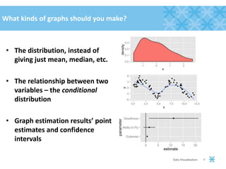
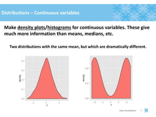
Download to read offline
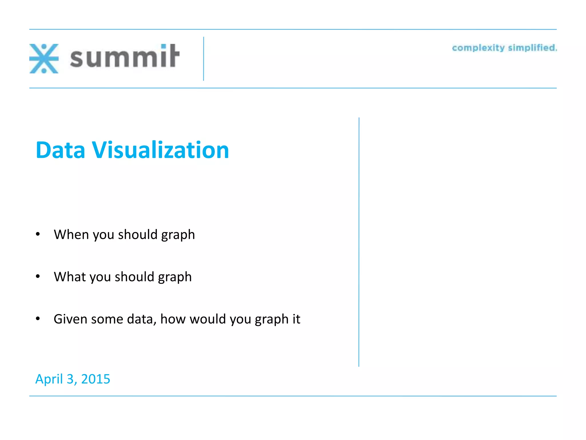
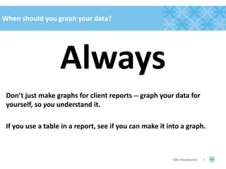
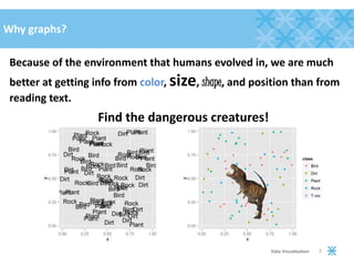
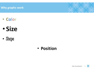
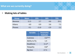

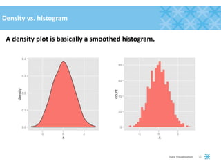
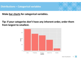
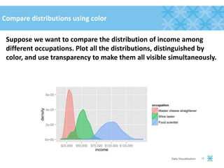
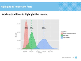

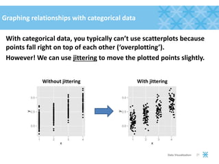
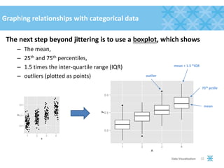
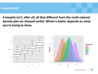
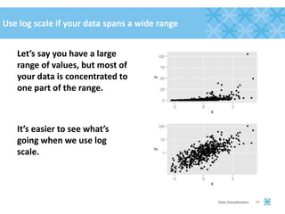
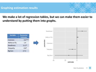
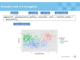
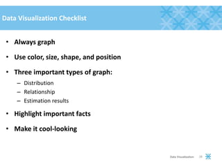

The document discusses the importance of data visualization, advocating for the use of graphs over tables to better understand data through visual means like color, size, and position. It outlines different types of graphs suitable for various data types, such as density plots for continuous variables and bar charts for categorical ones, and emphasizes the need for clear visual representation to highlight important trends and relationships. Additionally, it provides a checklist for effective graphing practices in data analysis.