Download to read offline

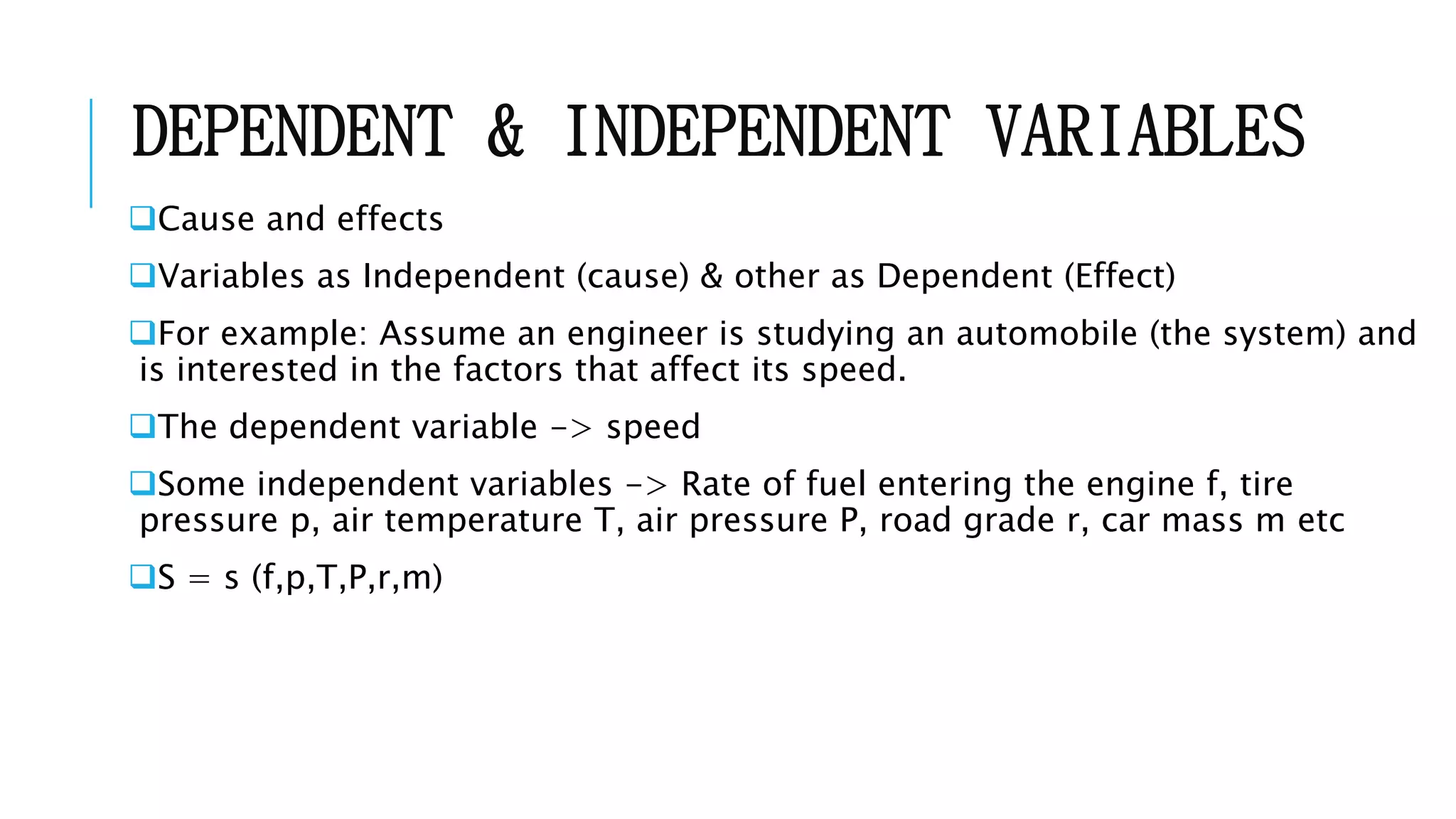
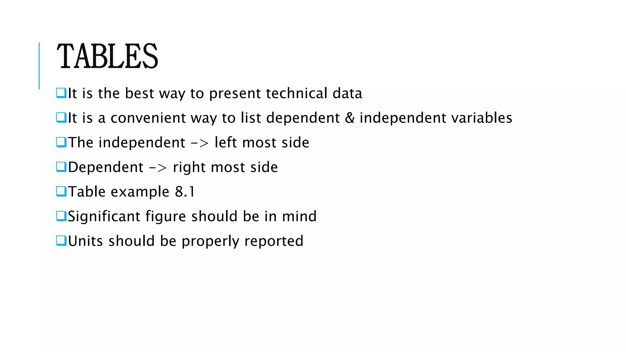
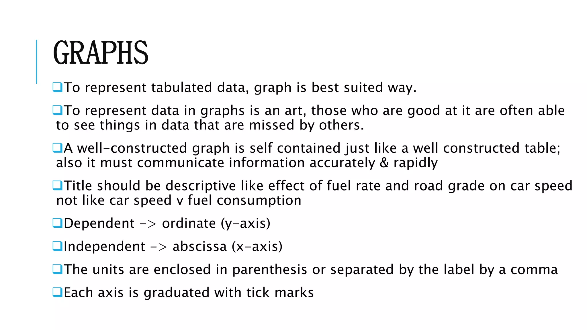
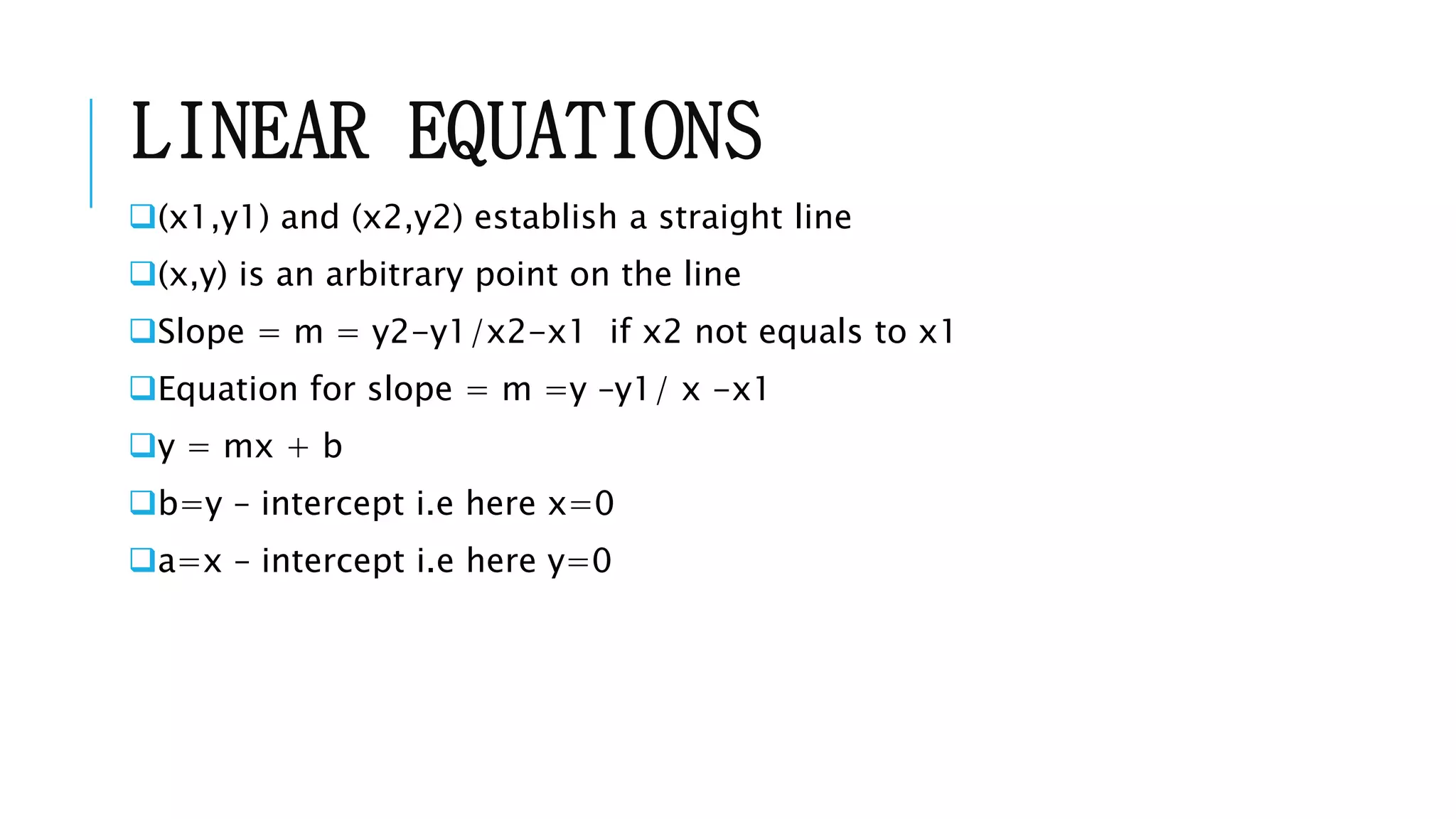

This document discusses tables, graphs, and linear regression analysis in engineering. It covers: 1) Using tables to present technical data with independent variables on the left and dependent variables on the right. 2) Using graphs to represent tabulated data, with the dependent variable on the y-axis and independent on the x-axis. 3) Performing linear regression analysis to determine the linear equation that best fits a set of data points by minimizing the residuals.