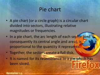
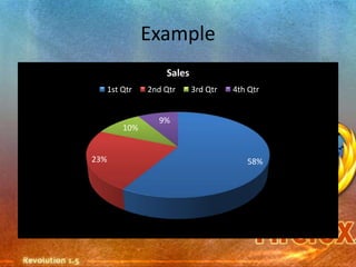
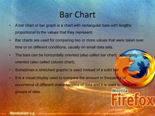
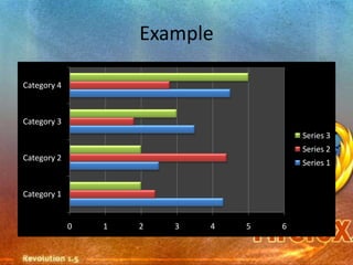
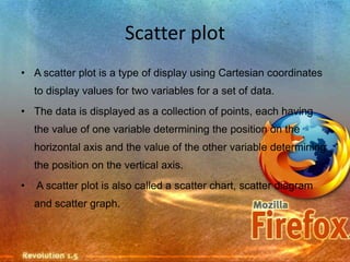
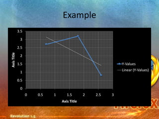
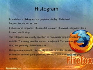
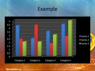
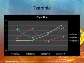
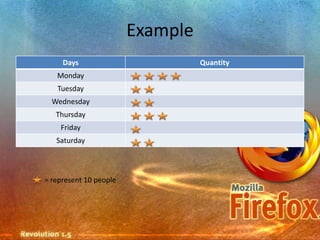
Basic Mathematics


Mohd Aidil Bin Othman
Pie chart
• A pie chart (or a circle graph) is a circular chart
  divided into sectors, illustrating relative
  magnitudes or frequencies.
• In a pie chart, the arc length of each sector (and
  consequently its central angle and area), is
  proportional to the quantity it represents.
• Together, the sectors create a full disk.
• It is named for its resemblance to a pie which has
  been sliced.
Example
                    Sales
      1st Qtr   2nd Qtr     3rd Qtr   4th Qtr


                  9%
          10%


23%                                      58%
Bar Chart
•   A bar chart or bar graph is a chart with rectangular bars with lengths
    proportional to the values that they represent.

•   Bar charts are used for comparing two or more values that were taken over
    time or on different conditions, usually on small data sets.

•   The bars can be horizontally oriented (also called bar chart) or vertically
    oriented (also called column chart).

•   Sometimes a stretched graphic is used instead of a solid bar.

•   It is a visual display used to compare the amount or frequency of
    occurrence of different characteristics of data and it is used to compare
    groups of data.
Example

Category 4


Category 3
                                         Series 3
                                         Series 2
Category 2
                                         Series 1


Category 1


             0   1   2   3   4   5   6
Scatter plot
• A scatter plot is a type of display using Cartesian coordinates
    to display values for two variables for a set of data.
• The data is displayed as a collection of points, each having
    the value of one variable determining the position on the
    horizontal axis and the value of the other variable determining
    the position on the vertical axis.
•   A scatter plot is also called a scatter chart, scatter diagram
    and scatter graph.
Example
             3.5

              3

             2.5
Axis Title


              2

             1.5                                            Y-Values
                                                            Linear (Y-Values)
              1

             0.5

              0
                   0   0.5   1      1.5       2   2.5   3
                                 Axis Title
Histogram
•   In statistics, a histogram is a graphical display of tabulated
    frequencies, shown as bars.

•   It shows what proportion of cases fall into each of several categories: it is a
    form of data binning.

•   The categories are usually specified as non-overlapping intervals of some
    variable. The categories (bars) must be adjacent. The intervals (or bands, or
    bins) are generally of the same size.

•   Histograms are used to plot density of data, and often for density
    estimation: estimating the probability density function of the underlying
    variable.
• The total area of a histogram always equals 1. If the
  length of the intervals on the x-axis are all 1, then a
  histogram is identical to a relative frequency plot.
• An alternative to the histogram is kernel density
  estimation, which uses a kernel to smooth samples.
• This will construct a smooth probability density
  function, which will in general more accurately reflect
  the underlying variable
Example
  5
4.5
  4
3.5
  3                                                       Series 1
2.5                                                       Series 2
  2                                                       Series 3
1.5
  1
0.5
  0
      Category 1   Category 2   Category 3   Category 4
Line Graph
• In a graph theory, the line graph of an
  undirected graph is another graph that
  represents the adjacencies between it edges.
• The line graph is also sometimes called the
  edge graph, the adjoin graph, the interchange
  graph, or the derived graph.
Example
                              Chart Title
6

5                                                    5
          4.3          4.4                           4.5
4
                                        3.5
                                                            Series 1
3                                       3            2.8    Series 2
          2.4          2.5
2         2            2                                    Series 3
                                        1.8
1

0
    Category 1   Category 2       Category 3   Category 4
Pictogram
• A Pictograph (also called pictogram or pictograms) is
  an ideogram that conveys its meaning through its
  pictorial resemblance to a physical object.
• Earliest examples of pictographs include ancient or
  prehistoric drawings or paintings found on rock walls.
• Pictographs are also used in writing and graphic
  systems in which the characters are to considerable
  extent pictorial in appearance.
• Pictographs can also take the form of
 diagrams to represent statistical data by
 pictorial forms, and can be varied in
 color, size, or number to indicate change
Example
     Days                         Quantity
   Monday
   Tuesday
  Wednesday
   Thursday
    Friday
   Saturday


= represent 10 people
Basic mathematics

Basic mathematics

  • 1.
  • 2.
    Pie chart • Apie chart (or a circle graph) is a circular chart divided into sectors, illustrating relative magnitudes or frequencies. • In a pie chart, the arc length of each sector (and consequently its central angle and area), is proportional to the quantity it represents. • Together, the sectors create a full disk. • It is named for its resemblance to a pie which has been sliced.
  • 3.
    Example Sales 1st Qtr 2nd Qtr 3rd Qtr 4th Qtr 9% 10% 23% 58%
  • 4.
    Bar Chart • A bar chart or bar graph is a chart with rectangular bars with lengths proportional to the values that they represent. • Bar charts are used for comparing two or more values that were taken over time or on different conditions, usually on small data sets. • The bars can be horizontally oriented (also called bar chart) or vertically oriented (also called column chart). • Sometimes a stretched graphic is used instead of a solid bar. • It is a visual display used to compare the amount or frequency of occurrence of different characteristics of data and it is used to compare groups of data.
  • 5.
    Example Category 4 Category 3 Series 3 Series 2 Category 2 Series 1 Category 1 0 1 2 3 4 5 6
  • 6.
    Scatter plot • Ascatter plot is a type of display using Cartesian coordinates to display values for two variables for a set of data. • The data is displayed as a collection of points, each having the value of one variable determining the position on the horizontal axis and the value of the other variable determining the position on the vertical axis. • A scatter plot is also called a scatter chart, scatter diagram and scatter graph.
  • 7.
    Example 3.5 3 2.5 Axis Title 2 1.5 Y-Values Linear (Y-Values) 1 0.5 0 0 0.5 1 1.5 2 2.5 3 Axis Title
  • 8.
    Histogram • In statistics, a histogram is a graphical display of tabulated frequencies, shown as bars. • It shows what proportion of cases fall into each of several categories: it is a form of data binning. • The categories are usually specified as non-overlapping intervals of some variable. The categories (bars) must be adjacent. The intervals (or bands, or bins) are generally of the same size. • Histograms are used to plot density of data, and often for density estimation: estimating the probability density function of the underlying variable.
  • 9.
    • The totalarea of a histogram always equals 1. If the length of the intervals on the x-axis are all 1, then a histogram is identical to a relative frequency plot. • An alternative to the histogram is kernel density estimation, which uses a kernel to smooth samples. • This will construct a smooth probability density function, which will in general more accurately reflect the underlying variable
  • 10.
    Example 5 4.5 4 3.5 3 Series 1 2.5 Series 2 2 Series 3 1.5 1 0.5 0 Category 1 Category 2 Category 3 Category 4
  • 11.
    Line Graph • Ina graph theory, the line graph of an undirected graph is another graph that represents the adjacencies between it edges. • The line graph is also sometimes called the edge graph, the adjoin graph, the interchange graph, or the derived graph.
  • 12.
    Example Chart Title 6 5 5 4.3 4.4 4.5 4 3.5 Series 1 3 3 2.8 Series 2 2.4 2.5 2 2 2 Series 3 1.8 1 0 Category 1 Category 2 Category 3 Category 4
  • 13.
    Pictogram • A Pictograph(also called pictogram or pictograms) is an ideogram that conveys its meaning through its pictorial resemblance to a physical object. • Earliest examples of pictographs include ancient or prehistoric drawings or paintings found on rock walls. • Pictographs are also used in writing and graphic systems in which the characters are to considerable extent pictorial in appearance.
  • 14.
    • Pictographs canalso take the form of diagrams to represent statistical data by pictorial forms, and can be varied in color, size, or number to indicate change
  • 15.
    Example Days Quantity Monday Tuesday Wednesday Thursday Friday Saturday = represent 10 people