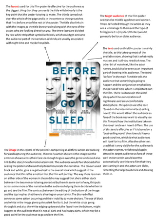
1. The layout used for this film poster is effective for the audience as
the biggest thing that they can see is the title which clearly is the
key point that the poster is trying to make. The title is spread out
over the whole of the page and is in the centre so the eye catches
that first before any of the rest of the poster. The title also links in
with the images as the title draws you in along with the eyes of the
actors who are looking directly at you. The three faces are divided
by two white strips that symbolize blinds, which could get across to
the audience part of the narrative as blinds are usually associated
with night time and maybe hospitals.
The target audience of this film poster
seems to be middle aged men and women.
This is reflected through the actors as they
are a similar age to them and the type of
film/genre it is (mystery/thriller) would
generally be for an older audience.
The text used on this film poster is mainly
the title, as this takes up most of the
available room, showing that is what really
matters and is all you need to know. The
other bit of main text, like the actor
names, could also be seen as an important
part of drawing in its audience. The word
‘before’ in the main film title tells the
audience that something is going to
happen and the conjunction emphasises
the period of time which is important part
the film. There is a focus on the word
sleep which has connotations of
nightmares and an uncomfortable
atmosphere. This poster uses the text
‘Based on the international best-selling
novel’, this would attract the audience as
fans of the book may want to visually see
this film and how the institutions take on
the novel and even how it differs. The use
of this text is effective as if it is based on a
‘best-selling novel’ then it would have a
good storyline, which is what audiences
will look for in a film. Also the other text
used that is very visible for the audience is
the actors names, which would again
attract its target audience as fans of these
well known actors would want to
automatically see this new film that they
are starring in and the actors are older,
reflecting the target audience and drawing
them in.
The image in the centre of the poster is compelling as all three actors are looking
forward capturing the audience. There is no action shown in the image but the
emotion shown across their faces is enough to give away the genre and could also
link to the story line of emotional content. The audience would feel shocked after
seeing the poster and would help to communicate the narrative. The colours used,
black and white, give a negative feel to the overall look which suggest to the
audience that this is the emotion that the film will portray. The way there is a man
on either side of the woman in the middle may suggest that she is either stuck
between the two men or is being protected by them in some sort of way, this puts
across some more of the narrative to the audience helping them decide whether to
go and see the film. The contrast between the editing of the bottom of the image
and the top implies that there is a feeling on uncertainty. The blurred effect
connotes some action occurring and their inability to make choices. The use of black
and white in the image gives quite a dark feel to it, but the white strips going
through it and also the white edging up towards the faces from the bottom, might
suggest to the audience that it is not all dark and has happy parts, which may be a
good point for the audience to go and see the film.