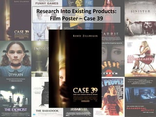
2. Main image – The image that has
been used in this poster is very
minimal, concealing the identity of
the character. What is reveled about
the character is that she is blonde and
has blue eyes; something that people
traditional associate with beauty. The
object, which is possibly a door, is
concealing the other half of the
characters face and is completely
black. This could suggest that the
character is discovering what it behind
the object, or that she is creating a
barrier between her self and the
darkness. A yellow glow is overlaid on
top of the part of the image that
features the character; this suggests
that she is innocent, as the light can
be seen as a protective one which is
guiding her through the once
concealed darkness. It is difficult to
distinguish anything identifiable about
this character, and again the poster
can be linked to Barthes Hermeneutic
code as the audience want to know
what she is hiding/what she is hiding
from, and what her role in the film is.
Release date – The release date of the
remains unknown, perhaps suggesting that
this was one of the initial posters that was
revealed to advertise the film and begin to
create a hype around it. The font colour is
similar to that of the actresses name, the
title and also the tagline to show
consistency and establish the products
identity.
Actress name – Including the actresses name on the top proportion of the trailer means that audiences are immediately able to identify if
this will be a film they may be interested in. For example, Renée Zellweger was in Bridget Jones’ Diary (2001) and independent horror film
Texas Chainsaw Massacre: The Next Generation (1994) amongst others.
Title – The title font of this film is split in
two halves; the bottom half is normal with
slight slits in, where as the upper half is the
same yellow glow as that of the image. The
mirroring of the image and title text is very
effective as it looks consistant and adds to
the mysterious tone. Furthermore, the
blurriness of the top half of the font could
be indicative of confusion, a lack of clarity
and also uncertainty; all of these are things
the image also connotes.
Tagline – This tagline is placed underneath
the film title to suggest that the two are
linked together. The statement ‘some cases
should never be opened’ is a direct
reference to the title of the film, and also
the theme of concealment as the adverb
‘never’ highlights the foreboding danger
that the character will place herself in
during the film.
Production credit – The production credit is once again placed at the bottom of the film
poster. The title of the film and the tag line are placed above the credit block, connoting
they are of more importance due to their size, placement and colour. Comparably, the
release date is placed below.