1. Film Poster Analysis - Woman in Black
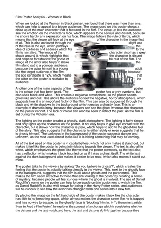
When we looked at the Woman in Black poster, we found that there was more than one,
which can help to appeal to a bigger audience. The image used on this poster shows a
close up of the main character that is featured in the film. The close up lets the audience
see the emotion on the character’s face, which appears to be serious and distant, because
he shows hardly any expression on his face. The image follows the rule of thirds, which
means that the viewer will look at the eye of the character in the image first
of all. This is also achieved through the slight use
of the blue in the eye, which portrays the
idea of coldness and sadness which fits to the
film’s narrative. The image of the character also has a grey
shade around it, which highlights that the character is distant
and helps to foreshadow the ghost int he rest of the film. The
image of the actor also helps to make the
film stand out to a younger audience,
because the actor himself is a young adult
like the target audience of the film, because
the age certificate is 12A, which means that
the actor on the poster is relatable to the
audience.
Another one of the main aspects of the poster
is the colour that has been used. The poster has a grey overtone, but
also uses black and white. This creates a negative atmosphere, so the poster seems
ghost-like and dull. This allows the audience to feel the negative, horror atmosphere, which
suggests how it is an important factor of the film. This can also be suggested through the
black and white shadows in the background which creates a ghostly face. This is an
example of dramatic irony, because the viewers can see the ghost whereas the character
on the poster cannot. The lack of colour can also be seen to reflect the past, as the film is
set during the Victorian era.
The lighting on the poster creates a ghostly, dark atmosphere. The lighting is fairly simple
and only lights up the character on the poster. It not only helps to give eye contact with the
character, but it shows how the character is pale, which helps to add to the ghost-like feel
of the story. This also suggests that the character is either sickly or even suggests that he
is ghosty himself. The darkness in the background of the poster suggests danger and
unknown, as the mist used almost looks like it is hiding something that may be coming.
All of the text used on the poster is in capital letters, which not only makes it stand out, but
makes it feel like the poster is being intimidating towards the viewer. The text is also all in
white, which emphasizes the ghost-like theme that the poster connotes, as the text also
has a reflection which makes it look haunted or as if it was a ghost itself. The white text
against the dark background also makes it easier to be read, which also makes it stand out
more.
The poster talks to the viewers by asking “Do you believe in ghosts?”, which creates the
feeling that the poster is actually talking directly to the viewer. This, next to the ghostly face
in the background, suggests that the film is all about ghosts and the paranormal. This
makes the film seem attractive to those that are looking at the poster by creating a sense
of mystery, because people will feel curious where the ghost is involved. The use of Daniel
Radcliffe’s name on the poster can help to persuade certain customers to watch the film,
as Daniel Radcliffe is also well known for being in the Harry Potter series, and audiences
will be curious to see how the actor has changed from one series into a new film.
By placing the image on the left hand side of the poster makes it look like the character
has little to no breathing space, which almost makes the character seem like he is trapped
and has no way to escape, as the ghostly face is ‘blocking’ him in. In To Brownlee’s article
‘How to Read a Film Poster’, he explores the concept of anchorage which is considering whether
the pictures and the text match, and here, the text and pictures do link together because they
2. both have a ghostly feel to them but even from analysing the image and the text separately this
supernatural atmosphere is also created especially from the colour and from the lighting.
After looking at this poster, we have seen how affective the use of little colour is, as this helps to
connote the horror genre. This means that we will have to consider the colour carefully when
creating our poster because it will be a large part of the poster. Another thing we need to consider
is the camera shot used in the image, because they can help to suggest the feelings or overall
mood of the character shown on the poster. This cover has influenced us to consider how we
consider how we arrange the elements that we put on our poster, as this has shown how we send
a message to our viewers.