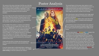
1. Poster Analysis
The names of the actors starring in this film are at the top
of the poster which will help gain the movie popularity as
their fan bases will be interested in watching it. It also
shows that because their fans know that they’re good
actors/actresses the quality of the film would be
excellent.
The main image has the actors layered upon one another
which tells us that the director is trying to show us the
main characters in this movie and also what the movie
will be about. It looks like an x-men movie because all of
the characters from the franchise are in it.
In the middle of the poster is a woman surrounded by
fire. The colours are very bright which helps make the
main image stand out even more then it already does.
It makes the audience look at the middle first before
following on and looking at the title to see what the
movie is called. It is very effective because it’s not bland
and it does capture our attention. It also tells the
audience that there is a possibility of the women having a
superpower involved with the element fire, enticing the
audience even more.
Underneath the title it includes who the artwork was
done by, usually the directors name would be there
instead.
It has the release date in white block letters, making sure
that the audience knows when it will release. It’s in block
white writing, so that the audience can notice it
The overall layout of this poster does capture a lot of
codes and conventions of a action/adventure movie. It’s
bright and the actors are stood and positioned in a
powerful way. The posters main focus seems to be the
main image as they don’t include a lot of writing.
Also, the directors may be letting the main image speak
for itself, instead of placing an unnecessary amount of
words on the poster.
The movie title is a gold/silver colour and it also looks
like its glowing. Maybe it’s scolding metal heating up
because of the fire.
In the bottom corners it has what looks to be sparks of
fire so it could be the directors trying to make it all link
and match up with the fire ignited in the middle of the
poster.
There are two colours, red/orange and blue, being in the
background. This could be showing codes and
conventions of an action/adventure film as it may be
about good vs evil? Light vs dark? The superhero’s are
going up against a dark force and maybe the women on
the left is evil and the women on the right is good. This
can be interpreted from this poster because of the way
the two women are being presented. The women on the
left has a more cold, stern look and it looks like she is the
brains behind the evil plan. Whereas the women on the
rights posture makes her seem heroic, her fiery red hair
blending in with the background behind her.
2. At the top of the poster, it includes the directors name
along with the other movies he had written and worked
on. His name is in a larger font in comparison to the rest
of the text with it and this is because his fans will then
watch the movie as all of his other films have been
successful.
It also includes the words “award winner” this is
important because it tells people that are not familiar
with his work that its worth watching and that the films
quality will be good too.
The main image of this movie includes the main actors
and it also gives us a short insight on what the movie
might be like. The masked people in the bottom left
corner wearing red jumpsuits, builds up curiosity as it
makes the audience wonder what's going to happen.
Also, because this is an American movie, the red
jumpsuits could also link to how in America prisoners
wear orange jumpsuits and so they may be prisoners too.
The release date is at the bottom of the page in white
and in a simple font. Telling the audience when it will
come out so that they can watch it, clearly it’s in the
same year otherwise it would have included the year
next to the date and month.
This is all representing the thriller genre very well. It is
showing the correct codes and conventions similar
thriller movies would include in the poster too.
From the top of the actresses head it slowly fades into a
red/black colour at the top of the poster. Including a
mask that is on top of the boys head. This builds in to the
codes and conventions of a thriller movie as it creates
suspense and drama, wanting to know why it is there.
The movie title is the biggest text on the page and it is
in a simple format, in the colour white. Even though it’s
simple it is very effective and it allows us to pay more
attention to the main image too.
The film poster is showing different codes and
conventions of a thriller film. The facial expressions on
the actors faces is a look of shock, they appear scared.
Creating some suspense and making the audience want
to know why they are presenting this way on the poster.
The tagline “We are our worst enemies” gives the
audience an insight to the movie. This is a very strong
and deep message being shown to the audience. It’s
almost as if they’re trying to get the audience to question
everything mentally.
They also layer the pictures together, the unknown
masked people and the terrified actors. This is so that it
shows the audience that the people are scared of
something and the picture layered beneath it is what the
people are probably terrified of.
Poster Analysis
3. At the top of the poster, it has the name of the
director Paul Feig and writer Emma
Thompson. It includes another successful movie
Paul Feig has worked on like ‘Bridesmaids’. Their
names and the word ‘Bridesmaids’ are in a bold
white colour so that they can attract fans who are
familiar with their work and those who loved the
movie ‘Bridesmaids’ because they would naturally
assume that it would be just as good.
Just below it, the main actors and actresses' names
are mentioned which will help the movie gain more
viewers as the public may be familiar with their
work and want to watch it because of that.
It includes the music producers too, “George
Michael and Wham!” so that it also reaches out to a
different type of audience, people who don’t watch
many movies, but LOVE music could be interested in
watching the movie because of them.
Instead of having a traditional billing block at the
bottom of the poster instead it just includes who
the story is by, the director and who oversaw the
screenplay. Showing the more important and
perhaps the most famous names involved in the
movie.
The release date November the 15th also plays into
this very well because it is coming out near
Christmas. So, everything would be very festive, and
it would fit in with the season and themes.
The colours of the background are a mixture of dark
blue, light blue and white. Seeing as this is a
Christmas themed Romcom it is definitely including
codes and conventions we would expect to see for
this type of movie. The colours are making it appear
as if it was snowing, fitting in with the Christmas
spirit.
The tagline “sometimes you’ve just gotta have faith”
could have multiple meanings. It could be related to
Christmas and how instead of being a Grinch you
should have more faith, getting in the Christmas
spirit. Or how you should have more faith and trust
in people.
The main image includes the two main
actors/actresses, and you can tell by their body
language that they like each other. The man is
looking at the women happily and in a loving way.
The woman is smiling and looking away, its as if
they’re having a conversation that they’re both
enjoying. They’re both sat closely to one another,
and it looks like they are very comfortable with each
other.
The movie title ‘Last Christmas’ is the largest text on
the poster, telling the audience what the movie is
called. Matching in with the codes of conventions a
Romcom typically has the ‘I’ has a pink love heart
for the dot. This is showing the audience that it is a
Romcom.
Poster Analysis
4. This movie poster is beautifully well done as it
presents what the story is about and does have an
accurate illustration, representing the story. The
layout of the movie will help attract fans because as
the movie title is right in the middle and it’s the
biggest text on the poster, it will immediately
capture their attention. The movie titles font looks
like its cursive, and it fits in with the typical fancy
Disney princess theme.
Surrounding the title includes pictures of the cast
and above two characters, Beauty and the Beast,
who’s images are larger than the others as they are
the main characters in the story line.
The beast is looking down slightly, and he seems
distraught. At first you would expect the beast to
look like a scary, ferocious monster but, he is the
complete opposite. He has real emotions; dislikes
the way he looks and wants to fix his appearance.
You can tell by his facial expression that he is not
happy at all. The Beast is on the right side and the
colours are darker there, perhaps trying to show the
dark and horrible life he has had.
But with Beauty it’s the complete opposite, her
clear, angelic complexion is complemented very well
with the brighter lighting on her side of the poster.
She looks innocent and is holding a rose that is
enchanted and tied to the beast's life. She is the key
to his happiness which is probably why she is the
one holding it.
The way she is dressed and presented makes her
look like a true Disney princess. She is glowing, it’s
almost as if she is the light to his life, she is what he
needs.
At the top of the poster, the main actors' names are
there in gold because it will help attract their fans to
the movie. As their fans know that they’re acting is
amazing, they will know that the movie won’t be of
a bad quality.
The background of the poster is mainly light and
dark blue with some white too. It makes it look like
it’s snowing, replicating the winter season. The
castle where the Beast lives is in the background
and it is where the main storyline occurs. Which is
why it is very significant to the story and is most
likely why it is in the poster background.
The poster has different lighting in some areas.
On the right it’s dark, representing the hard life the
beast has had and how much he has been
struggling. Whereas on the left side it is the
complete opposite, it’s very bright and it’s almost as
if Beauty was an angel sent down from heaven to
help the Beast and then slowly fall in love with him.
In between the other characters is Beauty holding
Lumiere, an enchanted object, trying to make her
way around the castle. She may possibly be trying to
find the Beast. Infront of her are other enchanted
objects possibly trying to help her.
At the bottom of the poster, it includes the release
date of the movie in block gold. So that the
audience know when the movie is going to be
released, so that they can go watch it in the cinemas
with their friends and family.
Poster Analysis