What changed from when we first planned our film poster and magazine
1. What changed from when we first planned our film poster and
magazine?
For our filmposter,we keptthe majorityof thingsthe same asour original mockups(digital andhand
drawn),showingourplanningwasveryusefulatthispointinthe whole process.The mainaspectthat
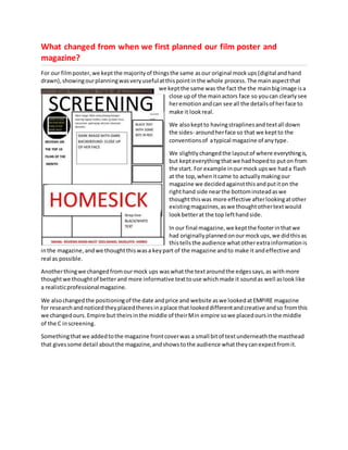
we keptthe same was the fact the the mainbigimage isa
close upof the mainactors face so youcan clearlysee
heremotionandcan see all the detailsof herface to
make it lookreal.
We alsokeptto havingstraplinesand textall down
the sides- aroundherface so that we keptto the
conventionsof atypical magazine of anytype.
We slightlychangedthe layoutof where everythingis,
but kepteverythingthatwe hadhopedto puton from
the start. For example inourmock upswe hada flash
at the top,whenitcame to actuallymakingour
magazine we decidedagainstthisandputiton the
righthand side nearthe bottominsteadaswe
thoughtthiswas more effective afterlookingatother
existingmagazines,aswe thoughtothertextwould
lookbetterat the top lefthandside.
In our final magazine,we keptthe footerinthatwe
had originallyplannedonourmockups,we didthisas
thistellsthe audience whatotherextrainformationis
inthe magazine,andwe thoughtthiswasa keypart of the magazine andto make it andeffective and
real as possible.
Anotherthingwe changedfromourmock ups waswhat the textaroundthe edgessays,as withmore
thoughtwe thoughtof betterand more informative texttouse whichmade it soundas well aslooklike
a realisticprofessionalmagazine.
We alsochangedthe positioningof the date andprice and website aswe lookedatEMPIRE magazine
for researchandnoticedtheyplacedtheresinaplace that lookeddifferentandcreative andso fromthis
we changedours.Empire but theirsinthe middle of theirMin empire sowe placedoursinthe middle
of the C inscreening.
Somethingthatwe addedtothe magazine frontcoverwas a small bitof textunderneaththe masthead
that givessome detail aboutthe magazine,andshowstothe audience whattheycanexpectfromit.
2. For our filmposterwe keptalmosteverythingaboutthe mockupsthat we made,the same.From the
start we had a clear ideaabouthowwe wantedourposterto lookas we had done priorresearchthat
we thoughtaboutwhile makingourmockups.
We keptthe title of the filminthe same place (atthe bottomof the magazine) asthisis a typical
conventionof anyfilmposters,asthiswayyoucan see all of the mainimage above andthat isan
importantfactorof filmposterssothe audience canidentifywiththe actorsandwho will be inthe film.
We kepthavingthe actor’snamesjustabove the filmname,as thisagain isa conventionthatquite alot
of filmpostersfollow.The onlythingwe changedaboutthiswasthe factthat we condensedittothree
actors insteadof twoas we thoughtthat that showsthe mostimportantcharacters better.
We keptthe small printat the verybottomof the posteras if it wasin anyotherplace it wouldbe inthe
wayand it doesn’tneedtobe anywhere thatisrightinyour face as It is notas importantas the filmtitle
of image forexample,butstillneedstobe included.
We keptthe
small statement
at the topof the
posterthat sums
the filmupin
justa few words,
there as we
thoughtthat this
was important
for the audience
to have some
ideaabout
whatthey
wouldbe
goingto
see.
Another
thingthat
3. we keptthe same was the release date atthe bottom‘comingsoon’as thisis keyforthe audience as
theyneedtoknowwhento lookoutfor itin the cinema.
One thingthat we didchange about our posteristhe mainimage,we originallyplannedtohave a
mediumshot/longshottoshowherphysical painas well asemotional,insteadwe changedthistoa
close upto showjust heremotionsasthisisa keypart of the film. We alsokeptall of the colouringthe
same as red white andblackisa colourscheme we kepttothroughoutthe trailer,posterandmagazine.