1. What changed from when we first planned our film poster and
magazine?
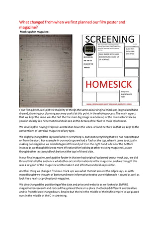
Mock upsfor magazine:
r our filmposter,we keptthe majorityof thingsthe same asour original mockups(digital andhand
drawn),showingourplanningwasveryusefulatthis pointinthe whole process.The mainaspect
that we keptthe same was the fact the the mainbigimage isa close up of the mainactors face so
youcan clearlysee heremotionandcansee all the detailsof herface to make it lookreal.
We alsokeptto havingstraplinesandtextall downthe sides- aroundherface sothat we keptto the
conventionsof atypical magazine of anytype.
We slightlychangedthe layoutof where everythingis,butkepteverythingthatwe hadhopedtoput
on fromthe start. For example inourmockups we hada flashat the top,whenitcame to actually
makingour magazine we decidedagainstthisandputit onthe righthandside nearthe bottom
insteadaswe thoughtthiswas more effectiveafterlookingatotherexistingmagazines,aswe
thoughtothertextwouldlookbetteratthe top lefthandside.
In our final magazine,we keptthe footerinthatwe had originallyplannedonourmock ups,we did
thisas thistellsthe audience whatotherextrainformationisinthe magazine,andwe thoughtthis
was a keypart of the magazine andto make itand effectiveandreal aspossible.
Anotherthingwe changedfromourmock ups waswhat the textaroundthe edgessays,as with
more thoughtwe thoughtof betterandmore informative textto use whichmade itsoundas well as
looklike arealisticprofessionalmagazine.
We alsochangedthe positioningof the date andprice and website aswe lookedatEMPIRE
magazine forresearchandnoticedtheyplacedtheresinaplace that lookeddifferent andcreative
and so fromthiswe changedours.Empire but theirsinthe middle of theirMin empire sowe placed
ours inthe middle of the C inscreening.
2. Somethingthatwe addedtothe magazine frontcoverwas a small bitof textunderneaththe
mastheadthatgivessome detail aboutthe magazine,andshowstothe audience whattheycan
expectfromit.
Mock ups for poster:
For our filmposterwe keptalmosteverythingaboutthe mockupsthat we made,the same.From
the start we had a clear ideaabouthow we wantedour postertolookas we haddone priorresearch
that we thoughtaboutwhile makingourmockups.
We keptthe title of the filminthe same place (atthe bottomof the magazine) asthisisa typical
conventionof anyfilmposters,asthiswayyou can see all of the mainimage above andthat isan
importantfactorof filmposterssothe audience canidentifywiththe actorsandwho will be inthe
film.
We kepthavingthe actor’snamesjustabove the filmname,asthisagain isa conventionthatquite a
lotof filmpostersfollow.The onlythingwe changedaboutthiswasthe factthat we condenseditto
three actors insteadof twoas we thoughtthat that showsthe mostimportantcharactersbetter.
We keptthe small printat the verybottomof the posteras if it wasin anyotherplace it wouldbe in
the way andit doesn’tneedtobe anywhere thatisrightinyour face as It is notas importantasthe
filmtitle of image forexample,butstill needstobe included.
We keptthe small statementatthe topof the posterthat sumsthe filmupin justa few words,there
as we thoughtthat thiswas importantforthe audience tohave some ideaaboutwhattheywould
be goingto see.
Anotherthingthatwe keptthe same was the release date atthe bottom‘coming soon’asthisis key
for the audience astheyneedtoknowwhentolookout forit inthe cinema.
One thingthat we didchange about our posteristhe mainimage,we originallyplannedtohave a
mediumshot/longshottoshowherphysical painas well as emotional,insteadwe changedthistoa
close upto showjust heremotionsasthisisa keypart of the film.We alsokeptall of the colouring
3. the same as red white andblackisa colourscheme we kepttothroughoutthe trailer,posterand
magazine.