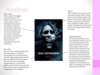
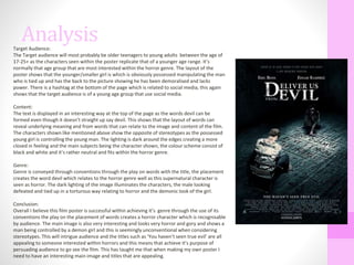
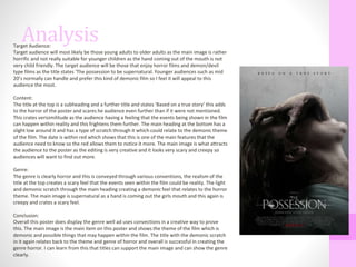
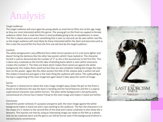
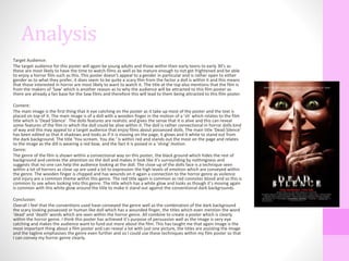
The document provides an analysis of film poster conventions based on research of four horror movie posters. Key conventions discussed include:
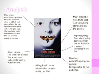
- Using close-up images of characters that relate to the film's story or theme.
- Placing the film title prominently in a contrasting color to stand out.
- Including taglines or subtitles that provide additional context or intrigue audiences.
- Featuring the release date in red to draw attention.
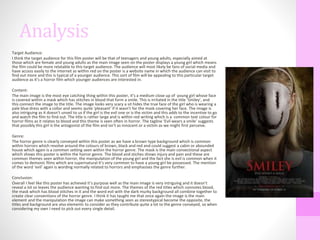
The analyses of individual posters examines how they convey their horror genre and would appeal to the target teenage/young adult demographic through creative use of images and text following common conventions. The research informs the creation of the student's own teaser poster.