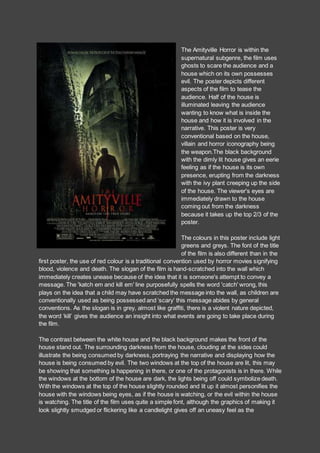
1. The Amityville Horror is within the
supernatural subgenre, the film uses
ghosts to scare the audience and a
house which on its own possesses
evil. The poster depicts different
aspects of the film to tease the
audience. Half of the house is
illuminated leaving the audience
wanting to know what is inside the
house and how it is involved in the
narrative. This poster is very
conventional based on the house,
villain and horror iconography being
the weapon.The black background
with the dimly lit house gives an eerie
feeling as if the house is its own
presence, erupting from the darkness
with the ivy plant creeping up the side
of the house. The viewer's eyes are
immediately drawn to the house
coming out from the darkness
because it takes up the top 2/3 of the
poster.
The colours in this poster include light
greens and greys. The font of the title
of the film is also different than in the
first poster, the use of red colour is a traditional convention used by horror movies signifying
blood, violence and death. The slogan of the film is hand-scratched into the wall which
immediately creates unease because of the idea that it is someone's attempt to convey a
message. The 'katch em and kill em' line purposefully spells the word 'catch' wrong, this
plays on the idea that a child may have scratched the message into the wall, as children are
conventionally used as being possessed and ‘scary’ this message abides by general
conventions. As the slogan is in grey, almost like graffiti, there is a violent nature depicted,
the word ‘kill’ gives the audience an insight into what events are going to take place during
the film.
The contrast between the white house and the black background makes the front of the
house stand out. The surrounding darkness from the house, clouding at the sides could
illustrate the being consumed by darkness, portraying the narrative and displaying how the
house is being consumed by evil. The two windows at the top of the house are lit, this may
be showing that something is happening in there, or one of the protagonists is in there. While
the windows at the bottom of the house are dark, the lights being off could symbolize death.
With the windows at the top of the house slightly rounded and lit up it almost personifies the
house with the windows being eyes, as if the house is watching, or the evil within the house
is watching. The title of the film uses quite a simple font, although the graphics of making it
look slightly smudged or flickering like a candlelight gives off an uneasy feel as the
2. candlelight could represent a supernatural presence, this is conventional in horror movies.
The blurred aspect to the font also uses the illusion factor of the film.
The main title has been placed at the bottom of the poster, beneath the main image, as it is
coloured in dark orange/red this stands out predominantly from the rest of the dark colouring
used. These colours are important as they have different connotations in horror, for example
blood and death. Just above the title there are newspaper clippings presented which faintly
say ‘he was possessed’, although this does not stand out very much and is almost
unreadable, once it has be spotted the audience gain an insight into the narrative and events
that will occur. Underneath the title are credits to people who were involved in the making of
the film. This provides the audience with a chance to see who is in the film and which
companies are involved in the production. It also allows them to possibly recognise names
and build a perception of what the film will be like, based on their reputations.
The house is used as a key attribute of the film; this poster uses a low angle to display the
house, making the viewers of the poster feel vulnerable and intimidated by the sheer size of
the house. This low angle shot makes the house seem like its looming over us. The man's
stance in front of the house looks determined, his shoulders are squared with his head is
facing downwards as if he is preparing himself for a fight. The gun in his hand makes the
viewers confused as to whether he is the hero or the villain, the way he is positioned could
suggest either, but the fact that his face is not covered and he is in dark clothing, indicates
that he is the antagonist.
The use of backlighting to make this poster creates a silhouetted figure, this has an impact
on the element of mystery as the audience can only imagine what this character looks like
based on their outline. The silhouette appears to be a male holding a weapon, the audience
may assume that this is the antagonist although he is wearing a white t-shirt which is usually
closely associated with protagonists and innocent characters. The tagline of ‘KATCH EM
AND KILL EM’ looks like it has been scratched on implying that whatever is doing the
‘haunting’ is not human. The overall look and feel of the house is very eerie, it can almost be
seen as a human due to the positioning and lighting in the windows, the two top windows are
seen as the eyes and they are both lit up suggesting that the house is watching. Again
relating to the house; the angle of this shot is heavily focused on the house conveying to the
audience that it has quite a big role within the film.
The fact that this is based on true events is a chilling concept to viewers as the now know
that as it has happened before and can happen again. When the audience realise that
possession is involved the poster will become clearer as they will find out that the supposed
antagonist featured on the poster is actually innocent but has been corrupted by a source of
evil. The black lines on this poster somewhat looks as if someone has tried to paint over it
and trying to hide what is underneath, this can relate to the narrative as we do not know who
or what the silhouetted character is doing until the actual film.
At the top of the poster there is a skyline stating the director and producers name; as
Michael Bay is a famous director and producer, the audience may be familiar with his work
and therefore may make a decision to watch the movie based on his other work such as ‘A
Nightmare on Elm Street’ and ‘Ouija’. Underneath the title is small printed text saying ‘based
on a true story’, this is chilling to the audience and instantly grabs their attention, as the film
3. will seem more realistic and therefore be more enticing, it makes it more believable and as a
result of this, the viewers will experience more fear.