1. Poster Analysis One
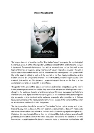
The poster above is promoting thefilm ‘The Broken’ which belongs to the psychological
horror sub-genre. It is theofficial poster used to advertisethefilm and I choseto analyse
it because it features similar themes that will be present in our horror film such as the
topic of the main protagonist going insanewhich was an inspiration to us so I thought it
would besuitableto examinethis poster. Theeffect used on theposter that I particularly
like is the way it is edited to look as if the top half of her face has turned to glass and is
broken because it is uniqueand different. The fact that the poster isn’t particularly scary
makes it link well to my film poster as the genre is psychological, so the fear is in the
audience’s head and not evidently in their faces.
This poster fulfils general film poster conventions as the main image takes up the entire
frame; drawing theaudiencein before they even know what movieis being advertised. It
also gives the audience clues to what the narrativewill include by suggesting that she is
mentallyunstable.Itpresentsthemainprotagonisttotheaudiencewithoutshowingwho
the antagonist is; thereby leaving the audience to wonder who the villain is. It follows
layout conventions as theinstitutional information is placed at the bottom of the poster
so it is common to identify it on a film poster.
The background setting of the poster for ‘The Broken’ isn’t a typical setting as it is just
black and grey mist and clouds. This isn’t a common convention as it doesn’t necessarily
scare the audience but it could link to the narrative of the film by representing the fact
that sinceit’s a psychological horror film, her mindcould bedark and gloomy whichcould
givetheaudience a hint to what thefilm is about as it indicates to thefact that in thefilm
her memory is very foggy as shedoesn’t remember being in places that shehas been said
2. to havebeen. This will causetheaudienceto form their own expectationson whether the
film will be successful or not and whether they will want to see it or not. Back lighting is
used in the image in the poster which creates an almost halo effect around the main
protagonists face; this could link to the fact that she is innocent or the victim in the film
which contrasts with the black, shadowy bottom of the poster which could suggest the
idea that all of her lifeis darkness but sheis theremaining lighttrying to bring aboutgood
over evil. The lighting doesn’t specifically create fear for the audience but it does set up
an appropriate mood as it ties in well with the psychological horror sub-genre as it is
conventional not to blatantly frighten the audience but to intellectually stimulatethem
with the storyline whilst pulling them in with the poster.
Gina, who is the main protagonist, is displayed in themain imageon this film poster and
specific mise-en-scene elements are used to affect the audience and attract them to
watching the film. The costumeshe is wearing is a grey turtleneck jumper with a black
coat over the top. Her costumecould signal the fact that she is a very privateperson as
she is covered up and not showing any skin. Her make-up is very minimal and her hair
appears to be tied up in a bun which could indicateto the audiencethat shehas moreto
worry about than her appearance as her mental state is deteriorating.
The audiencearepresented with a medium closeup shot of Gina, themainprotagonist in
the film as she looks into the distancewith a confused yet determined facial expression.
This could lead to the audience guessing that she is adamant to figuring out how to end
her psychological torture. However, a very importanteffect is used on her faceto makeit
seem as if it is half broken like glass, which first connects the main image to the title of
the film but gives the audience an indication of what will be happening to Gina in the
movie. Other mise-en-sceneelements stand out on this poster as sheis positioned in the
centre, dominatingtheframeandthisgives ustheimpressionthatsheissignificantto the
plot of the film and that sheneeds to be thefocal point of the poster. The colours black,
grey and white are clearly featured on the poster which create the effect of good versus
evil as white is seen to represent innocence and positivity whereas black is seen to
represent negativity and death. This could signify her split personalities and psychological
torture as she has another personality which is evil.
The titleof the film is ‘The Broken’ which ties in well with the main image presented on
the poster of the protagonists face being half broken. It suggests to the audience more
about thenarrativeas it hints to thefact that themain characters’ mind may be‘broken’
and that shemay spend the remainder of the film trying to find a way to repair it. This is
typical of this type of psychological horror film as it would persuade the audience into
wanting to watch the film as they would be curious to find out why her mental state is
declining and what makes the movie scary. The title is in an uppercase sans serif font
which catches the audience’s attention and symbolises the fact that her stateof mind is
of importancetothestorylinebutalsothefact thatithasa ghostlyeffect onit whichcould
3. have been used to frighten the audienceby making them assumethereis a supernatural
element to the movie.
Comparedtotheother pieces of text ontheposter,the titleis thelargestsizewhich could
be because it is the title of the film so it is the most important information that the
audience need. Its typography makes it so the audience are instantly drawn to the title
over theotherpieces of text becauseit standsoutthemost.Forthetitle, thecolour white
is used with an effect on it to makeit look ghostly and haunting. Theeffect of this is that
it is used to scare the audience and give an indication to how eerie the narrativeof the
film may end up being. Thecolour whitecould alsolink to thefact thatthemaincharacter
is innocent and good in the fight of good versus evil. It helps portray her positively rather
than negatively which could be the other side of her personality. The colour could also
represent her purity as the title and main image of the film illustrateher in relation to
glass so it could further this by showing how like glass she is pure but also ‘broken’.
In the frame, the title is placed towards the bottom underneath the main image, this is
typical of a psychological horror film poster as it is common for a titleto be placed here.
Thetitlemay havebeen put in that position becausethey wanted todraw in theaudience
first with the main image then present them with the title of the film once they are
intrigued by it.
The taglineon this poster for ‘The Broken’ is “Face your fear”. The tagline suggests that
throughout themovie, theprotagonistis going to haveto face her fears in order to solve
the mystery behind her psychological torture. The tagline anchors the image as it
determines the meaning behind her afraid expression in the main image as it tells the
audiencehowshewillin fact befacing herfears in thefilmbutitalso remainsquitecryptic
as it doesn’t specifically tell us what her fears areso wehaveto watch thefilm to find out
for ourselves.
To makesureit doesn’tovershadowthetitle, thetaglineis displayedina small,lowercase
sans serif font. This is to make it appear less dominating and of not as much importance
as other text in the frame which is contradicted by its creepy message which may have
been intentional for it to look scarier. The colour of the taglineis black so it suggests that
that may be thenegative, evil of the film; her ‘facing her fears’ in comparison to thetitle
which was whiteand more positive. The tagline is placed at the top of the poster above
themainimagewhich followsconventionsforahorrorfilmposter.The taglinemighthave
been placed here to signify the fact that it is in the psychological horror sub-genre, it is
placed above her head where it is seemingly ‘broken’. This implies to the audience that
her mind may have been broken because she had to face her fears and go her
psychological torment.
Other pieces of text that feature on the poster are text like main actress’s name ‘Lena
Headey’ which is positioned abovethetitleof thefilm. This is used to lurein theaudience
as they will see the name of the well-known actress and if they are fans of her it could
help persuadethem to watch thefilm more. Plus it is used to suggest genreas maybethe
4. actressonlyactsin a specific genreof film, theaudiencewillinstantlyrecognisewhattype
of movie it is and it will help them decide whether or not to go see it.
Institutional information is featured on the poster and is placed at the bottom of the
frame underneath the titleand the main image. It is presented clearly on the poster but
doesn’ttakeattentionawayfromtheother partsoftheposteras thetext isin a very small
font so it doesn’t catch theaudience’s attention as muchas other text in theframeplus it
only informs the audience on who is acting in the film and other miscellaneous
information that wouldn’t interest them so they would rather focus on other sections of
the poster instead of the institutional information. The appearance of the institutional
information is conventional of a film poster as they areusuallydisplayed at thebottomto
make sure that they are inconspicuous.
The colours black, whiteand grey dominatetheposter as they are displayed often in the
frame. An eerie mood is created with the useof these colours as the black creates an air
of mysterywhichwillmaketheaudiencecurioustofind outwhatwill transpireinthefilm.
The black also forms a negativeconnotation as it could be linked to the themeof evil or
theunknownwhichis associatedwiththenarrativeof ‘The Broken’ astheprotagonistwill
have to face an antagonist who is hidden to theaudience as they are not featured in the
film poster.
The grey colour gives us the impression that the main characters’ mind will be hazy or
unclear which could be one of the themes explored in this film as it is a psychological
horror so it is likely that her mental capacity will have a strain put on it. Colour is used to
signal genreand sub-genreas thecolours applied on theposter wouldn’tbeused in other
film genres e.g. romantic-comedy or action-adventureas they are quite dull and gloomy
so it wouldn’t be appropriatefor the more exciting or positivefilm genres to use these
colours.
Overall, the poster promoting the film ‘The Broken’ is in my opinion, very effective in
advertising thefilm and distributing it to theaudience. The main image, titleand effects
used in theposter all equal to it being ableto promotethefilm well. I think theposter will
be successful in luring in its target audience as it already appears like a horror film so it
will instantly attract dedicated horror film devotees to the watch it. Plus, using a well-
known actress in the main image will draw in a wider audience that wouldn’t usually
watch horror films to watch it because they enjoy watching the actress. The poster for
‘The Broken’is verysuccessfulin suggestingthefilm’snarrativewhilstnotgivingawaythe
entire plot as the main image showing her mind being ‘broken’ connects well with the
storyline of her going through psychological torture and trying to solve her problems
before they overpower her. However, it still leaves much of the narrative out so the
audiencewill bepersuaded to go watch thefilm to discover whether good triumphs over
evil.