
Recommended
More Related Content
What's hot
What's hot (18)
Similar to a level film poster analysis
Similar to a level film poster analysis (20)
Recently uploaded
Recently uploaded (20)
a level film poster analysis
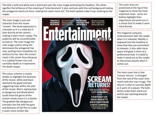
- 1. The main image is just one character from the movie 'scream'. The facial expression is unknown as it is a mask but it look directly at the camera , making it seem more creepy. The audience will be uncomfortable to look at. The main image the only image used to show the dominance the antagonist has over, putting more empathies on evilness he has. Also the scream mask is the center focus because it is a global known icon and connotes death as it represents the death reaper. The colour scheme is mostly shades to highlight the darkness of the movie. white and black represent the good and bad, suggesting hope within the plot of the movie. Red is represented as dangerous and blood which could show the genre of the scream movie since it is a slasher. The gradient like background connotes the link with the gore and darkness of the film to make it seem more sinister like. The title is bold and white and is dominant over the main image promoting the headline. The white signifies the brilliance of the meaning of 'entertainment' it also contrasts with the red background making the antagonist stand out more, making him seem more evil. The bold capitals make it eye-catching to the reader. The cover lines are positioned at the top of the magazine to show the most important news. some are bold to highlight their importance and some are in a roman font to make it seem more formal. The magazine company 'entertainment' tells the reader when it is released. Weekly is engraved into the headline to show that they are committed to releases. it also adds more space and gives it more of a professional look. it is bold to make it stand out to the reader so they know exactly when it comes out. The main cover line is that 'scream returns' is enlarged from the rest of the cover lines match with the main image. The returns is blue to connote depth as it parts of a sequel. The bold letters make them stand out and be eye-catching towards the reader.
- 2. The main image is a extreme close up of the girls face to exaggerate her expression also it creates mystery linking with a sub-genre as the audience does not know if its her hand or someone else's. Her facial expression shows she is scared or in shock this puts empathies on the horror genre. The blue eyes are the only colour in the poster this could highlight she is a protagonist as the colour makes her stand out. the blue eyes can connote purity and innocence making her the victim of the movie. and is looking directly at the audience which could be quite emotive. The vividness of the blue colour can contrast with the black and white making them stand out as the focus point of the picture. The hand over her mouth could signify she's being attacked or kept quiet it links with the title as it connotes fear and shock and helps creates suspense with the audience. The hand creates a horrific feeling as its like someone has crept onto her, and this enigma creates an uneasy feeling, also its not a gender specific as the hand looks both also creating a mystery feeling. The tagline gives the audience a insight on what is going to happen in the movie. in indicates that the main plot is going to be about murder connoting suspense and violence linking with the main image. By using emotive words like love will gain a relationship with the audience who also enjoys horror movies setting a target audience. The pun of 'mystery is going to be a murder' shows an element of comedy setting a sense of relief. The lighting in the image is dark creates fear and the unknown. The shade in the edges from the girls face can connote the evil larking in the shadows. the darkness is dominant on the poster to signify that evilness lurks everywhere and the danger. The title suggests the main element of the film, hence the play on the word 'scream' in which is included in the movie. it connects with the main image of the poster as it looks like she is about to scream by having a hand covering her mouth. the way the font is capitals can show the title is screaming playing on the title, also making it stand out and attract the audience. the white colour contrasts with the dark background, it also using the contrast of the colour as white connotes safety which goes against the plot of the movie. the letter 'm' is like a dagger this suggests that the film could contain violence . The poster uses dyers star theory as it shows the main actors which will attract the target audience as it is an easy way to promote the film. it also uses a common feature of a credit block to highlight the movie and give it a professional look. Also it uses the world famous director ‘wes craven’ in the poster to promote it more since the director has made good horror films attracting more of the target audience.
- 3. The main image is a close up of the protagonist eyes and the top of her head. Her expression creates a mystery as the audience does not know the rest of the characters facial expression relating to the sub-genre mystery. The effect is an sepia-like , which creates warmth in the image as though it is set in a home, however, this connotes a fiery and dangerous threat in the disturbance stage. connoting a time frame or seeing the narrative as a memory. The direct address of the character looking directly at the audience can connote a sense that she needs help or needs the attention. However the fact her mouth is hidden exaggerates her as more of the victim as the audience is left questioning if she is in danger. As her mouth is covered by the use of Photoshop by cut an outline of an forest with hanging rope coming off at the end in a artistic way, it can connote death and danger . The use of the iconography by the hanging rope have different connotations, one with suicide or a death sentence that criminals used. In which creates a darker deeper element of the poster. The fact the protagonist is a girl goes into the idea of her being the typical stereotype of the victim as she is left voiceless and the audience cannot view her emotions also the girl looks young, in which could link to the audience age. The title is bold and dispersed along the poster making it the most dominate piece of text on the poster. The font is simple and basic but slighly disoriented by the spacing which makes it more effective as it creates the poster to be more eerie and reinforcing the fear and the horror, the use of colour is black standing out from the background, it can connote surrender and death, linking to the narative of the the forest since it is based in the suicide forest in Japan. The colour scheme is a simple monochrome which displays the realism of the film. The colour scheme is unique and stands out as it is quite bright compared to other horror poster, as it is usually quite dark and gloomy to exaggerate the evilness within. The fact the poster is one colour but in different tones also connotes the narrative as the sense it is a continuous cycle, in which links to the narrative that suicide is always happening here and will never stop. The background of the narrative is highlighted here to give more clues to the audience about the film . This sets the typical horror convention by the use of the setting as the location is in the woods. this could also attract the target audience as most box office films use the forest as it creates an eerie effect.
- 4. The main image dominates the whole poster attracting the target audience as it stands out. The image is an extreme close up of the protagonist face to put empathises on their facial expression in which looks like she is in a lot of pain almost screaming creates a sense of vulnerability. It is clear on the plot as it seems the girl is possessed showing the sub- genre of horror being supernatural. The eye in her mouth is uncomfortable to look at as it is glaring at the audience creating an eerie atmosphere. It also connotes the abnormality as it is eye in the victims throat , also an evil sense. The image links to be the stereotype of the girl being the victim linking to the typical horror convention by the damsel in distress that needs help and rescued. ‘in cinemas’ positioned at the bottom in bold and red letters to connote alert, this is informing the audience that a new chapter is coming. Credit block is a common convention, it is used to highlight key features of the film, including film companies logos and film producers. This makes the poster have a more professional appearance and official, it could also just cover extra space to make it look more informing. The title is in white and red, this is to make it stand out and contrast with the black background. The red can connote blood and danger which could relate to the antagonist of the film. The white can connote the sprits indicating the narrative of the film. The title is small as the film has already gained an audience so it doesn’t need to promote that much compared to other movies that just have one plot. The font is quite informal in which could connote realism for the film. The use of lighting that it is a low artificial lighting can connote that it is night time which links to iconography that the night is dangerous. The picture is dominated with blackness connoting that the evilness within has taken over symbolising danger. The tagline just above the industrial information, leads the audience a sense of the narrative. It attracts the audience by putting empathises on the word ‘chapter’ with ‘scariest’. It could also links back to the first film which shows they know their target audience. This could be a direct link to the dark colours on the poster connoting the dark elements to the film, such as the gore, deaths or violence or even psychologically twisting plot lines.