“Oh GOSH! Reflecting on Hackteria's Collaborative Practices in a Global Do-It...
Unconventional Horror Poster Colours <40
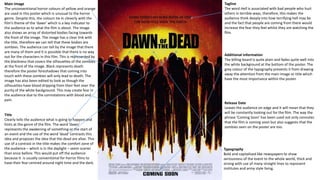
1. Main Image
The unconventional horror colours of yellow and orange
are used in this poster which is unusual to the horror
genre. Despite this, the colours tie in cleverly with the
film’s theme of the ‘dawn’ which is a key indicator to
the audience as to what the film is about. The image
also shows an array of distorted bodies facing towards
the front of the image. The image has a clear link with
the title, therefore we can tell that these bodies are
zombies. The audience can tell by the image that there
are many of them and it is possible that there is no way
out for the characters in this film. This is represented by
the blackness that covers the silhouettes of the zombies
at the front of the image. Black represents death
therefore the poster foreshadows that coming into
touch with these zombies will only lead to death. The
image has also been edited to look as though the
silhouettes have blood dripping from their feet over the
purity of the white background. This may create fear in
the audience due to the connotations with blood and
pain.
Typography
Bold and capitalised like newspapers to show
seriousness of the event to the whole world, thick and
strong with use of many straight lines to represent
institutes and army style living.
Release Date
Leaves the audience on edge and it will mean that they
will be constantly looking out for the film. The way the
phrase ‘Coming Soon’ has been used not only connotes
that the film is coming soon but also suggests that the
zombies seen on the poster are too.
Tagline
The word Hell is associated with bad people who hurt
others in terrible ways, therefore, this makes the
audience think deeply into how terrifying hell may be
and the fact that people are coming from there would
increase the fear they feel whilst they are watching the
film.
Title
Clearly tells the audience what is going to happen and
hints at the genre of the film. The word ‘dawn’
represents the awakening of something or the start of
an event and the use of the word ‘dead’ contrasts this
idea and proposes the idea that the dead are alive. This
use of a contrast in the title makes the comfort zone of
the audience – which is in the daylight – seem scarier
than once before. This would put off the audience
because it is usually conventional for horror films to
have their fear centred around night time and the dark.
Additional information
The billing board is quite plain and fades quite well into
the white background at the bottom of the poster. The
grey colour of the typography prevents it from drawing
away the attention from the main image or title which
have the most importance within the poster.
2. Title
Red colours are incorporated in order for them to link
in with the blood on the zombies face and the blood
that is splattered on the side of the poster. This makes
the title stand out slightly less than the image however
the colour match allows the audiences’ eyes to
naturally go to the title of the film from the image. It is
very unconventional for film posters to have a white
background however in this poster it works as it
represents the purity of the humans being taken over
by death, which really stands out over the white
background.
Main Image
The main image shows the main half of a man’s face
who is infected with a disease. It is clear to the
audience that he is a zombie of some sort. The fear
from this image is drawn by the audience knowing that
this man was once human, and by the fact that he is
wearing a normal shirt that any man would wear it
reinforces this idea. The man also has a red shirt on
underneath this plain shirt and this represents how
dangerous he is due to the connotations of danger
with the colour red. Although the man looks like a
human, he is dead underneath it all. Red is also the
main colour across the entire poster therefore it links
in well with the rest of the colour scheme.
Typography
The typography is quite sharp and thin which connotes
that it is something to be fearful of such as a knife. The
letter ‘N’ has a trail of blood that drips down from the
letter which reinforces this idea of death and pain. The
fact that it is red also adds to this effect.
Tagline
The word Hell is associated with bad people who hurt
others in terrible ways, therefore, this makes the
audience think deeply into how terrifying hell may be
and the fact that people are coming from there would
increase the fear they feel whilst they are watching the
film.
Represents that it may be too gory and explicit for younger
audiences. The fact that they have placed the rating on top
of the blood splatter represents this and reinforces the idea
that the film is going to be quite dark and scary.
3. Title
The layout of the title is shown in a specific arrangement in
order to show the word ‘Devil’. This has been done to show
that the thing that the characters in the film need delivering
from is the Devil, this is highlighted by the fact that the letter
‘D’ in deliver is in bold as well as the word ‘EVIL’ to make the
word stand out to the audience. The title is also in white,
which represent purity however the title suggests otherwise
making the colour a paradox. The white colour has a cracked
effect on the word Devil in particular which shows that the
purity has been broken and may not be restored within the
film.
Main Image
Mainly black background however the flooring is shown with
letters that could be used on Ouija boards surrounding the man
– psychological and paranormal themes.
Small girl can be seen dirty and bloody, holding a set of keys
with her mouth.
The man in the image appears to be trapped and the keys that
the young girl is holding suggests that he is in compete isolation.
There is also a slight blue colour tint to the flooring within the
poster which automatically creates a sense of sadness within the
audience, as well as creating a cold atmosphere.
Typography
The typography is shown in all capital letters which represents
its dominance and importance on the poster.
It can be represented as upper class typography due to its
association with writing that may be used in old fashioned
homes and in wealthy jobs and business’. This suggests to the
audience that the film is set in some sort of Manor House
which makes the film creepier because the audience would
assume that a place like this is safe.
Tagline
The tagline directly addresses the audience and makes them
seriously question whether or not they have seen true evil. They
are also questioned as to what is true evil, and this makes them
want to watch it to investigate. This links in with the main image
also due to the man not looking at the creepy girl at the top of
the image. This suggests that even though he has seen true evil,
he cannot bare to look at it any longer. This suggests to the
audience how much fear is going to be created by the film which
they may find exciting. This would push them to want to watch
the film more and to investigate this ‘true evil’ further.
Release Date
There is also no release date on this poster and this is shown
by the ‘Coming soon’ statement at the bottom of the poster.
4. DO’S AND DONT’S OF HORROR POSTERS
DOS
Keep it minimal – having too much information or detail in
the poster may lead to the audiences being overwhelmed
and therefore not being drawn into the poster.
Use capital letters! – using capital letters on the most
important information such as the title and tagline
emphasises their importance and helps the audience to
remember the film title better. If they remember the title
they would feel inclined to watch it due to them beginning
to feel curious about the film.
Have a focal point – it is always important to get the main
image to have a focal point for the audience to look at (this
is normally a convention of the horror genre). This will
make the poster stand out more and be more memorable
for the audience.
DONTS
Make the image too abstract/cluttered – having too much
detail in the image will not allow the audience to remember
the image as a whole meaning they will forget about it. This
will mean there will be a limited interest in the film.
Use unconventional colours – using colours such as pinks and
blues could make the film appear less scary making it less
effective towards the target audience.