1. Compare and contrast two contents pages
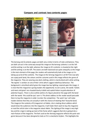
The kerrang and Q contents pages are both very similar in terms of style and balance. They
are both set out in the same way except the image on the kerrang contents is on the left
and the writing is on the right, whereas the image on Q’s contents is situated on the right
and the writing is on the left. The covers are both balanced out quite unequally as the image
is the main element of the page, the readers will automatically look at the image as it is
taking up aa lot of the contents. The image on the kerrang magazine is of All Time Low who
are a pop punk band, the colours and the costume used in this image reflects the genre of
the magazine. They are wearing very dark clothing, which is mainly black with white writing.
‘No regrets’ is written on one of their shirts which suggest rebellious behaviour. The
background is also black which gives the image low key lighting. Layered upon the image, it
is clear that the magazine is giving readers the opportunity to win a prize, the words ‘tickets
and meet and greet’ are situated clearly in bold and capital letters to grab attention of
potential buyers. There is also a white outline of a figure placed on the page with the band
with the words ‘this could be you’ over it. This direct address to the reader would persuade
them to buy the magazine in order to enter the competition. The word ‘you’ will make
readers believe that they are actually in with the chance of meeting their favourite band.
The image on the contents of Q magazine is of Adele, she is making direct address which
would draw the audiences into the magazine, it will make them want to buy the magazine
or read the article later in the magazine about Adele. The lighting of the image is very high
key and the singer is taking up most of the frame which suggests that she is going to be a
main feature of the magazine. The font used on the Kerrang magazine reflects the punk rock
genre because it has been designed to look as if it is smashed or broken. This highlights the
2. fact that the genre is seen as rebellious and dark. In similarity to Kerrang, Q magazine’s page
titles are written in Capital letters to make them stand out to readers so they are aware of
what is going to be featured in the magazine. Both magazines use a vast majority of white
for the background of the contents so it is easy to see what the words say. At the bottom of
the page on both of these magazines, they have included an image of another artist that will
appear in the magazine along with some information about the feature. This gives the
magazine a larger target audience as it appeals to more people. The design balance of both
of these magazine covers is quite equal as around half of the pages are taken up by imagery
and half is taken up by information/writing. The rule of thirds in Q magazine helps to place
the image on the contents page; Adele’s eyes are situated approximately 1/3rd of the way
down the page which is the main line of interest. The contents page of Kerrang is similar to
this although the difficulty id increased because there are four members of the band and a
long shot image has been used which means their faces are at the top of the contents page.