SlideShare a Scribd company logo
1 of 3
“Q” magazine have used a dominant image of the artist Ed
Sheeran that is central to the frame, which makes the artist
stand out and intrigue the target audience as its easy for the eye
to process. They have used the simple denotation of Ed and his
acoustic guitar, wearing all black casually clothing; symbolizing
that both the singer and his music may have the same relaxed
and laid back style. The artist is not providing the audience with
direct mode of address, instead looking to the top right corner
of the page. This creates an air of mystery to the singer as it
suggests that he is looking for something or possibly looking
toward the future. The lighting used on this image also implies
he is a mysterious character as, due to the key point lighting,
shadows are cast behind him. Ultimately suggesting he may
have a dark past and is now looking into the light of his future
endeavors.
The masthead of the magazine is in a bold red colour and
whilst standing out, to advertise the brand, it is placed behind
the picture of the artist, implying that he is the most
important part of the magazine. Despite not being at the
forefront of the front cover, the reader will still be aware of
the magazine they have without having to search for it.
The main sell-line,, in this case, is just the artists name “Ed
Sheeran”, to make the reader aware of who the artist is. It is
written in red sticking to the magazines colour scheme, and is
in a different font style and colour, red and cursive, to the rest
of the magazine, making it stand out from the cover-lines.
Style of this text could be interpreted to look as though it is
wrote in lipstick, therefore aiming the article and artist at a
female audience.
The subhead expands on the main cell line, it tells the reader
what the main article is about and gives them more
information on it. The colour white has been used for the
subhead and the font changed back to match the other
writing throughout the magazine as this would prevent
attention being taken away from the dominant image and
main sell-line. The subhead and the dominant image have a
sense of synergy as the image shows the exact words used,
"one man and his guitar.”
The barcode is kept small to the bottom of the page so it
does not interfere with the dominant image or any of the
text, however is still big enough for the target audience to
know the price of the magazine located on it.
The cover lines show the reader what else is involved in the
magazine without having to turn to the contents page. “Q”
magazine have stuck to the same block capital font and white
colouring, ensuring the text does not overlap the dominant
image. The composition of the cover lines are signature to “Q”,
on either side of the page framing the dominant image. This
creates a straight and clean cut layout that would attract an
older target audience due to its profession appearance. Each
article is also separated by a red line to make sure the articles
don’t overlap and adding to the column like structure of the
cover lines. The artists names that are featured in the cover
lines are in bold to attract the reader and make it stand out
what the main features are in the separate articles.
The plug of this magazine is different to the rest of the text as
it is in a red bubble, this colour indicates it is important and
significant, because these are the connotations of red, and
attracts the readers eye before any of the other text. It is also
the only part of the front page that uses black text, apart from
on the masthead; showing there is more information to find
out. In addition to this the text says “Your definite must hear
list” which creates direct address with audience, therefore
engaging with them to make the magazine more appealing.
The main colour scheme of this magazine is red and white.
These colours are very bold and therefore stand out on dark
backgrounds which, in this case, will catch the eye of their
target audience whilst they are browsing. The colour red has
connotations of importance and superiority which implies that
sections are highlighted more important than others as they
feature red, like the magazine and artist’s name.
The magazine indicates maturity with their colour scheme and
type of font used throughout the front page. The front page is
also very well organized and planned out. This gives the
impression that it is aimed at a target audience of late teens to
early/mid twenties. (16-24)
The masthead of this magazine, the “V” which
represents the magazine name “Vibe”
is situated behind the dominant image of Kanye
West. This implies that the artist is bigger than
the magazine and are the star in this particular
instance as he is at the forefront of the page. The
use of the single letter “V” is almost like a logo
for Vibe magazine, which makes the brand more
recognizable and creates synergy throughout
their magazine.
The colour scheme for this magazine is rather monochromatic
which creates a classic and elegant magazine with a
professional finish. With in the dominate image the dentation
of a heart is coloured red, which has connotations of love,
lust and possible danger. This injection of colour draws in the
audiences' eye imminently as it is a bold and makes a
statement that hints to the subject of the possible story
surrounding the artists appearance in the magazine.
The dominate image is of rapper Kanye West at mid
shot with an arm coming over his shoulder. This
particular denotation shows him in a shirt and jacket;
not the typical clothing for his music genre as the
”suited and booted” look has connotations
professionalism, education and a more classical sound
in music. The stereotypical rapper is not usually
represented in the media in this way, however the
brooding facial expression and the lax, almost
uninterested body stance, hands in pockets, are more
conventional to the music genre he originates from. the
image is eyelevel meaning that there is direct mode of
address, which results in a connection with the
audience and the magazine/artist. In addition to Kanye
West himself, the arm holding a heart-like object
coming from over his shoulder is also a main feature of
this image. The denotation suggests that someone is
tries to take his heart and possibly trap the artist;
shown by the possessive grip the hand has on the
heart. On the other hand, due to the arm coming from
behind Kanye, one could infer that someone from
Kanye’s past still has a hold over him and he cant move
on with is love life. Overall the audience is left with the
impression that the feature will consist of mainly the
artists love life/ personal life.
The heading of this page is on the right hand side which
creates balance between the two sides, the image and the
writing. The “contents” is presented in an unusual layout,
instead of being featured on one straight line the word is split
into three separate parts, which creates a different and
original vibe to the magazine. Also, the colouring and font of
the text, black block capitals, makes the page stand out and
easily understandable from a distance despite the odd layout.
On the contents page the subheadings “features” and
“fashion” are both in black which matches the heading,
however their fonts differ. The subheadings have a cursive
font which is stylish and rather fancy. This, in my opinion,
connects with the styling of Kanye’s clothes as they too are
rather fancy. Therefore this stylish elegance is featured
throughout the elements of the contents page. Underneath
the subheadings there is more information about different
stories within the magazine. These individual stories have
their own subheadings which are dark grey in colouring and
page numbers. There is then a brief summery of each story
that is in a lighter grey. The colouring used throughout the
magazine suggests that the darker the colouring the more
important the text and as you go further down the
monochromatic gradient the less important the information is
for the audience to notice, from “Vibe’s” point of view.
At the bottom right hand side there is the image/photographer
information, which provides the audience with further detail if the
wish for them
The masthead of this article is the
artists name, “Nicki Minaj”. The
block capital font allows the text to
be the biggest and clearest on the
page; allowing the audience to
easily see who the feature is about.
Combining this with the fact that
the colouring of the text is a hot
pink, which matches the colour
scheme of the double page spread,
it is unmissable who the story is
about.
Throughout this article there is a
theme of religion. First of all in the
masthead when referring to
”Gospel”, a term associated very
closely to the church. the actual
layout of the article further
emphasizes the theme as the article
is separated into sections, with each
one having its own subheading. The
subheadings all, excluding the first,
begin with with “Thou shalt…” and
are numbered; resembling the ten
commandments. These religious
connotations seen out of place
amongst the pop genre and bright
colouring of this magazine however,
create a unique and quirky style,
much like Nicki herself, to the
layout of the article. The religion
combined with the way the artist is
represented creates a sense of
juxtaposition.
The dominant image of the artist is the full
height of the page and is at the forefront of the
article as it is almost centered. All the text
surrounds Nicki’s body and the masthead is
even covered by the image, creating the sense
that she is the most important thing on the
page. The fact that the image blocks the artists
name suggests that the magazine is confident
that everyone would already know who the
article is about due to the picture- after all a
picture is worth a thousand words. The actual
denotation of Nicki Minaj is outrageously
confident clearly shown by her attire and body
language. One thing that stands out the most
is the denotation of her arm lifted into the
center of the page with a large “icon” ring on.
Judging by her stoic facial expression, it is clear
she is not joking and this is her honest opinion
of herself. In addition to this self confidence,
Nicki also presents herself as a quirky
individual due to her clothing and accessories.
The fact that she wears animal print, which is
stereotypically linked to people of African
origins or of the R&B music genre, shows what
type of music she produces. In addition to this,
one could also consider this style to be
attention grapping therefore implies that she
likes to be center of attention. The overall
appearance of Nicki looks almost like an
alternative retro as she adorns a beehive hair
style and a number of clashing colours and
prints, with the intention to be noticed.
The whole article is surrounded by
negative space which allows the article
not to look overwhelmed and well
spaced. This also creates a minimalistic
and simplistic style to the article as the
main focus of the audience, at first
glance, should be the bold image.
On the double page spread there is also a pull quote which
says, “I really toned down the sexual stuff. There was no need
for me to do it.” This pull quote allows the audience to realize
with out reading the article that Nicki has gone through on
image change; relating to the sudden use of religious
symbolism of the article as she is becoming “purer” and in a
way being “born again” in terms of her representation.
The colour scheme for this double page spread is pink
and black. Typically pink is stereotypes as a females
colour so one can assume that this article is targeted at
young girls. In addition to this the pop genre is also linked
to bright colours, such as this bubble gum pink colour,
with stark contrasting colours like black which allows
information to stand out.
This article also features some of the
common features in articles such as: the
stand first, which outlines briefly the
contents of the article, a drop cap which
clearly indictes the start of the article and
the by- line which ultimately shows who
wrote the article.

More Related Content

What's hot

Mojo magazine analysis
Mojo magazine analysisMojo magazine analysis
Mojo magazine analysis
LittlePainter
 
5 magazine front covers
5 magazine front covers5 magazine front covers
5 magazine front covers
robyngarcia
 
Analysis of music magazine one nme
Analysis of music magazine one nmeAnalysis of music magazine one nme
Analysis of music magazine one nme
alishalumsden
 
Analysis of music magazine covers/contents/doublepage
Analysis of music magazine covers/contents/doublepageAnalysis of music magazine covers/contents/doublepage
Analysis of music magazine covers/contents/doublepage
jamsterdj
 
Kerrang analysis
Kerrang analysisKerrang analysis
Kerrang analysis
Shelby
 
Format research of music magazines
Format research of music magazinesFormat research of music magazines
Format research of music magazines
ellisputnam
 
Magazine analysis: The Fly
Magazine analysis: The FlyMagazine analysis: The Fly
Magazine analysis: The Fly
theresakuhn4
 

What's hot (20)

Contents analysis
Contents analysisContents analysis
Contents analysis
 
Kerrang analysis
Kerrang analysisKerrang analysis
Kerrang analysis
 
Mojo magazine analysis
Mojo magazine analysisMojo magazine analysis
Mojo magazine analysis
 
5 magazine front covers
5 magazine front covers5 magazine front covers
5 magazine front covers
 
Analysis of music magazine one nme
Analysis of music magazine one nmeAnalysis of music magazine one nme
Analysis of music magazine one nme
 
Magazine Analyses
Magazine AnalysesMagazine Analyses
Magazine Analyses
 
Mojo’ magazine analysis
Mojo’ magazine analysisMojo’ magazine analysis
Mojo’ magazine analysis
 
Q
QQ
Q
 
Mojo magazine analysis
Mojo magazine analysis Mojo magazine analysis
Mojo magazine analysis
 
Magazine analysis
Magazine analysisMagazine analysis
Magazine analysis
 
Analysis of music magazine covers/contents/doublepage
Analysis of music magazine covers/contents/doublepageAnalysis of music magazine covers/contents/doublepage
Analysis of music magazine covers/contents/doublepage
 
Kerrang analysis
Kerrang analysisKerrang analysis
Kerrang analysis
 
Classic Rock
Classic Rock Classic Rock
Classic Rock
 
NME Music magazine analysis
NME Music magazine analysisNME Music magazine analysis
NME Music magazine analysis
 
Unit 14 - LO1
Unit 14 - LO1Unit 14 - LO1
Unit 14 - LO1
 
Magazine Analysis
Magazine AnalysisMagazine Analysis
Magazine Analysis
 
media studies Magazine cover analysis
media studies Magazine cover analysis media studies Magazine cover analysis
media studies Magazine cover analysis
 
Format research of music magazines
Format research of music magazinesFormat research of music magazines
Format research of music magazines
 
Xxl magazine analysis
Xxl magazine analysisXxl magazine analysis
Xxl magazine analysis
 
Magazine analysis: The Fly
Magazine analysis: The FlyMagazine analysis: The Fly
Magazine analysis: The Fly
 

Viewers also liked

Viewers also liked (20)

Magazine collage
Magazine collageMagazine collage
Magazine collage
 
Compare and contrast of a double page spread
Compare and contrast of a double page spreadCompare and contrast of a double page spread
Compare and contrast of a double page spread
 
Magazine inspirations
Magazine inspirationsMagazine inspirations
Magazine inspirations
 
December
DecemberDecember
December
 
Target audience moodboard
Target audience moodboardTarget audience moodboard
Target audience moodboard
 
Email with Model 1
Email with Model 1Email with Model 1
Email with Model 1
 
Third email with katie
Third email with katieThird email with katie
Third email with katie
 
January
JanuaryJanuary
January
 
Flat plan for my cover
Flat plan for my coverFlat plan for my cover
Flat plan for my cover
 
Flat plan dps
Flat plan  dpsFlat plan  dps
Flat plan dps
 
Flat plan contents page
Flat plan  contents page Flat plan  contents page
Flat plan contents page
 
Fonts
FontsFonts
Fonts
 
Second email with katie
Second email with katieSecond email with katie
Second email with katie
 
Flat plan front cover
Flat plan   front coverFlat plan   front cover
Flat plan front cover
 
Flat plan for double page spread
Flat plan for double page spreadFlat plan for double page spread
Flat plan for double page spread
 
Poses and facial expressions
Poses and facial expressionsPoses and facial expressions
Poses and facial expressions
 
Compare and contrast contents page
Compare and contrast contents pageCompare and contrast contents page
Compare and contrast contents page
 
Flat plan for contents page
Flat plan for contents pageFlat plan for contents page
Flat plan for contents page
 
Jan cal
Jan calJan cal
Jan cal
 
Dec cal
Dec calDec cal
Dec cal
 

Similar to Deconstruction of magazines 2

Kanye w contents page analysis
Kanye w contents page analysisKanye w contents page analysis
Kanye w contents page analysis
TriciaBrown354
 
Magazine analysis
Magazine analysisMagazine analysis
Magazine analysis
Jake Kemp
 
Evaluation question 1
Evaluation question 1Evaluation question 1
Evaluation question 1
10afrmal
 
Evaluation q1
Evaluation q1Evaluation q1
Evaluation q1
broganbb
 
Research on existing music magazines
Research on existing music magazinesResearch on existing music magazines
Research on existing music magazines
Giran11
 
Magazine research On Existing Music Magazines
Magazine research On Existing Music MagazinesMagazine research On Existing Music Magazines
Magazine research On Existing Music Magazines
giran_11
 
Industry analysis
Industry analysisIndustry analysis
Industry analysis
dammyalaka
 

Similar to Deconstruction of magazines 2 (20)

Student textual analysis
Student textual analysisStudent textual analysis
Student textual analysis
 
Kanye w contents page analysis
Kanye w contents page analysisKanye w contents page analysis
Kanye w contents page analysis
 
Analysis of contents pages
Analysis of contents pagesAnalysis of contents pages
Analysis of contents pages
 
Researching codes and conventions of music magazines double page spread
Researching codes and conventions of music magazines double page spreadResearching codes and conventions of music magazines double page spread
Researching codes and conventions of music magazines double page spread
 
Market research
Market researchMarket research
Market research
 
Contents page analysis
Contents page analysisContents page analysis
Contents page analysis
 
Cover analysis
Cover analysisCover analysis
Cover analysis
 
Chosen genre -(Magazine Anaylsis)
Chosen genre -(Magazine Anaylsis)Chosen genre -(Magazine Anaylsis)
Chosen genre -(Magazine Anaylsis)
 
Music magazines annotations
Music magazines annotationsMusic magazines annotations
Music magazines annotations
 
Front cover
Front coverFront cover
Front cover
 
Magazine analysis
Magazine analysisMagazine analysis
Magazine analysis
 
Magazine Cover/Contents/DPS Analysis
Magazine Cover/Contents/DPS AnalysisMagazine Cover/Contents/DPS Analysis
Magazine Cover/Contents/DPS Analysis
 
Evaluation question 1
Evaluation question 1Evaluation question 1
Evaluation question 1
 
Chosen genre pop music
Chosen genre pop musicChosen genre pop music
Chosen genre pop music
 
Chosen genre pop music
Chosen genre pop musicChosen genre pop music
Chosen genre pop music
 
Evaluation q1
Evaluation q1Evaluation q1
Evaluation q1
 
Research on existing music magazines
Research on existing music magazinesResearch on existing music magazines
Research on existing music magazines
 
Magazine research On Existing Music Magazines
Magazine research On Existing Music MagazinesMagazine research On Existing Music Magazines
Magazine research On Existing Music Magazines
 
Industry analysis
Industry analysisIndustry analysis
Industry analysis
 
Task 3 research bmth
Task 3 research bmthTask 3 research bmth
Task 3 research bmth
 

Recently uploaded

Recently uploaded (20)

How to Add a Tool Tip to a Field in Odoo 17
How to Add a Tool Tip to a Field in Odoo 17How to Add a Tool Tip to a Field in Odoo 17
How to Add a Tool Tip to a Field in Odoo 17
 
How to Manage Global Discount in Odoo 17 POS
How to Manage Global Discount in Odoo 17 POSHow to Manage Global Discount in Odoo 17 POS
How to Manage Global Discount in Odoo 17 POS
 
80 ĐỀ THI THỬ TUYỂN SINH TIẾNG ANH VÀO 10 SỞ GD – ĐT THÀNH PHỐ HỒ CHÍ MINH NĂ...
80 ĐỀ THI THỬ TUYỂN SINH TIẾNG ANH VÀO 10 SỞ GD – ĐT THÀNH PHỐ HỒ CHÍ MINH NĂ...80 ĐỀ THI THỬ TUYỂN SINH TIẾNG ANH VÀO 10 SỞ GD – ĐT THÀNH PHỐ HỒ CHÍ MINH NĂ...
80 ĐỀ THI THỬ TUYỂN SINH TIẾNG ANH VÀO 10 SỞ GD – ĐT THÀNH PHỐ HỒ CHÍ MINH NĂ...
 
Graduate Outcomes Presentation Slides - English
Graduate Outcomes Presentation Slides - EnglishGraduate Outcomes Presentation Slides - English
Graduate Outcomes Presentation Slides - English
 
How to Create and Manage Wizard in Odoo 17
How to Create and Manage Wizard in Odoo 17How to Create and Manage Wizard in Odoo 17
How to Create and Manage Wizard in Odoo 17
 
FSB Advising Checklist - Orientation 2024
FSB Advising Checklist - Orientation 2024FSB Advising Checklist - Orientation 2024
FSB Advising Checklist - Orientation 2024
 
FICTIONAL SALESMAN/SALESMAN SNSW 2024.pdf
FICTIONAL SALESMAN/SALESMAN SNSW 2024.pdfFICTIONAL SALESMAN/SALESMAN SNSW 2024.pdf
FICTIONAL SALESMAN/SALESMAN SNSW 2024.pdf
 
On National Teacher Day, meet the 2024-25 Kenan Fellows
On National Teacher Day, meet the 2024-25 Kenan FellowsOn National Teacher Day, meet the 2024-25 Kenan Fellows
On National Teacher Day, meet the 2024-25 Kenan Fellows
 
OSCM Unit 2_Operations Processes & Systems
OSCM Unit 2_Operations Processes & SystemsOSCM Unit 2_Operations Processes & Systems
OSCM Unit 2_Operations Processes & Systems
 
Sensory_Experience_and_Emotional_Resonance_in_Gabriel_Okaras_The_Piano_and_Th...
Sensory_Experience_and_Emotional_Resonance_in_Gabriel_Okaras_The_Piano_and_Th...Sensory_Experience_and_Emotional_Resonance_in_Gabriel_Okaras_The_Piano_and_Th...
Sensory_Experience_and_Emotional_Resonance_in_Gabriel_Okaras_The_Piano_and_Th...
 
Google Gemini An AI Revolution in Education.pptx
Google Gemini An AI Revolution in Education.pptxGoogle Gemini An AI Revolution in Education.pptx
Google Gemini An AI Revolution in Education.pptx
 
General Principles of Intellectual Property: Concepts of Intellectual Proper...
General Principles of Intellectual Property: Concepts of Intellectual  Proper...General Principles of Intellectual Property: Concepts of Intellectual  Proper...
General Principles of Intellectual Property: Concepts of Intellectual Proper...
 
Beyond_Borders_Understanding_Anime_and_Manga_Fandom_A_Comprehensive_Audience_...
Beyond_Borders_Understanding_Anime_and_Manga_Fandom_A_Comprehensive_Audience_...Beyond_Borders_Understanding_Anime_and_Manga_Fandom_A_Comprehensive_Audience_...
Beyond_Borders_Understanding_Anime_and_Manga_Fandom_A_Comprehensive_Audience_...
 
Basic Civil Engineering first year Notes- Chapter 4 Building.pptx
Basic Civil Engineering first year Notes- Chapter 4 Building.pptxBasic Civil Engineering first year Notes- Chapter 4 Building.pptx
Basic Civil Engineering first year Notes- Chapter 4 Building.pptx
 
Philosophy of china and it's charactistics
Philosophy of china and it's charactisticsPhilosophy of china and it's charactistics
Philosophy of china and it's charactistics
 
Jamworks pilot and AI at Jisc (20/03/2024)
Jamworks pilot and AI at Jisc (20/03/2024)Jamworks pilot and AI at Jisc (20/03/2024)
Jamworks pilot and AI at Jisc (20/03/2024)
 
Interdisciplinary_Insights_Data_Collection_Methods.pptx
Interdisciplinary_Insights_Data_Collection_Methods.pptxInterdisciplinary_Insights_Data_Collection_Methods.pptx
Interdisciplinary_Insights_Data_Collection_Methods.pptx
 
How to Add New Custom Addons Path in Odoo 17
How to Add New Custom Addons Path in Odoo 17How to Add New Custom Addons Path in Odoo 17
How to Add New Custom Addons Path in Odoo 17
 
Single or Multiple melodic lines structure
Single or Multiple melodic lines structureSingle or Multiple melodic lines structure
Single or Multiple melodic lines structure
 
On_Translating_a_Tamil_Poem_by_A_K_Ramanujan.pptx
On_Translating_a_Tamil_Poem_by_A_K_Ramanujan.pptxOn_Translating_a_Tamil_Poem_by_A_K_Ramanujan.pptx
On_Translating_a_Tamil_Poem_by_A_K_Ramanujan.pptx
 

Deconstruction of magazines 2

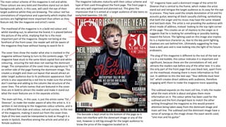
  • 1. “Q” magazine have used a dominant image of the artist Ed Sheeran that is central to the frame, which makes the artist stand out and intrigue the target audience as its easy for the eye to process. They have used the simple denotation of Ed and his acoustic guitar, wearing all black casually clothing; symbolizing that both the singer and his music may have the same relaxed and laid back style. The artist is not providing the audience with direct mode of address, instead looking to the top right corner of the page. This creates an air of mystery to the singer as it suggests that he is looking for something or possibly looking toward the future. The lighting used on this image also implies he is a mysterious character as, due to the key point lighting, shadows are cast behind him. Ultimately suggesting he may have a dark past and is now looking into the light of his future endeavors. The masthead of the magazine is in a bold red colour and whilst standing out, to advertise the brand, it is placed behind the picture of the artist, implying that he is the most important part of the magazine. Despite not being at the forefront of the front cover, the reader will still be aware of the magazine they have without having to search for it. The main sell-line,, in this case, is just the artists name “Ed Sheeran”, to make the reader aware of who the artist is. It is written in red sticking to the magazines colour scheme, and is in a different font style and colour, red and cursive, to the rest of the magazine, making it stand out from the cover-lines. Style of this text could be interpreted to look as though it is wrote in lipstick, therefore aiming the article and artist at a female audience. The subhead expands on the main cell line, it tells the reader what the main article is about and gives them more information on it. The colour white has been used for the subhead and the font changed back to match the other writing throughout the magazine as this would prevent attention being taken away from the dominant image and main sell-line. The subhead and the dominant image have a sense of synergy as the image shows the exact words used, "one man and his guitar.” The barcode is kept small to the bottom of the page so it does not interfere with the dominant image or any of the text, however is still big enough for the target audience to know the price of the magazine located on it. The cover lines show the reader what else is involved in the magazine without having to turn to the contents page. “Q” magazine have stuck to the same block capital font and white colouring, ensuring the text does not overlap the dominant image. The composition of the cover lines are signature to “Q”, on either side of the page framing the dominant image. This creates a straight and clean cut layout that would attract an older target audience due to its profession appearance. Each article is also separated by a red line to make sure the articles don’t overlap and adding to the column like structure of the cover lines. The artists names that are featured in the cover lines are in bold to attract the reader and make it stand out what the main features are in the separate articles. The plug of this magazine is different to the rest of the text as it is in a red bubble, this colour indicates it is important and significant, because these are the connotations of red, and attracts the readers eye before any of the other text. It is also the only part of the front page that uses black text, apart from on the masthead; showing there is more information to find out. In addition to this the text says “Your definite must hear list” which creates direct address with audience, therefore engaging with them to make the magazine more appealing. The main colour scheme of this magazine is red and white. These colours are very bold and therefore stand out on dark backgrounds which, in this case, will catch the eye of their target audience whilst they are browsing. The colour red has connotations of importance and superiority which implies that sections are highlighted more important than others as they feature red, like the magazine and artist’s name. The magazine indicates maturity with their colour scheme and type of font used throughout the front page. The front page is also very well organized and planned out. This gives the impression that it is aimed at a target audience of late teens to early/mid twenties. (16-24)
  • 2. The masthead of this magazine, the “V” which represents the magazine name “Vibe” is situated behind the dominant image of Kanye West. This implies that the artist is bigger than the magazine and are the star in this particular instance as he is at the forefront of the page. The use of the single letter “V” is almost like a logo for Vibe magazine, which makes the brand more recognizable and creates synergy throughout their magazine. The colour scheme for this magazine is rather monochromatic which creates a classic and elegant magazine with a professional finish. With in the dominate image the dentation of a heart is coloured red, which has connotations of love, lust and possible danger. This injection of colour draws in the audiences' eye imminently as it is a bold and makes a statement that hints to the subject of the possible story surrounding the artists appearance in the magazine. The dominate image is of rapper Kanye West at mid shot with an arm coming over his shoulder. This particular denotation shows him in a shirt and jacket; not the typical clothing for his music genre as the ”suited and booted” look has connotations professionalism, education and a more classical sound in music. The stereotypical rapper is not usually represented in the media in this way, however the brooding facial expression and the lax, almost uninterested body stance, hands in pockets, are more conventional to the music genre he originates from. the image is eyelevel meaning that there is direct mode of address, which results in a connection with the audience and the magazine/artist. In addition to Kanye West himself, the arm holding a heart-like object coming from over his shoulder is also a main feature of this image. The denotation suggests that someone is tries to take his heart and possibly trap the artist; shown by the possessive grip the hand has on the heart. On the other hand, due to the arm coming from behind Kanye, one could infer that someone from Kanye’s past still has a hold over him and he cant move on with is love life. Overall the audience is left with the impression that the feature will consist of mainly the artists love life/ personal life. The heading of this page is on the right hand side which creates balance between the two sides, the image and the writing. The “contents” is presented in an unusual layout, instead of being featured on one straight line the word is split into three separate parts, which creates a different and original vibe to the magazine. Also, the colouring and font of the text, black block capitals, makes the page stand out and easily understandable from a distance despite the odd layout. On the contents page the subheadings “features” and “fashion” are both in black which matches the heading, however their fonts differ. The subheadings have a cursive font which is stylish and rather fancy. This, in my opinion, connects with the styling of Kanye’s clothes as they too are rather fancy. Therefore this stylish elegance is featured throughout the elements of the contents page. Underneath the subheadings there is more information about different stories within the magazine. These individual stories have their own subheadings which are dark grey in colouring and page numbers. There is then a brief summery of each story that is in a lighter grey. The colouring used throughout the magazine suggests that the darker the colouring the more important the text and as you go further down the monochromatic gradient the less important the information is for the audience to notice, from “Vibe’s” point of view. At the bottom right hand side there is the image/photographer information, which provides the audience with further detail if the wish for them
  • 3. The masthead of this article is the artists name, “Nicki Minaj”. The block capital font allows the text to be the biggest and clearest on the page; allowing the audience to easily see who the feature is about. Combining this with the fact that the colouring of the text is a hot pink, which matches the colour scheme of the double page spread, it is unmissable who the story is about. Throughout this article there is a theme of religion. First of all in the masthead when referring to ”Gospel”, a term associated very closely to the church. the actual layout of the article further emphasizes the theme as the article is separated into sections, with each one having its own subheading. The subheadings all, excluding the first, begin with with “Thou shalt…” and are numbered; resembling the ten commandments. These religious connotations seen out of place amongst the pop genre and bright colouring of this magazine however, create a unique and quirky style, much like Nicki herself, to the layout of the article. The religion combined with the way the artist is represented creates a sense of juxtaposition. The dominant image of the artist is the full height of the page and is at the forefront of the article as it is almost centered. All the text surrounds Nicki’s body and the masthead is even covered by the image, creating the sense that she is the most important thing on the page. The fact that the image blocks the artists name suggests that the magazine is confident that everyone would already know who the article is about due to the picture- after all a picture is worth a thousand words. The actual denotation of Nicki Minaj is outrageously confident clearly shown by her attire and body language. One thing that stands out the most is the denotation of her arm lifted into the center of the page with a large “icon” ring on. Judging by her stoic facial expression, it is clear she is not joking and this is her honest opinion of herself. In addition to this self confidence, Nicki also presents herself as a quirky individual due to her clothing and accessories. The fact that she wears animal print, which is stereotypically linked to people of African origins or of the R&B music genre, shows what type of music she produces. In addition to this, one could also consider this style to be attention grapping therefore implies that she likes to be center of attention. The overall appearance of Nicki looks almost like an alternative retro as she adorns a beehive hair style and a number of clashing colours and prints, with the intention to be noticed. The whole article is surrounded by negative space which allows the article not to look overwhelmed and well spaced. This also creates a minimalistic and simplistic style to the article as the main focus of the audience, at first glance, should be the bold image. On the double page spread there is also a pull quote which says, “I really toned down the sexual stuff. There was no need for me to do it.” This pull quote allows the audience to realize with out reading the article that Nicki has gone through on image change; relating to the sudden use of religious symbolism of the article as she is becoming “purer” and in a way being “born again” in terms of her representation. The colour scheme for this double page spread is pink and black. Typically pink is stereotypes as a females colour so one can assume that this article is targeted at young girls. In addition to this the pop genre is also linked to bright colours, such as this bubble gum pink colour, with stark contrasting colours like black which allows information to stand out. This article also features some of the common features in articles such as: the stand first, which outlines briefly the contents of the article, a drop cap which clearly indictes the start of the article and the by- line which ultimately shows who wrote the article.