
Recommended
More Related Content
What's hot
What's hot (19)
Viewers also liked
Similar to Kerrang! magazine analysis
Similar to Kerrang! magazine analysis (20)
Recently uploaded
Recently uploaded (20)
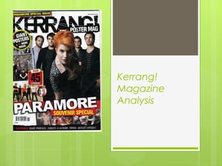
Kerrang! magazine analysis
- 2. Front Cover Banner-drawing attention to the featured posters and Warped Tour Mast Head, typically placed behind the heads of the people on the main image. Main image featuring the more commonly known artists Puff-pointing out that they have a lot of options so people check to see if there are any they are interested in Main Sell Line-Illustrates what the main feature of the magazine is, in this case it’s the top 100 rock songs Pull lines which make you want to read on ‘I’ve done stupid things’ ‘The Used saved my life’
- 3. Front Cover Kerrang! use a very standard basis and popular conventions on its cover. On a great majority of their magazines they have the heads of the people on the main image over the mast head as opposed to perhaps underneath. They have also placed the main sell line over what would be the lower body of the artists which implies that the main sell line is related to those particular artists. This would draw the reader to pick up the magazine if they saw their favourite artist. After considering other covers produced by Kerrang! it appears that this is a favourable layout for them although it has not been used on all of their magazines. Unusually on this particular cover the pull lines are small and tucked to the side so they don’t really scream at the reader or draw any attention to themselves. This could be because this is a special edition issue and seems to be more focused on the main article which is ‘The Rock 100.’ However they are still effective as the reader will still want to know why ‘the used saved [his] life’ and why the ‘haters entertain’ him etc. Kerrang! seem to use limited cover lines and the left third tends to be used up by other things. For example on this particular cover it is taken up by the main sell line and image and the bottom and the top by pull lines. While on other covers the left third is used up by previews of the posters featured inside.
- 4. Front Cover Both of these covers show a similar layout to the first one, with the main sell line over the artists on the front. However the blue one probably follows the pattern more but the green on is more recent. The colour scheme of the top one fits very well with the subjects on the front because the person on the left is from the band Green Day which fits well with the green back ground but also that is the colour of their latest album so it is a sort of subliminal promotion and people will automatically link the two. However this still links with both of them because the article the sell line is referring to is about the two bands (Green Day and All Time Low) playing a show together. As I previously mentioned, the more recent magazine Uses the left third to display the posters inside rather than cover lines or leaving it pretty much blank. This allows them to use the space more efficiently because now they have more banner space. There is one strict consistency amongst all of the magazines however and that is the banner across the top and bottom of the cover. While they don’t advertise the same things, the older magazines seem to be showing the posters but then in the newer ones they changed it to be on the left third. Personally I prefer the poster previews in the banner as they make the cover look squashed when they are down the side but this does give them a little extra space to promote concerts etc. in the banner.
- 5. Contents Page This issue has placed the contents in a column down the right side and has used the majority of the page for promoting a competition. This could have been purposely done as it is on the side that you see first as you open the page. This means that it is easier for the reader to find the page they want without having to fully open the magazine. Minimal detail has been used on the actual contents so it fits compactly into the right hand side of the page. Not much detail would be needed as it would simply clutter up the contents and make it harder for the reader to find what they are looking for. Also most of the main articles have been made apparent on the cover and since the reader has already picked up the magazine they don’t need further enticing to look at the magazine. The big space used for promoting the competition ensures that you can’t miss it and Slipknot fans will recognise the band immediately and possibly take an interest. Most of their magazines feature a competition on the contents page which increases the chance of people paying attention to it because the contents page is very often the first page people turn to and pay attention to. For example if they featured a competition on a page midway through the magazine the reader may just skip past it without even noticing it. They also include a note from the editor at the bottom of the page. It’s not very long but it just gives the reader a small update for example in this one he is informing the reader that the usual editor is away and he will be taking over for the week. By including this the editor is making the magazine feel more personal because the editor himself is addressing the reader.
- 6. Contents Page This is an example of another contents page by Kerrang! This one is in the same layout as the other for example there is a competition which is the main feature of the page, the contents itself is on the right and there is a note from the editor at the bottom. For the competition section they use bright colours and fonts that are not often taken seriously (comic sans) because this makes it obviously informal which is important because the target audience of the magazine would be younger people-teenagers and possibly young adults. This is another example but from a more recent issue. Here they have changed the layout, putting the editor’s message on the right and the contents in the bottom half of the page. Also, they have taken out the competition and replaced it with an image from one of the pages. Another difference between the two is that they seem to have included more detail in the contents. Most of the page titles have a short caption after them whereas in the older ones they only include captions in about half of them.
- 7. Double Page Spread In both of these spreads they have immediately related the text to the photo which makes it more interesting to look at and more intriguing. In the first one the heading is ‘Smashing It!’ with a photo of the singer punching what appears to be glass. In the second they have ‘Bloody Hell…’ with a photo of the band covered in blood. They also have a fluent colour scheme to match, for example the band in the top spread mostly centre their image around the colour black so the whole page is black with a bit of red included to make things like subheadings stand out. The second spread is relating to blood so all of the writing is on a red background. Despite them being double page spreads neither of them actually have a large amount of writing on them. Most of the space on the pages is taken up by the main image of the band/ person and the heading which leaves only about 2/3s of a page left for text. This makes the page look full while it doesn’t have an eye-watering amount of text. Another common factor between the two spreads is that they both contain quotes from the article made larger so they stand out. This will be inevitably what the reader reads first and they, like the pull lines on the cover, draw the reader in to keep them wanting to read on. For example ‘I was 12 hours away from losing my leg…’ and ‘I’ll never be satisfied’. They are intriguing quotes and make you want to know why he nearly lost his leg and why he’ll never be satisfied.