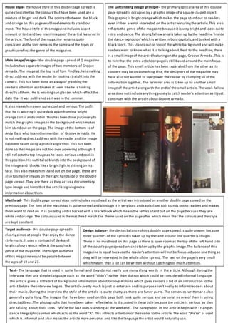
1. House style- the house style of this doublepage spread is
quite consistentas the colours thathave been used are a
mixture of bright and dark. The contrastbetween the black
and orange on this page enables elements to stand out
more. The housestyle of this magazineincludes a vast
amount of text and two main images of the artistfeatured in
the article.The font of the magazine remains quite
consistentas the font remains the same and the types of
graphics reflectthe genre of the magazine.
The Guttenberg design principle- the primary optical area of this double
page spread is occupied by a graphic imageof a squareshaped object.
This graphic is brightorangewhich makes the page stand out to readers
even if they arenot interested on the artistfeaturingthe article.This also
reflects the genre of the magazine becauseit is very bright and looks quite
retro and dance. The strong fallowarea is taken up by the headline ‘inside
the dance explosion’which is written in bold capitals,and backed with a
black block.This stands outon top of the white background and will make
readers want to know what it is talkingabout.Next to the headline,there
is a small imageof the artistfeaturingon the page, Groove Armada. This is
to hintthat the extra articleon page is still based around the main focus
of the page. This small articlehas been separated from the other as its
concern may be on something else, the designers of the magazine may
have also notwanted to overpower the reader by clumpingall of the
information together. The terminal area is taken up by another small
image of the artistalongwith the end of the small article.The weak fallow
area does not includeanythingpurely to catch reader’s attention as it just
continues with the articleaboutGroove Armada.
It also makes himseem quite cool and serious.The outfit
that he is wearingis quitedark apartfrom the bright
orange collar and symbol.This has been done purposely to
match the graphic images in the background which makes
him stand out on the page. The image at the bottom is of
Andy Gato who is another member of Groove Armada. He
is not makingdirect address with the reader and the image
has been taken usinga profileangleshot. This has been
done so the images are not too over powering although it
still reflects thetop image as he looks serious and cool in
this position.His outfitalso blends into the background of
the image and itlooks likea brightlightis shiningon his
face. This also makes himstand out on the page. There are
also to smaller images on the right hand sideof the double
page spread. They are there as they actas a documentary
type image and hints that the articleis givingmore
information aboutthem.
Masthead- This doublepage spread does not includea masthead as the artistwas introduced on another double page spread on the
previous page. The font of the masthead is quite normal and although it is very bold and capitalised so itstands out to readers and makes
them want to read on. It is quitebig and is backed with a black block which makes the letters stand out on the page because they are
white and orange. The colours used in the masthead match the theme used on the page after which mean that the colours and the style
are kept constant.
Design balance- the design balanceof this double page spread is quiteuneven because
three quarters of the spread is taken up by text and around one quarter is images.
There is no masthead on this page so there is open room at the top of the left hand side
of the double page spread which is taken up by the graphic image.The balanceof this
magazine is equal becausethe reader’s attention will notbe focussed upon one thing as
they will be interested in the whole of the spread. The text on the page is very small
which means that a lot can be written without catchingtoo much attention.
Target audience- this double page spread is
clearly aimed atpeople that enjoy the dance
stylemusic.It uses a contrastof dark and
brightcolours which reflects the pop/rock
genre of the magazine. The target audience
of this magazine would be people between
the ages of 19 and 27.
Main image/images- the double page spread of Q magazine
includes two separateimages of two members of Groove
Armada. The image at the top is of Tom Findlay,heis making
directaddress with the reader by lookingstraightinto the
camera. This has been done as a way of grabbingthe
reader’s attention as itmakes it seem likehe is looking
directly atthem. He is wearingsun glasses which reflectthe
date that itwas published as itwas in the summer.
Text- The language that is used is quite formal and they do not really use many slang words in the article. Although during the
interview they use simple language such as the word “didn’t” rather than did not which could be considered informal language.
The article gives a little bit of background information about Groove Armada which gives readers a bit of an introduction to the
artist before the interview begins. The article pretty much is just to entertain and its purpose isn’t really to inform readers about
their music. During the interview the style of the article is quite chatty as there are funny parts. The sentences written ar e also
generally quite long. The images that have been used on this page both look quite serious and personal as one of them is usi ng
directaddress.The photographs that have been taken reflect what is discussed in the article because the article is serious as they
are talking about their lives. “We’re the last ones standing at the weekend”. The paragraphs in the article begin with triangles
dance likegraphic symbol which acts as the word “A”. This attracts attention of the reader to the article. The word “We’re” is used
which is informal and also makes the article more personal and like the language the artist would naturally use.