TataKelola dan KamSiber Kecerdasan Buatan v022.pdf
Contents Page Analysis
1. Sophie Harrison
House Style
The colours ofthe contents page area
mainlyred white andblackwhichfits
in withthe rest of the magazine
general colour scheme. Alsothe black
writingfits inthe gene ofrock within
the magazine as quite darkcolours
tend to be associated withrock. It
also gives the magazine a more edgy
look. The style of contents page is
also kept the same in every
magazine; thisis sotheyhave a
particular style for their magazine
and then the audience willbe usedto
the style of the magazine.
Target Audience
I wouldsaythe target audience of
this magazine is 18-30. I would sayit
is a mainlyaimedat menbut still
aimedat women. I wouldsaythis
because of the artist and
advertisements used withinthe
magazine, the artists used on the
contents page you wouldexpect
males to like. Alsothe darkand
neutral colours used onthe contents
page suggest that it’s a male
dominatedcolour as these colours
are stereotypicallylinkedwith males.
Design Balance (informal/formal)
The design balance is informalbalance as everything is spread
aroundthe page insections, however thoughit the information
looks organisedinthe sections eventhough it’s spread out around
this page sothisgives the magazine a professional look. Alsothe
use of pictures makes the page easier to readandunderstandwho
is going to be in the magazine.
Gutenberg Principal
The primaryoptical area has the
mastheadina redbox andit stands
out so people notice it easilyand it
will be a hint about what sort of
artists are used in the magazine. Also
the numbers of the pagesare there
with what’s onthem to give the
reader the informationtheyneed
straight away. The strongfallow area
where people tend to looknext has 3
big red boxes that stand out andhas
important informationin to tryand
persuade the reader to continue
reading. Inthe terminal areaand
weak fallowarea theyhave the
magazinesadvertisements and
‘contributors’ whichis the less
important informationwhich people
are not reallyinterested in.
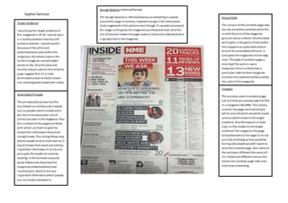
Imagery
The pictures usedincontents page
are of artists you wouldexpect to find
in a magazine like NME. The colours
usedon the page are mainlyblack
white and redwhich are white manly
colours whichrelate to the target
audience. Alsothe layout is a basic
style so this relates to the target
audience The imageson the page
helpbalancedout the page so its not
just lots of writing as that wouldbe
boring and people wouldn’t want to
read the contents page. Also some of
the writingis different like some of t
its inbold and different colours this
makes the contents page look nicer
and mote interesting..
2. Sophie Harrison
GutenbergPrincipal
The primary optical area has the
name of the magazine on and it
stands out as itis white writingon
a black background.The strong
fallowarea has the contents and
numbers of what’s on each page
again this writingstand out
because it’s white writingin a
black background.The picture
starts off in the primary optical
area down to the terminal area,
the image also takes up most of
the page and itstands out. In the
weak fallowarea and the terminal
areas haveinformation about a
free cd.
Target Audience
The target audience ofthe magazine
is 18-30 andwith a maintarget
audience of males who like to go out
clubbingor going to festivals and
followor evenset the trends as the
image onthe page reallyemphasises
this.. I wouldsaythis because of the
use of artists and the style of the
magazine ingeneral. From the
contents page. Also because of the
simple style ofthe waythe contents
age is set out you could saythe target
audience will be young as theydon’t
care how the magazine is set out.
Design Balance
The layout of the page is formal as everything looks to be organised
but the picture is informal but it is however symmetrical. The
layout ofthe page makes the magazine look fancybut the picture
stuck inthe middle ofthe page makes it looka but unprofessional
and like theycouldn’t be botheredto put info onthe page.
HouseStyle
The coloursused on thepageare
black and whitewith theimage
actually bringingsome colourto
the page,the coloursused linkto
the targetaudienceasthey are
mescalinecolours.Thecolours
could linkto thegenre of the
magazine.Thecontents page
becauseof theimagelooksquite
vibrantas everyoneseems to
laughingand havinga good time
this will encouragepeopleto read
the magazine.
Vibrant
Imagery
The colours used on the page
are dark colours, which could
link to the clubbing side of
the magazine. Also the image
you findon the contents
page is an image you would
expect to find in a festival
special of a magazine and on
a contents page. The image is
bright which you could linkto
the festivals and the sort of
music people would listen to
who read this magazine.
3. Sophie Harrison
Evaluation
Both magazines have around the same target audience but both have very different styles and genres that
will appeal to the target audience. The colours used on the contents page are the same black and white
colours but NME magazine has the red colour on it which is like their trademark and what they are
recognised by. The mixmag is quite a simple lay out with not a lot if information on it where as NME has
lots of information on the page, it also has small images all over the page, but mixmag has one large image
taking up most of the page. They both have the name of the magazine in the top left hand corner of the
magazine. Both magazines have some similarities but mainly differences.