1. House style- the house style of this
magazine is quiteconstantas the
font continues the same throughout
the issuealthough the sizeand
colour changes depending on the
feature. The interview in this
magazine is written in a small,black,
normal font. The double page spread
includes a masthead,main image,
and text which are the key elements
of house style. The house stylefits
the usual expectation of Kerrang
magazine as itis very in-your-face,
dark/rebellious and bold.
The Guttenberg design principle- the primary optical area and the
strong fallowarea of this double page spread are both quite
empty. They are only occupied by the big bold masthead. The
terminal area includes a rectangular box which is quiteattention
grabbingbecauseit is brightread. Insidethe box there is text with
more information from Corey about the album and music they are
producing.There is also an imageof the band Slipknotin the
terminal area to informreaders that the information in the box is
still based on them. There is text in this area alongwith another
image of the main feature of this double page spread (Corey). The
weak fallowarea also includes an imageof the artistalongwith
text, the two double pages are splitup by a big image of himin the
middle, and this would make it formally balanced becauseitis
almostsymmetrical.
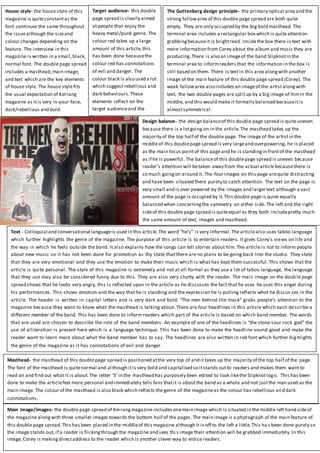
Main image/images- the double page spread of Kerrangmagazine includes onemain image which is situated in the middle left hand sideof
the magazine alongwith three smaller images towards the bottom half of the pages. The main image is a photograph of the main feature of
this double page spread.This has been placed in the middleof this magazine although it is off to the left a little.This ha s been done purely so
the image stands out, if a reader is flickingthrough the magazine and sees thi s image their attention will be grabbed immediately.In this
image, Corey is makingdirectaddress to the reader which is another clever way to entice readers.
Masthead- the masthead of this doublepage spread is positioned atthe very top of and it takes up the majority of the top half of the page.
The font of the masthead is quitenormal and although itis very bold and capitalised so itstands outto readers and makes them want to
read on and find out what it is about.The letter ‘S’ in the masthead has purposely been edited to look likethe Slipknotlogo. This has been
done to make the articlefeel more personal and immediately tells fans thatit is aboutthe band as a whole and not justthe man used as the
main image. The colour of the masthead is also black which reflects the genre of the magazineas the colour has rebellious and dark
connotations.
Design balance- the design balanceof this double page spread is quiteuneven
because there is a lotgoing on in the article.The masthead takes up the
majority of the top half of the double page. The image of the artistin the
middleof this doublepage spread is very largeand overpowering, he is placed
as the main focus pointof this page and he is standingin frontof the masthead
as if he is powerful. The balanceof this doublepage spread is uneven because
reader’s attention will betaken away from the actual articlebecausethere is
so much goingon around it. The four images on this page arequite distracting
and have been situated there purely to catch attention. The text on the page is
very small and is over powered by the images and larger text although a vast
amount of the page is occupied by it.This double page is quite equally
balanced when concerningthe symmetry on either side. The left and the right
sideof this double page spread is quiteequal as they both includepretty much
the same amount of text, images and masthead.
Target audience- this double
page spread is clearly aimed
at people that enjoy the
heavy metal/punk genre. The
colour red takes up a large
amount of this article,this
has been done becausethe
colour red has connotations
of evil and danger. The
colour black is also used a lot
which suggest rebellious and
dark behaviours.These
elements reflect on the
target audienceand the
colours arehints on the type
of genre it is.
Text - Colloquial and conversational languageis used in this article.The word “he’s” is very informal.The articlealso uses taboo language
which further highlights the genre of the magazine. The purpose of this article is to entertain readers. It gives Corey’s views on life and
the way in which he feels outside the band. It also explains how the songs can tell stories about him. The article is not to inform people
about new music so it has not been done for promotion as thy state that there are no plans to be going back into the studio. They state
that they are very emotional and they use the emotion to make their music which is what has kept them successful. This shows that the
article is quite personal. The style of this magazine is extremely and not at all formal as they use a lot of taboo language, the language
that they use may also be considered funny due to this. They are also very chatty with the reader. The main image on the doub le page
spread shows that he looks very angry, this is reflected upon in the article as he discusses the fact that he uses he uses this anger during
his performances. This shows emotion and the way that he is standing and the expression he is pulling reflects what he discus ses in the
article. The header is written in capital letters and is very dark and bold. “The men behind the mask” grabs people’s attention to the
magazine because they want to know what the masthead is talking about. There are four headlines in this article which each describe a
different member of the band. This has been done to inform readers which part of the article is based on which band member. The words
that are used are chosen to describe the role of the band members. An example of one of the headlines is “the stone sour rock god” the
use of alliteration is present here which is a language technique. This has been done to make the headline sound good and make the
reader want to learn more about what the band member has to say. The headlines are also written in red font which further highlights
the genre of the magazine as it has connotations of evil and danger.