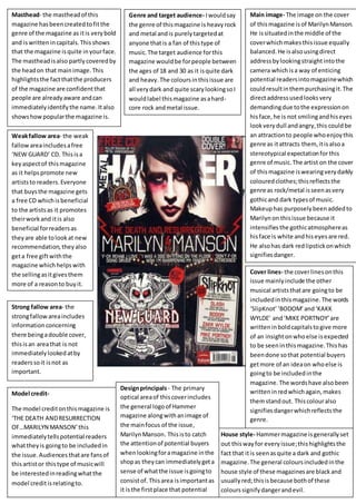
1. Masthead- the mastheadof this
magazine hasbeencreatedtofitthe
genre of the magazine as itis verybold
and iswrittenincapitals.Thisshows
that the magazine isquite inyourface.
The mastheadisalso partlycoveredby
the headon that mainimage.This
highlightsthe factthatthe producers
of the magazine are confidentthat
people are alreadyaware andcan
immediatelyidentifythe name.Italso
showshowpopularthe magazine is.
Genre and target audience- Iwouldsay
the genre of thismagazine is heavyrock
and metal andis purelytargetedat
anyone thatis a fan of thistype of
music.The target audience forthis
magazine wouldbe forpeople between
the ages of 18 and 30 as it isquite dark
and heavy.The coloursinthisissue are
all verydark and quite scarylookingsoI
wouldlabel thismagazine asahard-
core rock andmetal issue.
Main image- The image on the cover
of thismagazine isof MarilynManson.
He issituatedinthe middle of the
coverwhichmakesthisissue equally
balanced.He isalsousingdirect
addressbylookingstraightintothe
camera whichisa way of enticing
potential readersintomagazinewhich
couldresultinthempurchasingit.The
directaddressusedlooksvery
demandingdue tothe expressionon
hisface,he is not smilingandhiseyes
lookverydull andangry,this couldbe
an attractionto people whoenjoythis
genre as itattracts them,itisalsoa
stereotypical expectationforthis
genre of music.The artist on the cover
of thismagazine iswearingverydarkly
colouredclothes;thisreflectsthe
genre as rock/metal isseenasvery
gothicand dark typesof music.
Makeuphas purposelybeenaddedto
Marilynon thisissue because it
intensifiesthe gothicatmosphereas
hisface is white andhiseyesare red.
He alsohas dark redlipstickonwhich
signifiesdanger.
Cover lines- the coverlinesonthis
issue mainlyinclude the other
musical artiststhatare goingto be
includedinthismagazine.The words
‘SlipKnot’‘BODOM’and‘KAKK
WYLDE’ and‘MIKE PORTNOY’are
writteninboldcapitalstogive more
of an insightonwhoelse isexpected
to be seeninthismagazine.Thishas
beendone sothat potential buyers
getmore of an ideaon whoelse is
goingto be includedinthe
magazine. The wordshave alsobeen
writteninredwhichagain,makes
themstandout. Thiscolouralso
signifiesdangerwhichreflectsthe
genre.
Weakfallow area- the weak
fallowareaincludesafree
‘NEW GUARD’ CD. Thisisa
keyaspectof thismagazine
as it helpspromote new
artiststo readers.Everyone
that buysthe magazine gets
a free CD whichisbeneficial
to the artistsas it promotes
theirworkand itis also
beneficial forreadersas
theyare able tolookat new
recommendation,theyalso
geta free giftwiththe
magazine whichhelpswith
the sellingasitgivesthem
more of a reasonto buyit.
Model credit-
The model creditonthismagazine is
‘THE DEATH ANDRESURRECTION
OF…MARILYN MANSON’this
immediatelytellspotential readers
whattheyis goingto be includedin
the issue.Audiences thatare fansof
thisartistor thistype of musicwill
be interestedinreadingwhatthe
model creditisrelatingto.
Strong fallow area- the
strongfallowareaincludes
informationconcerning
there beingadouble cover,
thisisan areathat is not
immediatelylookedatby
readerssoit isnot as
important.
House style- Hammermagazine isgenerallyset
out thiswayfor everyissue;thishighlightsthe
fact that itis seenasquite a dark and gothic
magazine.The general coloursincludedinthe
house style of these magazinesare blackand
usuallyred;thisisbecause bothof these
colourssignifydangerandevil.
Designprincipals- The primary
optical areaof thiscoverincludes
the general logoof Hammer
magazine alongwithanimage of
the mainfocus of the issue,
MarilynManson. Thisisto catch
the attentionof potential buyers
whenlookingforamagazine inthe
shopas theycan immediatelygeta
sense of whatthe issue isgoingto
consistof.Thisarea isimportantas
it isthe firstplace that potential
readerslooksoit has to be