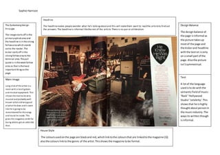
Sophie Harrison
House Style
The colours used on this doublepage spread areblack red and white and this fits in,some ways with the ‘British’theme
but also fits in with the genre of rock and dark colours likeblack areusually associated with that type of genre of music.
The fonts used on the page are justsimpleand the layoutis mainly pictures on one sideand text on the other which gives
a nice balancefor the reader.
The Guttenberg Design
Principle
The Guttenberg designprincipal
can be appliedas the kicker with
the main information onthe
page is in theprimary optical
area. It is a littlebitstrangethat
the headlinehowever is inthe
weak fallow area but the colours
ofred helps it to stand out
though. In the terminal area
there is just a box witha few
logos in that peoplemay notbe
as interestedin and themain
picture is inthestrong fallow
area and stands out.
Main Image/images
The main imageon the pageis of
band/artists with their Kerrang
awards ands it the biggestthing
on the page which emphasises
what the articleis about. The
other images areof other artist
with theirawards whicharea
little smaller this gives the
audience a hint of whatis to
come in therest of the magazine
as the artistall look rock androll
and like they would fit in to a
typical band thatwouldbe
shown in this magazine..
Headline
The headline of ‘Bestof British’suggeststhe magazineisthe bestmagazine togetall yourmusicinformation
from;alsothe headline isquitepersuasivebecause youwill wanttoreaditto findout whoisactuallythe best.
Text
The point ofthe text is to
inform people about what is
happening at these awards
and to inform you in to what
artists have wonor were
nominated. It is written
informally. The text uses
words that can be kinked
with the semantic field of
music like ‘rock’ andthisalso
links the genre of the
magazine whichwill make
the reader more interested.
DesignBalanceDesign Balance
The layoutof thepage
comes acrossinformal as
the picturetakes usmostof
the roomof the pageand
there is only alittlebitof
text on the pagebut this is
whatmakes themagazinea
littlebutmoreedgy which
linksto thegenreof the
magazine.Thepageis still
easy to read even though
there is a lotgoingon.
Sophie Harrison
Headline
DesignBalance
TextMain Image/images
The GuttenbergDesign
Principle
House Style
There aren’t many other colours used on the page other than black which is the text which is usually thenormal in every
magazine, however though the images do bringlittlecolour to the page ,however though the use of justblack makes the
double page spread seem more formal even though the design balanceis quiteinformal.
Design Balance
The waythe page hasbeen
set out makesit lookformal.
However through the set out
of the page is informal as the
picture o the pages don’t
match up. There a 6 columns
usedon the doubler page
sparedandtheyare broken
up with pictures so it makesit
easier on the reader. They
also have pull quotes from
the text to give a sense of
what is being said in the
article.
Headline
There isno headline onthe page totalkabout.
The GuttenbergDesign
Principle
The startof thetext is in the
primaryoptical area aswell
as themain imagesthisisso
peoplewill berefreshed
with the images as thisis
where everyonewill go first
to read thetext. In the
terminal areathereare
somemorepictures to
break up justhavingsmall
text all over thepage.
Main image/images
Lots of photos on this page
of his career whichshow
some ofthis best moments as
an artist andina band.The
photo shows his personal life
which suggests he has been
aroundfor manyyears and
had his relationships inthe
public eye for a while. The
photos linkto article as it’s
about his music career. The
mise enscene ofthe pictures
are quite rock androll which
linkto the genre of the
magazine.
Text
The articlecome across
serious it’s notgot many
funny moments or slangin
it this will bebecausethe
articleis there really just
to remember his career
and to honour someone.
Also the articlehas lots of
link with the semantic
field of music which
relates even more to the
artist.
Sophie Harrison
House Style
The coloursusedonthe page are blackand red,whichlinktothe coloursthat are linkedtothe magazine (Q)
alsothe colours linkto the genre of the artist.Thisshowsthe magazine tobe formal.
Text
DesignBalance
Headline
Main Image/images
The GuttenbergDesign
Principle
Headline
The headlinemakes people wonder what he’s talkingaboutand this will makethem want to read the articleto find out
the answers.The headlineis informal likethe rest of the article.There is no pun or alliteration.
DesignBalance
The designbalance of
the page isinformal as
the picture takesup
mostof the page and
the kickerand headline
withthe texton isonly
on a small part of the
page.Alsothe picture
isn’tsymmetrical.
Text
A lotof the language
usedisto do withthe
semanticfieldof music:
‘Rock’‘Hollywood
Studio’‘celebrity’.This
showsthat he ishighly
thoughtaboutpersonin
the musicindustry.The
waysits writtenthough
isinformal.
. Its written pretty
informal.
Main image
Long shot of the artist ina
room with a lot of guitars
and musical equipment. This
shows the manto be very
musical andprobablywell-
known artist andverygood
at what he does andit seem
like he is going to be
rememberedfor the songs
and music he made. This
gives the magazine credit for
being ableto get an artist like
that.
The GuttenbergDesign
Principle
The imagestartsoff in the
primaryoptical area and
the headlineisin thestrong
fallowareawhich stands
outto the reader.The
kicker startsoff in the
strongfallowareato the
terminal area.Thepull
quoteis in theweak fallow
area as thatistheleast
importantthingon the
page.
Sophie Harrison
Gutters
Dropcap
Pull Quotes
White Space
Caption
Pictures
Caption
BodyText
Dropcap
Sophie Harrison
Picture
Headline
Pull Quote
Kicker
Caption

Double Page Spread Analysis

  • 1.
    Sophie Harrison House Style Thecolours used on this doublepage spread areblack red and white and this fits in,some ways with the ‘British’theme but also fits in with the genre of rock and dark colours likeblack areusually associated with that type of genre of music. The fonts used on the page are justsimpleand the layoutis mainly pictures on one sideand text on the other which gives a nice balancefor the reader. The Guttenberg Design Principle The Guttenberg designprincipal can be appliedas the kicker with the main information onthe page is in theprimary optical area. It is a littlebitstrangethat the headlinehowever is inthe weak fallow area but the colours ofred helps it to stand out though. In the terminal area there is just a box witha few logos in that peoplemay notbe as interestedin and themain picture is inthestrong fallow area and stands out. Main Image/images The main imageon the pageis of band/artists with their Kerrang awards ands it the biggestthing on the page which emphasises what the articleis about. The other images areof other artist with theirawards whicharea little smaller this gives the audience a hint of whatis to come in therest of the magazine as the artistall look rock androll and like they would fit in to a typical band thatwouldbe shown in this magazine.. Headline The headline of ‘Bestof British’suggeststhe magazineisthe bestmagazine togetall yourmusicinformation from;alsothe headline isquitepersuasivebecause youwill wanttoreaditto findout whoisactuallythe best. Text The point ofthe text is to inform people about what is happening at these awards and to inform you in to what artists have wonor were nominated. It is written informally. The text uses words that can be kinked with the semantic field of music like ‘rock’ andthisalso links the genre of the magazine whichwill make the reader more interested. DesignBalanceDesign Balance The layoutof thepage comes acrossinformal as the picturetakes usmostof the roomof the pageand there is only alittlebitof text on the pagebut this is whatmakes themagazinea littlebutmoreedgy which linksto thegenreof the magazine.Thepageis still easy to read even though there is a lotgoingon.
  • 2.
    Sophie Harrison Headline DesignBalance TextMain Image/images TheGuttenbergDesign Principle House Style There aren’t many other colours used on the page other than black which is the text which is usually thenormal in every magazine, however though the images do bringlittlecolour to the page ,however though the use of justblack makes the double page spread seem more formal even though the design balanceis quiteinformal. Design Balance The waythe page hasbeen set out makesit lookformal. However through the set out of the page is informal as the picture o the pages don’t match up. There a 6 columns usedon the doubler page sparedandtheyare broken up with pictures so it makesit easier on the reader. They also have pull quotes from the text to give a sense of what is being said in the article. Headline There isno headline onthe page totalkabout. The GuttenbergDesign Principle The startof thetext is in the primaryoptical area aswell as themain imagesthisisso peoplewill berefreshed with the images as thisis where everyonewill go first to read thetext. In the terminal areathereare somemorepictures to break up justhavingsmall text all over thepage. Main image/images Lots of photos on this page of his career whichshow some ofthis best moments as an artist andina band.The photo shows his personal life which suggests he has been aroundfor manyyears and had his relationships inthe public eye for a while. The photos linkto article as it’s about his music career. The mise enscene ofthe pictures are quite rock androll which linkto the genre of the magazine. Text The articlecome across serious it’s notgot many funny moments or slangin it this will bebecausethe articleis there really just to remember his career and to honour someone. Also the articlehas lots of link with the semantic field of music which relates even more to the artist.
  • 3.
    Sophie Harrison House Style Thecoloursusedonthe page are blackand red,whichlinktothe coloursthat are linkedtothe magazine (Q) alsothe colours linkto the genre of the artist.Thisshowsthe magazine tobe formal. Text DesignBalance Headline Main Image/images The GuttenbergDesign Principle Headline The headlinemakes people wonder what he’s talkingaboutand this will makethem want to read the articleto find out the answers.The headlineis informal likethe rest of the article.There is no pun or alliteration. DesignBalance The designbalance of the page isinformal as the picture takesup mostof the page and the kickerand headline withthe texton isonly on a small part of the page.Alsothe picture isn’tsymmetrical. Text A lotof the language usedisto do withthe semanticfieldof music: ‘Rock’‘Hollywood Studio’‘celebrity’.This showsthat he ishighly thoughtaboutpersonin the musicindustry.The waysits writtenthough isinformal. . Its written pretty informal. Main image Long shot of the artist ina room with a lot of guitars and musical equipment. This shows the manto be very musical andprobablywell- known artist andverygood at what he does andit seem like he is going to be rememberedfor the songs and music he made. This gives the magazine credit for being ableto get an artist like that. The GuttenbergDesign Principle The imagestartsoff in the primaryoptical area and the headlineisin thestrong fallowareawhich stands outto the reader.The kicker startsoff in the strongfallowareato the terminal area.Thepull quoteis in theweak fallow area as thatistheleast importantthingon the page.
  • 4.
    Sophie Harrison Gutters Dropcap Pull Quotes WhiteSpace Caption Pictures Caption BodyText Dropcap
  • 5.