
Recommended
More Related Content
What's hot
What's hot (20)
Viewers also liked
Viewers also liked (14)
Similar to Analysis of Kerrang
Similar to Analysis of Kerrang (20)
More from AS Media Column D
More from AS Media Column D (20)
Recently uploaded
Recently uploaded (20)
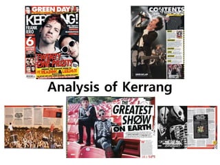
Analysis of Kerrang
- 2. Front Cover The target audience of Kerrang are aged 19-28 and are mostly male. This is suggested by the magazine showing newer and younger bands on the cover, with the majority being male. The social class of the target audience would be ABC1, and they would be intelligent, having most likely gone to university. This would be suggested throughout the long articles that are written throughout the magazine, meaning that the audience will most likely enjoy reading and have received a good education to a high level, which would suggest that they are well off, as they would have the opportunity to get a good paying job with their qualifications. The target audience would work in a job with computers of music, as they are very good with technology and electronics, and enjoy talking to people about the latest software. They are extremely passionate about music and are constantly going to concerts and festivals with friends, as their job supplies them with enough money to do this. The target audience are single, as they are young and their life of travelling to different festivals doesn’t suit a partner, who might not want to travel around a lot. When they’re not out listening to live music they enjoy playing the latest video games and listening to new bands that they read about in Kerrang. Kerrang would have the genre of a rock music magazine. Many people will infer this from the rock bands that appear on the cover and the rock festivals and concerts advertised. However, the genre is also shown through the use of red and black, which are colours commonly used in, not only rock music magazines, but also in many rock bands’ logos and album covers. The masthead of Kerrang is placed across the top of the magazine, since this will, most likely, be the first thing the audience will see, as when it is displayed on the shelf in a shop, conventionally, only the top part of the magazine is shown. It is also where the audiences’ eyes will be drawn to first because in the English language we read starting from the top left. In addition, the masthead of Kerrang doesn’t change with each issue, meaning that readers will be able to identify the magazine with ease. Furthermore, as the font that the masthead is written in denotes white, against a dark background, and is large and bold it stands out and draws the audiences’ eye straight away. It also unusual, as the font appears cracked and worn away, connoting the rock genre of the magazine.
- 3. Front Cover The main image on the magazine is a medium close up of the duo Twenty One Pilots, consisting of members Tyler Joseph and Josh Dun. Whilst Joseph is wearing sun glasses, Josh is looking at the camera and therefore making eye contact with the reader, which would denote direct address. The placement of Josh’s eyes is also following the rule of thirds, as they are in line with the hotspot points on the magazine cover, meaning that the audiences’ eyes are immediately drawn to the eye contact. By directly addressing the audience, Kerrang is making them intrigued and feel as though they need to buy the magazine because it’s addressing them personally. The fact that Tyler is wearing sunglasses and to the side of the cover could be because Kerrang doesn’t want to overwhelm the audience with too much to look at, as that might put them off buying the magazine. Therefore, by having one member giving eye contact it makes it more personal for the reader. By Tyler being to the side of the image and being lower down the cover, this could suggest that Josh is the more dominant one in the partnership, as he is taller and appears to be more confident within the image. The mise-en-scene is very minimal within the main image. The lighting draws attention to their faces with a simple white light directed only at the duo, meaning that the background is dark and contrasted. There isn’t any dramatic make-up, use of lots of different props, or a busy setting, to ensure that the audience is only focused on what the magazine is about and not confused and unsure where to look.
- 4. Front Cover The main cover line anchored to the image appears, at a slight slant, across the bottom of the cover, with the name ‘Twenty One Pilots’ over the main image, and the rest of the cover line in a yellow banner underneath. The fact that the main cover line is slanted with partly worn text, would have connotations of rebellion, which would link to rock music, reiterating to the audience the genre of music within the magazine. Also the slanted text could appeal to the audience, due to it seeming friendlier. If everything on the cover was ordered and in straight lines, then it may appear too formal and put the audiences off buying it, but by making the main cover line slightly slanted it makes the magazine more approachable. There are also other cover lines and secondary images on the cover that mainly appear around the edges of the cover, so that they don’t distract from the main image and cover line. To the left hand side there is a red box with images of six posters that are included with the magazine. These images are small and don’t contain bright colours so that they don’t clash with the colours already on the cover. The posters show the audience a preview of what’s inside the magazine, and could get people who don’t wish to read the articles to buy the magazine as well. Across the top of the cover there is a cover line for a Green Day interview. As it’s along the top, Kerrang clearly thinks that the interview will appeal to the audience, but again don’t want it to distract from the main cover line. It will also be visible to the audience when the magazine is in a shop, meaning that it will intrigue readers into picking up the magazine, and then buy it after seeing the main image and cover line. In addition there are three cover lines under the masthead. These cover lines are small and not manipulated with a worn effect. They don’t interfere with the main image, so the cover doesn’t appear to be overcrowded, but fill the dead space around them, so the cover doesn’t look bare either.
- 5. Front Cover The mode of address within the magazine clearly aims to excite the reader and make them think that they need to buy the magazine. The cover contains many uses of the exclamation mark: ‘6 Awesome Posters!’, ‘The World is Bonkers!’, ‘& Everyone Else You Need to See This Weekend!’. The use of the exclamation marks intends to make the magazine sound more exciting, which in turn makes the audience more excited to read it. It also links to the masthead: ‘Kerrang!’, meaning that the cover seems better composed and there are no fragments between the cover lines. Direct address is not only used in the main image, but also in the main cover line: ‘& Everyone Else You Need to See This Weekend!’. This makes the cover line seem more personal to the reader, and makes them feel as though this guide is specific for them. There is a clear colour scheme within the magazine, as only black, white, red, and yellow appear on the cover. Black and white are contrasting colours that are bold and striking, meaning that the text will stand out and the cover will grab the attention of the reader. Red is a stimulant colour meaning that it would make the audience make quick decisions, like the decision to buy the magazine. It also connotes danger, energy, power, and determination, which would link to the rock music genre of the magazine. Yellow is a very bright colour, so it is used in very few places. It is used to attract the eye to the main cover line, which is placed in a large yellow box. The colour scheme is used thoughtfully and isn’t too garish, to ensure that, before even reading a cover line, the reader isn’t put off by the clashing colours, but attracted by the strategic placement of the four colours. The barcode is placed in the bottom left hand corner of the cover, as this is the last place that the readers’ eyes will be drawn to. This means that the barcode won’t interfere or distract from the important information on the cover.
- 6. Contents Page The masthead of the contents page is placed in the top right hand corner of the page, as this is on the opposite side to the masthead on the cover, meaning that they won’t look the same, but the masthead is still where the readers eyes are drawn to first, as it is at the top. As the font that the masthead is written in denotes white against black, and it is large and bold it stands out and draws the audiences’ eye straight away. It also has images that connote the rock genre placed underneath it, like a skull, a snake, a beer bottle and a megaphone, meaning that the masthead links the genre of the magazine. The main image on the contents page is a medium long shot of the lead singer of Green Day, Billie Joe Armstrong, singing on stage. Armstrong isn’t making eye contact with the reader, meaning that direct address isn’t used within the main image. This would draw the attention away from the information, which is the most important part of the contents page. The colours within the main image are very minimal as black and white are the predominant colours used. This both ties in with the colour scheme on the cover, and also ensures that no colours from the image clash with anything else on the page. There are three secondary images used on the contents page. One of the cover, used next to a brief breakdown of the articles that appeared as cover lines on the cover. The next secondary image is used at the bottom right of the page, which is anchored by the title of an article: ‘Bloodstock Festival’. The image is used to represent the genre of the festival, which is clearly heavy metal, shown by the costumes that the two people in the image are wearing. The third secondary image is next to the editor’s letter, and is a close up image of the editor with a rock musician, making eye contact with the audience. The use of the image of the editor means that the editor’s note feels more personal to the reader, as they are being directly addressed, and can also see who is addressing them. This means that the audience will feel more relaxed and comfortable when reading the rest of the magazine.
- 7. Contents Page The layout of the contents page consists of one column down the right hand side of the page, with the main image taking up two-thirds of the page, meaning that it follows the rule of thirds. By putting the information into a column, it organises it so that it is easy for the audience to navigate. It also makes the page look neater and more appealing. All of the text is written in sans serif font, meaning that the information is the main focus to the audience, as sans serif fonts are very plain and simple. By writing in sans serif font it also links to the rock genre, as sans serif fonts appear quite harsh and bold. The editor’s note appears just underneath the masthead in a black box. This means that it stands out from the rest of the information, which is in the white column, and as it is under the masthead, will be the first thing that the audience will read. The article titles and page numbers are written in sentences, but are in bold to make them more obvious to the reader. By writing them in sentences, this ensures that the reader gets all the information about the article that they need before reading the article, whereas if the information was just written underneath, many people would just skip past it. These articles have been split up into sections with headings, which will help the reader to find the type of article they are looking to read.
- 8. Double Page Spread The double page spread on Twenty One Pilots has used both pages for the main image, but with Twenty One Pilots on one page and the title and the other text in front of the image on the second page. The page number is located in the bottom left hand corner of the first page and the bottom right hand corner of the second page, so that the audience can flick through the corners to easily find the page. The image and text are integrated by the use of a colour scheme of black, white and red. The main image on the page is a full shot of both Tyler and Josh. Both are looking at the camera, meaning that direct address is present within the image. But as Tyler is wearing sunglasses and their faces aren’t close to the camera, the readers’ eyes are more drawn to the title of the article, as the article itself is the most important part of the double page spread. Within the image, Tyler and Josh seem to be very relaxed and are represented as cool and carefree, as they are slouching and have their feet up on the chairs. The fact that they have their feet up on the chairs and aren’t smiling, would imply the negative stereotype that famous people are quite disrespectful and arrogant. This would also be supported by the ‘#1’ across the bottom of Tyler’s shoes, which anchors the image to the title: ‘The Greatest Show on Earth’, which comes across as being quite egotistical. However, when you read the article they are actually very humble, with them saying things like: ‘every night we play, I still feel like no-one will show up’, which would break the stereotype that they would have placed upon them. The mise-en-scène is used to emphasise the genre of Twenty One Pilots’ music and to link it to the cover and contents page. The red seats and the red ‘#1’ is used to connect the double page spread to the colour scheme used on the cover and the contents page, so that the brand of the magazine isn’t lost throughout it. The clothing of the skeleton jumpers and the black outfit would connote the rock genre of music, and the backwards cap would connote a more hip-hop/rap genre, which is also present in their music.
- 9. Double Page Spread The mode of address within the double page spread isn’t formal, but not entirely informal, as the article aims to inform the reader about Twenty One Pilots and their shows and music. However, the interview style is quite relaxed, which would make the readers’ feel more at ease and not like information is being thrown at them. It also doesn’t use direct address, as the article is about Twenty One Pilots’ life and music, not about personally addressing the readers. The title of the article is written is a large, sans serif font that takes up half of the second page. It denotes black against a white background, so that it stand out and catches the readers’ eye, and appears slightly slanted, with crosses through the ‘o’s to mimic the logo of the band. The subtitle is significantly smaller than the title, is in block capitals and isn’t in bold text, apart from the words ‘Twenty One Pilots’ and ‘Josh Dun’. This means that it won’t take focus away from the title, but still stands out to the reader. ‘Twenty One Pilots’ and ‘Josh Dun’ are in bold, as they are the focus of the article. The text in the article is smaller than the subtitle, so that the subtitle stands out more to the reader. It also starts off with a drop cap, which is an effective way of grabbing the audiences’ attention and add visual strength to the page.
- 10. These are the two other double page spreads that follow the one I have analysed. Both follow the colour scheme and continue to only use sans serif fonts, so that the pages link together and are continuous. The last paragraph on the second page is always left unfinished, so that the reader will turn the page and continue to read the next page, as opposed to not knowing that it continues onto another page.
- 11. Elements that Connect the Different Parts of the Magazine It is important that different parts of a magazine are connected, because otherwise the brand identity will be lost throughout it. Within Kerrang there are many elements that connect the cover, the contents page, and the double page spread to each other. One element would be the colour scheme of black, white, red and yellow. The use of a colour scheme is very important because, before any text is read, the audience will see the colours and general layout of a magazine. Another element that connects the three parts of Kerrang would be the fonts. Kerrang only uses sans serif fonts. The use of the same or similar fonts means that the magazine doesn’t look mismatched and unorganised. It also means that the audience isn’t overwhelmed with lots of different styles of fonts. In addition the use of music artists, in this issue Twenty One Pilots, on the cover and double page spread, means that the cover relates to the articles within the magazine. This is so the audience knows what to expect from the magazine just by looking at the cover and isn’t mislead by a cover that has nothing to do with the content of the magazine.