
Recommended
More Related Content
What's hot
What's hot (18)
Viewers also liked
Viewers also liked (20)
Similar to Genre research.
Similar to Genre research. (20)
Recently uploaded
Recently uploaded (20)
Genre research.
- 1. Genre research. By Eddie Cameron
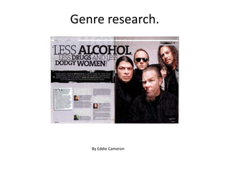
- 2. The main image on the page show 4 men who are all dressed in black clothing. This fits well with the genre of the magazine as well as the target audience as it mainly consists of dark colours. Also, from the photo, we see that most of the band has long hair or a beard. This represents the band in a rugged and rough way and it automatically gives us an idea on how they are. Also from the image we see the front man pulling a weird look from his eyebrows. This connotes that he is confused or intrigued. Its almost like he didn’t know the photo-shoot was happening, and this tell us that he doesn’t really take the photo-shoot seriously The pull quote as the title automatically gives us the target audience as it contains words such as “alcohol” “drugs” and “dodgy women”. We know that this was intended for an older audience. The words “alcohol” “drugs” and “dodgy women” are all in bold font so that they are emphasised. Fitting well with the main image on the page, there is a consistent colour scheme of black and white across this article. This is probably the house theme of the article hence why it is carried over onto this article. The text on the page is laid-out in simple column layout. This gives structure to the article as well as order to the article. The text being laid-out in this way makes the reader feel like there is less text then there actually is therefore making the article readable.
- 3. The main image of the page represents the target audience of the magazine in a very good way. It connotes anarchy and chaos which fits well with the subject of the magazine as well as the audience of the magazine going against the mainstream culture and style. There is a consistent theme of black and white on this contents page but there is a highlighted strip of red at the top of the page stating that it is the contents page. Along with the this, the logo KERRANG!’s font has a cracked glass font to it. This again connotes anarchy and “breaking the rules” which fits well with the audience of the magazine and the genre. A personal note and picture from the editor of the magazine is a typical convention of most contents pages. This brings the reader and the editors of the magazine closer on a personal level due to their being a personal message. Most contents pages will also have the subscription offer on them. KERRANG! Has offered theirs so that they can engage with their customers as well as keep their sales.
- 4. Again, like the contents page, the KERRANG! Logo has a smashed glass font to it, which connotes anarchy and chaos. It fits well with their target audience as they go against mainstream society. There is a consistent use of exclamation throughout the front cover. This tells us that each subtitle that has this is aimed at being emphasised and shouted. This fits well with the genre of the magazine with it being a loud and aggressive genre. The main image in the centre of the page shows two singers from two different magazines. The one at the front is pointing forward which engages with the reader because it as if he is pointing them personally. Along with this, he is raising one of his eyebrows which indicates confusion or he is intrigued. This shows that he is being quite adventurous with his photoshoot. The constant use of black and white is not unheard of within KERRANG! Magazine. However on this front cover, there is use of an electric blue and bright pink. This is to highlight the important information and emphasis it. Normally the subjects that are highlighted in a bright colour are the ones that the magazine deems the most important.