
Recommended
More Related Content
What's hot
What's hot (20)
Similar to Blur advert analysis
Similar to Blur advert analysis (20)
More from ellenheathfield11
More from ellenheathfield11 (17)
Recently uploaded
Recently uploaded (20)
Blur advert analysis
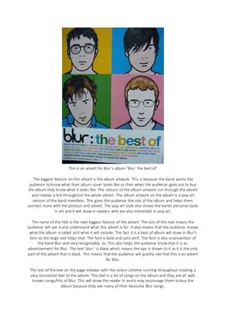
- 1. This is an advert for Blur’s album ‘Blur: the best of’ The biggest feature on this advert is the album artwork. This is because the band wants the audience to know what their album cover looks like so then when the audience goes out to buy the album they know what it looks like. The colours of the album artwork run through the advert and creates a link throughout the whole advert. The album artwork on the advert is a pop art version of the band members. This gives the audience the star of the album and helps them connect more with the product and advert. The pop art style also shows the bands personal taste in art and it will draw in readers who are also interested in pop art. The name of the title is the next biggest feature of the advert. The size of this text means the audience will see it and understand what this advert is for. It also means that the audience knows what the album is called and what it will include. The fact it is a best of album will draw in Blur’s fans so the large text helps that. The font is bold and sans serif. The font is also a convention of the band Blur and very recognisably so. This also helps the audience know that it is an advertisement for Blur. The text ‘blur:’ is black which means the eye is drawn to it as it is the only part of the advert that is black. This means that the audience will quickly see that this is an advert for Blur. The rest of the text on the page inkeeps with the colour scheme running throughout creating a very connected feel to the advert. This text is a list of songs on the album and they are all well- known songs/hits of Blur. This will draw the reader in and it may encourage them to buy the album because they see many of their favourite Blur songs.