
Recommended
More Related Content
What's hot
What's hot (20)
Viewers also liked
Similar to Pulp album analysis
Similar to Pulp album analysis (20)
More from ellenheathfield11
More from ellenheathfield11 (16)
Recently uploaded
Recently uploaded (20)
Pulp album analysis
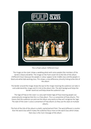
- 1. This is Pulp’s album ‘Different Class’ The image on the cover shows a wedding photo with some people (the members of the band) in black and white. The image on the front could link to the title of the album (‘Different Class’) because the people in colour appear to be middle class and the people in black and white look working class. This shows a class difference, directly linking to the title of the album. The border around the image draws the eye to the image meaning the audience can take in and understand the image and it’s link to the album title. The dark background helps the border stand out and helps draw the audience’s eye. The logo of Pulp on the cover is a very well known logo of Pulp meaning people can automatically recognise that this is a Pulp album. This is a convention of Pulp albums. This means that the audience can pick out the album very easily as they will recognise the logo. The style of the cover is also a convention of Pulp albums as they use this style on multiple albums. The font of the title of the album is a bold, capitalised serif font. The word different is smaller than the word class which makes the audience focus more on the word class which shows that class is the main message of the album.