Call Girl in Low Price Delhi Punjabi Bagh 9711199012
Adverts
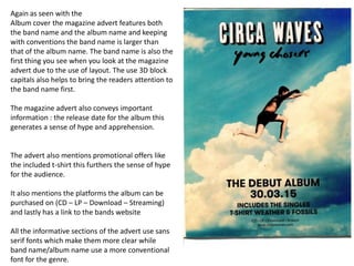
1. Again as seen with the
Album cover the magazine advert features both
the band name and the album name and keeping
with conventions the band name is larger than
that of the album name. The band name is also the
first thing you see when you look at the magazine
advert due to the use of layout. The use 3D block
capitals also helps to bring the readers attention to
the band name first.
The magazine advert also conveys important
information : the release date for the album this
generates a sense of hype and apprehension.
The advert also mentions promotional offers like
the included t-shirt this furthers the sense of hype
for the audience.
It also mentions the platforms the album can be
purchased on (CD – LP – Download – Streaming)
and lastly has a link to the bands website
All the informative sections of the advert use sans
serif fonts which make them more clear while
band name/album name use a more conventional
font for the genre.
2. Here again the artists name is the most
prominent thing on the advert instantly
identifying who the artist is to the reader, the
album name then follows quickly after.
The use of the advert is to convey the date of
the albums release to the audience.
The image of the artists creates a sense of
band identity within the advert.
Websites for the artist, the producer and the
publisher are all mentioned towards the
bottom of the advert
Fonts that are conventional for the genre are
used through the page.
3. Conventions of Form
There are some clear conventions of form for magazine adverts.
• The artist / band name is the first thing on the page and is also the most
prominent thing on the game
• The album name follows on after the artists name
• The image used attempts to create band identity
• Any promotional offers are also displayed on the page
• At the bottom there is commonly a website for the artist/band