
Recommended
More Related Content
Similar to Blur album cover analysis
Similar to Blur album cover analysis (20)
More from ellenheathfield11
More from ellenheathfield11 (15)
Recently uploaded
Recently uploaded (20)
Blur album cover analysis
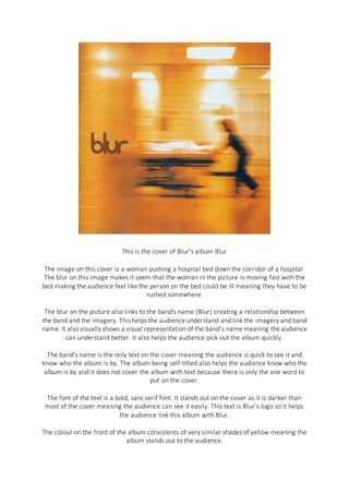
- 1. This is the cover of Blur’s album Blur The image on this cover is a woman pushing a hospital bed down the corridor of a hospital. The blur on this image makes it seem that the woman in the picture is moving fast with the bed making the audience feel like the person on the bed could be ill meaning they have to be rushed somewhere. The blur on the picture also links to the band's name (Blur) creating a relationship between the band and the imagery. This helps the audience understand and link the imagery and band name. It also visually shows a visual representation of the band’s name meaning the audience can understand better. It also helps the audience pick out the album quickly. The band’s name is the only text on the cover meaning the audience is quick to see it and know who the album is by. The album being self-titled also helps the audience know who the album is by and it does not cover the album with text because there is only the one word to put on the cover. The font of the text is a bold, sans serif font. It stands out on the cover as it is darker than most of the cover meaning the audience can see it easily. This text is Blur’s logo so it helps the audience link this album with Blur. The colour on the front of the album consistents of very similar shades of yellow meaning the album stands out to the audience.