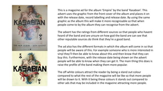
History Class XII Ch. 3 Kinship, Caste and Class (1).pptx
Advert analysis
1. This is a magazine ad for the album ‘Empire’ by the band ‘Kasabian’. This
advert uses the graphic from the front cover of the album and places it on
with the release date, record labelling and release date. By using the same
graphic as the album this will make it more recognisable so that when
people come to by the album they can recognise from the advert.
The advert has the ratings from different sources so that people who havent
heard of the band and are unsure on how god the band are can see that
other reputable sources do think that they’re a good band.
The ad also has the different formats in which the album will come in so that
people will be aware of this. For example someone who is more interested in
vinyl they’ll then be able to know about this and then know that they can
buy this. Furthermore, with the release date being shown on the advert
people will be able to know when they can get it. The main thing this does is
raise the profile of the band making them more popular.
The off white colours attract the reader by being a stand out colour
compared to what the rest of the magazine will be like so that more people
will be drawn to it. With it being these colours it stands out compared to
other ads that may be included in the magazine attracting more people.
2. This is an advert for the band Deerhunter. Its colour immediately
makes it stand out compared to anything else that is in the
magazine this is because of the colours used of yellow which isnt a
typical colour to be used on an advert then the blue. These two
colours perfectly together making it a pleasing advert to look at.
The picture that is used is from the album cover which again like
the last ad will mean that the person then buying the album will
know what to look for when buying the album. Further more it has
the name straight above it then underneath saying that it’s the
new album and that its out now. This gives the reader full
information on the album so they know how to look for it and that
they can get it now.
The blue writing fits in well with the picture as that also includes
the same shade of blue meaning that all the colours fit well
together making it good to look at. Additionally, the advert is very
simplistic which gives it a very contemporary look which will draw
many readers.
3. This again is a very simplistic advert which gives it a very
contemporary look. The font stays the same the whole way through
which gives it smart continuous look making it fluid throughout.
However, the album name is in a different colour to the rest of the
writing which means the reader will be able to easily identify what
the name of the album is when they come to buy it.
The advert also contains some information about album like the
awards its won and that it’s the debut album. It is positioned in the
middle so that people will be drawn to this and read it so that they
can take this information in. With the accreditation from the award
won from the Brit awards this will cause more people to be
interested in the album as it has won awards.
Furthermore, towards the bottom of the advert is had the release
date, record label and website so that people will know what date
they can then get the album. Also with the website at the bottom
this means that people who want further information on Tom Odell
and possibly buy merchandise or CDs online.
The font and also the photo on this advert are the same as on the
front of the album cover. This helps people who are looking for the
album so that they can easily identify it.