
Recommended
More Related Content
What's hot
What's hot (17)
Similar to Magazine advert analysis
Similar to Magazine advert analysis (20)
More from Alexandrav223
More from Alexandrav223 (20)
Recently uploaded
Recently uploaded (20)
Magazine advert analysis
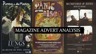
- 2. Florence and the machine The font for the band is different to the font for the name of the artist. This makes it stand out against the rest of the information on the advert. The font can also be recognisable to fans of the band and be something they are associated with. The black background of the advert helps the name of the album, artist and other key information stand out. It also compliments the colours used for the main image such as the greens and pinks of the flowers and the redness of the lungs which is relevant to the album name. The production company logo Is at the bottom of the advertisement so as a result is advertising itself as well as the band. The list of different ways you can listen to the album shows that however you plan on listening to the album it'll be available to you. The main image used shows Florence laying down in flowers. The flowers paired with the soft colours used creates a very feminine feel to the image. By using Florence it is introducing the audience to the front woman of the band. However by not looking at the camera she is not directly addressing the audience. The feminine imagery contrasts with lungs which in comparison are quite dark and morbid. The date for the realise of the album is shown so that the audience knows when it will be released. By including the release date it means a wider audience knows when its available. By including the website it means the band can promote themselves and get more information across to their target audience.
- 3. The name of the band is at the top of the advert and so is one of the first thing the audience will see. The colours used for the name of the band are mostly are whites, purples, oranges and blues. It is the largest font on the page meaning fans of the band will see his first and read on. The main image used for the pretty odd album advert is the front cover. This makes it easily identifiable so when fans of panic at the disco go to buy the album they will know what to look for. The colours used for the main image are pastel blues, yellows, pinks and whites that have a very vintage feel. This makes it clear that the album is not aimed at any gender in particular. The date for the release of the album is towards the bottom of the advert. This is essential to any advert for an album as it informs readers of when the album will be available to them. The logos for the record companies are at the bottom and are relatively small compared to the rest of the text on the advert. This is because they will be more concerned with selling the albums than themselves. By including the name of the website it means that they can attract a wider audience than before and so promote and sell themselves. The name of the single is included as well meaning that people who may know the song but not the artist could buy the album if they enjoyed it. Pretty Odd- Panic at the disco!
- 4. Mumford & Sons – Sigh No More Each member of the band is holding a instrument which helps promote the image that they are an authentic folk band who all play they're own instruments and write their own songs. The fact that all of the band have a mid shot taken of them and are in he same place shows that they are all equal parts of the band. The fact that the photos look fade remind the audience that they are from country roots and are like old fashioned bands. The title of the album and the name of band are at the top of the advertisement. This draws the audience attention to the advert especially if they are already a fan of the band. The white against the black catches the eye of the audience and draws there attention to the advert. However unlike the adverts for lungs and for pretty odd there is no release date mentioned on the poster. This is very uncommon and breaks one of the most important conventions for an advert. A quote from a magazine means that people who are fans of the magazine might listen to the album. It also recommends it to people who are maybe new to the band and by using a well respected magazine it means customers may be more likely to trust them. The logo for the record company is included although it is not meant to be the main focus of the advert. The names of singles they've previously released so that if they like the singles they could buy the album. By listing the singles it will catch the eye of anyone who's heard the name on the radio.