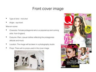
SlideShare a Scribd company logo
1 of 13
Planning
• Name (working): WorldWide
I chose this name because my magazine will be about popular international
indie artists and this title will indicate that.
• Music genre: Indie
I decided on indie as my genre because in my audience research indie was a
popular music genre.
• Price: £2.50
I chose this price because it is not too expensive and that means my magazine
can appeal to a wider audience of people.
• Frequency: Monthly
I chose monthly because you could pick the best content and get in more
content than if you did it weekly. The magazine will have 60 pages.
Reader Profile
(formed from my audience research)
• Median age : 16
• Female : 86.84%
• Male : 13.15%
• Student : 68.43%
Readers enjoy a multitude of different music
genres but specifically indie. Music is very
important to the readers and they enjoy an
array of musical activities and appreciate
good music. They enjoy fashion and
shopping. They spend time with their family
and friends. They are very caring and fun.
They enjoy live music at concerts and
festivals. They use social medias sites like
tumblr, twitter and Facebook.
Mission Statement
WorldWide magazine’s mission is to give our readers the latest music and
news from the world’s most popular indie artists,
We will open our reader’s eyes to new indie artists from all over the world.
We will provide our readers with a range of content and cover the biggest
news of each month. We will provide balanced content of artists.
We will give our readers everything they expect from our magazine.
Masthead fonts
I have thought about this font because it is bold and eye catching. It is quite simplisticand plain which reflects
indie’s feel. A downside could be that it is quite common.
I have thought about this font because it is quite cursive and feminine. Feminine is good because my magazines
majority audience is females. It is quite individual and unique. A downside is that it being feminine it could alienate
males and reduce the male audience. It may also not fit on a magazine cover because of it width and cursive.
I have thought about this font because it is quite expressive and individual. A downside is that it is not a type of font that
would typically reflect indie music. Another downside is that it is quite masculine meaning it may deter my majority
audience.
I have thought about this font because it is bold and eye catching. Also it is not completely plain because of the line
through the middle.A downside is that it is still quite common.
I have thought about this font because it is quite sleek and simple. It is quite simplewhich reflects indie’s attitude.
It is also not gendered meaning the magazine won’t look biased towards a certain gender. A downside is that it is
quite thin and it won’t catch the audience eye. It is also quite plain and common.
Bebas neue
Article fonts
Font 1. I have considered this font because of it’s classic,
sleek, formal appearance. It is not too bold that the reader
won’t be able to read it. The letters are simple and easy to
read. It is not to complex and outlandish.
Font 2. I have considered this font for similar reasons
too font 1. This font however is slightly cursive which I
do not like so therefore I do not like it as much as font 1.
Font 3. I have also considered this font for similar reasons
to fonts 1 & 2. The letters in this font are slightly more
spaced making it easier to read but therefore look
childish. The thinnest of the letters also makes it less
attractive.
Colour schemes
I have considered this
colour scheme because it
is quite plain and not too
bright. The blue and pink
would help to appeal to
both genders. However I
think there are too many
shades of blue and the
pink may be too light for
the magazine and be
hard to see.
I have considered this colour scheme because it is not too bright and will
help to appeal to both males and females. I may change the shade of red
because it is quite bold and may be too overpowering for the magazine.
The colours are quite so that may be a downside of this scheme.
I have considered this colour scheme
because it is quite plain and not bright. I do
not want bright colours because I think they
will overpower the magazine. I may change
the shade of red because it is the prime colour
of red and that can overpower the magazine.
The grey is very similar to white so it will be
hard to see on a white background so I will
probably not include it.
WORLDWIDES
P
L
A
S
H
I
M
A
G
E
SPLASH TITLE
PUFF BOTTOM STRIP
SPLASH ARTICLE OUTLINE (PERSUASION)
FEAT
URE
FEAT
URE
FEAT
URE
BUZZ WORD
FEAT
URE
PLUG PLUG PLUG PLUG PLUG PLUG PLUG
PLUG PLUG PLUG PLUG PLUG PLUG PLUG PLUG
The masthead will be
the biggest thing on
the cover so people
can obviously see it.
The features are here
to indicate what is also
in the magazine
The splash image is here
because it is the main focus
of the cover so it needs to
be in the middle. It will be
very large to make sure the
audience knows it is the
splash image. It will also
catch the audiences eye.
There will be plugs at the top
to persuade the audience to
buy the magazine. It will
catch the readers eye.
BARCODE
The buzzword will also draw the
readers eye and persuade them
to buy the magazine.
The splash title and article
outline are here to easily show
the reader that this is the main
focus of the cover. There will be
persuasion to persuade the
reader to get the magazine
This plug is here to get the
audiences attention and
persuade them to buy the
magazine.
There will be puffs in the bottom strip to draw the audiences eye so they get the magazine
The barcode will be here
with the price. This is a
normal convention of
magazines. It is needed
because the audience
need it so they can buy
the magazine.
CONTENTS Page number caption
Contents
Contents
Page number article
Article outline
2
quote
The page title is here
to indicate what is on
the page. This will be
the largest writing on
the page so it is
obvious what this
page is about.
The contents will split
into different sections
like: exclusives,
regulars, reviews etc.
This will help the
reader identify what is
on each page and
what category they are.
This will help the
reader locate certain
things they want to
read/look at.
These picture boxes
are here to show what
is on certain pages. It
will help the reader
decide if they want to
read the article
This quote box is here to
show what is said in one of
the articles. This will help to
persuade the reader to read
the article it is from.
The page number is here
because it is a normal
convention of magazines
and helps the reader
know what page they are
on and locate certain
pages.
These are here to indicate
what page the article linked
to the large photo is on
Article Title Lorem ipsum dolor sit amet,
consectetur adipiscing elit.
Fusce sodales, justo sed
gravida iaculis, arcu mauris
tristique est, a condimentum
velit risus id neque. Aliquam
pulvinar euismod mi ut lacinia.
Mauris tempor eget ex in
auctor. Fusce rhoncus
bibendum magna quis rutrum.
Nam mollis iaculis mi.
Maecenas sollicitudin augue
tempus, imperdiet velit sit
amet, dapibus ante. Etiam eget
nulla varius, tristique ligula non,
euismod mauris.
Fusce hendrerit, leo a interdum
molestie, lectus libero mollis
erat, nec ultrices turpis dolor
vitae libero. Phasellus porta
felis ac urna lobortis iaculis.
Duis in ipsum eu metus
posuere rhoncus sed a quam.
Aliquam erat volutpat.
Pellentesque vel blandit purus.
Fusce quis libero odio. Donec
vel justo eu massa mattis
tempor. Etiam est ipsum,
pharetra in magna et, vehicula
maximus ex. Aenean
ullamcorper sapien nulla, ac
tincidunt massa suscipit eu.
Mauris gravida non felis sit
amet pharetra. Pellentesque
aliquet ligula vitae tellus blandit
ultrices. Nunc sit amet lectus
quam.
Lorem ipsum dolor sit amet,
consectetur adipiscing elit.
Vivamus ornare efficitur
semper. Duis vitae finibus urna.
Praesent ac blandit lacus.
Vivamus lacinia neque eget
vestibulum malesuada. Mauris
pellentesque tincidunt posuere.
Proin orci velit, dapibus finibus
dolor id, varius luctus risus.
Pellentesque tincidunt orci vel
risus interdum mattis. Fusce
dapibus dui et lacus lacinia, ac
congue elit porttitor. Vivamus
facilisis elit at erat cursus, quis
consectetur leo tempus.
Ut condimentum tincidunt tellus
ac scelerisque. Vivamus feugiat
scelerisque lacinia. Aliquam
pharetra lectus sed tempus
convallis. Ut ut lorem quam.
Praesent ac est elementum,
sodales mi eu, dapibus neque.
Maecenas mi justo, auctor sed
tempus et, egestas eu libero.
Donec gravida ligula vel ex
tempus tempus. Ut semper
suscipit posuere. Etiam et urna
vel urna elementum mollis.
Aliquam vehicula, sapien vitae
dapibus auctor, odio lectus
tincidunt odio, in imperdiet
justo nibh ut felis. Mauris
volutpat dignissim mi, sed
malesuada enim placerat vel.
Lorem ipsum dolor sit amet,
consectetur adipiscing elit.
Aenean non dolor eu justo
ultrices euismod sit amet vitae
augue. Etiam.
Article outline
Writer & photographer
70 71
Image
The article title is here to show what the
article is. It helps the reader identify the
article too.
There is an article outline too show what the
article is about quickly helping the reader
decide if they want to read the article.
This is here to indicate who took the photographs used in the article and who wrote
the article. This is to credit the writer and photographer.
The page numbers are here because they
are a normal convention of magazines. They
help the reader locate certain articles they
want to read.
There will be a photo of the artist the article is
about. This is to visually show the reader who the
article is about.
There will be 3 columns of writing so they can be as much content on
one page. This is located here so the reader can easily see it.
Front cover image
• Type of shot – mid shot
• Angle – eye level
Mise-en-scene
• Character: Female protagonist who is a popular/up and coming
artist from England.
• Costume: Plain, casual clothes reflecting the protagonists
attitude and music
• Location: The image will be taken in a photography studio
• Props: There will no props used in the cover image
Double page spread image
• Type of shot: mid/long shot
• Angle: eye level
Mise en scene
• Character: Female protagonist who is a newly popular
artist.
• Clothes: Simple, casual clothing reflecting the
protagonists genre and music.
• Location: Photography studio
• Props: Possibly a guitar
Flatplan

More Related Content

What's hot (19)

Critical reflection
Critical reflectionCritical reflection
Critical reflection
 
Question 1 - Evaluation
Question 1 - EvaluationQuestion 1 - Evaluation
Question 1 - Evaluation
 
Evaluationneed to finish
Evaluationneed to finishEvaluationneed to finish
Evaluationneed to finish
 
Media Studies Planning
Media Studies Planning Media Studies Planning
Media Studies Planning
 
Evaluation
EvaluationEvaluation
Evaluation
 
Evaluation 1.2
Evaluation 1.2Evaluation 1.2
Evaluation 1.2
 
Evaluation
EvaluationEvaluation
Evaluation
 
Media studies evaluation
Media studies evaluationMedia studies evaluation
Media studies evaluation
 
Unit 13 LO2
Unit 13 LO2Unit 13 LO2
Unit 13 LO2
 
Media studies planning
Media studies planning Media studies planning
Media studies planning
 
Unit 30 LO2- 3
Unit 30 LO2- 3Unit 30 LO2- 3
Unit 30 LO2- 3
 
Unit 30 LO2-3
Unit 30 LO2-3Unit 30 LO2-3
Unit 30 LO2-3
 
Final evaluation presentation
Final evaluation presentationFinal evaluation presentation
Final evaluation presentation
 
Pitch document final
Pitch document finalPitch document final
Pitch document final
 
Dummies and stylesheets
Dummies and stylesheetsDummies and stylesheets
Dummies and stylesheets
 
Unit 13 LO3 - 10TH JAN
Unit 13 LO3 - 10TH JANUnit 13 LO3 - 10TH JAN
Unit 13 LO3 - 10TH JAN
 
Unit 13 : LO2 NEW NEW
Unit 13 : LO2 NEW NEWUnit 13 : LO2 NEW NEW
Unit 13 : LO2 NEW NEW
 
Evaluation question 1
Evaluation question 1Evaluation question 1
Evaluation question 1
 
Evaluation
EvaluationEvaluation
Evaluation
 

Similar to Planning

Harry Laflin Pre production and research
Harry Laflin Pre production and researchHarry Laflin Pre production and research
Harry Laflin Pre production and research
marcusmilburn
 
My Planning powerpoint
My Planning powerpointMy Planning powerpoint
My Planning powerpoint
Sophie
 
Media planning slides
Media planning slidesMedia planning slides
Media planning slides
marymedrana
 
Harry Laflin Pre production and research
Harry Laflin Pre production and researchHarry Laflin Pre production and research
Harry Laflin Pre production and research
marcusmilburn
 

Similar to Planning (20)

Media Studies Pitch/Planning
Media Studies Pitch/PlanningMedia Studies Pitch/Planning
Media Studies Pitch/Planning
 
Question 1
Question 1Question 1
Question 1
 
Contents page
Contents pageContents page
Contents page
 
Harry Laflin Pre production and research
Harry Laflin Pre production and researchHarry Laflin Pre production and research
Harry Laflin Pre production and research
 
Unit 14- LO1
Unit 14- LO1Unit 14- LO1
Unit 14- LO1
 
My Planning powerpoint
My Planning powerpointMy Planning powerpoint
My Planning powerpoint
 
Street magazine
Street magazineStreet magazine
Street magazine
 
Unit 30 - LO2
Unit 30 - LO2Unit 30 - LO2
Unit 30 - LO2
 
Unit 30 - LO2
Unit 30 - LO2Unit 30 - LO2
Unit 30 - LO2
 
Pitch 2
Pitch 2Pitch 2
Pitch 2
 
4. pre production(1)
4. pre production(1)4. pre production(1)
4. pre production(1)
 
Draft proposal
Draft proposalDraft proposal
Draft proposal
 
PR8 Magazine Layout and Page Design
PR8 Magazine Layout and Page DesignPR8 Magazine Layout and Page Design
PR8 Magazine Layout and Page Design
 
5. pre production magazine
5. pre production magazine5. pre production magazine
5. pre production magazine
 
Media planning slides
Media planning slidesMedia planning slides
Media planning slides
 
2. research [comp]
2. research [comp]2. research [comp]
2. research [comp]
 
Health Magazine Production Research
Health Magazine Production ResearchHealth Magazine Production Research
Health Magazine Production Research
 
Harry Laflin Pre production and research
Harry Laflin Pre production and researchHarry Laflin Pre production and research
Harry Laflin Pre production and research
 
Unit 13- LO3
Unit 13- LO3Unit 13- LO3
Unit 13- LO3
 
4. pre production fmp
4. pre production fmp4. pre production fmp
4. pre production fmp
 

More from ellenheathfield11

How did you use media technologies in the construction and research, planning...
How did you use media technologies in the construction and research, planning...How did you use media technologies in the construction and research, planning...
How did you use media technologies in the construction and research, planning...
ellenheathfield11
 
How effective is the combination of your main product and ancillary texts?
How effective is the combination of your main product and ancillary texts?How effective is the combination of your main product and ancillary texts?
How effective is the combination of your main product and ancillary texts?
ellenheathfield11
 
In what ways does your media product use, develop or challenge forms and conv...
In what ways does your media product use, develop or challenge forms and conv...In what ways does your media product use, develop or challenge forms and conv...
In what ways does your media product use, develop or challenge forms and conv...
ellenheathfield11
 

More from ellenheathfield11 (18)

How did you use media technologies in the construction and research, planning...
How did you use media technologies in the construction and research, planning...How did you use media technologies in the construction and research, planning...
How did you use media technologies in the construction and research, planning...
 
What have you learned from your audience feedback?
What have you learned from your audience feedback?What have you learned from your audience feedback?
What have you learned from your audience feedback?
 
How effective is the combination of your main product and ancillary texts?
How effective is the combination of your main product and ancillary texts?How effective is the combination of your main product and ancillary texts?
How effective is the combination of your main product and ancillary texts?
 
In what ways does your media product use, develop or challenge forms and conv...
In what ways does your media product use, develop or challenge forms and conv...In what ways does your media product use, develop or challenge forms and conv...
In what ways does your media product use, develop or challenge forms and conv...
 
Audience research analysis
Audience research analysisAudience research analysis
Audience research analysis
 
Magazine analysis
Magazine analysis Magazine analysis
Magazine analysis
 
Magazine analysis
Magazine analysisMagazine analysis
Magazine analysis
 
All time low textual analysis
All time low textual analysisAll time low textual analysis
All time low textual analysis
 
Kings of leon advert analysis
Kings of leon advert analysisKings of leon advert analysis
Kings of leon advert analysis
 
Oasis advert analysis
Oasis advert analysisOasis advert analysis
Oasis advert analysis
 
Blur advert analysis
Blur advert analysisBlur advert analysis
Blur advert analysis
 
Pulp album analysis
Pulp album analysisPulp album analysis
Pulp album analysis
 
Oasis album analysis
Oasis album analysisOasis album analysis
Oasis album analysis
 
Blur album cover analysis
Blur album cover analysisBlur album cover analysis
Blur album cover analysis
 
Audience research
Audience researchAudience research
Audience research
 
Planning
PlanningPlanning
Planning
 
Audience research analysis
Audience research analysisAudience research analysis
Audience research analysis
 
Market research
Market researchMarket research
Market research
 

Recently uploaded

Personalisation of Education by AI and Big Data - Lourdes Guàrdia
Personalisation of Education by AI and Big Data - Lourdes GuàrdiaPersonalisation of Education by AI and Big Data - Lourdes Guàrdia
Personalisation of Education by AI and Big Data - Lourdes Guàrdia
EADTU
 
Spellings Wk 4 and Wk 5 for Grade 4 at CAPS
Spellings Wk 4 and Wk 5 for Grade 4 at CAPSSpellings Wk 4 and Wk 5 for Grade 4 at CAPS
Spellings Wk 4 and Wk 5 for Grade 4 at CAPS
AnaAcapella
 

Recently uploaded (20)

Accessible Digital Futures project (20/03/2024)
Accessible Digital Futures project (20/03/2024)Accessible Digital Futures project (20/03/2024)
Accessible Digital Futures project (20/03/2024)
 
How to Add New Custom Addons Path in Odoo 17
How to Add New Custom Addons Path in Odoo 17How to Add New Custom Addons Path in Odoo 17
How to Add New Custom Addons Path in Odoo 17
 
80 ĐỀ THI THỬ TUYỂN SINH TIẾNG ANH VÀO 10 SỞ GD – ĐT THÀNH PHỐ HỒ CHÍ MINH NĂ...
80 ĐỀ THI THỬ TUYỂN SINH TIẾNG ANH VÀO 10 SỞ GD – ĐT THÀNH PHỐ HỒ CHÍ MINH NĂ...80 ĐỀ THI THỬ TUYỂN SINH TIẾNG ANH VÀO 10 SỞ GD – ĐT THÀNH PHỐ HỒ CHÍ MINH NĂ...
80 ĐỀ THI THỬ TUYỂN SINH TIẾNG ANH VÀO 10 SỞ GD – ĐT THÀNH PHỐ HỒ CHÍ MINH NĂ...
 
Wellbeing inclusion and digital dystopias.pptx
Wellbeing inclusion and digital dystopias.pptxWellbeing inclusion and digital dystopias.pptx
Wellbeing inclusion and digital dystopias.pptx
 
HMCS Vancouver Pre-Deployment Brief - May 2024 (Web Version).pptx
HMCS Vancouver Pre-Deployment Brief - May 2024 (Web Version).pptxHMCS Vancouver Pre-Deployment Brief - May 2024 (Web Version).pptx
HMCS Vancouver Pre-Deployment Brief - May 2024 (Web Version).pptx
 
Play hard learn harder: The Serious Business of Play
Play hard learn harder:  The Serious Business of PlayPlay hard learn harder:  The Serious Business of Play
Play hard learn harder: The Serious Business of Play
 
OS-operating systems- ch05 (CPU Scheduling) ...
OS-operating systems- ch05 (CPU Scheduling) ...OS-operating systems- ch05 (CPU Scheduling) ...
OS-operating systems- ch05 (CPU Scheduling) ...
 
NO1 Top Black Magic Specialist In Lahore Black magic In Pakistan Kala Ilam Ex...
NO1 Top Black Magic Specialist In Lahore Black magic In Pakistan Kala Ilam Ex...NO1 Top Black Magic Specialist In Lahore Black magic In Pakistan Kala Ilam Ex...
NO1 Top Black Magic Specialist In Lahore Black magic In Pakistan Kala Ilam Ex...
 
REMIFENTANIL: An Ultra short acting opioid.pptx
REMIFENTANIL: An Ultra short acting opioid.pptxREMIFENTANIL: An Ultra short acting opioid.pptx
REMIFENTANIL: An Ultra short acting opioid.pptx
 
21st_Century_Skills_Framework_Final_Presentation_2.pptx
21st_Century_Skills_Framework_Final_Presentation_2.pptx21st_Century_Skills_Framework_Final_Presentation_2.pptx
21st_Century_Skills_Framework_Final_Presentation_2.pptx
 
COMMUNICATING NEGATIVE NEWS - APPROACHES .pptx
COMMUNICATING NEGATIVE NEWS - APPROACHES .pptxCOMMUNICATING NEGATIVE NEWS - APPROACHES .pptx
COMMUNICATING NEGATIVE NEWS - APPROACHES .pptx
 
diagnosting testing bsc 2nd sem.pptx....
diagnosting testing bsc 2nd sem.pptx....diagnosting testing bsc 2nd sem.pptx....
diagnosting testing bsc 2nd sem.pptx....
 
AIM of Education-Teachers Training-2024.ppt
AIM of Education-Teachers Training-2024.pptAIM of Education-Teachers Training-2024.ppt
AIM of Education-Teachers Training-2024.ppt
 
Personalisation of Education by AI and Big Data - Lourdes Guàrdia
Personalisation of Education by AI and Big Data - Lourdes GuàrdiaPersonalisation of Education by AI and Big Data - Lourdes Guàrdia
Personalisation of Education by AI and Big Data - Lourdes Guàrdia
 
Andreas Schleicher presents at the launch of What does child empowerment mean...
Andreas Schleicher presents at the launch of What does child empowerment mean...Andreas Schleicher presents at the launch of What does child empowerment mean...
Andreas Schleicher presents at the launch of What does child empowerment mean...
 
FICTIONAL SALESMAN/SALESMAN SNSW 2024.pdf
FICTIONAL SALESMAN/SALESMAN SNSW 2024.pdfFICTIONAL SALESMAN/SALESMAN SNSW 2024.pdf
FICTIONAL SALESMAN/SALESMAN SNSW 2024.pdf
 
Spellings Wk 4 and Wk 5 for Grade 4 at CAPS
Spellings Wk 4 and Wk 5 for Grade 4 at CAPSSpellings Wk 4 and Wk 5 for Grade 4 at CAPS
Spellings Wk 4 and Wk 5 for Grade 4 at CAPS
 
dusjagr & nano talk on open tools for agriculture research and learning
dusjagr & nano talk on open tools for agriculture research and learningdusjagr & nano talk on open tools for agriculture research and learning
dusjagr & nano talk on open tools for agriculture research and learning
 
Unit 3 Emotional Intelligence and Spiritual Intelligence.pdf
Unit 3 Emotional Intelligence and Spiritual Intelligence.pdfUnit 3 Emotional Intelligence and Spiritual Intelligence.pdf
Unit 3 Emotional Intelligence and Spiritual Intelligence.pdf
 
What is 3 Way Matching Process in Odoo 17.pptx
What is 3 Way Matching Process in Odoo 17.pptxWhat is 3 Way Matching Process in Odoo 17.pptx
What is 3 Way Matching Process in Odoo 17.pptx
 

Planning

  • 2. • Name (working): WorldWide I chose this name because my magazine will be about popular international indie artists and this title will indicate that. • Music genre: Indie I decided on indie as my genre because in my audience research indie was a popular music genre. • Price: £2.50 I chose this price because it is not too expensive and that means my magazine can appeal to a wider audience of people. • Frequency: Monthly I chose monthly because you could pick the best content and get in more content than if you did it weekly. The magazine will have 60 pages.
  • 3. Reader Profile (formed from my audience research) • Median age : 16 • Female : 86.84% • Male : 13.15% • Student : 68.43% Readers enjoy a multitude of different music genres but specifically indie. Music is very important to the readers and they enjoy an array of musical activities and appreciate good music. They enjoy fashion and shopping. They spend time with their family and friends. They are very caring and fun. They enjoy live music at concerts and festivals. They use social medias sites like tumblr, twitter and Facebook.
  • 4. Mission Statement WorldWide magazine’s mission is to give our readers the latest music and news from the world’s most popular indie artists, We will open our reader’s eyes to new indie artists from all over the world. We will provide our readers with a range of content and cover the biggest news of each month. We will provide balanced content of artists. We will give our readers everything they expect from our magazine.
  • 5. Masthead fonts I have thought about this font because it is bold and eye catching. It is quite simplisticand plain which reflects indie’s feel. A downside could be that it is quite common. I have thought about this font because it is quite cursive and feminine. Feminine is good because my magazines majority audience is females. It is quite individual and unique. A downside is that it being feminine it could alienate males and reduce the male audience. It may also not fit on a magazine cover because of it width and cursive. I have thought about this font because it is quite expressive and individual. A downside is that it is not a type of font that would typically reflect indie music. Another downside is that it is quite masculine meaning it may deter my majority audience. I have thought about this font because it is bold and eye catching. Also it is not completely plain because of the line through the middle.A downside is that it is still quite common. I have thought about this font because it is quite sleek and simple. It is quite simplewhich reflects indie’s attitude. It is also not gendered meaning the magazine won’t look biased towards a certain gender. A downside is that it is quite thin and it won’t catch the audience eye. It is also quite plain and common. Bebas neue
  • 6. Article fonts Font 1. I have considered this font because of it’s classic, sleek, formal appearance. It is not too bold that the reader won’t be able to read it. The letters are simple and easy to read. It is not to complex and outlandish. Font 2. I have considered this font for similar reasons too font 1. This font however is slightly cursive which I do not like so therefore I do not like it as much as font 1. Font 3. I have also considered this font for similar reasons to fonts 1 & 2. The letters in this font are slightly more spaced making it easier to read but therefore look childish. The thinnest of the letters also makes it less attractive.
  • 7. Colour schemes I have considered this colour scheme because it is quite plain and not too bright. The blue and pink would help to appeal to both genders. However I think there are too many shades of blue and the pink may be too light for the magazine and be hard to see. I have considered this colour scheme because it is not too bright and will help to appeal to both males and females. I may change the shade of red because it is quite bold and may be too overpowering for the magazine. The colours are quite so that may be a downside of this scheme. I have considered this colour scheme because it is quite plain and not bright. I do not want bright colours because I think they will overpower the magazine. I may change the shade of red because it is the prime colour of red and that can overpower the magazine. The grey is very similar to white so it will be hard to see on a white background so I will probably not include it.
  • 8. WORLDWIDES P L A S H I M A G E SPLASH TITLE PUFF BOTTOM STRIP SPLASH ARTICLE OUTLINE (PERSUASION) FEAT URE FEAT URE FEAT URE BUZZ WORD FEAT URE PLUG PLUG PLUG PLUG PLUG PLUG PLUG PLUG PLUG PLUG PLUG PLUG PLUG PLUG PLUG The masthead will be the biggest thing on the cover so people can obviously see it. The features are here to indicate what is also in the magazine The splash image is here because it is the main focus of the cover so it needs to be in the middle. It will be very large to make sure the audience knows it is the splash image. It will also catch the audiences eye. There will be plugs at the top to persuade the audience to buy the magazine. It will catch the readers eye. BARCODE The buzzword will also draw the readers eye and persuade them to buy the magazine. The splash title and article outline are here to easily show the reader that this is the main focus of the cover. There will be persuasion to persuade the reader to get the magazine This plug is here to get the audiences attention and persuade them to buy the magazine. There will be puffs in the bottom strip to draw the audiences eye so they get the magazine The barcode will be here with the price. This is a normal convention of magazines. It is needed because the audience need it so they can buy the magazine.
  • 9. CONTENTS Page number caption Contents Contents Page number article Article outline 2 quote The page title is here to indicate what is on the page. This will be the largest writing on the page so it is obvious what this page is about. The contents will split into different sections like: exclusives, regulars, reviews etc. This will help the reader identify what is on each page and what category they are. This will help the reader locate certain things they want to read/look at. These picture boxes are here to show what is on certain pages. It will help the reader decide if they want to read the article This quote box is here to show what is said in one of the articles. This will help to persuade the reader to read the article it is from. The page number is here because it is a normal convention of magazines and helps the reader know what page they are on and locate certain pages. These are here to indicate what page the article linked to the large photo is on
  • 10. Article Title Lorem ipsum dolor sit amet, consectetur adipiscing elit. Fusce sodales, justo sed gravida iaculis, arcu mauris tristique est, a condimentum velit risus id neque. Aliquam pulvinar euismod mi ut lacinia. Mauris tempor eget ex in auctor. Fusce rhoncus bibendum magna quis rutrum. Nam mollis iaculis mi. Maecenas sollicitudin augue tempus, imperdiet velit sit amet, dapibus ante. Etiam eget nulla varius, tristique ligula non, euismod mauris. Fusce hendrerit, leo a interdum molestie, lectus libero mollis erat, nec ultrices turpis dolor vitae libero. Phasellus porta felis ac urna lobortis iaculis. Duis in ipsum eu metus posuere rhoncus sed a quam. Aliquam erat volutpat. Pellentesque vel blandit purus. Fusce quis libero odio. Donec vel justo eu massa mattis tempor. Etiam est ipsum, pharetra in magna et, vehicula maximus ex. Aenean ullamcorper sapien nulla, ac tincidunt massa suscipit eu. Mauris gravida non felis sit amet pharetra. Pellentesque aliquet ligula vitae tellus blandit ultrices. Nunc sit amet lectus quam. Lorem ipsum dolor sit amet, consectetur adipiscing elit. Vivamus ornare efficitur semper. Duis vitae finibus urna. Praesent ac blandit lacus. Vivamus lacinia neque eget vestibulum malesuada. Mauris pellentesque tincidunt posuere. Proin orci velit, dapibus finibus dolor id, varius luctus risus. Pellentesque tincidunt orci vel risus interdum mattis. Fusce dapibus dui et lacus lacinia, ac congue elit porttitor. Vivamus facilisis elit at erat cursus, quis consectetur leo tempus. Ut condimentum tincidunt tellus ac scelerisque. Vivamus feugiat scelerisque lacinia. Aliquam pharetra lectus sed tempus convallis. Ut ut lorem quam. Praesent ac est elementum, sodales mi eu, dapibus neque. Maecenas mi justo, auctor sed tempus et, egestas eu libero. Donec gravida ligula vel ex tempus tempus. Ut semper suscipit posuere. Etiam et urna vel urna elementum mollis. Aliquam vehicula, sapien vitae dapibus auctor, odio lectus tincidunt odio, in imperdiet justo nibh ut felis. Mauris volutpat dignissim mi, sed malesuada enim placerat vel. Lorem ipsum dolor sit amet, consectetur adipiscing elit. Aenean non dolor eu justo ultrices euismod sit amet vitae augue. Etiam. Article outline Writer & photographer 70 71 Image The article title is here to show what the article is. It helps the reader identify the article too. There is an article outline too show what the article is about quickly helping the reader decide if they want to read the article. This is here to indicate who took the photographs used in the article and who wrote the article. This is to credit the writer and photographer. The page numbers are here because they are a normal convention of magazines. They help the reader locate certain articles they want to read. There will be a photo of the artist the article is about. This is to visually show the reader who the article is about. There will be 3 columns of writing so they can be as much content on one page. This is located here so the reader can easily see it.
  • 11. Front cover image • Type of shot – mid shot • Angle – eye level Mise-en-scene • Character: Female protagonist who is a popular/up and coming artist from England. • Costume: Plain, casual clothes reflecting the protagonists attitude and music • Location: The image will be taken in a photography studio • Props: There will no props used in the cover image
  • 12. Double page spread image • Type of shot: mid/long shot • Angle: eye level Mise en scene • Character: Female protagonist who is a newly popular artist. • Clothes: Simple, casual clothing reflecting the protagonists genre and music. • Location: Photography studio • Props: Possibly a guitar