1. Magazine Advert Conventions
(2012 Concert)
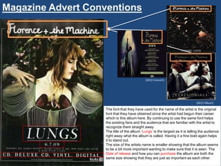
(2012 Album)
The font that they have used for the name of the artist is the original
font that they have obtained since the artist had begun their career
which is this album here. By continuing to use the same font helps
the existing fans and the audience that are familiar with the artist to
recognize them straight away.
The title of the album „Lungs‟ is the largest as it is telling the audience
right away what the album is called. Having it a fine bold again helps
it to stand out.
The size of the artists name is smaller showing that the album seems
to be a bit more important wanting to make sure that it is seen. The
Date of release and how you can purchase the album are both the
same size showing that they are just as important as each other.
2. The style of language within this poster is
direct. All of the words are straight for
with no long sentences. The description
as to what type of form you can purchase
the album, is straight forward, one word
answers. Instead of there being a
sentence along the lines of “You can
purchase the album on…” They already
know that the audience would be asking
that question.
I would say that the writing is formal as I
feel the artist is not trying to aim at a
younger audience.
Includes the singles Rabbit Heart
(raise it up). Dog Days Are Over &
Kiss With A Fist.
3. The main image that is used in this
poster is the album cover itself. The
only part that has been included and
changed are the additional information
underneath the title of the album.
There is an advantage having the
album cover presented on the poster
as the audience will already be aware
of what the album looks like, this will
help them to identify it when they go to
purchase the product.
4. There are only two colours used in this
poster both being black and white. As the
background colour of the album is already
black it is used blends in with the rest of
the poster. Including the the colour of the
font on the album cover which remains
within the poster. I find that having the
black and white on the poster reflects well
and makes the font easily visible. I also
find that not having so much colour
around the main image is important as it
doesn‟t distract the main focus which is on
the album cover.
5. The layout has been set to a position
that meets the eye at first sight and that
is simply by having everything in the
centre. As the layout is in this particular
way, it helps to have a straightforward
presentation and not too complicated.
As this is a poster that has direct
information, you would want the layout
to be direct as well, in this form it does
just that.
6. The information that is used is important and
presented directly to the audience answering all of
their questions. All of the five W‟s. Who the artist
in the main image of the poster is, as this is their
first album they would not be recognized just by
their image at that time. What, is the name of the
product that is being presented to the public.
When, will the product be available for the public
to go out and receive their own copy. Where the
public would be able to purchase their
copy, including how as the audience would want
to know what ways they would be able to
purchase it. Lastly Why should the public go and
buy this product? As stated on the poster this
album includes singles that have been released
before this album, which the public would be
familiar to and if their target audience are already
familiar with the songs and enjoyed them they
would also like to listen to the rest.