1. How effective is the combination of your main
product and ancillary texts?
2.
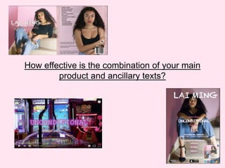
3. DIGIPAK
My Digipak is captivating and effective due to the consistent colour scheme of pink, red and white
throughout. The use of these colours create a warm, passionate atmosphere reinforcing the
romantic, heartbreak theme of the album. Overall the digipak is bright and engaging offering my
target audience a variety of styles on each page. The majority of shot types included in the digipak
are medium close ups, close up, low angle and mid shots where the artist is providing direct
contact; these create an intimacy and relationship with the artist and target audience fulfilling their
needs of comfort and safety. The shot types are additionally impactful instantly catching the
attention of my target audience. There is a consistency with the font style used, I thought the font
‘Arial Narrow’ reflected the genre of the album providing a formality and youtuhful touch , also the
font ‘Handwriting- Dakota’ used for the title of each song provided a unique handwriting effect
which made the text seem as if the artist had handwritten it, this is emulated on the opening page
of the digipak used to produce a message from the artist. The use of high key and low lighting sets
the mood of each image mirroring the relaxed action code of the artist, with the edgy, home
environment it caputres the artist in her natural state showing an honesty to the artist and her
music. Including the song lyrics in my digipak adds appeal to my product as my audience will be
satisfied they are recieving more than just the CD. This feature will also attract a wider audience
gaining more sales ; if they arent familiar with the artist and their music they will be able to learn
the lyrics easily.
4. MAGAZINE ADVERT
For my magazine advert I used a similar image to my digipak; this
consisted of the same costume code and mise en scene but a different
action code. Through direct address present in the image makes the
advert more engaging. The low angle shot reinforces the artists star
persona making her superior to society. I conformed to the conventions
of existing magazine adverts by including a smaller image of my Digipak
front cover allowing my target audience to recognize what the Digipak
looks like if they decide to pursue purchasing the album. Both my digipak
and magazine advert effectively provide a link through the consistent
colour scheme of pink and white creating a positive atmosphere while
allowing my target audience to be familiar with both products, as a result
of this there is no sense of confusion in regards to what each product is
advertising. I included the font ‘Chalk Duster’ for the artists name and
album title as this is the same font used on my Digipak cover; the use of
this provides a clear link between both products, it also makes the advert
more compelling. The use of convergence and insertion of reviews
alleviate the advert promoting the artist. They provide an interactive
feature enabling my target audience to actively participate in the
purchasing and research of the artists album. Centering my textual
information on my advert makes it one of the main focuses aside from
the image, I also added an outer glow to my text to make it stand out off
the contrasting light blue colour of the artists jeans. Overall the advert is
potent achieving the needs of my target audiences to feel informed, self
esteemed and confident in relation to Maslow’s Hierarchy of needs.
5. MUSIC VIDEO
In the production of my music video I made sure there was a consistency throughout with the costume code, mise en
scene and shot types. In each shot the model is wearing the same style of clothing used in my Digipak photos, this
promotes the artists unique style reinforcing her star identity. We filmed in lively locations finding bright walls and
houses to capture footage next to; these helped provide the same bright and positive atmosphere that was present in
my ancillary texts. It was essential that my artist stood out next to her surroundings and was the main focus therefore
we used a variety of shot types such as a medium close up to focus on the artist while having a smaller focus on the
background with it still being visible. These shots were repeated throughout the video creating an intimacy with the
audience, we also wanted to highlight features of the model which would attract the male audience conforming to
Mulveys male gaze theory. The use of pan shots in the opening sequence of my video offers an aspect of pleasure to
my target audience, as aspirers they will feel encapsulated by the different locations as they promote the message
that there are no boundaries in the outside world, a sense of freedom is advertised persuading my target audience to
one day visit these locations. We decided to include an opening title which I imitated the same font and colours used
in Rihanna’s ‘Work’ music video, as well as a convention of pop music videos it also made the video more exciting and
recognizable.