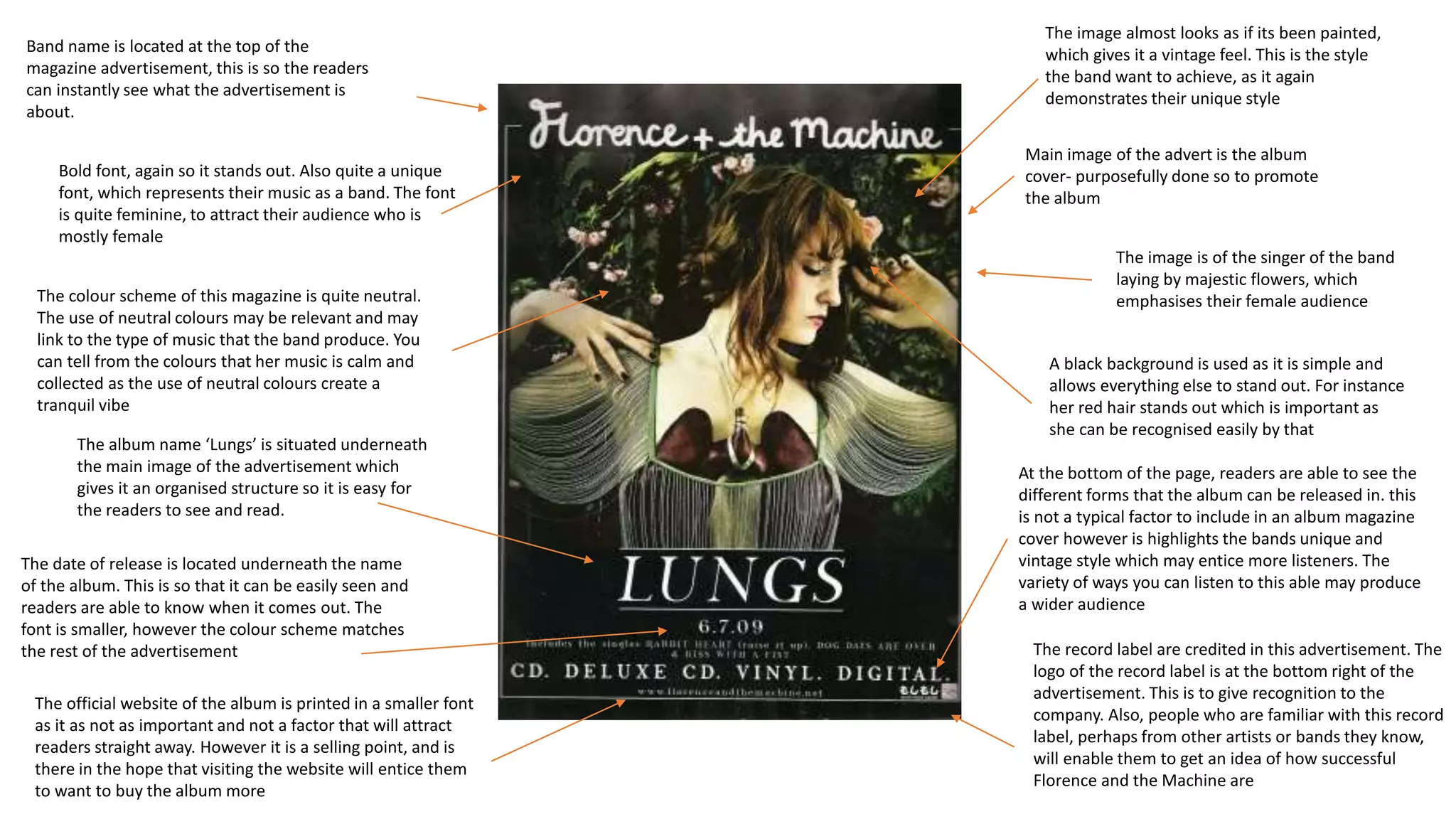
1. Band name is located at the top of the
magazine advertisement, this is so the readers
can instantly see what the advertisement is
about.
Bold font, again so it stands out. Also quite a unique
font, which represents their music as a band. The font
is quite feminine, to attract their audience who is
mostly female
Main image of the advert is the album
cover- purposefully done so to promote
the album
The image is of the singer of the band
laying by majestic flowers, which
emphasises their female audience
A black background is used as it is simple and
allows everything else to stand out. For instance
her red hair stands out which is important as
she can be recognised easily by that
The image almost looks as if its been painted,
which gives it a vintage feel. This is the style
the band want to achieve, as it again
demonstrates their unique style
The official website of the album is printed in a smaller font
as it as not as important and not a factor that will attract
readers straight away. However it is a selling point, and is
there in the hope that visiting the website will entice them
to want to buy the album more
The colour scheme of this magazine is quite neutral.
The use of neutral colours may be relevant and may
link to the type of music that the band produce. You
can tell from the colours that her music is calm and
collected as the use of neutral colours create a
tranquil vibe
The album name ‘Lungs’ is situated underneath
the main image of the advertisement which
gives it an organised structure so it is easy for
the readers to see and read.
The date of release is located underneath the name
of the album. This is so that it can be easily seen and
readers are able to know when it comes out. The
font is smaller, however the colour scheme matches
the rest of the advertisement
At the bottom of the page, readers are able to see the
different forms that the album can be released in. this
is not a typical factor to include in an album magazine
cover however is highlights the bands unique and
vintage style which may entice more listeners. The
variety of ways you can listen to this able may produce
a wider audience
The record label are credited in this advertisement. The
logo of the record label is at the bottom right of the
advertisement. This is to give recognition to the
company. Also, people who are familiar with this record
label, perhaps from other artists or bands they know,
will enable them to get an idea of how successful
Florence and the Machine are