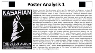
1. Kasabian have used the same colour scheme and font style to the on they used on their CD
digipak. This creates familiarity to the fans of Kasabian and allows them to become familiar to
their products which is needed as this is Kasabian's first album. Underneath the bands name is
their website, this is enables good promotion due to the design of the poster. As the largest space
used up on the poster is the bands name at the top of the poster which is what will catch the
audiences eye and then the next element of the poster near the masthead is the website,
resulting in people knowing where to look for further information and products. This also complies
with stereotypical conventions of poster designs having larger text a the top and then working its
way down. Towards the bottom of the poster, they have included a large font size also to highlight
the fact that it is the bands debut album and that hype should be created over this for band. They
have then included text of the best tracks they feel are within the album on the poster to make
sure their audience listen to these songs in particular. More promotional content is included at the
bottom of the poster in a smaller font as its less important, but it notifies the audience that they
can listen to the album on different platforms if they want. This poster has still been kept simple
like the digipak produced, it represents the nature of the band well and their perception of being
simple and cool. They have allowed blank space to appear on the poster and not include multiple
elements to make the poster be packed full of information. I feel this enables more attention to be
diverted on to the elements that are required to allow the band to succeed which Kasabian have
achieved through this design. It is simple but effective and is something I will be looking to
implement into my own designs. Not only this, but eh colour scheme also I feel looks professional
and suits the genre of music. I feel this will also work well for a punk and as it signifies danger and
using a mysterious figure who is portrayed as “The Hunter” will work well for our designs I feel
and is an idea that could get implemented.
Poster Analysis 1