The poster advertises the new album from Arctic Monkeys using minimal design elements. It features the band's name and logo in black and white at the top to identify the band and reinforce their image. Below is their soundwave-style logo reminiscent of how the band presents itself across platforms. The release date informs viewers when the album can be purchased on CD or downloaded, communicating availability on different platforms. An overall minimalist design with just text and the soundwave image aims to focus attention on the album itself for fans.
Spring gala 2024 photo slideshow - Celebrating School-Community Partnerships
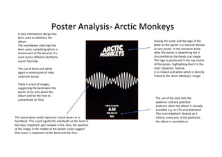
Poster analysis
1. Having the name and the logo of the
band on the poster is a massive feature
on any poster. It lets everyone know
what the poster is advertising but it
also reinforces the bands starimage.
The logo is positioned in the top centre
of the poster, highlighting that it is the
most important feature.
It is in black and white which is directly
linked to the Arctic Monkey’s image.
The use of the date tells the
audience and any potential
audience when the album is actually
available e.g. on CDs and download.
This is an important feature as it
informs every one of the platforms
the album is available on.
A very minimalistic design has
been used to advertise the
album.
The soundwave style logo has
been used, something which is
reminiscent of the band as it is
used across different platforms
e.g on YouTube.
The use of black and white
again is reminiscent of indie
rock/rock bands.
There is a lack of images,
suggesting the band want the
poster to be only about the
album and for the fans to
concentrate on that.
Poster Analysis- Arctic Monkeys
The sound wave could represent sound waves or a
heartbeat. This could signify life and death as the heart is
the most important part needed in life. Also, the position
of the image in the middle of the poster could suggest
that music is important to the band and the fans.